- Published on
6 Tips To Make A Material UI Textfield With Tailwind CSS
- What is Tailwind CSS?
- The description of Material UI Textfield ui component
- Why use Tailwind CSS to create a Material UI Textfield ui component?
- The preview of Material UI Textfield ui component
- The source code of Material UI Textfield ui component
- How to create a Material UI Textfield with Tailwind CSS?
- 1. Install Tailwind CSS
- 2. Create a custom theme
- 3. Import Tailwind CSS
- 4. Create a Material UI Textfield
- 5. Customize the Material UI Textfield
- 6. Add custom styles
- Conclusion
What is Tailwind CSS?
Tailwind CSS is a utility-first CSS framework that provides a set of pre-defined classes to style your HTML elements. It allows you to build custom designs quickly by providing a set of low-level utility classes that can be combined to create complex designs.
The description of Material UI Textfield ui component
Material UI is a popular React UI library that provides a set of pre-built UI components. One of the most commonly used components is the Textfield component. The Textfield component is used to take input from the user and is commonly used in forms.
Why use Tailwind CSS to create a Material UI Textfield ui component?
Tailwind CSS provides a set of pre-defined classes that can be used to style the Material UI Textfield component quickly. It allows you to create custom designs without writing custom CSS. Additionally, Tailwind CSS is easy to learn and can be used with any front-end framework.
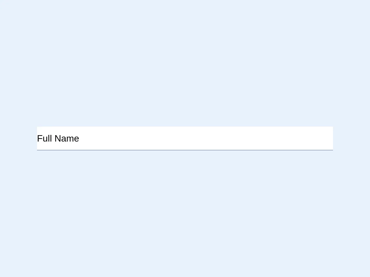
The preview of Material UI Textfield ui component
The Material UI Textfield component is a simple input field that can be used to take input from the user. It can be customized using Tailwind CSS to match the design of your application.
Free download of the Material UI Textfield's source code
The source code of Material UI Textfield ui component
The Material UI Textfield component can be easily customized using Tailwind CSS. The source code for the Textfield component can be found on the Material UI website.
<style>
  body {
    background-color: white;
  }

.md-input-main {
	@apply font-sans text-xl w-full;
  	width: 50%;
	font-size: 1.25rem;
  	font-family: -apple-system, BlinkMacSystemFont, "Segoe UI", Roboto, "Helvetica Neue", Arial, "Noto Sans", sans-serif, "Apple Color Emoji", "Segoe UI Emoji", "Segoe UI Symbol", "Noto Color Emoji";

}
.md-input-box {
	@apply relative;
  	position: relative;
}
.md-input {
	@apply w-full;
  	width: 100%;
	outline: none;
	height: 50px;
}
.md-label {
	@apply absolute pointer-events-none block;
  	display: block;
  	position: absolute;
  	pointer-events: none;
	transform-origin: top left;
	transform: translate(0, -40px) scale(1);
	transition: color 200ms cubic-bezier(0.0, 0, 0.2, 1) 0ms, transform 200ms cubic-bezier(0.0, 0, 0.2, 1) 0ms;
}
.md-label-focus {
	@apply text-blue;
	color: #3182ce;
	transform: translate(0, -65px) scale(0.75);
	transform-origin: top left;
}
.md-input-underline {
	border-bottom: 1px solid #718096;;
}
.md-input-underline:after {
	@apply absolute left-0 right-0 pointer-events-none;
  	position: absolute;
  	left: 0;
  	right: 0;
  	pointer-events: none;
	bottom: -0.05rem;
	content: "";
	transition: transform 200ms cubic-bezier(0.0, 0, 0.2, 1) 0ms;
	transform: scaleX(0);
	border-bottom: 2px solid #805ad5;
}
.md-input:focus ~ .md-input-underline:after {
	transform: scaleX(1);
}
.md-input:focus + .md-label, .md-input:not(:placeholder-shown) + .md-label {
  	@apply md-label-focus;
	color: #3182ce;
	transform: translate(0, -65px) scale(0.75);
	transform-origin: top left;
}
/* enable to leave border-bottom in modified color when the field is populated */
/*
.md-input:not(:placeholder-shown) ~ .md-input-underline:after {
  	transform: scaleX(1);
}
*/

</style>

<div class="md-input-main">
  <div class="md-input-box">
    <input
           id="fullName"
           name="fullName"
           type="text"
           class="md-input"
           placeholder=" "
           />
    <label for="fullName" class="md-label">Full Name</label>
    <div class="md-input-underline" />
  </div>
</div>
How to create a Material UI Textfield with Tailwind CSS?
Here are 6 tips to create a Material UI Textfield with Tailwind CSS:
1. Install Tailwind CSS
The first step to creating a Material UI Textfield with Tailwind CSS is to install Tailwind CSS. You can install it using npm or yarn.
npm install tailwindcss
2. Create a custom theme
The next step is to create a custom theme for your application. You can do this by creating a tailwind.config.js file in the root of your project and adding your custom theme.
// tailwind.config.js
module.exports = {
  theme: {
    extend: {
      colors: {
        primary: '#1a202c',
        secondary: '#2d3748',
        tertiary: '#4a5568',
      },
    },
  },
  variants: {},
  plugins: [],
};
3. Import Tailwind CSS
The next step is to import Tailwind CSS into your project. You can do this by importing it into your index.css file.
/* index.css */
@import 'tailwindcss/base';
@import 'tailwindcss/components';
@import 'tailwindcss/utilities';
4. Create a Material UI Textfield
The next step is to create a Material UI Textfield component. You can do this by importing the Textfield component from Material UI and adding it to your JSX code.
import React from 'react';
import TextField from '@material-ui/core/TextField';

function App() {
  return (
    <div className="p-4">
      <TextField label="Email" variant="outlined" />
    </div>
  );
}

export default App;
5. Customize the Material UI Textfield
The next step is to customize the Material UI Textfield using Tailwind CSS. You can do this by adding Tailwind CSS classes to the Textfield component.
import React from 'react';
import TextField from '@material-ui/core/TextField';

function App() {
  return (
    <div className="p-4">
      <TextField
        label="Email"
        variant="outlined"
        className="w-full max-w-md mx-auto"
        InputProps={{
          classes: {
            root: 'bg-white rounded-lg',
            focused: 'border-blue-500',
          },
        }}
        InputLabelProps={{
          classes: {
            root: 'text-gray-600',
            focused: 'text-blue-500',
          },
        }}
      />
    </div>
  );
}

export default App;
6. Add custom styles
The final step is to add custom styles to the Textfield component. You can do this by adding custom CSS classes to the Textfield component.
import React from 'react';
import TextField from '@material-ui/core/TextField';

function App() {
  return (
    <div className="p-4">
      <TextField
        label="Email"
        variant="outlined"
        className="w-full max-w-md mx-auto"
        InputProps={{
          classes: {
            root: 'bg-white rounded-lg shadow-md',
            focused: 'border-blue-500',
          },
        }}
        InputLabelProps={{
          classes: {
            root: 'text-gray-600',
            focused: 'text-blue-500',
          },
        }}
      />
    </div>
  );
}

export default App;
Conclusion
Creating a Material UI Textfield with Tailwind CSS is a quick and easy way to customize the Textfield component. By following these 6 tips, you can create a custom Textfield component that matches the design of your application. Tailwind CSS is a powerful tool that can be used to create custom designs quickly and easily.