- Published on
Beginners Guide: Build A Material Design - Card With Tailwind CSS
- What is Tailwind CSS?
- The description of Material Design - Card UI component
- Why use Tailwind CSS to create a Material Design - Card UI component?
- The preview of Material Design - Card UI component
- The source code of Material Design - Card UI component
- How to create a Material Design - Card with Tailwind CSS?
- Conclusion
In this article, we will be discussing how to create a Material Design - Card UI component using Tailwind CSS. We will provide a brief introduction to Tailwind CSS, explain the Material Design - Card UI component, and then dive into the code to create it.
What is Tailwind CSS?
Tailwind CSS is a utility-first CSS framework that allows developers to rapidly build custom user interfaces. It provides a set of pre-defined classes that can be used to style HTML elements. Tailwind CSS is highly customizable and can be configured to meet the specific needs of a project.
The description of Material Design - Card UI component
Material Design is a design language developed by Google. It is characterized by a clean and modern look, with a focus on bold colors and typography. The Material Design - Card UI component is a container that displays content in a card-like format. It is commonly used to display information such as product details, blog posts, or user profiles.
The Material Design - Card UI component typically consists of a header, body, and footer. The header contains a title and an optional image, the body contains the main content, and the footer contains additional information such as a call-to-action button or social media links.
Why use Tailwind CSS to create a Material Design - Card UI component?
Tailwind CSS provides a set of pre-defined classes that can be used to style HTML elements. This makes it easy to create a Material Design - Card UI component without having to write custom CSS. Additionally, Tailwind CSS is highly customizable, which means that developers can easily modify the styles to meet their specific needs.
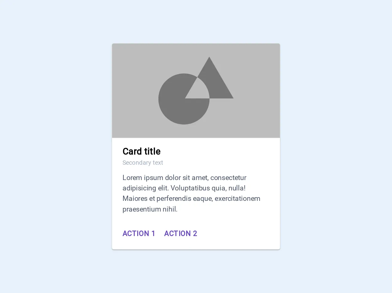
The preview of Material Design - Card UI component
To create a Material Design - Card UI component, we will use Tailwind CSS to style the HTML elements. The result will be a card that displays an image, title, and description.
Free download of the Material Design - Card's source code
The source code of Material Design - Card UI component
The source code for the Material Design - Card UI component is relatively simple. We will use HTML and Tailwind CSS classes to create the card.
<link href="https://fonts.googleapis.com/css?family=Roboto&display=swap" rel="stylesheet">
<style>
.material-card {
  	font-family: 'Roboto', sans-serif;
	background-color: #FFF;
  	box-shadow: 0px 2px 1px -1px rgba(0, 0, 0, 0.2), 0px 1px 1px 0px rgba(0, 0, 0, 0.14), 0px 1px 3px 0px rgba(0,0,0,.12);
}
</style>
<div class="max-w-sm rounded material-card bg-white">
  <img class="w-full rounded-t" src="data:image/svg+xml,%3Csvg%20width%3D%22344%22%20height%3D%22194%22%20xmlns%3D%22http%3A%2F%2Fwww.w3.org%2F2000%2Fsvg%22%20xmlns%3Axlink%3D%22http%3A%2F%2Fwww.w3.org%2F1999%2Fxlink%22%3E%3Cdefs%3E%3Cpath%20id%3D%22a%22%20d%3D%22M-1%200h344v194H-1z%22%2F%3E%3C%2Fdefs%3E%3Cg%20transform%3D%22translate(1)%22%20fill%3D%22none%22%20fill-rule%3D%22evenodd%22%3E%3Cmask%20id%3D%22b%22%20fill%3D%22%23fff%22%3E%3Cuse%20xlink%3Ahref%3D%22%23a%22%2F%3E%3C%2Fmask%3E%3Cuse%20fill%3D%22%23BDBDBD%22%20xlink%3Ahref%3D%22%23a%22%2F%3E%3Cg%20mask%3D%22url(%23b)%22%3E%3Cpath%20d%3D%22M173.65%2069.238L198.138%2027%20248%20112.878h-49.3c.008.348.011.697.011%201.046%200%2028.915-23.44%2052.356-52.355%2052.356C117.44%20166.28%2094%20142.84%2094%20113.924c0-28.915%2023.44-52.355%2052.356-52.355%2010%200%2019.347%202.804%2027.294%207.669zm0%200l-25.3%2043.64h50.35c-.361-18.478-10.296-34.61-25.05-43.64z%22%20fill%3D%22%23757575%22%2F%3E%3C%2Fg%3E%3C%2Fg%3E%3C%2Fsvg%3E">
  <div class="px-6 py-4">
    <div class="font-bold text-xl tracking-wide">Card title</div>
    <div class="text-gray-500 text-sm mb-3">Secondary text</div>
    <p class="text-gray-700 text-base">
      Lorem ipsum dolor sit amet, consectetur adipisicing elit. Voluptatibus quia, nulla! Maiores et perferendis eaque, exercitationem praesentium nihil.
    </p>
  </div>
  <div class="mx-4 mt-2 mb-4">
    <a class="tracking-wider uppercase font-bold text-purple-700 hover:bg-purple-100 rounded p-2 inline-block" href="#">Action 1</a>
    <a class="tracking-wider uppercase font-bold text-purple-700 hover:bg-purple-100 rounded p-2 inline-block" href="#">Action 2</a>
  </div>
</div>
How to create a Material Design - Card with Tailwind CSS?
To create a Material Design - Card UI component with Tailwind CSS, follow these steps:
- Create a new HTML file and add the following code:
<div class="max-w-sm rounded overflow-hidden shadow-lg">
  <img class="w-full" src="https://source.unsplash.com/random/400x200" alt="Sunset in the mountains">
  <div class="px-6 py-4">
    <div class="font-bold text-xl mb-2">The Coldest Sunset</div>
    <p class="text-gray-700 text-base">
      Lorem ipsum dolor sit amet, consectetur adipisicing elit. Voluptatibus quia, nulla! Maiores et perferendis eaque, exercitationem praesentium nihil.
    </p>
  </div>
  <div class="px-6 py-4">
    <span class="inline-block bg-gray-200 rounded-full px-3 py-1 text-sm font-semibold text-gray-700 mr-2">#photography</span>
    <span class="inline-block bg-gray-200 rounded-full px-3 py-1 text-sm font-semibold text-gray-700 mr-2">#travel</span>
    <span class="inline-block bg-gray-200 rounded-full px-3 py-1 text-sm font-semibold text-gray-700">#winter</span>
  </div>
</div>
- Add the Tailwind CSS CDN to the head of your HTML file:
<head>
  <link href="https://cdn.jsdelivr.net/npm/[email protected]/dist/tailwind.min.css" rel="stylesheet">
</head>
- Save the file and open it in your web browser. You should see a Material Design - Card UI component displayed on the page.
Conclusion
In this article, we discussed how to create a Material Design - Card UI component using Tailwind CSS. We provided a brief introduction to Tailwind CSS, explained the Material Design - Card UI component, and then dove into the code to create it. We hope this article was helpful in getting you started with Tailwind CSS and Material Design.