- Published on
A Complete Guide To Build A Manage Product Cart With Tailwind CSS
- What is Tailwind CSS?
- The description of manage product cart ui component
- Why use Tailwind CSS to create a manage product cart ui component?
- The preview of manage product cart ui component
- The source code of manage product cart ui component
- How to create a manage product cart with Tailwind CSS?
- Conclusion
What is Tailwind CSS?
Tailwind CSS is a utility-first CSS framework that provides a set of pre-defined classes that can be used to quickly build custom user interfaces. It is designed to be highly customizable, allowing developers to create unique designs without having to write custom CSS from scratch.
The description of manage product cart ui component
A manage product cart UI component is a common feature in e-commerce websites that allows users to view and manage the items in their shopping cart. This component typically displays a list of items, their prices, and the total cost of the order.
Why use Tailwind CSS to create a manage product cart ui component?
Tailwind CSS provides a set of pre-defined classes that can be used to quickly build custom user interfaces. This makes it an ideal choice for creating a manage product cart UI component, as it allows developers to quickly build a custom design without having to write custom CSS from scratch.
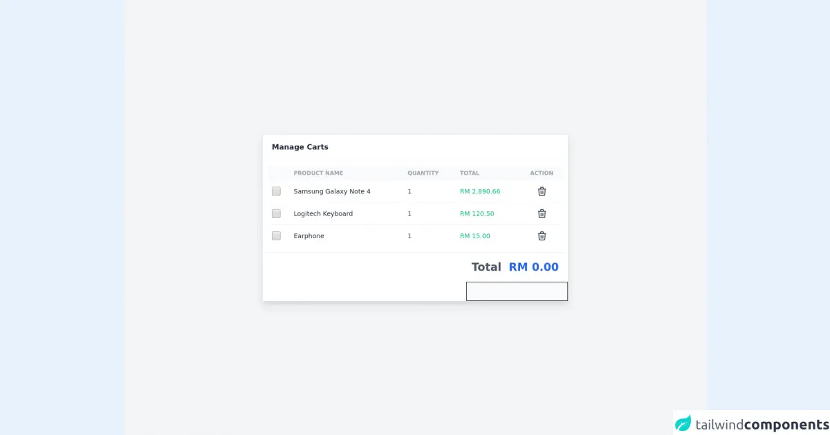
The preview of manage product cart ui component
To create a manage product cart UI component with Tailwind CSS, we will use a combination of pre-defined classes to create a custom design. The resulting component will display a list of items, their prices, and the total cost of the order.
Free download of the manage product cart's source code
The source code of manage product cart ui component
To create a manage product cart UI component with Tailwind CSS, we will use a combination of HTML and CSS. The HTML will define the structure of the component, while the CSS will define the styling.
<script defer src="https://unpkg.com/[email protected]/dist/cdn.min.js"></script>

<section class="antialiased bg-gray-100 text-gray-600 h-screen px-4" x-data="app">
    <div class="flex flex-col justify-center h-full">
        <!-- Table -->
        <div class="w-full max-w-2xl mx-auto bg-white shadow-lg rounded-sm border border-gray-200">
            <header class="px-5 py-4 border-b border-gray-100">
                <div class="font-semibold text-gray-800">Manage Carts</div>
            </header>

            <div class="overflow-x-auto p-3">
                <table class="table-auto w-full">
                    <thead class="text-xs font-semibold uppercase text-gray-400 bg-gray-50">
                        <tr>
                            <th></th>
                            <th class="p-2">
                                <div class="font-semibold text-left">Product Name</div>
                            </th>
                            <th class="p-2">
                                <div class="font-semibold text-left">Quantity</div>
                            </th>
                            <th class="p-2">
                                <div class="font-semibold text-left">Total</div>
                            </th>
                            <th class="p-2">
                                <div class="font-semibold text-center">Action</div>
                            </th>
                        </tr>
                    </thead>

                    <tbody class="text-sm divide-y divide-gray-100">
                        <!-- record 1 -->
                        <tr>
                            <td class="p-2">
                                <input type="checkbox" class="w-5 h-5" value="id-1"
                                    @click="toggleCheckbox($el, 2890.66)" />
                            </td>
                            <td class="p-2">
                                <div class="font-medium text-gray-800">
                                    Samsung Galaxy Note 4
                                </div>
                            </td>
                            <td class="p-2">
                                <div class="text-left">1</div>
                            </td>
                            <td class="p-2">
                                <div class="text-left font-medium text-green-500">
                                    RM 2,890.66
                                </div>
                            </td>
                            <td class="p-2">
                                <div class="flex justify-center">
                                    <button>
                                        <svg class="w-8 h-8 hover:text-blue-600 rounded-full hover:bg-gray-100 p-1"
                                            fill="none" stroke="currentColor" viewBox="0 0 24 24"
                                            xmlns="http://www.w3.org/2000/svg">
                                            <path stroke-linecap="round" stroke-linejoin="round" stroke-width="2"
                                                d="M19 7l-.867 12.142A2 2 0 0116.138 21H7.862a2 2 0 01-1.995-1.858L5 7m5 4v6m4-6v6m1-10V4a1 1 0 00-1-1h-4a1 1 0 00-1 1v3M4 7h16">
                                            </path>
                                        </svg>
                                    </button>
                                </div>
                            </td>
                        </tr>

                        <!-- record 2 -->
                        <tr>
                            <td class="p-2">
                                <input type="checkbox" class="w-5 h-5" value="id-2"
                                    @click="toggleCheckbox($el, 120.50)" />
                            </td>
                            <td class="p-2">
                                <div>
                                    <div class="font-medium text-gray-800">Logitech Keyboard</div>
                                </div>
                            </td>
                            <td class="p-2">
                                <div class="text-left">1</div>
                            </td>
                            <td class="p-2">
                                <div class="text-left font-medium text-green-500">
                                    RM 120.50
                                </div>
                            </td>
                            <td class="p-2">
                                <div class="flex justify-center">
                                    <button>
                                        <svg class="w-8 h-8 hover:text-blue-600 rounded-full hover:bg-gray-100 p-1"
                                            fill="none" stroke="currentColor" viewBox="0 0 24 24"
                                            xmlns="http://www.w3.org/2000/svg">
                                            <path stroke-linecap="round" stroke-linejoin="round" stroke-width="2"
                                                d="M19 7l-.867 12.142A2 2 0 0116.138 21H7.862a2 2 0 01-1.995-1.858L5 7m5 4v6m4-6v6m1-10V4a1 1 0 00-1-1h-4a1 1 0 00-1 1v3M4 7h16">
                                            </path>
                                        </svg>
                                    </button>
                                </div>
                            </td>
                        </tr>

                        <!-- record 3 -->
                        <tr>
                            <td class="p-2">
                                <input type="checkbox" class="w-5 h-5" value="id-3"
                                    @click="toggleCheckbox($el, 15.00)" />
                            </td>
                            <td class="p-2">
                                <div>
                                    <div class="font-medium text-gray-800">Earphone</div>
                                </div>
                            </td>
                            <td class="p-2">
                                <div class="text-left">1</div>
                            </td>
                            <td class="p-2">
                                <div class="text-left font-medium text-green-500">RM 15.00</div>
                            </td>
                            <td class="p-2">
                                <div class="flex justify-center">
                                    <button>
                                        <svg class="w-8 h-8 hover:text-blue-600 rounded-full hover:bg-gray-100 p-1"
                                            fill="none" stroke="currentColor" viewBox="0 0 24 24"
                                            xmlns="http://www.w3.org/2000/svg">
                                            <path stroke-linecap="round" stroke-linejoin="round" stroke-width="2"
                                                d="M19 7l-.867 12.142A2 2 0 0116.138 21H7.862a2 2 0 01-1.995-1.858L5 7m5 4v6m4-6v6m1-10V4a1 1 0 00-1-1h-4a1 1 0 00-1 1v3M4 7h16">
                                            </path>
                                        </svg>
                                    </button>
                                </div>
                            </td>
                        </tr>
                    </tbody>
                </table>
            </div>

            <!-- total amount -->
            <div class="flex justify-end font-bold space-x-4 text-2xl border-t border-gray-100 px-5 py-4">
                <div>Total</div>
                <div class="text-blue-600">RM <span x-text="total.toFixed(2)"></span></div>
            </div>

            <div class="flex justify-end">
                <!-- send this data to backend (note: use class 'hidden' to hide this input) -->
                <input type="text" class="border border-black bg-gray-50" x-model="selected" />
            </div>
        </div>
    </div>
</section>

<script>
    document.addEventListener("alpine:init", () => {
        Alpine.data("app", () => ({
            total: 0,
            selected: [],

            toggleCheckbox(element, amount) {
                if (element.checked) {
                    this.selected.push(element.value);
                    this.total += amount;
                } else {
                    const index = this.selected.indexOf(element.value);

                    if (index > -1) this.selected.splice(index, 1);

                    this.total -= amount;
                }
            },
        }));
    });
</script>
How to create a manage product cart with Tailwind CSS?
To create a manage product cart UI component with Tailwind CSS, follow these steps:
- Create a new HTML file and add the following code to define the structure of the component:
<div class="bg-white rounded-lg shadow-lg">
  <div class="px-6 py-4">
    <h2 class="text-lg font-medium text-gray-900">Your Cart</h2>
  </div>
  <ul class="divide-y divide-gray-200">
    <li class="flex items-center py-6">
      <img class="h-10 w-10 rounded-full" src="https://via.placeholder.com/150" alt="">
      <div class="ml-4">
        <h3 class="text-sm font-medium text-gray-900">Product Name</h3>
        <p class="text-sm text-gray-500">$10.00</p>
      </div>
      <div class="ml-auto flex items-center">
        <button class="text-gray-500 focus:outline-none focus:text-gray-600">
          <svg class="h-5 w-5" fill="none" viewBox="0 0 24 24" stroke="currentColor">
            <path stroke-linecap="round" stroke-linejoin="round" stroke-width="2" d="M15 19l-7-7 7-7" />
          </svg>
        </button>
        <span class="mx-2 text-gray-700">1</span>
        <button class="text-gray-500 focus:outline-none focus:text-gray-600">
          <svg class="h-5 w-5" fill="none" viewBox="0 0 24 24" stroke="currentColor">
            <path stroke-linecap="round" stroke-linejoin="round" stroke-width="2" d="M9 5l7 7-7 7" />
          </svg>
        </button>
      </div>
    </li>
  </ul>
  <div class="px-6 py-4">
    <div class="flex justify-between text-sm font-medium text-gray-900">
      <span>Subtotal</span>
      <span>$20.00</span>
    </div>
    <p class="mt-2 text-sm text-gray-600">Shipping and taxes calculated at checkout.</p>
    <div class="mt-6">
      <button class="w-full bg-indigo-600 border border-transparent rounded-md py-3 px-4 text-base font-medium text-white hover:bg-indigo-700 focus:outline-none focus:ring-2 focus:ring-offset-2 focus:ring-indigo-500">
        Checkout
      </button>
    </div>
  </div>
</div>
- Add the following CSS to style the component:
/* Set the width of the component */
.bg-white {
  width: 400px;
}

/* Style the heading */
.text-lg {
  font-size: 1.125rem;
  line-height: 1.75rem;
}

/* Style the list items */
.py-6 {
  padding-top: 1.5rem;
  padding-bottom: 1.5rem;
}

/* Style the product image */
.h-10 {
  height: 2.5rem;
}

/* Style the product name */
.text-sm {
  font-size: 0.875rem;
  line-height: 1.25rem;
}

/* Style the product price */
.text-gray-500 {
  color: #6b7280;
}

/* Style the product quantity buttons */
.text-gray-700 {
  color: #4b5563;
}

/* Style the subtotal */
.text-sm {
  font-size: 0.875rem;
  line-height: 1.25rem;
}

/* Style the checkout button */
.bg-indigo-600 {
  background-color: #4f46e5;
}

/* Style the checkout button on hover */
.hover\:bg-indigo-700:hover {
  background-color: #4338ca;
}

/* Style the checkout button when focused */
.focus\:ring-2:focus {
  outline: none;
  box-shadow: 0 0 0 3px rgba(66, 153, 225, 0.5);
}

/* Style the checkout button when active */
.active\:bg-indigo-700:active {
  background-color: #4338ca;
}
- Save the file and open it in a web browser to see the manage product cart UI component.
Conclusion
In conclusion, Tailwind CSS is a powerful tool for creating custom user interfaces quickly and easily. By following the steps outlined in this guide, you can create a manage product cart UI component that is both functional and visually appealing. With its pre-defined classes and highly customizable nature, Tailwind CSS is an ideal choice for developers looking to create unique designs without having to write custom CSS from scratch.