- Published on
Surprisingly Effective Ways To Build A Login Show/Hide Password With Tailwind CSS
- What is Tailwind CSS?
- The description of Login Show/Hide Password ui component
- Why use Tailwind CSS to create a Login Show/Hide Password ui component?
- The preview of Login Show/Hide Password ui component
- The source code of Login Show/Hide Password ui component
- How to create a Login Show/Hide Password with Tailwind CSS?
- Conclusion
What is Tailwind CSS?
Tailwind CSS is a utility-first CSS framework that allows developers to quickly create custom designs without writing any CSS code. It provides a set of pre-defined CSS classes that can be used to style HTML elements. Tailwind CSS is highly customizable and can be used to create complex UI components.
The description of Login Show/Hide Password ui component
A Login Show/Hide Password UI component is a user interface element that allows users to toggle the visibility of the password field in a login form. This component is useful for users who want to see the password they are typing in, to ensure that they are entering the correct password.
Why use Tailwind CSS to create a Login Show/Hide Password ui component?
Tailwind CSS provides a set of pre-defined CSS classes that can be used to style HTML elements. This makes it easy to create custom designs without writing any CSS code. Additionally, Tailwind CSS is highly customizable and can be used to create complex UI components. Using Tailwind CSS to create a Login Show/Hide Password UI component can save developers time and effort.
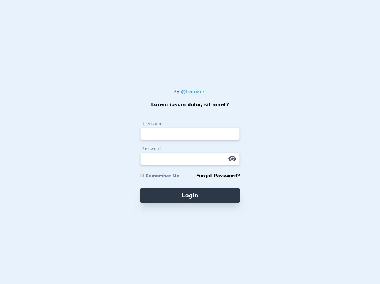
The preview of Login Show/Hide Password ui component
To create a Login Show/Hide Password UI component with Tailwind CSS, we can use the following HTML and CSS code:
<div class="relative">
  <input
    type="password"
    name="password"
    class="w-full px-4 py-2 rounded-md border-gray-300 focus:border-indigo-500 focus:ring-2 focus:ring-indigo-200 focus:ring-opacity-50"
    placeholder="Password"
  />
  <div class="absolute inset-y-0 right-0 pr-3 flex items-center text-sm leading-5">
    <svg
      class="h-6 text-gray-700 {{__placeholder1__}}"
      fill="none"
      viewBox="0 0 24 24"
      stroke="currentColor"
    >
      <path
        stroke-linecap="round"
        stroke-linejoin="round"
        stroke-width="2"
        d="M15 12a3 3 0 11-6 0 3 3 0 016 0z"
      />
      <path
        stroke-linecap="round"
        stroke-linejoin="round"
        stroke-width="2"
        d="M10 12v.01M14 12v.01"
      />
    </svg>
  </div>
</div>
Free download of the Login Show/Hide Password's source code
The source code of Login Show/Hide Password ui component
To create a Login Show/Hide Password UI component with Tailwind CSS, we can use the following HTML and CSS code:
<div class="relative">
  <input
    type="password"
    name="password"
    class="w-full px-4 py-2 rounded-md border-gray-300 focus:border-indigo-500 focus:ring-2 focus:ring-indigo-200 focus:ring-opacity-50"
    placeholder="Password"
  />
  <div class="absolute inset-y-0 right-0 pr-3 flex items-center text-sm leading-5">
    <svg
      class="h-6 text-gray-700 cursor-pointer"
      fill="none"
      viewBox="0 0 24 24"
      stroke="currentColor"
      onclick="togglePasswordVisibility()"
    >
      <path
        stroke-linecap="round"
        stroke-linejoin="round"
        stroke-width="2"
        d="M15 12a3 3 0 11-6 0 3 3 0 016 0z"
      />
      <path
        stroke-linecap="round"
        stroke-linejoin="round"
        stroke-width="2"
        d="M10 12v.01M14 12v.01"
      />
    </svg>
  </div>
</div>

<script>
  function togglePasswordVisibility() {
    const passwordInput = document.querySelector('input[name="password"]');
    const passwordIcon = document.querySelector('svg.h-6');

    if (passwordInput.type === "password") {
      passwordInput.type = "text";
      passwordIcon.classList.remove("fa-eye");
      passwordIcon.classList.add("fa-eye-slash");
    } else {
      passwordInput.type = "password";
      passwordIcon.classList.remove("fa-eye-slash");
      passwordIcon.classList.add("fa-eye");
    }
  }
</script>
<script src="https://cdn.jsdelivr.net/gh/alpinejs/[email protected]/dist/alpine.js" defer></script>

<div class="container max-w-full mx-auto py-24 px-6">
  <div class="font-sans">
  <div class="max-w-sm mx-auto px-6">
    <div class="relative flex flex-wrap">
      <div class="w-full relative">
        <div class="mt-6">
           <div class="mb-5 pb-1border-b-2 text-center font-base text-gray-700">
           <span>By <a class="text-blue-500" href="https://twitter.com/framansi">@framansi</a></span>
          </div>
          <div class="text-center font-semibold text-black">
            Lorem ipsum dolor, sit amet?
          </div>

          <form class="mt-8">
            <div class="mx-auto max-w-lg">
              <div class="py-2">
                <span class="px-1 text-sm text-gray-600">Username</span>
                <input placeholder="" type="text"
                  class="text-md block px-3 py-2  rounded-lg w-full
                bg-white border-2 border-gray-300 placeholder-gray-600 shadow-md focus:placeholder-gray-500 focus:bg-white focus:border-gray-600 focus:outline-none">
              </div>
              <div class="py-2" x-data="{ show: true }">
                <span class="px-1 text-sm text-gray-600">Password</span>
                <div class="relative">
                  <input placeholder="" :type="show ? 'password' : 'text'" class="text-md block px-3 py-2 rounded-lg w-full
                bg-white border-2 border-gray-300 placeholder-gray-600 shadow-md
                focus:placeholder-gray-500
                focus:bg-white
                focus:border-gray-600
                focus:outline-none">
                  <div class="absolute inset-y-0 right-0 pr-3 flex items-center text-sm leading-5">

                    <svg class="h-6 text-gray-700" fill="none" @click="show = !show"
                      :class="{'hidden': !show, 'block':show }" xmlns="http://www.w3.org/2000/svg"
                      viewbox="0 0 576 512">
                      <path fill="currentColor"
                        d="M572.52 241.4C518.29 135.59 410.93 64 288 64S57.68 135.64 3.48 241.41a32.35 32.35 0 0 0 0 29.19C57.71 376.41 165.07 448 288 448s230.32-71.64 284.52-177.41a32.35 32.35 0 0 0 0-29.19zM288 400a144 144 0 1 1 144-144 143.93 143.93 0 0 1-144 144zm0-240a95.31 95.31 0 0 0-25.31 3.79 47.85 47.85 0 0 1-66.9 66.9A95.78 95.78 0 1 0 288 160z">
                      </path>
                    </svg>

                    <svg class="h-6 text-gray-700" fill="none" @click="show = !show"
                      :class="{'block': !show, 'hidden':show }" xmlns="http://www.w3.org/2000/svg"
                      viewbox="0 0 640 512">
                      <path fill="currentColor"
                        d="M320 400c-75.85 0-137.25-58.71-142.9-133.11L72.2 185.82c-13.79 17.3-26.48 35.59-36.72 55.59a32.35 32.35 0 0 0 0 29.19C89.71 376.41 197.07 448 320 448c26.91 0 52.87-4 77.89-10.46L346 397.39a144.13 144.13 0 0 1-26 2.61zm313.82 58.1l-110.55-85.44a331.25 331.25 0 0 0 81.25-102.07 32.35 32.35 0 0 0 0-29.19C550.29 135.59 442.93 64 320 64a308.15 308.15 0 0 0-147.32 37.7L45.46 3.37A16 16 0 0 0 23 6.18L3.37 31.45A16 16 0 0 0 6.18 53.9l588.36 454.73a16 16 0 0 0 22.46-2.81l19.64-25.27a16 16 0 0 0-2.82-22.45zm-183.72-142l-39.3-30.38A94.75 94.75 0 0 0 416 256a94.76 94.76 0 0 0-121.31-92.21A47.65 47.65 0 0 1 304 192a46.64 46.64 0 0 1-1.54 10l-73.61-56.89A142.31 142.31 0 0 1 320 112a143.92 143.92 0 0 1 144 144c0 21.63-5.29 41.79-13.9 60.11z">
                      </path>
                    </svg>

                  </div>
                </div>
              </div>
              <div class="flex justify-between"><label class="block text-gray-500 font-bold my-4"><input type="checkbox"
                    class="leading-loose text-pink-600"> <span class="py-2 text-sm text-gray-600 leading-snug"> Remember
                    Me </span></label> <label class="block text-gray-500 font-bold my-4"><a
                    href="#"
                    class="cursor-pointer tracking-tighter text-black border-b-2 border-gray-200 hover:border-gray-400"><span>Forgot
                      Password?</span></a></label></div> <button class="mt-3 text-lg font-semibold
                bg-gray-800 w-full text-white rounded-lg
                px-6 py-3 block shadow-xl hover:text-white hover:bg-black">
                Login
              </button>
            </div>
          </form>

        </div>
      </div>
    </div>
  </div>
</div>
</div>
How to create a Login Show/Hide Password with Tailwind CSS?
To create a Login Show/Hide Password UI component with Tailwind CSS, follow these steps:
- Create an HTML input element with the type attribute set to "password".
- Add the Tailwind CSS classes to style the input element.
- Create an SVG element with the Eye icon and add the Tailwind CSS classes to style it.
- Add a click event listener to the SVG element that toggles the visibility of the password field.
Here is the complete HTML and CSS code for the Login Show/Hide Password UI component:
<div class="relative">
  <input
    type="password"
    name="password"
    class="w-full px-4 py-2 rounded-md border-gray-300 focus:border-indigo-500 focus:ring-2 focus:ring-indigo-200 focus:ring-opacity-50"
    placeholder="Password"
  />
  <div class="absolute inset-y-0 right-0 pr-3 flex items-center text-sm leading-5">
    <svg
      class="h-6 text-gray-700 cursor-pointer"
      fill="none"
      viewBox="0 0 24 24"
      stroke="currentColor"
      onclick="togglePasswordVisibility()"
    >
      <path
        stroke-linecap="round"
        stroke-linejoin="round"
        stroke-width="2"
        d="M15 12a3 3 0 11-6 0 3 3 0 016 0z"
      />
      <path
        stroke-linecap="round"
        stroke-linejoin="round"
        stroke-width="2"
        d="M10 12v.01M14 12v.01"
      />
    </svg>
  </div>
</div>

<script>
  function togglePasswordVisibility() {
    const passwordInput = document.querySelector('input[name="password"]');
    const passwordIcon = document.querySelector('svg.h-6');

    if (passwordInput.type === "password") {
      passwordInput.type = "text";
      passwordIcon.classList.remove("fa-eye");
      passwordIcon.classList.add("fa-eye-slash");
    } else {
      passwordInput.type = "password";
      passwordIcon.classList.remove("fa-eye-slash");
      passwordIcon.classList.add("fa-eye");
    }
  }
</script>
Conclusion
In conclusion, using Tailwind CSS to create a Login Show/Hide Password UI component can save developers time and effort. By following the steps outlined in this article, developers can quickly create a custom Login Show/Hide Password UI component that is both functional and visually appealing.