- Published on
Practical Guide: Build A Login, Register Form With Tailwind CSS
- What is Tailwind CSS?
- The description of Login, register form ui component
- Why use Tailwind CSS to create a Login, register form ui component?
- The preview of Login, register form ui component
- The source code of Login, register form ui component
- How to create a Login, register form with Tailwind CSS?
- Step 1: Create the HTML structure
- Step 2: Add Tailwind CSS classes
- Step 3: Customize the styles
- Conclusion
In this article, we will guide you through building a Login and Register form using Tailwind CSS. We will start by explaining what Tailwind CSS is and its benefits, followed by a description of the Login and Register form UI component. Then, we will show you how to create the form using Tailwind CSS, and provide you with the source code.
What is Tailwind CSS?
Tailwind CSS is a utility-first CSS framework that provides a set of pre-defined classes to help you style your website. It allows you to build complex and responsive layouts quickly, without writing custom CSS. Tailwind CSS is highly customizable, and you can easily modify the default styles to fit your needs.
The description of Login, register form ui component
A Login and Register form is a common UI component that allows users to authenticate and create an account on a website. The form typically includes input fields for the user's email address, password, and a submit button. The Login and Register form can be styled in various ways, but in this article, we will show you how to create a simple and clean design using Tailwind CSS.
Why use Tailwind CSS to create a Login, register form ui component?
Tailwind CSS provides a set of pre-defined classes that can help you style your Login and Register form quickly and efficiently. Instead of writing custom CSS, you can use Tailwind CSS classes to style your form, which saves time and effort. Tailwind CSS also provides responsive design classes that allow you to create a mobile-friendly form without writing any media queries.
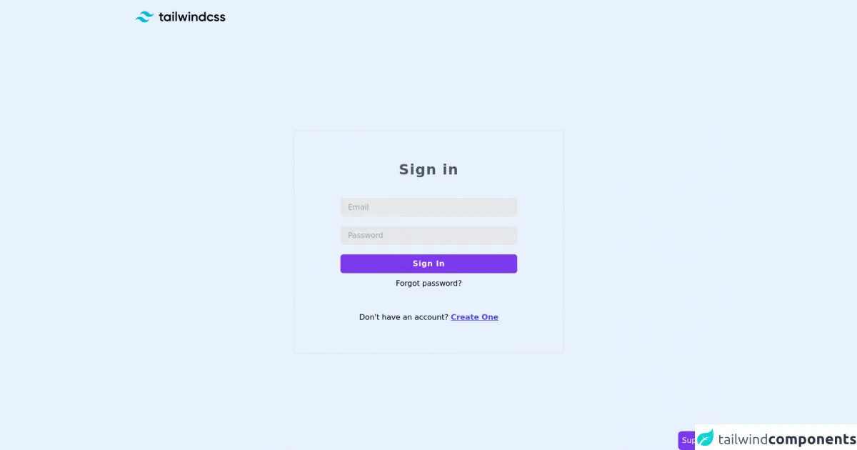
The preview of Login, register form ui component
To give you an idea of what the Login and Register form will look like, here is a preview:
Free download of the Login, register form's source code
The source code of Login, register form ui component
Here is the source code for the Login and Register form UI component:
<section class="min-h-screen flex flex-col">
            <nav>
                <div class="px-4 py-6">
                    <svg viewBox="0 0 247 31" class="w-auto lg:mx-0 mx-auto h-6"><path fill-rule="evenodd" clip-rule="evenodd" d="M25.517 0C18.712 0 14.46 3.382 12.758 10.146c2.552-3.382 5.529-4.65 8.931-3.805 1.941.482 3.329 1.882 4.864 3.432 2.502 2.524 5.398 5.445 11.722 5.445 6.804 0 11.057-3.382 12.758-10.145-2.551 3.382-5.528 4.65-8.93 3.804-1.942-.482-3.33-1.882-4.865-3.431C34.736 2.92 31.841 0 25.517 0zM12.758 15.218C5.954 15.218 1.701 18.6 0 25.364c2.552-3.382 5.529-4.65 8.93-3.805 1.942.482 3.33 1.882 4.865 3.432 2.502 2.524 5.397 5.445 11.722 5.445 6.804 0 11.057-3.381 12.758-10.145-2.552 3.382-5.529 4.65-8.931 3.805-1.941-.483-3.329-1.883-4.864-3.432-2.502-2.524-5.398-5.446-11.722-5.446z" fill="#06B6D4"></path><path fill-rule="evenodd" clip-rule="evenodd" d="M76.546 12.825h-4.453v8.567c0 2.285 1.508 2.249 4.453 2.106v3.463c-5.962.714-8.332-.928-8.332-5.569v-8.567H64.91V9.112h3.304V4.318l3.879-1.143v5.937h4.453v3.713zM93.52 9.112h3.878v17.849h-3.878v-2.57c-1.365 1.891-3.484 3.034-6.285 3.034-4.884 0-8.942-4.105-8.942-9.389 0-5.318 4.058-9.388 8.942-9.388 2.801 0 4.92 1.142 6.285 2.999V9.112zm-5.674 14.636c3.232 0 5.674-2.392 5.674-5.712s-2.442-5.711-5.674-5.711-5.674 2.392-5.674 5.711c0 3.32 2.442 5.712 5.674 5.712zm16.016-17.313c-1.364 0-2.477-1.142-2.477-2.463a2.475 2.475 0 012.477-2.463 2.475 2.475 0 012.478 2.463c0 1.32-1.113 2.463-2.478 2.463zm-1.939 20.526V9.112h3.879v17.849h-3.879zm8.368 0V.9h3.878v26.06h-3.878zm29.053-17.849h4.094l-5.638 17.849h-3.807l-3.735-12.03-3.771 12.03h-3.806l-5.639-17.849h4.094l3.484 12.315 3.771-12.315h3.699l3.734 12.315 3.52-12.315zm8.906-2.677c-1.365 0-2.478-1.142-2.478-2.463a2.475 2.475 0 012.478-2.463 2.475 2.475 0 012.478 2.463c0 1.32-1.113 2.463-2.478 2.463zm-1.939 20.526V9.112h3.878v17.849h-3.878zm17.812-18.313c4.022 0 6.895 2.713 6.895 7.354V26.96h-3.878V16.394c0-2.713-1.58-4.14-4.022-4.14-2.55 0-4.561 1.499-4.561 5.14v9.567h-3.879V9.112h3.879v2.285c1.185-1.856 3.124-2.749 5.566-2.749zm25.282-6.675h3.879V26.96h-3.879v-2.57c-1.364 1.892-3.483 3.034-6.284 3.034-4.884 0-8.942-4.105-8.942-9.389 0-5.318 4.058-9.388 8.942-9.388 2.801 0 4.92 1.142 6.284 2.999V1.973zm-5.674 21.775c3.232 0 5.674-2.392 5.674-5.712s-2.442-5.711-5.674-5.711-5.674 2.392-5.674 5.711c0 3.32 2.442 5.712 5.674 5.712zm22.553 3.677c-5.423 0-9.481-4.105-9.481-9.389 0-5.318 4.058-9.388 9.481-9.388 3.519 0 6.572 1.82 8.008 4.605l-3.34 1.928c-.79-1.678-2.549-2.749-4.704-2.749-3.16 0-5.566 2.392-5.566 5.604 0 3.213 2.406 5.605 5.566 5.605 2.155 0 3.914-1.107 4.776-2.749l3.34 1.892c-1.508 2.82-4.561 4.64-8.08 4.64zm14.472-13.387c0 3.249 9.661 1.285 9.661 7.89 0 3.57-3.125 5.497-7.003 5.497-3.591 0-6.177-1.607-7.326-4.177l3.34-1.927c.574 1.606 2.011 2.57 3.986 2.57 1.724 0 3.052-.571 3.052-2 0-3.176-9.66-1.391-9.66-7.781 0-3.356 2.909-5.462 6.572-5.462 2.945 0 5.387 1.357 6.644 3.713l-3.268 1.82c-.647-1.392-1.904-2.035-3.376-2.035-1.401 0-2.622.607-2.622 1.892zm16.556 0c0 3.249 9.66 1.285 9.66 7.89 0 3.57-3.124 5.497-7.003 5.497-3.591 0-6.176-1.607-7.326-4.177l3.34-1.927c.575 1.606 2.011 2.57 3.986 2.57 1.724 0 3.053-.571 3.053-2 0-3.176-9.66-1.391-9.66-7.781 0-3.356 2.908-5.462 6.572-5.462 2.944 0 5.386 1.357 6.643 3.713l-3.268 1.82c-.646-1.392-1.903-2.035-3.375-2.035-1.401 0-2.622.607-2.622 1.892z" fill="#000"></path>
                    </svg>
                </div>
            </nav>
            <div class="flex flex-1 items-center justify-center">
                <div class="rounded-lg sm:border-2 px-4 lg:px-24 py-16 lg:max-w-xl sm:max-w-md w-full text-center">
                    <form class="text-center">
                        <h1 class="font-bold tracking-wider text-3xl mb-8 w-full text-gray-600">
                            Sign in
                        </h1>
                        <div class="py-2 text-left">
                            <input type="email" class="bg-gray-200 border-2 border-gray-100 focus:outline-none bg-gray-100 block w-full py-2 px-4 rounded-lg focus:border-gray-700 " placeholder="Email" />
                        </div>
                        <div class="py-2 text-left">
                            <input type="password" class="bg-gray-200 border-2 border-gray-100 focus:outline-none bg-gray-100 block w-full py-2 px-4 rounded-lg focus:border-gray-700 " placeholder="Password" />
                        </div>
                        <div class="py-2">
                            <button type="submit" class="border-2 border-gray-100 focus:outline-none bg-purple-600 text-white font-bold tracking-wider block w-full p-2 rounded-lg focus:border-gray-700 hover:bg-purple-700">
                                Sign In
                            </button>
                        </div>
                    </form>
                    <div class="text-center">
                        <a href="#" class="hover:underline">Forgot password?</a>
                    </div>
                    <div class="text-center mt-12">
                        <span>
                            Don't have an account?
                        </span>
                        <a href="#" class="font-light text-md text-indigo-600 underline font-semibold hover:text-indigo-800">Create One</a>
                    </div>
                </div>
            </div>
        </section>


    <!-- support me by buying a coffee -->
    <a href="https://www.buymeacoffee.com/danimai" target="_blank" class="bg-purple-600 p-2 rounded-lg text-white fixed right-0 bottom-0">
        Support me
    </a>
How to create a Login, register form with Tailwind CSS?
To create a Login and Register form with Tailwind CSS, follow these steps:
Step 1: Create the HTML structure
First, create the HTML structure for the Login and Register form. Here is an example:
<div class="flex flex-col justify-center items-center min-h-screen bg-gray-100">
<div class="w-full max-w-md">
<form class="bg-white shadow-md rounded px-8 pt-6 pb-8 mb-4">
<div class="mb-4">
<label class="block text-gray-700 font-bold mb-2" for="email">
Email
</label>
<input
class="shadow appearance-none border rounded w-full py-2 px-3 text-gray-700 leading-tight focus:outline-none focus:shadow-outline"
id="email"
type="email"
placeholder="Email"
/>
</div>
<div class="mb-6">
<label class="block text-gray-700 font-bold mb-2" for="password">
Password
</label>
<input
class="shadow appearance-none border rounded w-full py-2 px-3 text-gray-700 leading-tight focus:outline-none focus:shadow-outline"
id="password"
type="password"
placeholder="********"
/>
</div>
<div class="flex items-center justify-between">
<button
class="bg-blue-500 hover:bg-blue-700 text-white font-bold py-2 px-4 rounded focus:outline-none focus:shadow-outline"
type="button"
>
Sign In
</button>
<a
class="inline-block align-baseline font-bold text-sm text-blue-500 hover:text-blue-800"
href="#"
>
Forgot Password?
</a>
</div>
</form>
<p class="text-center text-gray-500 text-xs">
©2021 Acme Corp. All rights reserved.
</p>
</div>
</div>
Step 2: Add Tailwind CSS classes
Next, add Tailwind CSS classes to the HTML elements to style the form. Here is an example:
<div class="flex flex-col justify-center items-center min-h-screen bg-gray-100">
<div class="w-full max-w-md">
<form class="bg-white shadow-md rounded px-8 pt-6 pb-8 mb-4">
<div class="mb-4">
<label class="block text-gray-700 font-bold mb-2" for="email">
Email
</label>
<input
class="shadow appearance-none border rounded w-full py-2 px-3 text-gray-700 leading-tight focus:outline-none focus:shadow-outline"
id="email"
type="email"
placeholder="Email"
/>
</div>
<div class="mb-6">
<label class="block text-gray-700 font-bold mb-2" for="password">
Password
</label>
<input
class="shadow appearance-none border rounded w-full py-2 px-3 text-gray-700 leading-tight focus:outline-none focus:shadow-outline"
id="password"
type="password"
placeholder="********"
/>
</div>
<div class="flex items-center justify-between">
<button
class="bg-blue-500 hover:bg-blue-700 text-white font-bold py-2 px-4 rounded focus:outline-none focus:shadow-outline"
type="button"
>
Sign In
</button>
<a
class="inline-block align-baseline font-bold text-sm text-blue-500 hover:text-blue-800"
href="#"
>
Forgot Password?
</a>
</div>
</form>
<p class="text-center text-gray-500 text-xs">
©2021 Acme Corp. All rights reserved.
</p>
</div>
</div>
Step 3: Customize the styles
Finally, customize the styles to fit your needs. You can modify the colors, fonts, and sizes by editing the Tailwind CSS configuration file. Here is an example:
// tailwind.config.js
module.exports = {
  theme: {
    extend: {
      colors: {
        primary: '#1E90FF',
        secondary: '#FFA500',
      },
      fontFamily: {
        sans: ['Open Sans', 'sans-serif'],
      },
      fontSize: {
        '2xl': '1.5rem',
      },
    },
  },
  variants: {},
  plugins: [],
};
Conclusion
In this article, we have shown you how to create a Login and Register form using Tailwind CSS. We explained what Tailwind CSS is and its benefits, described the Login and Register form UI component, and provided you with the source code and steps to create the form. With Tailwind CSS, you can easily create a clean and responsive Login and Register form without writing custom CSS.