- Published on
How To Make A Login Page With Image With Tailwind CSS In 5 Easy Steps
- What is Tailwind CSS?
- The description of Login Page With Image ui component
- Why use Tailwind CSS to create a Login Page With Image ui component?
- The preview of Login Page With Image ui component.
- The source code of Login Page With Image ui component.
- How to create a Login Page With Image with Tailwind CSS?
- Step 1: Create the HTML structure
- Step 2: Add the image
- Step 3: Style the form
- Step 4: Style the input fields
- Step 5: Style the submit button
- Conclusion
In this tutorial, we will learn how to create a login page with an image using Tailwind CSS. Tailwind CSS is a utility-first CSS framework that makes it easy to create responsive and customizable UI components. We will be using Tailwind CSS to create a beautiful and functional login page with an image in just five easy steps.
What is Tailwind CSS?
Tailwind CSS is a utility-first CSS framework that provides a set of pre-defined classes that can be used to style HTML elements. It is designed to be highly customizable and provides a lot of flexibility in terms of design. Tailwind CSS is easy to learn and use, and it can help you create beautiful and responsive UI components quickly.
The description of Login Page With Image ui component
A login page with an image is a popular UI component that is used in many web applications. It typically consists of a form where users can enter their login credentials and an image that is used to provide visual interest and context to the page. The image can be a photograph, an illustration, or any other type of visual element that is relevant to the application.
Why use Tailwind CSS to create a Login Page With Image ui component?
Tailwind CSS provides a set of pre-defined classes that can be used to create a login page with an image quickly. These classes are designed to be easy to use and highly customizable, which makes it easy to create a unique and beautiful login page with an image. Additionally, Tailwind CSS is highly responsive, which means that your login page will look great on any device.
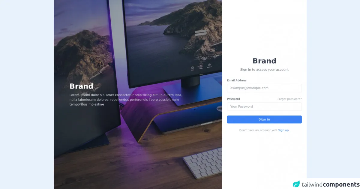
The preview of Login Page With Image ui component.
To create a login page with an image using Tailwind CSS, we will use a combination of HTML and CSS. The HTML will define the structure of the page, and the CSS will be used to style the page and add the image. Here is a preview of what our login page with an image will look like:
Free download of the Login Page With Image's source code
The source code of Login Page With Image ui component.
To create our login page with an image, we will use the following HTML and CSS code:
<div class="bg-white dark:bg-gray-900">
<div class="flex justify-center h-screen">
<div class="hidden bg-cover lg:block lg:w-2/3" style="background-image: url(https://images.unsplash.com/photo-1616763355603-9755a640a287?ixlib=rb-1.2.1&ixid=MnwxMjA3fDB8MHxwaG90by1wYWdlfHx8fGVufDB8fHx8&auto=format&fit=crop&w=1470&q=80)">
<div class="flex items-center h-full px-20 bg-gray-900 bg-opacity-40">
<div>
<h2 class="text-4xl font-bold text-white">Brand</h2>
<p class="max-w-xl mt-3 text-gray-300">Lorem ipsum dolor sit, amet consectetur adipisicing elit. In autem ipsa, nulla laboriosam dolores, repellendus perferendis libero suscipit nam temporibus molestiae</p>
</div>
</div>
</div>
<div class="flex items-center w-full max-w-md px-6 mx-auto lg:w-2/6">
<div class="flex-1">
<div class="text-center">
<h2 class="text-4xl font-bold text-center text-gray-700 dark:text-white">Brand</h2>
<p class="mt-3 text-gray-500 dark:text-gray-300">Sign in to access your account</p>
</div>
<div class="mt-8">
<form>
<div>
<label for="email" class="block mb-2 text-sm text-gray-600 dark:text-gray-200">Email Address</label>
<input type="email" name="email" id="email" placeholder="[email protected]" class="block w-full px-4 py-2 mt-2 text-gray-700 placeholder-gray-400 bg-white border border-gray-200 rounded-md dark:placeholder-gray-600 dark:bg-gray-900 dark:text-gray-300 dark:border-gray-700 focus:border-blue-400 dark:focus:border-blue-400 focus:ring-blue-400 focus:outline-none focus:ring focus:ring-opacity-40" />
</div>
<div class="mt-6">
<div class="flex justify-between mb-2">
<label for="password" class="text-sm text-gray-600 dark:text-gray-200">Password</label>
<a href="#" class="text-sm text-gray-400 focus:text-blue-500 hover:text-blue-500 hover:underline">Forgot password?</a>
</div>
<input type="password" name="password" id="password" placeholder="Your Password" class="block w-full px-4 py-2 mt-2 text-gray-700 placeholder-gray-400 bg-white border border-gray-200 rounded-md dark:placeholder-gray-600 dark:bg-gray-900 dark:text-gray-300 dark:border-gray-700 focus:border-blue-400 dark:focus:border-blue-400 focus:ring-blue-400 focus:outline-none focus:ring focus:ring-opacity-40" />
</div>
<div class="mt-6">
<button
class="w-full px-4 py-2 tracking-wide text-white transition-colors duration-200 transform bg-blue-500 rounded-md hover:bg-blue-400 focus:outline-none focus:bg-blue-400 focus:ring focus:ring-blue-300 focus:ring-opacity-50">
Sign in
</button>
</div>
</form>
<p class="mt-6 text-sm text-center text-gray-400">Don't have an account yet? <a href="#" class="text-blue-500 focus:outline-none focus:underline hover:underline">Sign up</a>.</p>
</div>
</div>
</div>
</div>
</div>
How to create a Login Page With Image with Tailwind CSS?
Now that we have an idea of what our login page with an image will look like, let's get started and create it using Tailwind CSS. Here are the five easy steps to create a login page with an image using Tailwind CSS:
Step 1: Create the HTML structure
The first step is to create the HTML structure of our login page. We will use a simple form with two input fields for the username and password, and a submit button. We will also add an image element to the page to display the image. Here is the HTML code for our login page:
<div class="flex flex-col items-center justify-center min-h-screen py-2">
  <div class="flex flex-col items-center w-full px-4">
    <img src="https://via.placeholder.com/150" alt="Logo" class="w-24 h-24 rounded-full mb-4">
    <form class="w-full max-w-lg">
      <div class="flex flex-wrap -mx-3 mb-4">
        <div class="w-full px-3">
          <label class="block uppercase tracking-wide text-gray-700 text-xs font-bold mb-2" for="username">
            Username
          </label>
          <input class="appearance-none block w-full bg-gray-200 text-gray-700 border border-gray-200 rounded py-3 px-4 mb-3 leading-tight focus:outline-none focus:bg-white focus:border-gray-500" id="username" type="text" placeholder="Username">
        </div>
      </div>
      <div class="flex flex-wrap -mx-3 mb-4">
        <div class="w-full px-3">
          <label class="block uppercase tracking-wide text-gray-700 text-xs font-bold mb-2" for="password">
            Password
          </label>
          <input class="appearance-none block w-full bg-gray-200 text-gray-700 border border-gray-200 rounded py-3 px-4 mb-3 leading-tight focus:outline-none focus:bg-white focus:border-gray-500" id="password" type="password" placeholder="Password">
        </div>
      </div>
      <div class="flex items-center justify-between">
        <button class="bg-blue-500 hover:bg-blue-700 text-white font-bold py-2 px-4 rounded focus:outline-none focus:shadow-outline" type="button">
          Sign In
        </button>
      </div>
    </form>
  </div>
</div>
In this code, we have used a combination of Tailwind CSS classes and regular HTML elements to create the structure of our login page. We have used the flex and flex-col classes to create a flexible layout, and the items-center and justify-center classes to center the content of the page vertically and horizontally.
We have also used the max-w-lg class to set a maximum width for the form, and the mb-4 class to add some margin between the form elements.
Step 2: Add the image
The next step is to add the image to our login page. We will use the img element to display the image, and we will use the src attribute to specify the URL of the image. Here is the updated HTML code:
<img src="https://via.placeholder.com/150" alt="Logo" class="w-24 h-24 rounded-full mb-4">
In this code, we have used the w-24 and h-24 classes to set the width and height of the image, and the rounded-full class to make the image round. We have also used the mb-4 class to add some margin between the image and the form.
Step 3: Style the form
The next step is to style the form using Tailwind CSS classes. We will use a combination of background colors, border colors, and padding to create a visually appealing form. Here is the updated HTML code:
<form class="w-full max-w-lg bg-white rounded-lg shadow-lg px-8 pt-6 pb-8 mb-4">
  ...
</form>
In this code, we have used the bg-white class to set the background color of the form to white, the rounded-lg class to make the corners of the form rounded, and the shadow-lg class to add a drop shadow to the form. We have also used the px-8, pt-6, pb-8, and mb-4 classes to add padding and margin to the form.
Step 4: Style the input fields
The next step is to style the input fields using Tailwind CSS classes. We will use a combination of background colors, border colors, and padding to create a visually appealing input field. Here is the updated HTML code:
<input class="appearance-none block w-full bg-gray-200 text-gray-700 border border-gray-200 rounded py-3 px-4 mb-3 leading-tight focus:outline-none focus:bg-white focus:border-gray-500" id="username" type="text" placeholder="Username">
In this code, we have used the bg-gray-200 class to set the background color of the input field to gray, the text-gray-700 class to set the text color to dark gray, and the border-gray-200 class to set the border color to light gray. We have also used the rounded, py-3, and px-4 classes to make the input field rounded and add some padding.
Step 5: Style the submit button
The final step is to style the submit button using Tailwind CSS classes. We will use a combination of background colors, text colors, and padding to create a visually appealing button. Here is the updated HTML code:
<button class="bg-blue-500 hover:bg-blue-700 text-white font-bold py-2 px-4 rounded focus:outline-none focus:shadow-outline" type="button">
  Sign In
</button>
In this code, we have used the bg-blue-500 class to set the background color of the button to blue, the hover:bg-blue-700 class to change the background color of the button when the user hovers over it, and the text-white class to set the text color to white. We have also used the font-bold, py-2, px-4, rounded, focus:outline-none, and focus:shadow-outline classes to add some padding, make the button bold, and remove the default outline when the button is clicked.
Conclusion
In this tutorial, we have learned how to create a login page with an image using Tailwind CSS. We have used a combination of HTML and CSS to create a beautiful and functional login page with an image in just five easy steps. Tailwind CSS is a powerful and flexible CSS framework that can help you create responsive and customizable UI components quickly and easily. With Tailwind CSS, you can create beautiful and functional UI components without writing a lot of CSS code.