- Published on
Most Effective Ways To Make A Login Page With Tailwind CSS
- What is Tailwind CSS?
- The description of Login Page UI component
- Why use Tailwind CSS to create a Login Page UI component?
- The preview of Login Page UI component
- The source code of Login Page UI component
- How to create a Login Page with Tailwind CSS?
- Step 1: Set up the HTML structure
- Step 2: Add Tailwind CSS classes
- Step 3: Customize the Login Page
- Conclusion
In the world of web development, creating a login page is an essential task. It is the gateway for users to access your website or application. Therefore, it is crucial to create a login page that is not only functional but also visually appealing. In this article, we will discuss the most effective ways to make a login page with Tailwind CSS.
What is Tailwind CSS?
Tailwind CSS is a utility-first CSS framework that provides a set of pre-defined classes to create custom designs quickly. It is a popular choice among developers because of its flexibility and ease of use. With Tailwind CSS, you can create complex layouts and designs without writing custom CSS.
The description of Login Page UI component
A login page is a UI component that allows users to enter their credentials to access a website or application. It typically consists of a form with two input fields for username and password, a submit button, and a link to reset the password or create a new account.
Why use Tailwind CSS to create a Login Page UI component?
Tailwind CSS provides a set of pre-defined classes that can be used to create a login page quickly. It saves time and effort, as you don't have to write custom CSS for every element on the page. Additionally, Tailwind CSS is highly customizable, allowing you to create unique designs that match your brand.
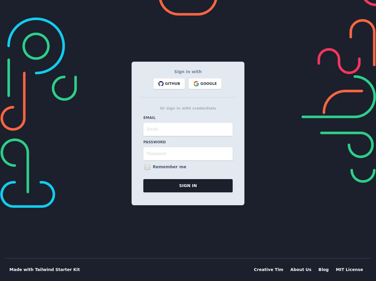
The preview of Login Page UI component
To create a login page with Tailwind CSS, we will use the pre-defined classes for forms, buttons, and input fields. Here's a preview of what the login page will look like:
Free download of the Login Page's source code
The source code of Login Page UI component
To create the login page, we will use HTML and Tailwind CSS classes. Here's the source code for the login page:
<section class="absolute w-full top-0">
<div class="absolute top-0 w-full h-full bg-gray-900" style="background-image: url("https://demos.creative-tim.com/tailwindcss-starter-project/static/media/register_bg_2.2fee0b50.png"); background-size: 100%; background-repeat: no-repeat;"></div>
<div class="container mx-auto px-4 h-full">
<div class="flex content-center items-center justify-center h-full">
<div class="w-full lg:w-4/12 px-4 pt-32">
<div class="relative flex flex-col min-w-0 break-words w-full mb-6 shadow-lg rounded-lg bg-gray-300 border-0">
<div class="rounded-t mb-0 px-6 py-6">
<div class="text-center mb-3">
<h6 class="text-gray-600 text-sm font-bold">Sign in with</h6></div>
<div class="btn-wrapper text-center">
<button class="bg-white active:bg-gray-100 text-gray-800 font-normal px-4 py-2 rounded outline-none focus:outline-none mr-2 mb-1 uppercase shadow hover:shadow-md inline-flex items-center font-bold text-xs" type="button" style="transition: all 0.15s ease 0s;"><img alt="..." class="w-5 mr-1" src="https://demos.creative-tim.com/tailwindcss-starter-project/static/media/github.4ffd4fe7.svg">Github</button>
<button class="bg-white active:bg-gray-100 text-gray-800 font-normal px-4 py-2 rounded outline-none focus:outline-none mr-1 mb-1 uppercase shadow hover:shadow-md inline-flex items-center font-bold text-xs" type="button" style="transition: all 0.15s ease 0s;"><img alt="..." class="w-5 mr-1" src="https://demos.creative-tim.com/tailwindcss-starter-project/static/media/google.87be59a1.svg">Google</button>
</div>
<hr class="mt-6 border-b-1 border-gray-400">
</div>
<div class="flex-auto px-4 lg:px-10 py-10 pt-0">
<div class="text-gray-500 text-center mb-3 font-bold"><small>Or sign in with credentials</small></div>
<form>
<div class="relative w-full mb-3">
<label class="block uppercase text-gray-700 text-xs font-bold mb-2" for="grid-password">Email</label>
<input type="email" class="px-3 py-3 placeholder-gray-400 text-gray-700 bg-white rounded text-sm shadow focus:outline-none focus:shadow-outline w-full" placeholder="Email" style="transition: all 0.15s ease 0s;">
</div>
<div class="relative w-full mb-3">
<label class="block uppercase text-gray-700 text-xs font-bold mb-2" for="grid-password">Password</label>
<input type="password" class="px-3 py-3 placeholder-gray-400 text-gray-700 bg-white rounded text-sm shadow focus:outline-none focus:shadow-outline w-full" placeholder="Password" style="transition: all 0.15s ease 0s;">
</div>
<div>
<label class="inline-flex items-center cursor-pointer">
<input id="customCheckLogin" type="checkbox" class="form-checkbox text-gray-800 ml-1 w-5 h-5" style="transition: all 0.15s ease 0s;"><span class="ml-2 text-sm font-semibold text-gray-700">Remember me</span></label>
</div>
<div class="text-center mt-6">
<button class="bg-gray-900 text-white active:bg-gray-700 text-sm font-bold uppercase px-6 py-3 rounded shadow hover:shadow-lg outline-none focus:outline-none mr-1 mb-1 w-full" type="button" style="transition: all 0.15s ease 0s;">Sign In</button>
</div>
</form>
</div>
</div>
<div class="flex flex-wrap mt-6">
<div class="w-1/2"><a href="#pablo" class="text-gray-300"><small>Forgot password?</small></a></div>
<div class="w-1/2 text-right"><a href="#pablo" class="text-gray-300"><small>Create new account</small></a></div>
</div>
</div>
</div>
</div>
<footer class="absolute w-full bottom-0 bg-gray-900 pb-6">
<div class="container mx-auto px-4">
<hr class="mb-6 border-b-1 border-gray-700">
<div class="flex flex-wrap items-center md:justify-between justify-center">
<div class="w-full md:w-4/12 px-4">
<div class="text-sm text-white font-semibold py-1">Made with <a href="https://www.creative-tim.com/learning-lab/tailwind-starter-kit" class="text-white hover:text-gray-400 text-sm font-semibold py-1" target="_blank">Tailwind Starter Kit </a></div>
</div>
<div class="w-full md:w-8/12 px-4">
<ul class="flex flex-wrap list-none md:justify-end justify-center">
<li><a href="https://www.creative-tim.com" class="text-white hover:text-gray-400 text-sm font-semibold block py-1 px-3" target="_blank">Creative Tim</a></li>
<li><a href="https://www.creative-tim.com/presentation" class="text-white hover:text-gray-400 text-sm font-semibold block py-1 px-3" target="_blank">About Us</a></li>
<li><a href="https://creative-tim.com/blog" class="text-white hover:text-gray-400 text-sm font-semibold block py-1 px-3" target="_blank">Blog</a></li>
<li><a href="https://github.com/creativetimofficial/argon-design-system/blob/master/LICENSE.md" class="text-white hover:text-gray-400 text-sm font-semibold block py-1 px-3" target="_blank">MIT License</a></li>
</ul>
</div>
</div>
</div>
</footer>
</section>
How to create a Login Page with Tailwind CSS?
To create a login page with Tailwind CSS, follow these steps:
Step 1: Set up the HTML structure
The first step is to set up the HTML structure for the login page. Create a new HTML file and add the following code:
<!DOCTYPE html>
<html lang="en">
<head>
  <meta charset="UTF-8">
  <meta name="viewport" content="width=device-width, initial-scale=1.0">
  <title>Login Page</title>
  <link rel="stylesheet" href="https://cdn.jsdelivr.net/npm/[email protected]/dist/tailwind.min.css">
</head>
<body>
  <div class="min-h-screen bg-gray-100 flex justify-center items-center">
    <div class="bg-white p-8 rounded shadow-md w-full sm:w-3/4 md:w-1/2 lg:w-1/3 xl:w-1/4">
      <h2 class="text-2xl font-bold mb-4">Login</h2>
      <form>
        <div class="mb-4">
          <label class="block text-gray-700 font-bold mb-2" for="username">
            Username
          </label>
          <input class="appearance-none border rounded w-full py-2 px-3 text-gray-700 leading-tight focus:outline-none focus:shadow-outline" id="username" type="text" placeholder="Username">
        </div>
        <div class="mb-6">
          <label class="block text-gray-700 font-bold mb-2" for="password">
            Password
          </label>
          <input class="appearance-none border rounded w-full py-2 px-3 text-gray-700 leading-tight focus:outline-none focus:shadow-outline" id="password" type="password" placeholder="********">
        </div>
        <div class="flex items-center justify-between">
          <button class="bg-blue-500 hover:bg-blue-700 text-white font-bold py-2 px-4 rounded focus:outline-none focus:shadow-outline" type="button">
            Sign In
          </button>
          <a class="inline-block align-baseline font-bold text-sm text-blue-500 hover:text-blue-800" href="#">
            Forgot Password?
          </a>
        </div>
      </form>
    </div>
  </div>
</body>
</html>
Step 2: Add Tailwind CSS classes
In the HTML code, we have used Tailwind CSS classes to style the login page. Here's a breakdown of the classes used:
min-h-screen: Sets the minimum height of the page to the height of the screen.bg-gray-100: Sets the background color of the page to light gray.flex: Sets the display property to flex.justify-center: Centers the content horizontally.items-center: Centers the content vertically.bg-white: Sets the background color of the login form to white.p-8: Adds padding of 8 units to the login form.rounded: Rounds the corners of the login form.shadow-md: Adds a shadow to the login form.w-full: Sets the width of the login form to 100%.sm:w-3/4: Sets the width of the login form to 75% on small screens.md:w-1/2: Sets the width of the login form to 50% on medium screens.lg:w-1/3: Sets the width of the login form to 33.33% on large screens.xl:w-1/4: Sets the width of the login form to 25% on extra-large screens.text-2xl: Sets the font size to 2rem.font-bold: Sets the font weight to bold.mb-4: Adds margin-bottom of 4 units.mb-6: Adds margin-bottom of 6 units.block: Sets the display property to block.text-gray-700: Sets the text color to gray.leading-tight: Sets the line-height to 1.25.focus:outline-none: Removes the outline when the input field is in focus.focus:shadow-outline: Adds a shadow when the input field is in focus.bg-blue-500: Sets the background color of the button to blue.hover:bg-blue-700: Sets the background color of the button to dark blue on hover.text-white: Sets the text color of the button to white.py-2: Adds padding of 2 units to the button vertically.px-4: Adds padding of 4 units to the button horizontally.rounded: Rounds the corners of the button.inline-block: Sets the display property to inline-block.align-baseline: Aligns the element to the baseline.text-sm: Sets the font size to 0.875rem.text-blue-500: Sets the text color to blue.hover:text-blue-800: Sets the text color to dark blue on hover.
Step 3: Customize the Login Page
You can customize the login page by changing the values of the Tailwind CSS classes. For example, you can change the background color of the page by changing the bg-gray-100 class to bg-blue-100. Similarly, you can change the font size of the heading by changing the text-2xl class to text-3xl.
Conclusion
In this article, we have discussed the most effective ways to make a login page with Tailwind CSS. Tailwind CSS provides a set of pre-defined classes that can be used to create custom designs quickly. By following the steps outlined in this article, you can create a visually appealing and functional login page for your website or application.