- Published on
6 Easy Ways To Make A Login Form With Tailwind CSS Without Even Thinking About It
- What is Tailwind CSS?
- The description of Login form UI component
- Why use Tailwind CSS to create a Login form UI component?
- The preview of Login form UI component
- The source code of Login form UI component
- How to create a Login form with Tailwind CSS?
- Step 1: Create the HTML structure
- Step 2: Add Tailwind CSS classes
- Conclusion
As a FrontEnd technology blogger, I am always on the lookout for new and exciting ways to create UI components. One such tool that has caught my attention recently is Tailwind CSS. In this article, I will show you how to create a Login form UI component using Tailwind CSS without even thinking about it.
What is Tailwind CSS?
Tailwind CSS is a utility-first CSS framework that allows you to quickly build custom UI components. It provides a set of pre-defined CSS classes that you can use to style your HTML elements. With Tailwind CSS, you can create beautiful and responsive UI components without writing a single line of CSS code.
The description of Login form UI component
A Login form is a UI component that allows users to enter their login credentials, such as username and password, to access a website or application. It typically consists of two input fields, one for the username and the other for the password, and a submit button.
Why use Tailwind CSS to create a Login form UI component?
Tailwind CSS provides a set of pre-defined CSS classes that you can use to style your HTML elements. This means that you don't have to write any CSS code to create a Login form UI component. You can simply use the pre-defined classes to style your HTML elements and create a beautiful and responsive Login form UI component.
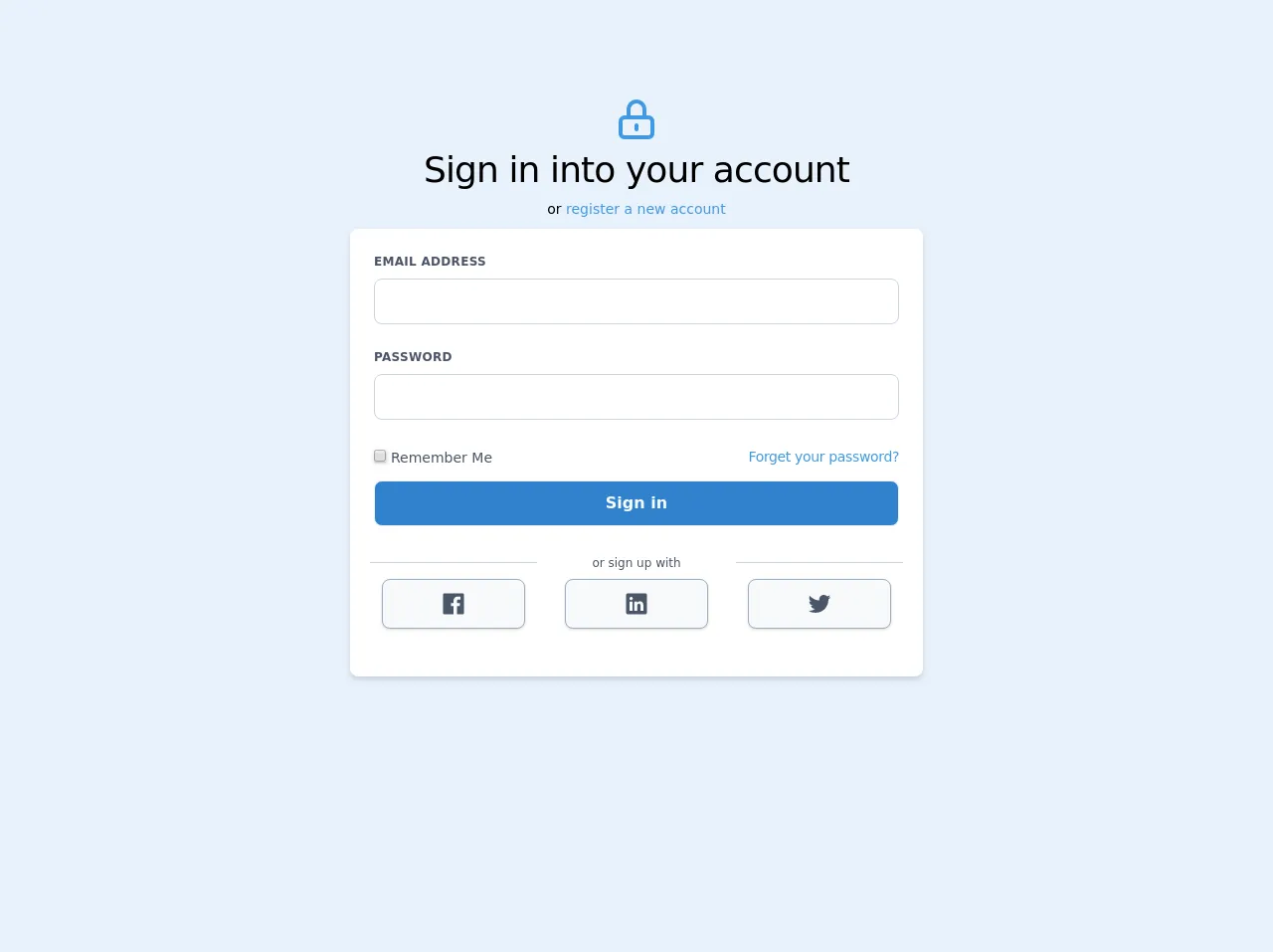
The preview of Login form UI component
To give you an idea of what the Login form UI component looks like, here is a preview:
Free download of the Login form's source code
The source code of Login form UI component
To create the Login form UI component, you can use the following HTML and Tailwind CSS classes:
<div class="text-center mt-24">
      <div class="flex items-center justify-center">
         <svg fill="none" viewBox="0 0 24 24" class="w-12 h-12 text-blue-500" stroke="currentColor">
            <path stroke-linecap="round" stroke-linejoin="round" stroke-width="2" d="M12 15v2m-6 4h12a2 2 0 002-2v-6a2 2 0 00-2-2H6a2 2 0 00-2 2v6a2 2 0 002 2zm10-10V7a4 4 0 00-8 0v4h8z"/>
         </svg>
      </div>
      <h2 class="text-4xl tracking-tight">
         Sign in into your account
      </h2>
      <span class="text-sm">or <a href="#" class="text-blue-500">
         register a new account
      </a>
   </span>
</div>
<div class="flex justify-center my-2 mx-4 md:mx-0">
   <form class="w-full max-w-xl bg-white rounded-lg shadow-md p-6">
      <div class="flex flex-wrap -mx-3 mb-6">
         <div class="w-full md:w-full px-3 mb-6">
            <label class="block uppercase tracking-wide text-gray-700 text-xs font-bold mb-2" for='Password'>Email address</label>
            <input class="appearance-none block w-full bg-white text-gray-900 font-medium border border-gray-400 rounded-lg py-3 px-3 leading-tight focus:outline-none" type='email'  required>
         </div>
         <div class="w-full md:w-full px-3 mb-6">
            <label class="block uppercase tracking-wide text-gray-700 text-xs font-bold mb-2" for='Password'>Password</label>
            <input class="appearance-none block w-full bg-white text-gray-900 font-medium border border-gray-400 rounded-lg py-3 px-3 leading-tight focus:outline-none" type='password' required>
         </div>
         <div class="w-full flex items-center justify-between px-3 mb-3 ">
            <label for="remember" class="flex items-center w-1/2">
               <input type="checkbox" name="" id="" class="mr-1 bg-white shadow">
               <span class="text-sm text-gray-700 pt-1">Remember Me</span>
            </label>
            <div class="w-1/2 text-right">
               <a href="#" class="text-blue-500 text-sm tracking-tight">Forget your password?</a>
            </div>
         </div>
         <div class="w-full md:w-full px-3 mb-6">
            <button class="appearance-none block w-full bg-blue-600 text-gray-100 font-bold border border-gray-200 rounded-lg py-3 px-3 leading-tight hover:bg-blue-500 focus:outline-none focus:bg-white focus:border-gray-500">Sign in</button>
         </div>
         <div class="mx-auto -mb-6 pb-1">
            <span class="text-center text-xs text-gray-700">or sign up with</span>
         </div>
         <div class="flex items-center w-full mt-2">
            <div class="w-full md:w-1/3 px-3 pt-4 mx-2 border-t border-gray-400">
               <button class='appearance-none flex items-center justify-center block w-full bg-gray-100 text-gray-700 shadow border border-gray-500 rounded-lg py-3 px-3 leading-tight hover:bg-gray-200 hover:text-gray-700 focus:outline-none'>
                  <svg class="h-6 w-6 fill-current text-gray-700" viewBox="0 0 512 512">
                     <path d="M455.27,32H56.73A24.74,24.74,0,0,0,32,56.73V455.27A24.74,24.74,0,0,0,56.73,480H256V304H202.45V240H256V189c0-57.86,40.13-89.36,91.82-89.36,24.73,0,51.33,1.86,57.51,2.68v60.43H364.15c-28.12,0-33.48,13.3-33.48,32.9V240h67l-8.75,64H330.67V480h124.6A24.74,24.74,0,0,0,480,455.27V56.73A24.74,24.74,0,0,0,455.27,32Z"/>
                  </svg>
               </button>
            </div>
            <div class="w-full md:w-1/3 px-3 pt-4 mx-2">
               <button class="appearance-none flex items-center justify-center block w-full bg-gray-100 text-gray-700 shadow border border-gray-500 rounded-lg py-3 px-3 leading-tight hover:bg-gray-200 hover:text-gray-700 focus:outline-none">
                  <svg class="h-6 w-6 fill-current text-gray-700" viewBox="0 0 512 512">
                     <path d="M444.17,32H70.28C49.85,32,32,46.7,32,66.89V441.61C32,461.91,49.85,480,70.28,480H444.06C464.6,480,480,461.79,480,441.61V66.89C480.12,46.7,464.6,32,444.17,32ZM170.87,405.43H106.69V205.88h64.18ZM141,175.54h-.46c-20.54,0-33.84-15.29-33.84-34.43,0-19.49,13.65-34.42,34.65-34.42s33.85,14.82,34.31,34.42C175.65,160.25,162.35,175.54,141,175.54ZM405.43,405.43H341.25V296.32c0-26.14-9.34-44-32.56-44-17.74,0-28.24,12-32.91,23.69-1.75,4.2-2.22,9.92-2.22,15.76V405.43H209.38V205.88h64.18v27.77c9.34-13.3,23.93-32.44,57.88-32.44,42.13,0,74,27.77,74,87.64Z"/>
                  </svg>
               </button>
            </div>
            <div class="w-full md:w-1/3 px-3 pt-4 mx-2 border-t border-gray-400">
               <button class="appearance-none flex items-center justify-center block w-full bg-gray-100 text-gray-700 shadow border border-gray-500 rounded-lg py-3 px-3 leading-tight hover:bg-gray-200 hover:text-gray-700 focus:outline-none">
                  <svg class="h-6 w-6 fill-current text-gray-700" viewBox="0 0 512 512">
                     <path d="M496,109.5a201.8,201.8,0,0,1-56.55,15.3,97.51,97.51,0,0,0,43.33-53.6,197.74,197.74,0,0,1-62.56,23.5A99.14,99.14,0,0,0,348.31,64c-54.42,0-98.46,43.4-98.46,96.9a93.21,93.21,0,0,0,2.54,22.1,280.7,280.7,0,0,1-203-101.3A95.69,95.69,0,0,0,36,130.4C36,164,53.53,193.7,80,211.1A97.5,97.5,0,0,1,35.22,199v1.2c0,47,34,86.1,79,95a100.76,100.76,0,0,1-25.94,3.4,94.38,94.38,0,0,1-18.51-1.8c12.51,38.5,48.92,66.5,92.05,67.3A199.59,199.59,0,0,1,39.5,405.6,203,203,0,0,1,16,404.2,278.68,278.68,0,0,0,166.74,448c181.36,0,280.44-147.7,280.44-275.8,0-4.2-.11-8.4-.31-12.5A198.48,198.48,0,0,0,496,109.5Z"/>
                  </svg>
               </button>
            </div>
         </div>
      </div>
   </form>
</div>
How to create a Login form with Tailwind CSS?
Now that you have seen what the Login form UI component looks like and have the source code, let's dive into how to create it with Tailwind CSS.
Step 1: Create the HTML structure
The first step is to create the HTML structure for the Login form. You can use the following HTML code:
<form class="bg-white shadow-md rounded px-8 pt-6 pb-8 mb-4">
  <div class="mb-4">
    <label class="block text-gray-700 font-bold mb-2" for="username">
      Username
    </label>
    <input
      class="shadow appearance-none border rounded w-full py-2 px-3 text-gray-700 leading-tight focus:outline-none focus:shadow-outline"
      id="username"
      type="text"
      placeholder="Enter your username"
    />
  </div>
  <div class="mb-6">
    <label class="block text-gray-700 font-bold mb-2" for="password">
      Password
    </label>
    <input
      class="shadow appearance-none border rounded w-full py-2 px-3 text-gray-700 mb-3 leading-tight focus:outline-none focus:shadow-outline"
      id="password"
      type="password"
      placeholder="Enter your password"
    />
  </div>
  <div class="flex items-center justify-between">
    <button
      class="bg-blue-500 hover:bg-blue-700 text-white font-bold py-2 px-4 rounded focus:outline-none focus:shadow-outline"
      type="button"
    >
      Sign In
    </button>
    <a
      class="inline-block align-baseline font-bold text-sm text-blue-500 hover:text-blue-800"
      href="#"
    >
      Forgot Password?
    </a>
  </div>
</form>
This HTML code creates the structure for the Login form UI component. It consists of a form element with two input fields for the username and password, and a submit button.
Step 2: Add Tailwind CSS classes
The next step is to add Tailwind CSS classes to style the Login form UI component. You can use the following Tailwind CSS classes:
<form class="bg-white shadow-md rounded px-8 pt-6 pb-8 mb-4">
  <div class="mb-4">
    <label class="block text-gray-700 font-bold mb-2" for="username">
      Username
    </label>
    <input
      class="shadow appearance-none border rounded w-full py-2 px-3 text-gray-700 leading-tight focus:outline-none focus:shadow-outline"
      id="username"
      type="text"
      placeholder="Enter your username"
    />
  </div>
  <div class="mb-6">
    <label class="block text-gray-700 font-bold mb-2" for="password">
      Password
    </label>
    <input
      class="shadow appearance-none border rounded w-full py-2 px-3 text-gray-700 mb-3 leading-tight focus:outline-none focus:shadow-outline"
      id="password"
      type="password"
      placeholder="Enter your password"
    />
  </div>
  <div class="flex items-center justify-between">
    <button
      class="bg-blue-500 hover:bg-blue-700 text-white font-bold py-2 px-4 rounded focus:outline-none focus:shadow-outline"
      type="button"
    >
      Sign In
    </button>
    <a
      class="inline-block align-baseline font-bold text-sm text-blue-500 hover:text-blue-800"
      href="#"
    >
      Forgot Password?
    </a>
  </div>
</form>
These Tailwind CSS classes style the Login form UI component. They add a white background, a shadow, and rounded corners to the form element. They also add margin and padding to the input fields, and style the submit button and the forgot password link.
Conclusion
In this article, we have seen how to create a Login form UI component using Tailwind CSS without even thinking about it. Tailwind CSS provides a set of pre-defined CSS classes that you can use to style your HTML elements, which makes it easy to create beautiful and responsive UI components. With these six easy steps, you can create a Login form UI component that looks great and is easy to use.