- Published on
Best Ways To Make A Login Form With Tailwind CSS
- What is Tailwind CSS?
- The description of Login Form ui component
- Why use Tailwind CSS to create a Login Form ui component?
- The preview of Login Form ui component
- The source code of Login Form ui component
- How to create a Login Form with Tailwind CSS?
- Conclusion
What is Tailwind CSS?
Tailwind CSS is a utility-first CSS framework that helps you create responsive and customizable designs quickly. With Tailwind CSS, you don't have to write custom CSS code for every element on your website. Instead, you can use pre-defined classes to style your HTML elements.
The description of Login Form ui component
A login form is an essential component of any website or application that requires user authentication. It typically consists of two input fields for the user's email or username and password, along with a submit button.
Why use Tailwind CSS to create a Login Form ui component?
Tailwind CSS provides a set of pre-defined classes that make it easy to create a login form quickly. You don't have to write custom CSS code for every element in the form, which saves you time and effort. Additionally, Tailwind CSS is highly customizable, so you can easily modify the form's appearance to match your website's design.
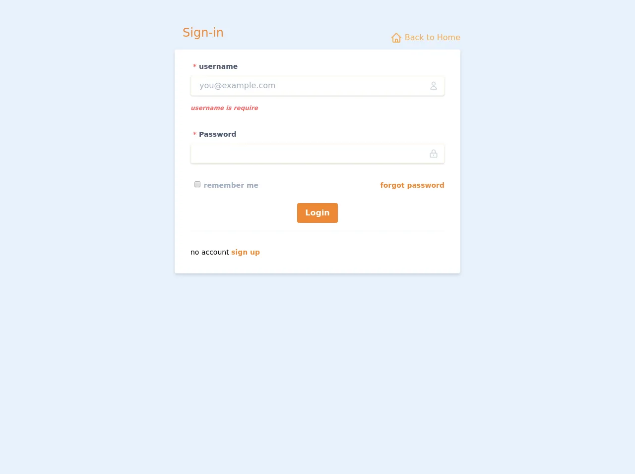
The preview of Login Form ui component
To create a login form with Tailwind CSS, you can use the following code:
<div class="bg-white shadow-md rounded px-8 pt-6 pb-8 mb-4 flex flex-col">
  <div class="mb-4">
    <label class="block text-grey-darker text-sm font-bold mb-2" for="username">
      Username
    </label>
    <input
      class="shadow appearance-none border rounded w-full py-2 px-3 text-grey-darker"
      id="username"
      type="text"
      placeholder="Enter your username"
    />
  </div>
  <div class="mb-6">
    <label class="block text-grey-darker text-sm font-bold mb-2" for="password">
      Password
    </label>
    <input
      class="shadow appearance-none border rounded w-full py-2 px-3 text-grey-darker mb-3"
      id="password"
      type="password"
      placeholder="Enter your password"
    />
  </div>
  <div class="flex items-center justify-between">
    <button
      class="bg-blue-500 hover:bg-blue-700 text-white font-bold py-2 px-4 rounded"
      type="button"
    >
      Sign In
    </button>
    <a class="inline-block align-baseline font-bold text-sm text-blue-500 hover:text-blue-800" href="#">
      Forgot Password?
    </a>
  </div>
</div>
Free download of the Login Form's source code
The source code of Login Form ui component
To create the login form, we used Tailwind CSS classes to style the HTML elements. The bg-white class sets the background color of the form to white, while the shadow-md class adds a drop shadow effect. The rounded class rounds the corners of the form, and the px-8, pt-6, and pb-8 classes add padding to the form's top, bottom, and left and right sides.
The form's input fields use the shadow, appearance-none, border, and rounded classes to create a shadow effect, remove the default appearance of the input field, add a border, and round the corners of the input field. The w-full class sets the input field's width to 100%, and the py-2 and px-3 classes add padding to the input field's top and bottom and left and right sides.
The text-grey-darker class sets the color of the text inside the input fields to a darker shade of grey. The mb-4 and mb-6 classes add margin to the top and bottom of the input fields.
The flex and items-center classes align the form's submit button and forgot password link horizontally, while the justify-between class adds space between the two elements. The submit button uses the bg-blue-500, hover:bg-blue-700, text-white, font-bold, py-2, px-4, and rounded classes to set the button's background color, hover color, text color, font weight, padding, and rounded corners.
The forgot password link uses the inline-block, align-baseline, font-bold, text-sm, text-blue-500, and hover:text-blue-800 classes to align the link with the submit button, set the font weight and size, and set the link's text color and hover color.
<div class="mx-auto container flex items-center" id="nav">
<div class="w-full pt-2 p-4">
<div class="mx-auto md:p-6 md:w-1/2">
<div class="flex flex-wrap justify-between">
<h1 class="text-2xl text-orange-500 hover:text-orange-500 transition duration-500 p-4">
<i class="fas fa-sign-in-alt fa-fw fa-lg"></i>
Sign-in
</h1>
<a href="#home" class="mt-8 text-orange-400 hover:text-orange-600 transition duration-500">
<svg class=" w-6 h-6 inline-block align-bottom" fill="none" stroke-linecap="round" stroke-linejoin="round" stroke-width="2" stroke="currentColor" viewBox="0 0 24 24"><path d="M3 12l2-2m0 0l7-7 7 7M5 10v10a1 1 0 001 1h3m10-11l2 2m-2-2v10a1 1 0 01-1 1h-3m-6 0a1 1 0 001-1v-4a1 1 0 011-1h2a1 1 0 011 1v4a1 1 0 001 1m-6 0h6"></path></svg>
Back to Home
<i class="fas fa-chevron-circle-left fa-fw"></i>
</a>
</div>
<div class="bg-white shadow-md rounded px-8 pt-6 pb-8 mb-4">
<form method="POST" action="#login">
<div class="mb-8">
<label for="username" class="block text-gray-700 text-sm font-bold mb-2">
<span class="text-red-500"> *</span>
username
</label>
<div class="mt-1 relative rounded-md shadow-sm">
<div class="absolute inset-y-0 right-0 pr-3 flex items-center pointer-events-none">
<svg class="h-5 w-5 text-gray-400" fill="none" stroke-linecap="round" stroke-linejoin="round" stroke-width="2" stroke="currentColor" viewBox="0 0 24 24"><path d="M16 7a4 4 0 11-8 0 4 4 0 018 0zM12 14a7 7 0 00-7 7h14a7 7 0 00-7-7z"></path></svg>
</div>
<input id="username" class="block pr-10 shadow appearance-none border-2 border-orange-100 rounded w-full py-2 px-4 text-gray-700 mb-3 leading-tight focus:outline-none focus:bg-white focus:border-orange-500 transition duration-500 ease-in-out" placeholder="[email protected]" />
</div>
<strong class="text-red-500 text-xs italic">username is require</strong>
</div>
<div class="mb-8">
<label for="password" class="block text-gray-700 text-sm font-bold mb-2">
<span class="text-red-500"> *</span>
Password
</label>
<div class="mt-1 relative rounded-md shadow-sm">
<div class="absolute inset-y-0 right-0 pr-3 flex items-center pointer-events-none">
<svg class="h-5 w-5 text-gray-400" fill="none" stroke-linecap="round" stroke-linejoin="round" stroke-width="2" stroke="currentColor" viewBox="0 0 24 24"><path d="M12 15v2m-6 4h12a2 2 0 002-2v-6a2 2 0 00-2-2H6a2 2 0 00-2 2v6a2 2 0 002 2zm10-10V7a4 4 0 00-8 0v4h8z"></path></svg>
</div>
<input name="password" id="password" type="text" class="block pr-10 shadow appearance-none border-2 border-orange-100 rounded w-full py-2 px-4 text-gray-700 mb-3 leading-tight focus:outline-none focus:bg-white focus:border-orange-500 transition duration-500 ease-in-out">
</div>
</div>
<div class="mb-6">
<div class="flex items-center justify-between">
<div>
<label class="block text-gray-500 font-bold" for="remember">
<input class="ml-2 leading-tight" type="checkbox" id="remember" name="remember">
<span class="text-sm">
remember me
</span>
</label>
</div>
<div>
<a class="font-bold text-sm text-orange-500 hover:text-orange-800" href="#password-request">
forgot password
</a>
</div>
</div>
</div>
<div class="mb-4 text-center">
<button class="transition duration-500 bg-orange-500 hover:bg-orange-700 text-white font-bold py-2 px-4 rounded focus:outline-none focus:shadow-outline" type="submit">
Login
</button>
</div>
<hr>
<div class="mt-8">
<p class="text-sm">
no account
<a class="font-bold text-sm text-orange-500 hover:text-orange-800" href="#register">
sign up
</a>
</p>
</div>
</form>
</div>
</div>
</div>
</div>
How to create a Login Form with Tailwind CSS?
To create a login form with Tailwind CSS, follow these steps:
- Create a new HTML file and add the necessary HTML elements for the login form, including two input fields and a submit button.
- Add the Tailwind CSS CDN link to the head of your HTML file.
- Add the necessary Tailwind CSS classes to style the HTML elements.
- Preview your login form in a web browser and make any necessary adjustments to the form's appearance.
Here's an example of how you can create a login form with Tailwind CSS:
<!DOCTYPE html>
<html>
  <head>
    <title>Login Form</title>
    <link
      rel="stylesheet"
      href="https://cdnjs.cloudflare.com/ajax/libs/tailwindcss/2.2.7/tailwind.min.css"
    />
  </head>
  <body>
    <div class="bg-white shadow-md rounded px-8 pt-6 pb-8 mb-4 flex flex-col">
      <div class="mb-4">
        <label class="block text-grey-darker text-sm font-bold mb-2" for="username">
          Username
        </label>
        <input
          class="shadow appearance-none border rounded w-full py-2 px-3 text-grey-darker"
          id="username"
          type="text"
          placeholder="Enter your username"
        />
      </div>
      <div class="mb-6">
        <label class="block text-grey-darker text-sm font-bold mb-2" for="password">
          Password
        </label>
        <input
          class="shadow appearance-none border rounded w-full py-2 px-3 text-grey-darker mb-3"
          id="password"
          type="password"
          placeholder="Enter your password"
        />
      </div>
      <div class="flex items-center justify-between">
        <button
          class="bg-blue-500 hover:bg-blue-700 text-white font-bold py-2 px-4 rounded"
          type="button"
        >
          Sign In
        </button>
        <a
          class="inline-block align-baseline font-bold text-sm text-blue-500 hover:text-blue-800"
          href="#"
        >
          Forgot Password?
        </a>
      </div>
    </div>
  </body>
</html>
Conclusion
Creating a login form with Tailwind CSS is a quick and easy process that can save you time and effort. By using pre-defined classes, you can style your HTML elements without having to write custom CSS code. Additionally, Tailwind CSS is highly customizable, so you can easily modify the form's appearance to match your website's design.