- Published on
6 Ideas To Help You Create A Login Form With Tailwind CSS Like A Pro
- What is Tailwind CSS?
- The description of login form ui component
- Why use Tailwind CSS to create a login form ui component?
- The preview of login form ui component
- The source code of login form ui component
- How to create a login form with Tailwind CSS?
- Conclusion
As a FrontEnd technology blogger, it's important to stay up-to-date with the latest trends and tools in the industry. One of the most popular tools for building responsive and customizable user interfaces is Tailwind CSS. In this article, we'll explore 6 ideas to help you create a login form with Tailwind CSS like a pro.
What is Tailwind CSS?
Tailwind CSS is a utility-first CSS framework that allows you to create custom designs without writing any CSS. It provides a set of pre-defined classes that you can use to style your HTML elements. With Tailwind CSS, you can easily create responsive layouts, typography, and components.
The description of login form ui component
A login form is a common UI component that you'll find on most websites and applications. It allows users to enter their credentials to access a secure area of the website or application. A login form typically consists of two input fields (username and password) and a submit button.
Why use Tailwind CSS to create a login form ui component?
Tailwind CSS provides a set of pre-defined classes that you can use to create a login form quickly and easily. You don't need to write any CSS code from scratch, which saves you time and effort. Additionally, Tailwind CSS is highly customizable, so you can easily change the look and feel of your login form to match your brand.
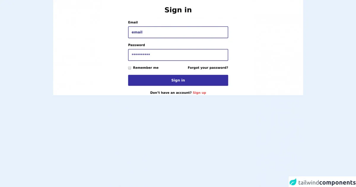
The preview of login form ui component
To create a login form with Tailwind CSS, you can use the following HTML code:
<form class="bg-white shadow-md rounded px-8 pt-6 pb-8 mb-4">
  <div class="mb-4">
    <label class="block text-gray-700 font-bold mb-2" for="username">
      Username
    </label>
    <input
      class="shadow appearance-none border rounded w-full py-2 px-3 text-gray-700 leading-tight focus:outline-none focus:shadow-outline"
      id="username"
      type="text"
      placeholder="Username"
    />
  </div>
  <div class="mb-6">
    <label class="block text-gray-700 font-bold mb-2" for="password">
      Password
    </label>
    <input
      class="shadow appearance-none border rounded w-full py-2 px-3 text-gray-700 leading-tight focus:outline-none focus:shadow-outline"
      id="password"
      type="password"
      placeholder="******************"
    />
  </div>
  <div class="flex items-center justify-between">
    <button
      class="bg-blue-500 hover:bg-blue-700 text-white font-bold py-2 px-4 rounded focus:outline-none focus:shadow-outline"
      type="button"
    >
      Sign In
    </button>
    <a
      class="inline-block align-baseline font-bold text-sm text-blue-500 hover:text-blue-800"
      href="#"
    >
      Forgot Password?
    </a>
  </div>
</form>
Free download of the login form's source code
The source code of login form ui component
To create the login form with Tailwind CSS, you can use the following classes:
bg-white: sets the background color of the form to white.shadow-md: adds a shadow effect to the form.rounded: rounds the corners of the form.px-8: adds padding to the left and right sides of the form.pt-6: adds padding to the top of the form.pb-8: adds padding to the bottom of the form.mb-4: adds margin to the bottom of the form.mb-6: adds margin to the bottom of the password input field.block: displays the label as a block element.text-gray-700: sets the color of the label text to gray.font-bold: sets the font weight of the label text to bold.leading-tight: sets the line height of the input fields to a tight value.focus:outline-none: removes the outline when the input field is in focus.focus:shadow-outline: adds a shadow effect when the input field is in focus.bg-blue-500: sets the background color of the submit button to blue.hover:bg-blue-700: changes the background color of the submit button to a darker shade of blue when the button is hovered over.text-white: sets the color of the submit button text to white.font-bold: sets the font weight of the submit button text to bold.py-2: adds padding to the top and bottom of the submit button.px-4: adds padding to the left and right sides of the submit button.rounded: rounds the corners of the submit button.inline-block: displays the forgot password link as an inline-block element.align-baseline: aligns the forgot password link with the baseline of the submit button text.text-sm: sets the font size of the forgot password link to small.text-blue-500: sets the color of the forgot password link text to blue.hover:text-blue-800: changes the color of the forgot password link text to a darker shade of blue when the link is hovered over.
<section class="py-26 bg-white">
<div class="container px-4 mx-auto">
<div class="max-w-lg mx-auto">
<div class="text-center mb-8">
<a class="inline-block mx-auto mb-6" href="#">
<img src="nigodo-assets/logo-icon-nigodo.svg" alt="">
</a>
<h2 class="text-3xl md:text-4xl font-extrabold mb-2">Sign in</h2>
</div>
<form action="">
<div class="mb-6">
<label class="block mb-2 font-extrabold" for="">Email</label>
<input class="inline-block w-full p-4 leading-6 text-lg font-extrabold placeholder-indigo-900 bg-white shadow border-2 border-indigo-900 rounded" type="email" placeholder="email">
</div>
<div class="mb-6">
<label class="block mb-2 font-extrabold" for="">Password</label>
<input class="inline-block w-full p-4 leading-6 text-lg font-extrabold placeholder-indigo-900 bg-white shadow border-2 border-indigo-900 rounded" type="password" placeholder="**********">
</div>
<div class="flex flex-wrap -mx-4 mb-6 items-center justify-between">
<div class="w-full lg:w-auto px-4 mb-4 lg:mb-0">
<label for="">
<input type="checkbox">
<span class="ml-1 font-extrabold">Remember me</span>
</label>
</div>
<div class="w-full lg:w-auto px-4"><a class="inline-block font-extrabold hover:underline" href="#">Forgot your password?</a></div>
</div>
<button class="inline-block w-full py-4 px-6 mb-6 text-center text-lg leading-6 text-white font-extrabold bg-indigo-800 hover:bg-indigo-900 border-3 border-indigo-900 shadow rounded transition duration-200">Sign in</button>
<p class="text-center font-extrabold">Don’t have an account? <a class="text-red-500 hover:underline" href="#">Sign up</a></p>
</form>
</div>
</div>
</section>
How to create a login form with Tailwind CSS?
Now that you've seen the HTML and CSS code for creating a login form with Tailwind CSS, let's walk through the steps to create the form:
- Create a new HTML file and add the above HTML code to it.
- Add the Tailwind CSS CDN link to the head section of your HTML file.
- Save the HTML file and open it in your web browser to see the login form.
You can customize the login form by changing the values of the Tailwind CSS classes. For example, you can change the background color of the form by changing the bg-white class to bg-gray-100.
Conclusion
Creating a login form with Tailwind CSS is a quick and easy way to add a professional-looking component to your website or application. By using the pre-defined classes provided by Tailwind CSS, you can create a custom login form without writing any CSS code from scratch. Remember to experiment with different classes to find the perfect look for your login form.