- Published on
Surprisingly Effective Ways To Create A Login Form With Tailwind CSS
- What is Tailwind CSS?
- The description of Login form UI component
- Why use Tailwind CSS to create a Login form UI component?
- The preview of Login form UI component
- The source code of Login form UI component
- How to create a Login form with Tailwind CSS?
- Conclusion
As a FrontEnd technology blogger, you might have heard of Tailwind CSS, a utility-first CSS framework that helps you create beautiful and responsive UI components quickly. In this article, we will explore how to create a login form UI component using Tailwind CSS.
What is Tailwind CSS?
Tailwind CSS is a utility-first CSS framework that provides a set of pre-defined classes that you can use to style your HTML elements. Unlike other CSS frameworks, Tailwind CSS does not come with pre-designed UI components, but it provides a set of building blocks that you can use to create your own UI components quickly.
The description of Login form UI component
A login form is a UI component that allows users to authenticate themselves by entering their username and password. It is a critical component of most web applications, and it should be easy to use and visually appealing.
Why use Tailwind CSS to create a Login form UI component?
Tailwind CSS provides a set of pre-defined classes that you can use to style your HTML elements. This means that you don't have to write custom CSS code to style your UI components, which can save you a lot of time and effort. Additionally, Tailwind CSS is designed to be highly customizable, which means that you can easily modify the styles of your UI components to fit your needs.
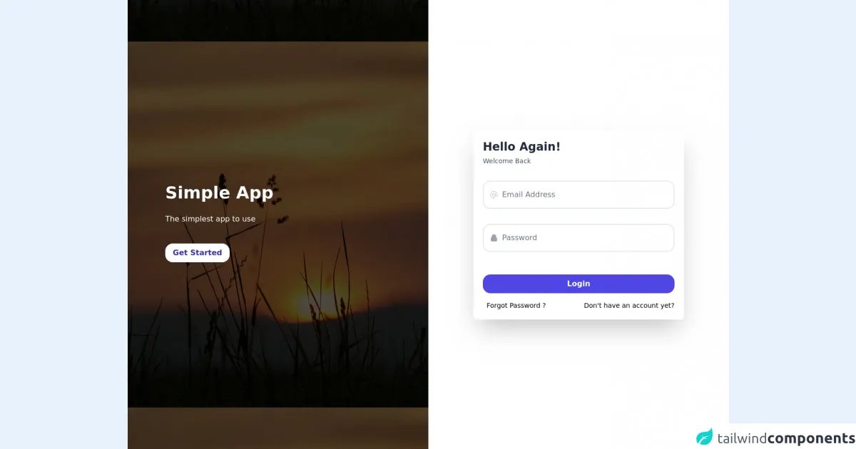
The preview of Login form UI component
To create a login form UI component with Tailwind CSS, we will use a combination of form elements and utility classes. The login form will consist of two input fields for the username and password, a submit button, and a link to reset the password.
Free download of the Login form's source code
The source code of Login form UI component
To create the login form UI component, we will use HTML and Tailwind CSS classes. The HTML code for the login form is as follows:
<style>
  .login_img_section {
  background: linear-gradient(rgba(2,2,2,.7),rgba(0,0,0,.7)),url(https://images.unsplash.com/photo-1650825556125-060e52d40bd0?ixlib=rb-1.2.1&ixid=MnwxMjA3fDB8MHxwaG90by1wYWdlfHx8fGVufDB8fHx8&auto=format&fit=crop&w=1170&q=80) center center;
}
</style>
<div class="h-screen flex">
          <div class="hidden lg:flex w-full lg:w-1/2 login_img_section
          justify-around items-center">
            <div
                  class="
                  bg-black
                  opacity-20
                  inset-0
                  z-0"
                  >

                  </div>
            <div class="w-full mx-auto px-20 flex-col items-center space-y-6">
              <h1 class="text-white font-bold text-4xl font-sans">Simple App</h1>
              <p class="text-white mt-1">The simplest app to use</p>
              <div class="flex justify-center lg:justify-start mt-6">
                  <a href="#" class="hover:bg-indigo-700 hover:text-white hover:-translate-y-1 transition-all duration-500 bg-white text-indigo-800 mt-4 px-4 py-2 rounded-2xl font-bold mb-2">Get Started</a>
              </div>
            </div>
          </div>
          <div class="flex w-full lg:w-1/2 justify-center items-center bg-white space-y-8">
            <div class="w-full px-8 md:px-32 lg:px-24">
            <form class="bg-white rounded-md shadow-2xl p-5">
              <h1 class="text-gray-800 font-bold text-2xl mb-1">Hello Again!</h1>
              <p class="text-sm font-normal text-gray-600 mb-8">Welcome Back</p>
              <div class="flex items-center border-2 mb-8 py-2 px-3 rounded-2xl">
                <svg xmlns="http://www.w3.org/2000/svg" class="h-5 w-5 text-gray-400" fill="none" viewBox="0 0 24 24" stroke="currentColor">
                  <path strokeLinecap="round" strokeLinejoin="round" strokeWidth="2" d="M16 12a4 4 0 10-8 0 4 4 0 008 0zm0 0v1.5a2.5 2.5 0 005 0V12a9 9 0 10-9 9m4.5-1.206a8.959 8.959 0 01-4.5 1.207" />
                </svg>
                <input id="email" class=" pl-2 w-full outline-none border-none" type="email" name="email" placeholder="Email Address" />
              </div>
              <div class="flex items-center border-2 mb-12 py-2 px-3 rounded-2xl ">
                <svg xmlns="http://www.w3.org/2000/svg" class="h-5 w-5 text-gray-400" viewBox="0 0 20 20" fill="currentColor">
                  <path fillRule="evenodd" d="M5 9V7a5 5 0 0110 0v2a2 2 0 012 2v5a2 2 0 01-2 2H5a2 2 0 01-2-2v-5a2 2 0 012-2zm8-2v2H7V7a3 3 0 016 0z" clipRule="evenodd" />
                </svg>
                <input class="pl-2 w-full outline-none border-none" type="password" name="password" id="password" placeholder="Password" />

              </div>
              <button type="submit" class="block w-full bg-indigo-600 mt-5 py-2 rounded-2xl hover:bg-indigo-700 hover:-translate-y-1 transition-all duration-500 text-white font-semibold mb-2">Login</button>
              <div class="flex justify-between mt-4">
                <span class="text-sm ml-2 hover:text-blue-500 cursor-pointer hover:-translate-y-1 duration-500 transition-all">Forgot Password ?</span>

                <a href="#" class="text-sm ml-2 hover:text-blue-500 cursor-pointer hover:-translate-y-1 duration-500 transition-all">Don't have an account yet?</a>
              </div>

            </form>
            </div>

          </div>
      </div>
How to create a Login form with Tailwind CSS?
To create a login form with Tailwind CSS, follow these steps:
- Create a new HTML file and add the necessary form elements, such as input fields and a submit button.
- Add the required Tailwind CSS classes to the form elements to style them according to your needs.
- Customize the styles of the form elements using Tailwind CSS utilities to fit your design requirements.
Here's an example of how to create a login form using Tailwind CSS:
<form class="bg-white shadow-md rounded px-8 pt-6 pb-8 mb-4">
  <div class="mb-4">
    <label class="block text-gray-700 font-bold mb-2" for="username">
      Username
    </label>
    <input
      class="shadow appearance-none border rounded w-full py-2 px-3 text-gray-700 leading-tight focus:outline-none focus:shadow-outline"
      id="username"
      type="text"
      placeholder="Username"
    />
  </div>
  <div class="mb-6">
    <label class="block text-gray-700 font-bold mb-2" for="password">
      Password
    </label>
    <input
      class="shadow appearance-none border rounded w-full py-2 px-3 text-gray-700 leading-tight focus:outline-none focus:shadow-outline"
      id="password"
      type="password"
      placeholder="Password"
    />
  </div>
  <div class="flex items-center justify-between">
    <button
      class="bg-blue-500 hover:bg-blue-700 text-white font-bold py-2 px-4 rounded focus:outline-none focus:shadow-outline"
      type="button"
    >
      Sign In
    </button>
    <a
      class="inline-block align-baseline font-bold text-sm text-blue-500 hover:text-blue-800"
      href="#"
    >
      Forgot Password?
    </a>
  </div>
</form>
In this example, we use the bg-white, shadow-md, rounded, px-8, pt-6, pb-8, and mb-4 classes to style the form container. We use the mb-4 class to add some margin at the bottom of the form container.
We use the mb-4 class again to add some margin at the bottom of the Username label. We use the shadow, appearance-none, border, rounded, w-full, py-2, px-3, text-gray-700, leading-tight, focus:outline-none, and focus:shadow-outline classes to style the Username input field.
We use the mb-6 class to add some margin at the bottom of the Password label. We use the same set of classes as the Username input field to style the Password input field.
We use the flex, items-center, and justify-between classes to create a flex container that aligns the Sign In button and the Forgot Password? link horizontally. We use the bg-blue-500, hover:bg-blue-700, text-white, font-bold, py-2, px-4, rounded, focus:outline-none, and focus:shadow-outline classes to style the Sign In button. We use the inline-block, align-baseline, font-bold, text-sm, text-blue-500, and hover:text-blue-800 classes to style the Forgot Password? link.
Conclusion
In conclusion, Tailwind CSS is an excellent choice for creating UI components quickly and easily. In this article, we explored how to create a login form UI component using Tailwind CSS. We learned why Tailwind CSS is a good choice for creating UI components, and we saw a preview and the source code of a login form UI component created with Tailwind CSS. With Tailwind CSS, you can create beautiful and responsive UI components in no time.