- Published on
Beginners Guide: Make A Login Form With Tailwind CSS
- What is Tailwind CSS?
- The description of Login Form ui component
- Why use Tailwind CSS to create a Login Form ui component?
- The preview of Login Form ui component
- The source code of Login Form ui component
- How to create a Login Form with Tailwind CSS?
- Step 1: Install Tailwind CSS
- Step 2: Create a Tailwind CSS configuration file
- Step 3: Create a CSS file and import Tailwind CSS
- Step 4: Add the HTML markup
- Step 5: Add Tailwind CSS classes to the HTML markup
- Step 6: Customize the Login Form ui component
- Conclusion
Are you a beginner in FrontEnd development? Are you looking for an easy way to create a Login Form ui component? Look no further than Tailwind CSS! In this article, we will guide you through the process of creating a Login Form ui component with Tailwind CSS.
What is Tailwind CSS?
Tailwind CSS is a utility-first CSS framework that provides a set of pre-defined CSS classes to style your HTML elements. It allows you to create responsive and customizable UI components with minimal effort. With Tailwind CSS, you can focus on the functionality of your application rather than spending time on styling.
The description of Login Form ui component
A Login Form ui component is a user interface element that allows users to log in to an application by entering their username and password. It typically consists of two input fields for username and password, a submit button, and a link to reset the password.
Why use Tailwind CSS to create a Login Form ui component?
Tailwind CSS provides a set of pre-defined CSS classes that can be used to style the Login Form ui component. This makes it easy for beginners to create a Login Form without having to write custom CSS. Additionally, Tailwind CSS is highly customizable, allowing you to easily modify the appearance of the Login Form to match your application's branding.
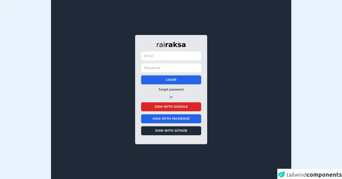
The preview of Login Form ui component
To create a Login Form ui component with Tailwind CSS, we will use the following HTML markup:
<div class="bg-white p-6 rounded-lg shadow-md">
  <h2 class="text-lg font-medium mb-4">Login</h2>
  <form>
    <div class="mb-4">
      <label class="block text-gray-700 font-medium mb-2" for="username">
        Username
      </label>
      <input
        class="border border-gray-400 p-2 w-full rounded-lg"
        type="text"
        id="username"
        name="username"
        required
      />
    </div>
    <div class="mb-4">
      <label class="block text-gray-700 font-medium mb-2" for="password">
        Password
      </label>
      <input
        class="border border-gray-400 p-2 w-full rounded-lg"
        type="password"
        id="password"
        name="password"
        required
      />
    </div>
    <button
      class="bg-blue-500 text-white py-2 px-4 rounded-lg hover:bg-blue-600"
      type="submit"
    >
      Login
    </button>
  </form>
  <div class="mt-4">
    <a class="text-blue-500 hover:text-blue-600" href="#">
      Forgot your password?
    </a>
  </div>
</div>
Free download of the Login Form's source code
The source code of Login Form ui component
To create the Login Form ui component, we used a combination of HTML markup and Tailwind CSS classes. The HTML markup defines the structure of the Login Form, while the Tailwind CSS classes provide the styling.
<div class="w-full h-screen flex items-center justify-center bg-gray-800">
    <div class="bg-gray-200 w-96 h-auto rounded-lg pt-8 pb-8 px-8 flex flex-col items-center">
        <label class="font-light text-4xl mb-4">rai<span class="font-bold">raksa</span></label>
        <input type="text" class="w-full h-12 rounded-lg px-4 text-lg focus:ring-blue-600 mb-4" placeholder="Email"/>
        <input type="password" class="w-full h-12 rounded-lg px-4 text-lg focus:ring-blue-600 mb-4" placeholder="Password"/>
        <button class="w-full h-12 rounded-lg bg-blue-600 text-gray-200 uppercase font-semibold hover:bg-blue-700 text-gray-100 transition mb-4">Login</button>
        <p class="text-right mb-4">Forgot password</p>
        <label class="text-gray-800 mb-4">or</label>
        <button class="w-full h-12 rounded-lg bg-red-600 text-gray-200 uppercase font-semibold hover:bg-red-700 text-gray-100 transition mb-4">Sign with Google</button>
        <button class="w-full h-12 rounded-lg bg-blue-600 text-gray-200 uppercase font-semibold hover:bg-blue-700 text-gray-100 transition mb-4">Sign with Facebook</button>
        <button class="w-full h-12 rounded-lg bg-gray-800 text-gray-200 uppercase font-semibold hover:bg-gray-900 text-gray-100 transition mb-4">Sign with Github</button>
    </div>
</div>
How to create a Login Form with Tailwind CSS?
Now that we have a preview of what the Login Form ui component looks like, let's dive into the steps to create it with Tailwind CSS.
Step 1: Install Tailwind CSS
To use Tailwind CSS, you first need to install it in your project. You can do this by running the following command in your terminal:
npm install tailwindcss
Step 2: Create a Tailwind CSS configuration file
Next, you need to create a Tailwind CSS configuration file. You can do this by running the following command in your terminal:
npx tailwindcss init
This will create a tailwind.config.js file in your project directory.
Step 3: Create a CSS file and import Tailwind CSS
Create a new CSS file in your project directory and import Tailwind CSS by adding the following line to the top of the file:
@import 'tailwindcss/base';
@import 'tailwindcss/components';
@import 'tailwindcss/utilities';
Step 4: Add the HTML markup
Add the HTML markup for the Login Form ui component to your project's HTML file.
Step 5: Add Tailwind CSS classes to the HTML markup
Add the appropriate Tailwind CSS classes to the HTML markup to style the Login Form ui component. Refer to the preview code above for an example.
Step 6: Customize the Login Form ui component
Tailwind CSS allows you to easily customize the appearance of the Login Form ui component by modifying the values in the tailwind.config.js file. For example, you can change the colors, fonts, and spacing of the Login Form ui component to match your application's branding.
Conclusion
In this article, we have shown you how to create a Login Form ui component with Tailwind CSS. Tailwind CSS provides a set of pre-defined CSS classes that make it easy for beginners to create responsive and customizable UI components. By following the steps outlined in this article, you can create your own Login Form ui component with minimal effort.