- Published on
What You Need To Build A Login Form With Tailwind CSS
- What is Tailwind CSS?
- The description of Login Form ui component
- Why use Tailwind CSS to create a Login Form ui component?
- The preview of Login Form ui component.
- The source code of Login Form ui component.
- How to create a Login Form with Tailwind CSS?
- Step 1: Define the HTML structure of the form.
- Step 2: Apply Tailwind CSS classes to style the form's elements.
- Step 3: Customize the form's appearance and layout as needed.
- Conclusion
In the world of web development, creating a login form is one of the most common tasks that developers face. A login form is an essential component of any website or application that requires user authentication. In this article, we will explore how to create a login form using Tailwind CSS.
What is Tailwind CSS?
Tailwind CSS is a utility-first CSS framework that provides a set of pre-defined classes to style HTML elements. It allows developers to create complex user interfaces quickly and efficiently. Tailwind CSS is gaining popularity among developers due to its flexibility, ease of use, and customization options.
The description of Login Form ui component
A login form is a user interface component that allows users to enter their credentials to access a website or application. It typically consists of two input fields for the username and password, a submit button, and a link to reset the password or create a new account.
Why use Tailwind CSS to create a Login Form ui component?
Tailwind CSS provides a set of pre-defined classes that can be used to style a login form quickly and efficiently. It eliminates the need for writing custom CSS, which can save a lot of time and effort. Additionally, Tailwind CSS allows for easy customization of the form's appearance and layout, making it a great choice for creating a login form.
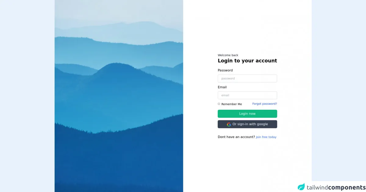
The preview of Login Form ui component.
To create a login form using Tailwind CSS, we will first need to define the HTML structure of the form. Here is a preview of what the login form will look like:
<form class="bg-white shadow-md rounded px-8 pt-6 pb-8 mb-4">
  <div class="mb-4">
    <label class="block text-gray-700 font-bold mb-2" for="username">
      Username
    </label>
    <input
      class="shadow appearance-none border rounded w-full py-2 px-3 text-gray-700 leading-tight focus:outline-none focus:shadow-outline"
      id="username"
      type="text"
      placeholder="Username"
    >
  </div>
  <div class="mb-6">
    <label class="block text-gray-700 font-bold mb-2" for="password">
      Password
    </label>
    <input
      class="shadow appearance-none border rounded w-full py-2 px-3 text-gray-700 leading-tight focus:outline-none focus:shadow-outline"
      id="password"
      type="password"
      placeholder="********"
    >
  </div>
  <div class="flex items-center justify-between">
    <button
      class="bg-blue-500 hover:bg-blue-700 text-white font-bold py-2 px-4 rounded focus:outline-none focus:shadow-outline"
      type="button"
    >
      Sign In
    </button>
    <a class="inline-block align-baseline font-bold text-sm text-blue-500 hover:text-blue-800" href="#">
      Forgot Password?
    </a>
  </div>
</form>
Free download of the Login Form's source code
The source code of Login Form ui component.
To create the login form using Tailwind CSS, we will need to define the HTML structure of the form and apply Tailwind CSS classes to style the form's elements. Here is the source code for the login form:
<form class="bg-white shadow-md rounded px-8 pt-6 pb-8 mb-4">
  <div class="mb-4">
    <label class="block text-gray-700 font-bold mb-2" for="username">
      Username
    </label>
    <input
      class="shadow appearance-none border rounded w-full py-2 px-3 text-gray-700 leading-tight focus:outline-none focus:shadow-outline"
      id="username"
      type="text"
      placeholder="Username"
    >
  </div>
  <div class="mb-6">
    <label class="block text-gray-700 font-bold mb-2" for="password">
      Password
    </label>
    <input
      class="shadow appearance-none border rounded w-full py-2 px-3 text-gray-700 leading-tight focus:outline-none focus:shadow-outline"
      id="password"
      type="password"
      placeholder="********"
    >
  </div>
  <div class="flex items-center justify-between">
    <button
      class="bg-blue-500 hover:bg-blue-700 text-white font-bold py-2 px-4 rounded focus:outline-none focus:shadow-outline"
      type="button"
    >
      Sign In
    </button>
    <a class="inline-block align-baseline font-bold text-sm text-blue-500 hover:text-blue-800" href="#">
      Forgot Password?
    </a>
  </div>
</form>
<!-- Create By Joker Banny -->
<div class="min-h-screen bg-no-repeat bg-cover bg-center"
	style="background-image: url('https://images.unsplash.com/photo-1486520299386-6d106b22014b?ixid=MnwxMjA3fDB8MHxwaG90by1wYWdlfHx8fGVufDB8fHx8&ixlib=rb-1.2.1&auto=format&fit=crop&w=1050&q=80')">
	<div class="flex justify-end">
		<div class="bg-white min-h-screen w-1/2 flex justify-center items-center">
			<div>

				<form>
					<div>
						<span class="text-sm text-gray-900">Welcome back</span>
						<h1 class="text-2xl font-bold">Login to your account</h1>
					</div>
					<div class="mt-5">
						<label class="block text-md mb-2" for="password">Password</label>
						<input class="px-4 w-full border-2 py-2 rounded-md text-sm outline-none" type="password" name="password" placeholder="password">
        </div>
						<div class="my-3">
							<label class="block text-md mb-2" for="email">Email</label>
							<input class="px-4 w-full border-2 py-2 rounded-md text-sm outline-none" type="email" name="password" placeholder="email">
        </div>
							<div class="flex justify-between">
								<div>
									<input class="cursor-pointer"  type="radio" name="rememberme">
									<span class="text-sm">Remember Me</span>
								</div>
								<span class="text-sm text-blue-700 hover:underline cursor-pointer">Forgot password?</span>
							</div>
							<div class="">
								<button class="mt-4 mb-3 w-full bg-green-500 hover:bg-green-400 text-white py-2 rounded-md transition duration-100">Login now</button>
								<div class="flex  space-x-2 justify-center items-end bg-gray-700 hover:bg-gray-600 text-white py-2 rounded-md transition duration-100"">

            <img class=" h-5 cursor-pointer" src="https://i.imgur.com/arC60SB.png" alt="">
									<button >Or sign-in with google</button>
								</div>
							</div>
				</form>
				<p class="mt-8"> Dont have an account? <span class="cursor-pointer text-sm text-blue-600"> Join free today</span></p>
			</div>
		</div>
	</div>
</div>
</div>
How to create a Login Form with Tailwind CSS?
To create a login form using Tailwind CSS, we will need to follow these steps:
- Define the HTML structure of the form.
- Apply Tailwind CSS classes to style the form's elements.
- Customize the form's appearance and layout as needed.
Let's walk through each of these steps in detail.
Step 1: Define the HTML structure of the form.
The first step in creating a login form is to define the HTML structure of the form. We will need to create a form element and add input fields for the username and password, a submit button, and a link to reset the password or create a new account. Here is an example of the HTML structure for the login form:
<form>
  <div>
    <label for="username">Username:</label>
    <input type="text" id="username" name="username">
  </div>
  <div>
    <label for="password">Password:</label>
    <input type="password" id="password" name="password">
  </div>
  <div>
    <button type="submit">Sign In</button>
  </div>
  <div>
    <a href="#">Forgot Password?</a>
  </div>
</form>
Step 2: Apply Tailwind CSS classes to style the form's elements.
The next step is to apply Tailwind CSS classes to style the form's elements. We can use the pre-defined classes provided by Tailwind CSS to style the form's input fields, buttons, and links. Here is an example of the Tailwind CSS classes applied to the login form:
<form class="bg-white shadow-md rounded px-8 pt-6 pb-8 mb-4">
  <div class="mb-4">
    <label class="block text-gray-700 font-bold mb-2" for="username">
      Username
    </label>
    <input
      class="shadow appearance-none border rounded w-full py-2 px-3 text-gray-700 leading-tight focus:outline-none focus:shadow-outline"
      id="username"
      type="text"
      placeholder="Username"
    >
  </div>
  <div class="mb-6">
    <label class="block text-gray-700 font-bold mb-2" for="password">
      Password
    </label>
    <input
      class="shadow appearance-none border rounded w-full py-2 px-3 text-gray-700 leading-tight focus:outline-none focus:shadow-outline"
      id="password"
      type="password"
      placeholder="********"
    >
  </div>
  <div class="flex items-center justify-between">
    <button
      class="bg-blue-500 hover:bg-blue-700 text-white font-bold py-2 px-4 rounded focus:outline-none focus:shadow-outline"
      type="button"
    >
      Sign In
    </button>
    <a class="inline-block align-baseline font-bold text-sm text-blue-500 hover:text-blue-800" href="#">
      Forgot Password?
    </a>
  </div>
</form>
Step 3: Customize the form's appearance and layout as needed.
The final step is to customize the form's appearance and layout as needed. We can use the Tailwind CSS classes to adjust the form's colors, fonts, and spacing. For example, we can change the background color of the form, adjust the font size of the input fields, and add padding to the form's elements. Here is an example of a customized login form:
<form class="bg-gray-100 shadow-md rounded px-8 pt-6 pb-8 mb-4">
  <div class="mb-6">
    <label class="block text-gray-700 font-bold mb-2" for="username">
      Username
    </label>
    <input
      class="shadow appearance-none border rounded w-full py-2 px-3 text-gray-700 leading-tight focus:outline-none focus:shadow-outline text-lg"
      id="username"
      type="text"
      placeholder="Username"
    >
  </div>
  <div class="mb-6">
    <label class="block text-gray-700 font-bold mb-2" for="password">
      Password
    </label>
    <input
      class="shadow appearance-none border rounded w-full py-2 px-3 text-gray-700 leading-tight focus:outline-none focus:shadow-outline text-lg"
      id="password"
      type="password"
      placeholder="********"
    >
  </div>
  <div class="flex items-center justify-between">
    <button
      class="bg-blue-500 hover:bg-blue-700 text-white font-bold py-2 px-4 rounded focus:outline-none focus:shadow-outline"
      type="button"
    >
      Sign In
    </button>
    <a class="inline-block align-baseline font-bold text-sm text-blue-500 hover:text-blue-800" href="#">
      Forgot Password?
    </a>
  </div>
</form>
Conclusion
In this article, we have explored how to create a login form using Tailwind CSS. Tailwind CSS provides a set of pre-defined classes that can be used to style a login form quickly and efficiently. By following the steps outlined in this article, you can create a customized login form that fits the needs of your website or application.