- Published on
How To Build A Login Form With Tailwind CSS In 5 Easy Steps
- What is Tailwind CSS?
- The description of Login form ui component
- Why use Tailwind CSS to create a Login form ui component?
- The preview of Login form ui component
- The source code of Login form ui component
- How to create a Login form with Tailwind CSS?
- Step 1: Set up your HTML file
- Step 2: Add the login form code
- Step 3: Style the login form
- Step 4: Add functionality to the login form
- Step 5: Test the login form
- Conclusion
In this tutorial, we will learn how to create a login form using Tailwind CSS. Tailwind CSS is a utility-first CSS framework that provides a set of pre-defined classes that can be used to build custom user interfaces. With Tailwind CSS, you can easily create a responsive and modern login form that looks great on any device.
What is Tailwind CSS?
Tailwind CSS is a utility-first CSS framework that provides a set of pre-defined classes that can be used to style HTML elements. It is designed to be highly customizable and provides a wide range of utility classes that can be used to create custom user interfaces. Tailwind CSS is easy to learn and use, and it can help you build responsive and modern web applications quickly.
The description of Login form ui component
A login form is a user interface component that allows users to log in to a web application. It typically consists of two input fields for the username and password, and a submit button to authenticate the user's credentials. A login form can be simple or complex, depending on the requirements of the web application.
Why use Tailwind CSS to create a Login form ui component?
Tailwind CSS provides a set of pre-defined classes that can be used to create a login form quickly and easily. It also provides responsive design classes that can be used to ensure that the login form looks great on any device. Using Tailwind CSS can save you time and effort when creating a login form, and it can help you create a consistent user interface across your web application.
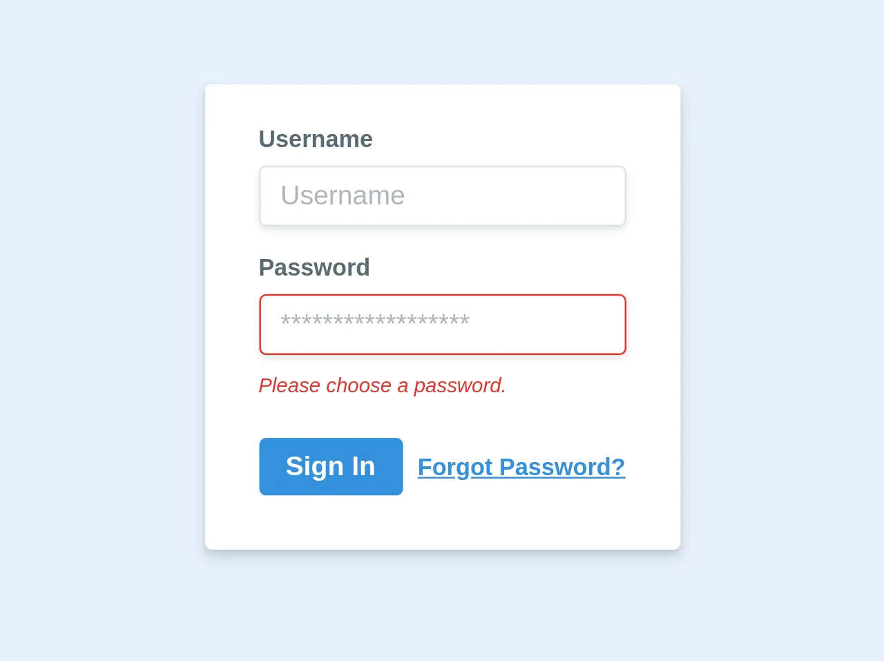
The preview of Login form ui component
To create a login form with Tailwind CSS, we will use the following HTML code:
<div class="bg-white shadow-md rounded px-8 pt-6 pb-8 mb-4 flex flex-col">
  <div class="mb-4">
    <label class="block text-gray-700 text-sm font-bold mb-2" for="username">
      Username
    </label>
    <input
      class="shadow appearance-none border rounded w-full py-2 px-3 text-gray-700 leading-tight focus:outline-none focus:shadow-outline"
      id="username"
      type="text"
      placeholder="Username"
    />
  </div>
  <div class="mb-6">
    <label class="block text-gray-700 text-sm font-bold mb-2" for="password">
      Password
    </label>
    <input
      class="shadow appearance-none border rounded w-full py-2 px-3 text-gray-700 leading-tight focus:outline-none focus:shadow-outline"
      id="password"
      type="password"
      placeholder="Password"
    />
  </div>
  <div class="flex items-center justify-between">
    <button
      class="bg-blue-500 hover:bg-blue-700 text-white font-bold py-2 px-4 rounded focus:outline-none focus:shadow-outline"
      type="button"
    >
      Sign In
    </button>
    <a
      class="inline-block align-baseline font-bold text-sm text-blue-500 hover:text-blue-800"
      href="#"
    >
      Forgot Password?
    </a>
  </div>
</div>
Free download of the Login form's source code
The source code of Login form ui component
To create the login form using Tailwind CSS, we will use the following classes:
bg-white: sets the background color of the login form to white.shadow-md: adds a shadow effect to the login form.rounded: rounds the corners of the login form.px-8: adds padding to the left and right sides of the login form.pt-6: adds padding to the top of the login form.pb-8: adds padding to the bottom of the login form.mb-4: adds margin to the bottom of the login form.flex: sets the display property of the login form to flex.flex-col: sets the flex-direction property of the login form to column.mb-4: adds margin to the bottom of the input fields.block: sets the display property of the label to block.text-gray-700: sets the text color of the label to gray.text-sm: sets the font size of the label to small.font-bold: sets the font weight of the label to bold.leading-tight: sets the line height of the input fields to tight.focus:outline-none: removes the outline when the input fields are in focus.focus:shadow-outline: adds a shadow effect when the input fields are in focus.w-full: sets the width of the input fields to full.py-2: adds padding to the top and bottom of the input fields.px-3: adds padding to the left and right sides of the input fields.bg-blue-500: sets the background color of the submit button to blue.hover:bg-blue-700: changes the background color of the submit button when hovering.text-white: sets the text color of the submit button to white.font-bold: sets the font weight of the submit button to bold.py-2: adds padding to the top and bottom of the submit button.px-4: adds padding to the left and right sides of the submit button.rounded: rounds the corners of the submit button.inline-block: sets the display property of the forgot password link to inline-block.align-baseline: aligns the forgot password link with the baseline.text-blue-500: sets the text color of the forgot password link to blue.hover:text-blue-800: changes the text color of the forgot password link when hovering.
<div class="bg-white shadow-md rounded px-8 pt-6 pb-8 mb-4 flex flex-col">
    <div class="mb-4">
      <label class="block text-grey-darker text-sm font-bold mb-2" for="username">
        Username
      </label>
      <input class="shadow appearance-none border rounded w-full py-2 px-3 text-grey-darker" id="username" type="text" placeholder="Username">
    </div>
    <div class="mb-6">
      <label class="block text-grey-darker text-sm font-bold mb-2" for="password">
        Password
      </label>
      <input class="shadow appearance-none border border-red rounded w-full py-2 px-3 text-grey-darker mb-3" id="password" type="password" placeholder="******************">
      <p class="text-red text-xs italic">Please choose a password.</p>
    </div>
    <div class="flex items-center justify-between">
      <button class="bg-blue hover:bg-blue-dark text-white font-bold py-2 px-4 rounded" type="button">
        Sign In
      </button>
      <a class="inline-block align-baseline font-bold text-sm text-blue hover:text-blue-darker" href="#">
        Forgot Password?
      </a>
    </div>
</div>
How to create a Login form with Tailwind CSS?
To create a login form with Tailwind CSS, follow these steps:
Step 1: Set up your HTML file
Create a new HTML file and add the following code:
<!DOCTYPE html>
<html>
  <head>
    <title>Login Form</title>
    <link rel="stylesheet" href="https://cdn.jsdelivr.net/npm/[email protected]/dist/tailwind.min.css" />
  </head>
  <body>
    <div class="container mx-auto mt-8">
      <!-- Login form code goes here -->
    </div>
  </body>
</html>
This code sets up a basic HTML file and includes the Tailwind CSS stylesheet.
Step 2: Add the login form code
Add the login form code to the HTML file:
<div class="bg-white shadow-md rounded px-8 pt-6 pb-8 mb-4 flex flex-col">
  <div class="mb-4">
    <label class="block text-gray-700 text-sm font-bold mb-2" for="username">
      Username
    </label>
    <input
      class="shadow appearance-none border rounded w-full py-2 px-3 text-gray-700 leading-tight focus:outline-none focus:shadow-outline"
      id="username"
      type="text"
      placeholder="Username"
    />
  </div>
  <div class="mb-6">
    <label class="block text-gray-700 text-sm font-bold mb-2" for="password">
      Password
    </label>
    <input
      class="shadow appearance-none border rounded w-full py-2 px-3 text-gray-700 leading-tight focus:outline-none focus:shadow-outline"
      id="password"
      type="password"
      placeholder="Password"
    />
  </div>
  <div class="flex items-center justify-between">
    <button
      class="bg-blue-500 hover:bg-blue-700 text-white font-bold py-2 px-4 rounded focus:outline-none focus:shadow-outline"
      type="button"
    >
      Sign In
    </button>
    <a
      class="inline-block align-baseline font-bold text-sm text-blue-500 hover:text-blue-800"
      href="#"
    >
      Forgot Password?
    </a>
  </div>
</div>
This code creates the login form using Tailwind CSS classes.
Step 3: Style the login form
To style the login form, you can modify the Tailwind CSS classes used in the HTML code. For example, you can change the background color of the login form by changing the bg-white class to bg-gray-100.
Step 4: Add functionality to the login form
To add functionality to the login form, you can use JavaScript to handle form submissions and authentication.
Step 5: Test the login form
Test the login form in different web browsers and on different devices to ensure that it looks and works as expected.
Conclusion
In this tutorial, we learned how to create a login form using Tailwind CSS. Tailwind CSS provides a set of pre-defined classes that can be used to create custom user interfaces quickly and easily. Using Tailwind CSS can save you time and effort when creating a login form, and it can help you create a consistent user interface across your web application.