- Published on
Here Are 6 Ways To Create A Login Page With Tailwind CSS
- What is Tailwind CSS?
- The description of login page UI component
- Why use Tailwind CSS to create a login page UI component?
- The preview of login page UI component
- The source code of login page UI component
- How to create a login page with Tailwind CSS?
- 1. Basic Login Page
- 2. Centered Login Page
- 3. Split Login Page
- 4. Image Login Page
- 5. Social Login Page
- 6. Animated Login Page
- Conclusion
As a FrontEnd technology blogger, it is important to stay up-to-date with the latest tools and techniques. One tool that has gained popularity in recent years is Tailwind CSS. Tailwind CSS is a utility-first CSS framework that allows you to rapidly build custom user interfaces. In this article, we will explore 6 ways to create a login page with Tailwind CSS.
What is Tailwind CSS?
Tailwind CSS is a utility-first CSS framework that provides a set of pre-defined CSS classes that can be used to rapidly build custom user interfaces. Unlike traditional CSS frameworks, Tailwind CSS does not provide pre-designed components. Instead, it provides a set of low-level utility classes that can be combined to create custom components.
The description of login page UI component
A login page is a common UI component that is used in many web applications. It typically consists of a form with two input fields (one for the username and one for the password) and a submit button. The form may also include additional elements such as a "remember me" checkbox or a "forgot password" link.
Why use Tailwind CSS to create a login page UI component?
Tailwind CSS provides a number of benefits when it comes to creating a login page UI component. Firstly, it allows you to rapidly prototype and iterate on your designs. Secondly, it provides a consistent and maintainable codebase, which is essential for large-scale projects. Finally, it allows you to easily customize the look and feel of your UI components, without having to write custom CSS.
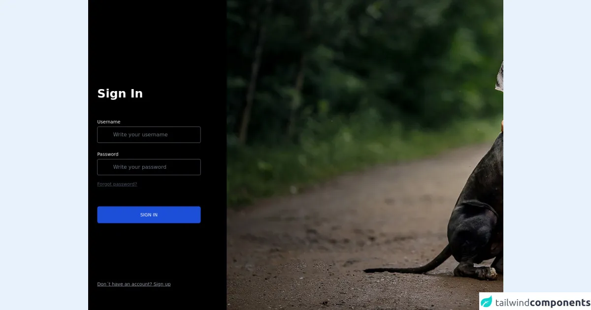
The preview of login page UI component
Creating a login page with Tailwind CSS is easy and straightforward. Here is a preview of what the final login page UI component will look like:
Free download of the login page's source code
The source code of login page UI component
To create a login page with Tailwind CSS, you will need to write some HTML and CSS code. Here is a sample code that you can use as a starting point:
<!-- This is an example component
    Instagram: ccornejo__ -->
<div class='grid grid-cols-12'>
        <div class="col-span-4 text-white font-sans font-bold bg-black min-h-screen pl-7">
            <div class="grid grid-rows-6 grid-flow-col min-h-screen items-center justify-items-start">
                <div class="row-span-4 row-start-2 text-4xl">
                    Sign In
                    <div class="pt-10 pr-20">
                        <label class="text-sm font-sans font-medium">
                            Username
                        </label>
                        <input
                            type="text"
                            name="username"
                            placeholder="Write your username"
                            class="w-full bg-black py-3 px-12 border hover: border-gray-500 rounded shadow text-base font-sans"/>
                    </div>
                    <div class="pt-2 pr-20">
                        <label class="text-sm font-sans font-medium">
                            Password
                        </label>
                        <input
                            type="password"
                            name="password"
                            placeholder="Write your password"
                            class=" w-full bg-black py-3 px-12 border hover: border-gray-500 rounded shadow text-base font-sans"/>
                        <a href="" class="text-sm font-sans font-medium text-gray-600 underline">
                            Forgot password?
                        </a>
                    </div>
                    <!-- Button -->
                    <div class="text-sm font-sans font-medium w-full pr-20 pt-14">
                        <button
                            type="button"
                            class="text-center w-full py-4 bg-blue-700 hover:bg-blue-400 rounded-md text-white">
                                SIGN IN
                        </button>
                    </div>
                </div>
                <!-- Text -->
                <a href="" class="text-sm font-sans font-medium text-gray-400 underline">
                    Don´t have an account? Sign up
                </a>
            </div>
        </div>

        <!-- Second column image -->
        <div class="banner col-span-8 text-white font-sans font-bold">
            <!-- Aquí iría algún comentario -->
        </div>
</div>


<style>
    .banner {
        background: url( 'https://s1.1zoom.me/b6058/448/Dogs_Svetlana_Shelemeteva_Hug_Little_girls_568770_1920x1080.jpg' );
        background-repeat: no-repeat;
        background-size: cover
    }
</style>
How to create a login page with Tailwind CSS?
Now that we have covered the basics, let's dive into the 6 ways to create a login page with Tailwind CSS.
1. Basic Login Page
The first way to create a login page with Tailwind CSS is to use the basic login page template. This template consists of a simple form with two input fields and a submit button. Here is the HTML code for the basic login page:
<div class="flex flex-col items-center justify-center min-h-screen bg-gray-100">
  <div class="w-full max-w-md">
    <form class="bg-white shadow-lg rounded px-12 pt-6 pb-8 mb-4">
      <div class="mb-4">
        <label class="block text-gray-700 font-bold mb-2" for="username">
          Username
        </label>
        <input
          class="shadow appearance-none border rounded w-full py-2 px-3 text-gray-700 leading-tight focus:outline-none focus:shadow-outline"
          id="username"
          type="text"
          placeholder="Username"
        />
      </div>
      <div class="mb-6">
        <label class="block text-gray-700 font-bold mb-2" for="password">
          Password
        </label>
        <input
          class="shadow appearance-none border rounded w-full py-2 px-3 text-gray-700 leading-tight focus:outline-none focus:shadow-outline"
          id="password"
          type="password"
          placeholder="********"
        />
      </div>
      <div class="flex items-center justify-between">
        <button
          class="bg-blue-500 hover:bg-blue-700 text-white font-bold py-2 px-4 rounded focus:outline-none focus:shadow-outline"
          type="button"
        >
          Sign In
        </button>
      </div>
    </form>
  </div>
</div>
2. Centered Login Page
The second way to create a login page with Tailwind CSS is to use the centered login page template. This template centers the login form on the page and adds some additional styling to the input fields. Here is the HTML code for the centered login page:
<div class="flex flex-col items-center justify-center min-h-screen bg-gray-100">
  <div class="w-full max-w-md">
    <form class="bg-white shadow-lg rounded px-12 pt-6 pb-8 mb-4">
      <div class="mb-4">
        <label class="block text-gray-700 font-bold mb-2" for="username">
          Username
        </label>
        <input
          class="shadow appearance-none border rounded w-full py-2 px-3 text-gray-700 leading-tight focus:outline-none focus:shadow-outline"
          id="username"
          type="text"
          placeholder="Username"
        />
      </div>
      <div class="mb-6">
        <label class="block text-gray-700 font-bold mb-2" for="password">
          Password
        </label>
        <input
          class="shadow appearance-none border rounded w-full py-2 px-3 text-gray-700 leading-tight focus:outline-none focus:shadow-outline"
          id="password"
          type="password"
          placeholder="********"
        />
      </div>
      <div class="flex items-center justify-between">
        <button
          class="bg-blue-500 hover:bg-blue-700 text-white font-bold py-2 px-4 rounded focus:outline-none focus:shadow-outline"
          type="button"
        >
          Sign In
        </button>
      </div>
    </form>
  </div>
</div>
3. Split Login Page
The third way to create a login page with Tailwind CSS is to use the split login page template. This template splits the login form into two sections and adds some additional styling to the input fields. Here is the HTML code for the split login page:
<div class="flex flex-col items-center justify-center min-h-screen bg-gray-100">
  <div class="w-full max-w-md">
    <div class="bg-white shadow-lg rounded px-12 pt-6 pb-8 mb-4 flex flex-col">
      <div class="mb-4">
        <label class="block text-gray-700 font-bold mb-2" for="username">
          Username
        </label>
        <input
          class="shadow appearance-none border rounded w-full py-2 px-3 text-gray-700 leading-tight focus:outline-none focus:shadow-outline"
          id="username"
          type="text"
          placeholder="Username"
        />
      </div>
      <div class="mb-6">
        <label class="block text-gray-700 font-bold mb-2" for="password">
          Password
        </label>
        <input
          class="shadow appearance-none border rounded w-full py-2 px-3 text-gray-700 leading-tight focus:outline-none focus:shadow-outline"
          id="password"
          type="password"
          placeholder="********"
        />
      </div>
      <div class="flex items-center justify-between">
        <button
          class="bg-blue-500 hover:bg-blue-700 text-white font-bold py-2 px-4 rounded focus:outline-none focus:shadow-outline"
          type="button"
        >
          Sign In
        </button>
      </div>
    </div>
    <div class="text-center">
      <a
        class="inline-block align-baseline font-bold text-sm text-blue-500 hover:text-blue-800"
        href="#"
      >
        Forgot Password?
      </a>
    </div>
  </div>
</div>
4. Image Login Page
The fourth way to create a login page with Tailwind CSS is to use the image login page template. This template adds an image to the login form and adds some additional styling to the input fields. Here is the HTML code for the image login page:
<div class="flex flex-col items-center justify-center min-h-screen bg-gray-100">
  <div class="w-full max-w-md">
    <div class="bg-white shadow-lg rounded px-12 pt-6 pb-8 mb-4">
      <div class="mb-4">
        <label class="block text-gray-700 font-bold mb-2" for="username">
          Username
        </label>
        <input
          class="shadow appearance-none border rounded w-full py-2 px-3 text-gray-700 leading-tight focus:outline-none focus:shadow-outline"
          id="username"
          type="text"
          placeholder="Username"
        />
      </div>
      <div class="mb-6">
        <label class="block text-gray-700 font-bold mb-2" for="password">
          Password
        </label>
        <input
          class="shadow appearance-none border rounded w-full py-2 px-3 text-gray-700 leading-tight focus:outline-none focus:shadow-outline"
          id="password"
          type="password"
          placeholder="********"
        />
      </div>
      <div class="flex items-center justify-between">
        <button
          class="bg-blue-500 hover:bg-blue-700 text-white font-bold py-2 px-4 rounded focus:outline-none focus:shadow-outline"
          type="button"
        >
          Sign In
        </button>
      </div>
    </div>
    <div class="text-center">
      <img
        class="w-32 h-32 rounded-full mx-auto"
        src="https://via.placeholder.com/150"
        alt="Logo"
      />
    </div>
  </div>
</div>
5. Social Login Page
The fifth way to create a login page with Tailwind CSS is to use the social login page template. This template adds social media buttons to the login form and adds some additional styling to the input fields. Here is the HTML code for the social login page:
<div class="flex flex-col items-center justify-center min-h-screen bg-gray-100">
  <div class="w-full max-w-md">
    <div class="bg-white shadow-lg rounded px-12 pt-6 pb-8 mb-4">
      <div class="mb-4">
        <label class="block text-gray-700 font-bold mb-2" for="username">
          Username
        </label>
        <input
          class="shadow appearance-none border rounded w-full py-2 px-3 text-gray-700 leading-tight focus:outline-none focus:shadow-outline"
          id="username"
          type="text"
          placeholder="Username"
        />
      </div>
      <div class="mb-6">
        <label class="block text-gray-700 font-bold mb-2" for="password">
          Password
        </label>
        <input
          class="shadow appearance-none border rounded w-full py-2 px-3 text-gray-700 leading-tight focus:outline-none focus:shadow-outline"
          id="password"
          type="password"
          placeholder="********"
        />
      </div>
      <div class="flex items-center justify-between">
        <button
          class="bg-blue-500 hover:bg-blue-700 text-white font-bold py-2 px-4 rounded focus:outline-none focus:shadow-outline"
          type="button"
        >
          Sign In
        </button>
      </div>
    </div>
    <div class="text-center">
      <p class="text-gray-600 mb-2">Or sign in with:</p>
      <div class="flex justify-center">
        <button
          class="bg-blue-500 hover:bg-blue-700 text-white font-bold py-2 px-4 rounded focus:outline-none focus:shadow-outline mr-2"
          type="button"
        >
          Facebook
        </button>
        <button
          class="bg-red-500 hover:bg-red-700 text-white font-bold py-2 px-4 rounded focus:outline-none focus:shadow-outline ml-2"
          type="button"
        >
          Google
        </button>
      </div>
    </div>
  </div>
</div>
6. Animated Login Page
The sixth and final way to create a login page with Tailwind CSS is to use the animated login page template. This template adds some animations to the login form and adds some additional styling to the input fields. Here is the HTML code for the animated login page:
<div class="flex flex-col items-center justify-center min-h-screen bg-gray-100">
  <div class="w-full max-w-md">
    <div
      class="bg-white shadow-lg rounded px-12 pt-6 pb-8 mb-4 animate__animated animate__fadeInDown"
    >
      <div class="mb-4">
        <label class="block text-gray-700 font-bold mb-2" for="username">
          Username
        </label>
        <input
          class="shadow appearance-none border rounded w-full py-2 px-3 text-gray-700 leading-tight focus:outline-none focus:shadow-outline"
          id="username"
          type="text"
          placeholder="Username"
        />
      </div>
      <div class="mb-6">
        <label class="block text-gray-700 font-bold mb-2" for="password">
          Password
        </label>
        <input
          class="shadow appearance-none border rounded w-full py-2 px-3 text-gray-700 leading-tight focus:outline-none focus:shadow-outline"
          id="password"
          type="password"
          placeholder="********"
        />
      </div>
      <div class="flex items-center justify-between">
        <button
          class="bg-blue-500 hover:bg-blue-700 text-white font-bold py-2 px-4 rounded focus:outline-none focus:shadow-outline"
          type="button"
        >
          Sign In
        </button>
      </div>
    </div>
    <div
      class="text-center animate__animated animate__fadeInUp animate__delay-1s"
    >
      <a
        class="inline-block align-baseline font-bold text-sm text-blue-500 hover:text-blue-800"
        href="#"
      >
        Forgot Password?
      </a>
    </div>
  </div>
</div>
Conclusion
In this article, we have explored 6 ways to create a login page with Tailwind CSS. Tailwind CSS provides a number of benefits when it comes to creating custom UI components, including rapid prototyping, maintainable code, and easy customization. By using the templates provided in this article, you can create a login page that is both functional and visually appealing.