- Published on
Build A Login Form With Tailwind CSS Like A Pro With The Help Of These 6 Tips
- What is Tailwind CSS?
- The description of Login Form ui component
- Why use Tailwind CSS to create a Login Form ui component?
- The preview of Login Form ui component.
- The source code of Login Form ui component.
- How to create a Login Form with Tailwind CSS?
- Step 1: Create the HTML structure
- Step 2: Add Tailwind CSS classes
- Step 3: Style the container
- Step 4: Style the form container
- Step 5: Style the form header
- Step 6: Style the form inputs
- Step 7: Style the form submit button
- Conclusion
As a FrontEnd technology blogger, you might have heard of Tailwind CSS, a utility-first CSS framework that helps you quickly build custom designs without writing any CSS. In this article, we will explore how to build a Login Form with Tailwind CSS like a pro with the help of these 6 tips.
What is Tailwind CSS?
Tailwind CSS is a utility-first CSS framework that provides a set of pre-defined CSS classes that you can use to style your HTML elements. It allows you to create custom designs without writing any CSS code. Tailwind CSS provides a wide range of utility classes that you can use to create your own custom styles.
The description of Login Form ui component
A Login Form is a user interface component that allows users to log in to a website or an application. It usually consists of two input fields, one for the user's email or username and another for the user's password. It also includes a submit button that allows the user to log in.
Why use Tailwind CSS to create a Login Form ui component?
Tailwind CSS provides a set of pre-defined CSS classes that you can use to style your Login Form. It allows you to quickly create custom designs without writing any CSS code. Tailwind CSS also provides responsive design classes that allow you to create a Login Form that looks great on all devices.
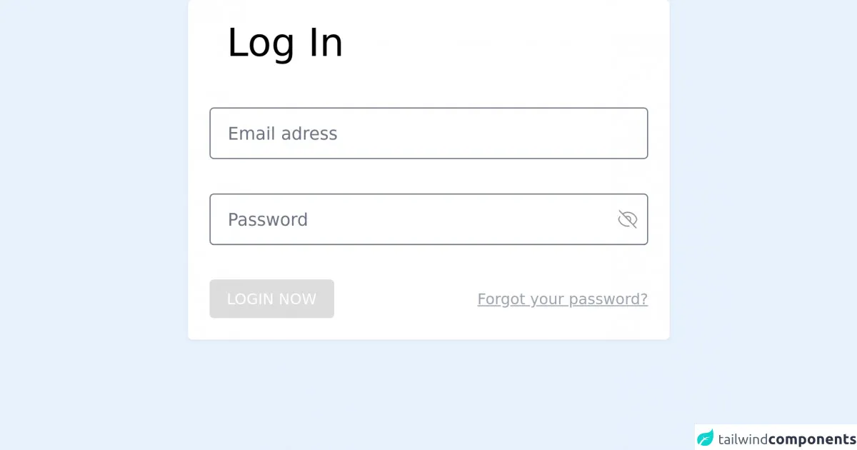
The preview of Login Form ui component.
To create a Login Form with Tailwind CSS, we will use a combination of utility classes to style our HTML elements. Here is a preview of what our Login Form will look like:
Free download of the Login Form's source code
The source code of Login Form ui component.
To create a Login Form with Tailwind CSS, we will use a combination of utility classes to style our HTML elements. Here is the source code of our Login Form:
<div class="bg-white p-5 max-w-md mx-auto rounded shadow-sm">
    <h2 class="text-4xl px-4 ">Log In</h2>
    <form class="mt-10 space-y-8">
        <input
          class="w-full border rounded h-12 px-4 focus:outline-none"
          placeholder="Email adress "
          type="email"
        />

        <div class="flex items-center ">
          <input
            class="w-full border rounded h-12 px-4 focus:outline-none -mr-7"
            placeholder="Password"
            type="password"
          />
          <svg
            xmlns="http://www.w3.org/2000/svg"
            width="17.607"
            height="17.076"
            viewBox="0 0 17.607 17.076"
          >
            <path
              id="eye-off"
              d="M12.392,16.769a8.718,8.718,0,0,1-9.935-5.938A8.675,8.675,0,0,1,3.817,8.2m5.1.79a2.611,2.611,0,1,1,3.692,3.692M8.914,8.985,12.6,12.675M8.916,8.986,6.053,6.124m6.554,6.554,2.863,2.863M2.929,3,6.053,6.124m0,0a8.7,8.7,0,0,1,13.011,4.707,8.723,8.723,0,0,1-3.6,4.708m0,0,3.123,3.123"
              transform="translate(-1.957 -2.293)"
              fill="none"
              stroke="#949090"
              strokeLinecap="round"
              strokeLinejoin="round"
              strokeidth="1"
            />
          </svg>
        </div>
        <div>
          <div class="flex flex-col md:flex-row md:items-center justify-between ">
            <input
              class="bg-orange-500 text-sm active:bg-gray-700 cursor-pointer font-regular text-white px-4 py-2 rounded uppercase"
              type="submit"
              value="login now"
            />
            <p
              class="text-gray-400 text-sm
            underline self-center
            md:self-auto mt-4 md:mt-0"
            >
              Forgot your password?
            </p>
          </div>
        </div>
      </form>
</div>
How to create a Login Form with Tailwind CSS?
Now that we have seen the preview and the source code of our Login Form, let's dive into how to create it step-by-step.
Step 1: Create the HTML structure
First, we need to create the HTML structure of our Login Form. We will use the following HTML code:
<div class="min-h-screen flex items-center justify-center bg-gray-50 py-12 px-4 sm:px-6 lg:px-8">
  <div class="max-w-md w-full space-y-8">
    <div>
      <h2 class="mt-6 text-center text-3xl font-extrabold text-gray-900">
        Sign in to your account
      </h2>
    </div>
    <form class="mt-8 space-y-6" action="#" method="POST">
      <input type="hidden" name="remember" value="true">
      <div class="rounded-md shadow-sm -space-y-px">
        <div>
          <label for="email-address" class="sr-only">Email address</label>
          <input id="email-address" name="email" type="email" autocomplete="email" required class="appearance-none rounded-none relative block w-full px-3 py-2 border border-gray-300 placeholder-gray-500 text-gray-900 rounded-t-md focus:outline-none focus:ring-indigo-500 focus:border-indigo-500 focus:z-10 sm:text-sm" placeholder="Email address">
        </div>
        <div>
          <label for="password" class="sr-only">Password</label>
          <input id="password" name="password" type="password" autocomplete="current-password" required class="appearance-none rounded-none relative block w-full px-3 py-2 border border-gray-300 placeholder-gray-500 text-gray-900 rounded-b-md focus:outline-none focus:ring-indigo-500 focus:border-indigo-500 focus:z-10 sm:text-sm" placeholder="Password">
        </div>
      </div>

      <div class="flex items-center justify-between">
        <div class="flex items-center">
          <input id="remember_me" name="remember_me" type="checkbox" class="h-4 w-4 text-indigo-600 focus:ring-indigo-500 border-gray-300 rounded">
          <label for="remember_me" class="ml-2 block text-sm text-gray-900">
            Remember me
          </label>
        </div>

        <div class="text-sm">
          <a href="#" class="font-medium text-indigo-600 hover:text-indigo-500">
            Forgot your password?
          </a>
        </div>
      </div>

      <div>
        <button type="submit" class="group relative w-full flex justify-center py-2 px-4 border border-transparent text-sm font-medium rounded-md text-white bg-indigo-600 hover:bg-indigo-700 focus:outline-none focus:ring-2 focus:ring-offset-2 focus:ring-indigo-500">
          <span class="absolute left-0 inset-y-0 flex items-center pl-3">
            <!-- Heroicon name: solid/lock-closed -->
            <svg class="h-5 w-5 text-indigo-500 group-hover:text-indigo-400" xmlns="http://www.w3.org/2000/svg" viewBox="0 0 20 20" fill="currentColor" aria-hidden="true">
              <path fill-rule="evenodd" d="M10 2a3 3 0 0 0-3 3v2H5a3 3 0 0 0-3 3v6a3 3 0 0 0 3 3h8a3 3 0 0 0 3-3V8a3 3 0 0 0-3-3h-2V5a3 3 0 0 0-3-3z" clip-rule="evenodd" />
            </svg>
          </span>
          Sign in
        </button>
      </div>
    </form>
  </div>
</div>
Step 2: Add Tailwind CSS classes
Now that we have created the HTML structure of our Login Form, we can start adding Tailwind CSS classes to style our HTML elements. We will use a combination of utility classes to style our Login Form.
Step 3: Style the container
We will start by styling the container of our Login Form. We will use the following Tailwind CSS classes:
<div class="min-h-screen flex items-center justify-center bg-gray-50 py-12 px-4 sm:px-6 lg:px-8">
Step 4: Style the form container
Next, we will style the form container of our Login Form. We will use the following Tailwind CSS classes:
<div class="max-w-md w-full space-y-8">
Step 5: Style the form header
We will now style the header of our Login Form. We will use the following Tailwind CSS classes:
<h2 class="mt-6 text-center text-3xl font-extrabold text-gray-900">
  Sign in to your account
</h2>
Step 6: Style the form inputs
Next, we will style the input fields of our Login Form. We will use the following Tailwind CSS classes:
<input id="email-address" name="email" type="email" autocomplete="email" required class="appearance-none rounded-none relative block w-full px-3 py-2 border border-gray-300 placeholder-gray-500 text-gray-900 rounded-t-md focus:outline-none focus:ring-indigo-500 focus:border-indigo-500 focus:z-10 sm:text-sm" placeholder="Email address">

<input id="password" name="password" type="password" autocomplete="current-password" required class="appearance-none rounded-none relative block w-full px-3 py-2 border border-gray-300 placeholder-gray-500 text-gray-900 rounded-b-md focus:outline-none focus:ring-indigo-500 focus:border-indigo-500 focus:z-10 sm:text-sm" placeholder="Password">
Step 7: Style the form submit button
Finally, we will style the submit button of our Login Form. We will use the following Tailwind CSS classes:
<button type="submit" class="group relative w-full flex justify-center py-2 px-4 border border-transparent text-sm font-medium rounded-md text-white bg-indigo-600 hover:bg-indigo-700 focus:outline-none focus:ring-2 focus:ring-offset-2 focus:ring-indigo-500">
  <span class="absolute left-0 inset-y-0 flex items-center pl-3">
    <!-- Heroicon name: solid/lock-closed -->
    <svg class="h-5 w-5 text-indigo-500 group-hover:text-indigo-400" xmlns="http://www.w3.org/2000/svg" viewBox="0 0 20 20" fill="currentColor" aria-hidden="true">
      <path fill-rule="evenodd" d="M10 2a3 3 0 0 0-3 3v2H5a3 3 0 0 0-3 3v6a3 3 0 0 0 3 3h8a3 3 0 0 0 3-3V8a3 3 0 0 0-3-3h-2V5a3 3 0 0 0-3-3z" clip-rule="evenodd" />
    </svg>
  </span>
  Sign in
</button>
Conclusion
In this article, we have explored how to build a Login Form with Tailwind CSS like a pro with the help of these 6 tips. We have seen how Tailwind CSS provides a set of pre-defined CSS classes that you can use to style your HTML elements. We have also seen how to use a combination of utility classes to create a custom Login Form. With Tailwind CSS, you can quickly create custom designs without writing any CSS code.