- Published on
Ultimate Guide: Build A Linkedin - Add To Your Feed With Tailwind CSS
- What is Tailwind CSS?
- The description of Linkedin - Add to your Feed ui component
- Why use Tailwind CSS to create a Linkedin - Add to your Feed ui component?
- The preview of Linkedin - Add to your Feed ui component.
- The source code of Linkedin - Add to your Feed ui component.
- How to create a Linkedin - Add to your Feed with Tailwind CSS?
- Step 1: Set up your project
- Step 2: Add Tailwind CSS to your project
- Step 3: Customize your UI component
- Conclusion
If you're a FrontEnd developer, you've probably heard of Tailwind CSS. It's a utility-first CSS framework that makes it easy to create responsive and customizable user interfaces. In this tutorial, we'll show you how to use Tailwind CSS to build a Linkedin - Add to your Feed UI component.
What is Tailwind CSS?
Tailwind CSS is a utility-first CSS framework that allows you to quickly and easily create custom user interfaces. It provides a set of pre-defined CSS classes that you can use to style your HTML elements. With Tailwind CSS, you can create responsive designs, customize colors, fonts, and more.
The description of Linkedin - Add to your Feed ui component
The Linkedin - Add to your Feed UI component is a simple form that allows users to add a new post to their feed. It consists of a text area for the post content and a button to submit the post. The UI component is typically used in social media applications where users can share their thoughts, ideas, and experiences with their followers.
Why use Tailwind CSS to create a Linkedin - Add to your Feed ui component?
Tailwind CSS is an excellent choice for creating the Linkedin - Add to your Feed UI component. It provides a set of pre-defined CSS classes that you can use to style your HTML elements. With Tailwind CSS, you can create responsive designs, customize colors, fonts, and more. Additionally, Tailwind CSS is easy to learn and use, making it an excellent choice for FrontEnd developers of all skill levels.
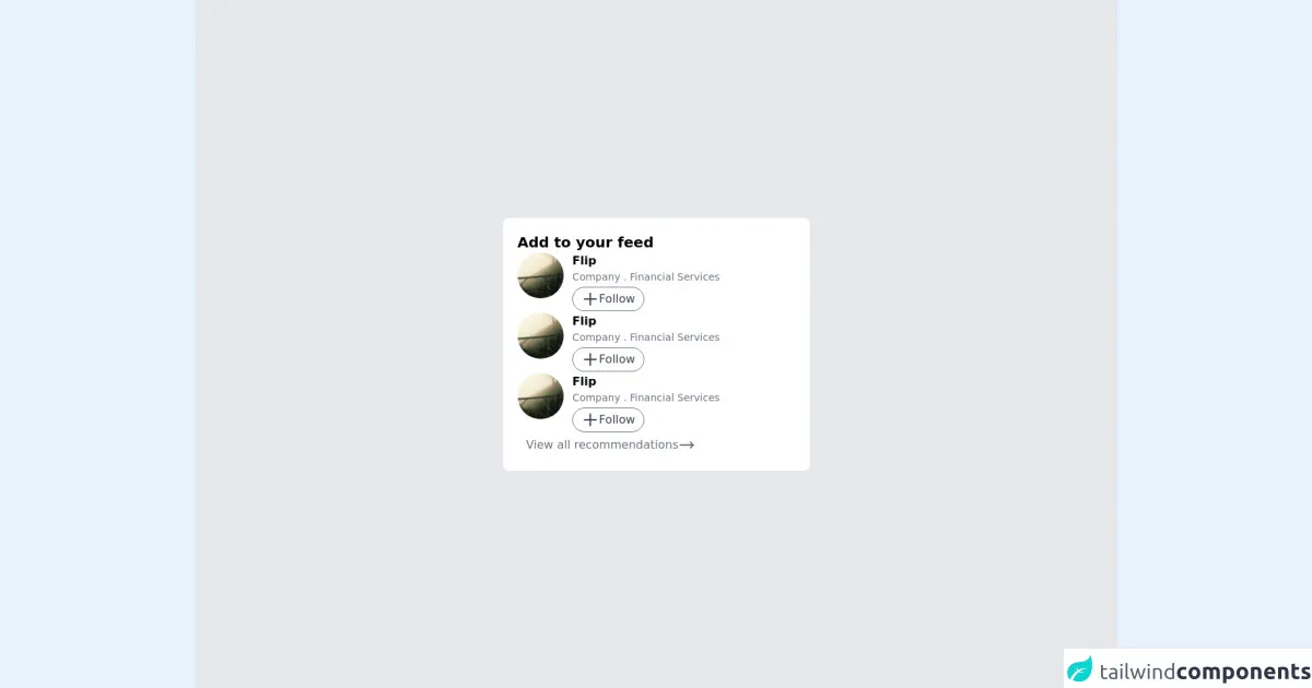
The preview of Linkedin - Add to your Feed ui component.
To preview the Linkedin - Add to your Feed UI component, simply follow the link below:
Free download of the Linkedin - Add to your Feed's source code
The source code of Linkedin - Add to your Feed ui component.
To view the source code for the Linkedin - Add to your Feed UI component, simply follow the link below:
<div class="h-screen bg-gray-200 flex items-center justify-center">

  <card class="bg-white rounded-lg flex flex-col p-5 w-1/3 gap-5">

    <header class="font-semibold text-xl">
      Add to your feed
    </header>

    <content class="grid grid-cols-6">

      <div>
        <img src="https://picsum.photos/70/70" class="rounded-full"/>
      </div>

      <div class="col-span-5 flex flex-col gap-1 pl-3">

        <name class="font-semibold">
          Flip
        </name>

        <description class="text-gray-500 text-sm">
          Company . Financial Services
        </description>

        <div class="mt-1">
          <button class="hover:border-gray-900 hover:bg-gray-300 delay-100 duration-100 border border-gray-500 rounded-full text-gray-700 inline-flex px-3 py-1 text-md">
            <svg xmlns="http://www.w3.org/2000/svg" class="h-6 w-6" fill="none" viewBox="0 0 24 24" stroke="currentColor">
    <path stroke-linecap="round" stroke-linejoin="round" stroke-width="2" d="M12 4v16m8-8H4" />
  </svg>
            Follow
          </button>
        </div>

      </div>

    </content>

    <footer class="text-gray-500">
      <button class="hover:bg-gray-200 delay-100 duration-100 inline-flex items-center px-3 py-1 rounded">
        View all recommendations
        <svg xmlns="http://www.w3.org/2000/svg" class="h-6 w-6" fill="none" viewBox="0 0 24 24" stroke="currentColor">
          <path stroke-linecap="round" stroke-linejoin="round" stroke-width="2" d="M17 8l4 4m0 0l-4 4m4-4H3" />
        </svg>
      </button
    </footer>

  </card>
</div>
How to create a Linkedin - Add to your Feed with Tailwind CSS?
To create a Linkedin - Add to your Feed UI component with Tailwind CSS, follow the steps below:
Step 1: Set up your project
First, create a new HTML file and add the required HTML elements for the UI component. You'll need a form element, a text area element, and a button element. Add the required Tailwind CSS classes to each element.
<form class="bg-white p-6 rounded-lg shadow-md">
  <div class="mb-4">
    <label class="block text-gray-700 font-bold mb-2" for="post-content">
      Post Content
    </label>
    <textarea
      class="appearance-none border rounded w-full py-2 px-3 text-gray-700 leading-tight focus:outline-none focus:shadow-outline"
      id="post-content"
      placeholder="What's on your mind?"
    ></textarea>
  </div>
  <div class="flex items-center justify-end">
    <button
      class="bg-blue-500 hover:bg-blue-700 text-white font-bold py-2 px-4 rounded focus:outline-none focus:shadow-outline"
      type="button"
    >
      Post
    </button>
  </div>
</form>
Step 2: Add Tailwind CSS to your project
Next, add the Tailwind CSS framework to your project. You can do this by including the Tailwind CSS CDN in your HTML file or by installing Tailwind CSS using npm.
<link
  href="https://cdn.jsdelivr.net/npm/tailwindcss@latest/dist/tailwind.min.css"
  rel="stylesheet"
/>
Step 3: Customize your UI component
Finally, customize your UI component by adding your own styles and modifying the existing Tailwind CSS classes. You can also add additional functionality to the UI component using JavaScript.
<form class="bg-white p-6 rounded-lg shadow-md">
  <div class="mb-4">
    <label class="block text-gray-700 font-bold mb-2" for="post-content">
      Post Content
    </label>
    <textarea
      class="appearance-none border rounded w-full py-2 px-3 text-gray-700 leading-tight focus:outline-none focus:shadow-outline"
      id="post-content"
      placeholder="What's on your mind?"
    ></textarea>
  </div>
  <div class="flex items-center justify-end">
    <button
      class="bg-blue-500 hover:bg-blue-700 text-white font-bold py-2 px-4 rounded focus:outline-none focus:shadow-outline"
      type="button"
    >
      Post
    </button>
  </div>
</form>
Conclusion
In this tutorial, we showed you how to use Tailwind CSS to create a Linkedin - Add to your Feed UI component. Tailwind CSS is an excellent choice for creating custom user interfaces. It provides a set of pre-defined CSS classes that you can use to style your HTML elements. With Tailwind CSS, you can create responsive designs, customize colors, fonts, and more. We hope this tutorial has been helpful, and we encourage you to continue exploring Tailwind CSS and its many features.