- Published on
How To Make A Link Underline Animation With Tailwind CSS From Scratch
- What is Tailwind CSS?
- The description of Link Underline Animation ui component
- Why use Tailwind CSS to create a Link Underline Animation ui component?
- The preview of Link Underline Animation ui component
- The source code of Link Underline Animation ui component
- How to create a Link Underline Animation with Tailwind CSS?
- Step 1: Create the HTML markup
- Step 2: Define the styles for the link
- Step 3: Define the styles for the underline
- Step 4: Define the styles for the animation
- Step 5: Customize the animation
- Conclusion
What is Tailwind CSS?
Tailwind CSS is a utility-first CSS framework that allows you to quickly build custom user interfaces. It provides a set of pre-defined classes that you can use to style your HTML elements without having to write any CSS code. With Tailwind CSS, you can create beautiful and responsive designs in a fraction of the time it would take to write custom CSS.
The description of Link Underline Animation ui component
A Link Underline Animation is a UI component that adds a subtle animation to links when they are hovered over. This animation can help to draw attention to the links and make them more engaging for users. The animation typically involves a line that appears under the link and moves in a smooth and fluid motion.
Why use Tailwind CSS to create a Link Underline Animation ui component?
Tailwind CSS is an ideal choice for creating a Link Underline Animation UI component because it provides a set of pre-defined classes that can be used to create the animation quickly and easily. These classes can be combined and customized to achieve the desired effect, without having to write any custom CSS code.
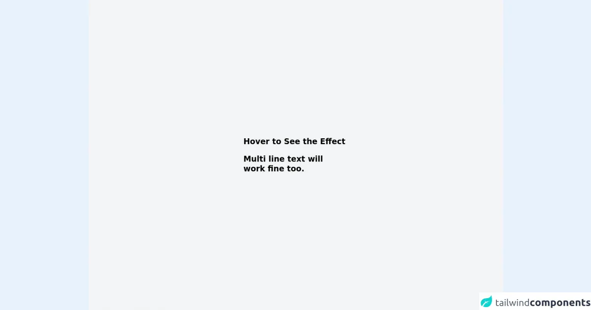
The preview of Link Underline Animation ui component
To create a Link Underline Animation UI component with Tailwind CSS, we will use a combination of classes to style the link and the underline. The result will be a subtle animation that adds a touch of elegance to the link.
Free download of the Link Underline Animation's source code
The source code of Link Underline Animation ui component
To create the Link Underline Animation UI component, we will use the following HTML and CSS code. The HTML code defines a link element with the class "underline-animation", and the CSS code defines the styles for the link and the underline.
<div class="min-h-screen bg-gray-100 py-6 flex flex-col justify-center sm:py-12">
	<div class="relative py-3 sm:max-w-xl sm:mx-auto">
		<a href="#" class="font-display max-w-sm text-2xl font-bold leading-tight">
			<span class="link link-underline link-underline-black text-black"> Hover to See the Effect </span>
		</a>
		<br>
		<br>
		<a href="#" class="font-display max-w-sm text-2xl font-bold leading-tight">
			<span class="link link-underline link-underline-black text-black"> Multi line text will <br>work fine too.</span>
		</a>
	</div>
</div>


<style>
	.link-underline {
		border-bottom-width: 0;
		background-image: linear-gradient(transparent, transparent), linear-gradient(#fff, #fff);
		background-size: 0 3px;
		background-position: 0 100%;
		background-repeat: no-repeat;
		transition: background-size .5s ease-in-out;
	}

	.link-underline-black {
		background-image: linear-gradient(transparent, transparent), linear-gradient(#F2C, #F2C)
	}

	.link-underline:hover {
		background-size: 100% 3px;
		background-position: 0 100%
	}
</style>
How to create a Link Underline Animation with Tailwind CSS?
To create a Link Underline Animation with Tailwind CSS, follow these steps:
Step 1: Create the HTML markup
Create an HTML link element with the class "underline-animation". This class will be used to style the link and the underline.
<a href="#" class="underline-animation">Link</a>
Step 2: Define the styles for the link
Use the "text-gray-900" class to set the color of the link to black. Use the "hover:text-gray-700" class to change the color of the link to a darker shade of gray when it is hovered over.
<a href="#" class="underline-animation text-gray-900 hover:text-gray-700">Link</a>
Step 3: Define the styles for the underline
Use the "relative" class to set the position of the underline to relative. Use the "after:absolute" class to position the underline after the link. Use the "after:bottom-0" class to position the underline at the bottom of the link. Use the "after:left-0" and "after:w-full" classes to set the width of the underline to the width of the link.
<a href="#" class="underline-animation text-gray-900 hover:text-gray-700 relative">
  Link
  <span class="after:absolute after:bottom-0 after:left-0 after:w-full after:h-px after:bg-gray-700"></span>
</a>
Step 4: Define the styles for the animation
Use the "hover:after:w-0" class to set the width of the underline to 0 when the link is hovered over. Use the "hover:after:w-full" class to set the width of the underline back to the width of the link when the mouse leaves the link.
<a href="#" class="underline-animation text-gray-900 hover:text-gray-700 relative">
  Link
  <span class="after:absolute after:bottom-0 after:left-0 after:w-full after:h-px after:bg-gray-700 hover:after:w-0 hover:after:w-full"></span>
</a>
Step 5: Customize the animation
You can customize the animation by adjusting the duration and easing of the transition. Use the "transition" class to set the duration and easing of the transition.
<a href="#" class="underline-animation text-gray-900 hover:text-gray-700 relative transition duration-300 ease-in-out">
  Link
  <span class="after:absolute after:bottom-0 after:left-0 after:w-full after:h-px after:bg-gray-700 hover:after:w-0 hover:after:w-full"></span>
</a>
Conclusion
In this article, we have learned how to create a Link Underline Animation UI component with Tailwind CSS. By using a combination of pre-defined classes, we were able to create a subtle animation that adds a touch of elegance to the link. With Tailwind CSS, creating custom UI components has never been easier.