- Published on
How To Create A Notification Alert With Tailwind CSS In 6 Easy Steps?
- What is Tailwind CSS?
- The description of Notification alert ui component
- Why use Tailwind CSS to create a Notification alert ui component?
- The preview of Notification alert ui component
- The source code of Notification alert ui component
- How to create a Notification alert with Tailwind CSS?
- Step 1: Create a new HTML file
- Step 2: Add a container for the notification alert
- Step 3: Customize the notification alert
- Step 4: Add different types of notification alerts
- Step 5: Add animations to the notification alerts
- Step 6: Add JavaScript functionality to the notification alerts
- Conclusion
What is Tailwind CSS?
Tailwind CSS is a utility-first CSS framework that provides a set of pre-defined classes to help you quickly build custom user interfaces. It allows you to create complex designs without writing any custom CSS.
The description of Notification alert ui component
A notification alert is a user interface component that displays important messages to the user. It is often used to inform the user about the status of an action or to provide feedback on an error. Notification alerts can be displayed in various ways, such as a pop-up window or a banner at the top of the page.
Why use Tailwind CSS to create a Notification alert ui component?
Tailwind CSS provides a set of pre-defined classes that you can use to create a notification alert quickly and easily. It also allows you to customize the style of the alert to match the design of your website or application.
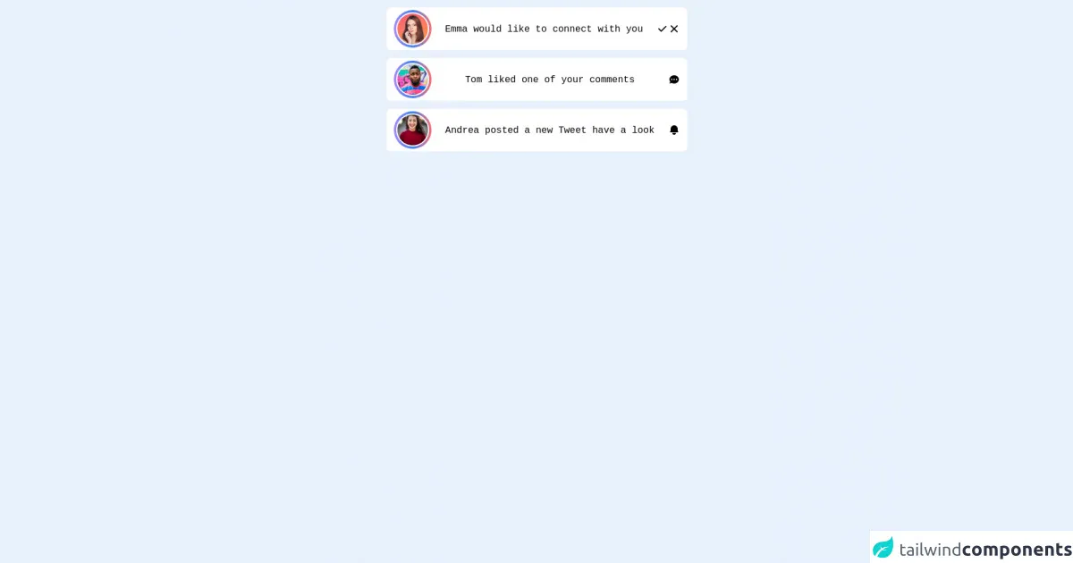
The preview of Notification alert ui component
To create a notification alert with Tailwind CSS, you can use the following classes:
- bg-blue-500: Sets the background color of the alert to blue.
- text-white: Sets the text color of the alert to white.
- px-4: Adds padding to the left and right of the alert.
- py-3: Adds padding to the top and bottom of the alert.
- rounded: Rounds the corners of the alert.
Free download of the Notification alert's source code
The source code of Notification alert ui component
To create a notification alert with Tailwind CSS, you can use the following HTML code:
<div class="bg-blue-500 text-white px-4 py-3 rounded" role="alert">
  <strong>Success!</strong> Your action was successful.
</div>
<div class="max-w-lg mx-auto items-center h-screen">
    <div class="flex justify-between px-3 py-1 bg-white items-center gap-1 rounded-lg border border-gray-100 my-3">
        <div class="relative w-16 h-16 rounded-full hover:bg-red-700 bg-gradient-to-r from-purple-400 via-blue-500 to-red-400 ">
            <div class="absolute top-1/2 left-1/2 transform -translate-x-1/2 -translate-y-1/2 w-14 h-14 bg-gray-200 rounded-full border-2 border-white">
                <img class="w-full h-full object-cover rounded-full" src="https://d2qp0siotla746.cloudfront.net/img/use-cases/profile-picture/template_3.jpg" alt="">
            </div>
        </div>
        <div>
            <span class="font-mono">Emma would like to connect with you</span>
        </div>
        <div class="flex gap-2">
            <button>
                <svg xmlns="http://www.w3.org/2000/svg" class="h-5 w-5" viewBox="0 0 20 20" fill="currentColor">
                    <path fill-rule="evenodd" d="M16.707 5.293a1 1 0 010 1.414l-8 8a1 1 0 01-1.414 0l-4-4a1 1 0 011.414-1.414L8 12.586l7.293-7.293a1 1 0 011.414 0z" clip-rule="evenodd" />
                  </svg>
            </button>
            <button>
                <svg xmlns="http://www.w3.org/2000/svg" class="h-5 w-5" viewBox="0 0 20 20" fill="currentColor">
                    <path fill-rule="evenodd" d="M4.293 4.293a1 1 0 011.414 0L10 8.586l4.293-4.293a1 1 0 111.414 1.414L11.414 10l4.293 4.293a1 1 0 01-1.414 1.414L10 11.414l-4.293 4.293a1 1 0 01-1.414-1.414L8.586 10 4.293 5.707a1 1 0 010-1.414z" clip-rule="evenodd" />
                  </svg>
            </button>
        </div>
    </div>

    <div class="flex justify-between px-3 py-1 bg-white items-center gap-1 rounded-lg border border-gray-100 my-3">
        <div class="relative w-16 h-16 rounded-full hover:bg-red-700 bg-gradient-to-r from-purple-400 via-blue-500 to-red-400 ">
            <div class="absolute top-1/2 left-1/2 transform -translate-x-1/2 -translate-y-1/2 w-14 h-14 bg-gray-200 rounded-full border-2 border-white">
                <img class="w-full h-full object-cover rounded-full" src="https://images.unsplash.com/photo-1463453091185-61582044d556?ixlib=rb-1.2.1&ixid=MnwxMjA3fDB8MHxwaG90by1wYWdlfHx8fGVufDB8fHx8&auto=format&fit=crop&w=1170&q=80" alt="">
            </div>
        </div>
        <div>
            <span class="font-mono">Tom liked one of your comments</span>
        </div>
        <div>
            <svg xmlns="http://www.w3.org/2000/svg" class="h-5 w-5" viewBox="0 0 20 20" fill="currentColor">
                <path fill-rule="evenodd" d="M18 10c0 3.866-3.582 7-8 7a8.841 8.841 0 01-4.083-.98L2 17l1.338-3.123C2.493 12.767 2 11.434 2 10c0-3.866 3.582-7 8-7s8 3.134 8 7zM7 9H5v2h2V9zm8 0h-2v2h2V9zM9 9h2v2H9V9z" clip-rule="evenodd" />
            </svg>
        </div>
    </div>

    <div class="flex justify-between px-3 py-1 bg-white items-center gap-1 rounded-lg border border-gray-100 my-3">
        <div class="relative w-16 h-16 rounded-full hover:bg-red-700 bg-gradient-to-r from-purple-400 via-blue-500 to-red-400 ">
            <div class="absolute top-1/2 left-1/2 transform -translate-x-1/2 -translate-y-1/2 w-14 h-14 bg-gray-200 rounded-full border-2 border-white">
                <img class="w-full h-full object-cover rounded-full" src="https://images.unsplash.com/photo-1494790108377-be9c29b29330?ixlib=rb-1.2.1&ixid=MnwxMjA3fDB8MHxwaG90by1wYWdlfHx8fGVufDB8fHx8&auto=format&fit=crop&w=687&q=80" alt="">
            </div>
        </div>
        <div>
            <span class="font-mono">Andrea posted a new Tweet have a look</span>
        </div>
        <div>
            <svg xmlns="http://www.w3.org/2000/svg" class="h-5 w-5" viewBox="0 0 20 20" fill="currentColor">
                <path d="M10 2a6 6 0 00-6 6v3.586l-.707.707A1 1 0 004 14h12a1 1 0 00.707-1.707L16 11.586V8a6 6 0 00-6-6zM10 18a3 3 0 01-3-3h6a3 3 0 01-3 3z" />
            </svg>
        </div>
    </div>
</div>
How to create a Notification alert with Tailwind CSS?
Now, let's create a notification alert with Tailwind CSS in 6 easy steps:
Step 1: Create a new HTML file
Create a new HTML file and add the following code:
<!DOCTYPE html>
<html lang="en">
<head>
  <meta charset="UTF-8">
  <title>Notification Alert with Tailwind CSS</title>
  <link rel="stylesheet" href="https://cdnjs.cloudflare.com/ajax/libs/tailwindcss/2.2.7/tailwind.min.css" integrity="sha512-9iGd+XcJXUJzO4yv0zJ7I8+Zp+eZL0sUWY7LZ9j+9yq5l+Dj4vJ9zY5z5aW5rG6f3lK7mC9zTc8I4RJjwV5Rg==" crossorigin="anonymous" referrerpolicy="no-referrer" />
</head>
<body>

</body>
</html>
This code sets up the basic structure of the HTML file and includes the Tailwind CSS framework.
Step 2: Add a container for the notification alert
Add a container for the notification alert to the HTML file:
<div class="container mx-auto mt-5">
  <div class="bg-blue-500 text-white px-4 py-3 rounded" role="alert">
    <strong>Success!</strong> Your action was successful.
  </div>
</div>
This code creates a container with a notification alert inside it. The container class centers the alert on the page, while the mx-auto and mt-5 classes add margins to the container.
Step 3: Customize the notification alert
Customize the notification alert by adding additional classes to the HTML code:
<div class="container mx-auto mt-5">
  <div class="bg-green-500 text-white font-bold px-4 py-3 rounded" role="alert">
    <strong>Success!</strong> Your action was successful.
  </div>
</div>
This code changes the background color of the alert to green, adds a bold font to the text, and removes the blue background color from the alert.
Step 4: Add different types of notification alerts
Add different types of notification alerts by changing the background color and text of the alert:
<div class="container mx-auto mt-5">
  <div class="bg-green-500 text-white font-bold px-4 py-3 rounded" role="alert">
    <strong>Success!</strong> Your action was successful.
  </div>
  <div class="bg-red-500 text-white font-bold px-4 py-3 rounded mt-3" role="alert">
    <strong>Error!</strong> There was an error with your action.
  </div>
  <div class="bg-yellow-500 text-white font-bold px-4 py-3 rounded mt-3" role="alert">
    <strong>Warning!</strong> Your action may have unintended consequences.
  </div>
</div>
This code adds three different types of notification alerts: success, error, and warning.
Step 5: Add animations to the notification alerts
Add animations to the notification alerts by using the transition and duration classes:
<div class="container mx-auto mt-5">
  <div class="bg-green-500 text-white font-bold px-4 py-3 rounded transition duration-500 ease-in-out transform hover:-translate-y-1 hover:scale-110" role="alert">
    <strong>Success!</strong> Your action was successful.
  </div>
  <div class="bg-red-500 text-white font-bold px-4 py-3 rounded mt-3 transition duration-500 ease-in-out transform hover:-translate-y-1 hover:scale-110" role="alert">
    <strong>Error!</strong> There was an error with your action.
  </div>
  <div class="bg-yellow-500 text-white font-bold px-4 py-3 rounded mt-3 transition duration-500 ease-in-out transform hover:-translate-y-1 hover:scale-110" role="alert">
    <strong>Warning!</strong> Your action may have unintended consequences.
  </div>
</div>
This code adds a hover animation to the notification alerts that scales and moves the alert slightly when the user hovers over it.
Step 6: Add JavaScript functionality to the notification alerts
Add JavaScript functionality to the notification alerts by using the setTimeout function:
<div class="container mx-auto mt-5">
  <div class="bg-green-500 text-white font-bold px-4 py-3 rounded transition duration-500 ease-in-out transform hover:-translate-y-1 hover:scale-110" role="alert" id="success-alert">
    <strong>Success!</strong> Your action was successful.
  </div>
  <div class="bg-red-500 text-white font-bold px-4 py-3 rounded mt-3 transition duration-500 ease-in-out transform hover:-translate-y-1 hover:scale-110" role="alert" id="error-alert">
    <strong>Error!</strong> There was an error with your action.
  </div>
  <div class="bg-yellow-500 text-white font-bold px-4 py-3 rounded mt-3 transition duration-500 ease-in-out transform hover:-translate-y-1 hover:scale-110" role="alert" id="warning-alert">
    <strong>Warning!</strong> Your action may have unintended consequences.
  </div>
</div>

<script>
  setTimeout(function() {
    document.getElementById('success-alert').style.display = 'none';
  }, 5000);

  setTimeout(function() {
    document.getElementById('error-alert').style.display = 'none';
  }, 5000);

  setTimeout(function() {
    document.getElementById('warning-alert').style.display = 'none';
  }, 5000);
</script>
This code adds JavaScript functionality to the notification alerts that hides the alert after 5 seconds.
Conclusion
Creating a notification alert with Tailwind CSS is a simple and easy process. With just a few lines of code, you can create a custom notification alert that matches the design of your website or application. By following the 6 easy steps outlined in this article, you can create a notification alert in no time.