- Published on
Practical Guide: Build A Landing Section In Space Black Theme With Tailwind CSS
- What is Tailwind CSS?
- The description of Landing Section in Space Black Theme ui component
- Why use Tailwind CSS to create a Landing Section in Space Black Theme ui component?
- The preview of Landing Section in Space Black Theme ui component
- The source code of Landing Section in Space Black Theme ui component
- How to create a Landing Section in Space Black Theme with Tailwind CSS?
- Step 1: Set up the project
- Step 2: Add the Tailwind CSS classes
- Step 3: Preview and customize the Landing Section in Space Black Theme
- Conclusion
In this article, we will guide you through the process of building a Landing Section in Space Black Theme with Tailwind CSS. We will cover what Tailwind CSS is, the description of the Landing Section in Space Black Theme ui component, why use Tailwind CSS to create a Landing Section in Space Black Theme ui component, the preview of the Landing Section in Space Black Theme ui component, the source code of the Landing Section in Space Black Theme ui component, and how to create a Landing Section in Space Black Theme with Tailwind CSS.
What is Tailwind CSS?
Tailwind CSS is a utility-first CSS framework that provides a set of pre-defined classes to help you quickly build custom designs. It allows you to focus on your design rather than writing CSS code from scratch. Tailwind CSS is highly customizable, and you can easily modify it to fit your project's needs.
The description of Landing Section in Space Black Theme ui component
The Landing Section in Space Black Theme is a ui component that is commonly used in web design. It is a section that appears at the top of a webpage and is used to showcase the main features of a website or application. The Space Black Theme is a dark-themed design that is popular in modern web design.
Why use Tailwind CSS to create a Landing Section in Space Black Theme ui component?
Tailwind CSS provides a set of pre-defined classes that can be used to quickly build custom designs. It is highly customizable, and you can easily modify it to fit your project's needs. Using Tailwind CSS to create a Landing Section in Space Black Theme ui component will save you time and effort, and it will allow you to focus on the design rather than writing CSS code from scratch.
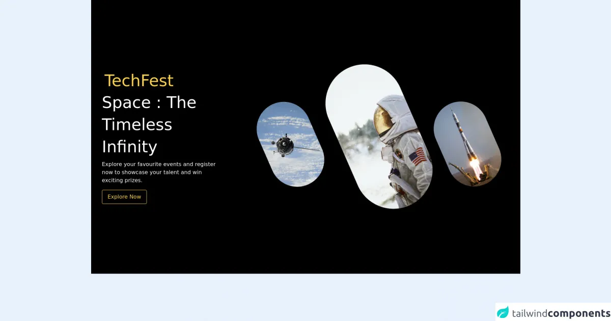
The preview of Landing Section in Space Black Theme ui component
Free download of the Landing Section in Space Black Theme's source code
The source code of Landing Section in Space Black Theme ui component
<section>
	<div class="bg-black text-white py-20">
		<div class="container mx-auto flex flex-col md:flex-row items-center my-12 md:my-24">
			<div class="flex flex-col w-full lg:w-1/3 justify-center items-start p-8">
				<h1 class="text-3xl md:text-5xl p-2 text-yellow-300 tracking-loose">TechFest</h1>
				<h2 class="text-3xl md:text-5xl leading-relaxed md:leading-snug mb-2">Space : The Timeless Infinity
				</h2>
				<p class="text-sm md:text-base text-gray-50 mb-4">Explore your favourite events and
					register now to showcase your talent and win exciting prizes.</p>
				<a href="#"
					class="bg-transparent hover:bg-yellow-300 text-yellow-300 hover:text-black rounded shadow hover:shadow-lg py-2 px-4 border border-yellow-300 hover:border-transparent">
					Explore Now</a>
			</div>
			<div class="p-8 mt-12 mb-6 md:mb-0 md:mt-0 ml-0 md:ml-12 lg:w-2/3  justify-center">
				<div class="h-48 flex flex-wrap content-center">
					<div>
						<img class="inline-block mt-28 hidden xl:block" src="https://user-images.githubusercontent.com/54521023/116969935-c13d5b00-acd4-11eb-82b1-5ad2ff10fb76.png"></div>
						<div>
							<img class="inline-block mt-24 md:mt-0 p-8 md:p-0"  src="https://user-images.githubusercontent.com/54521023/116969931-bedb0100-acd4-11eb-99a9-ff5e0ee9f31f.png"></div>
							<div>
								<img class="inline-block mt-28 hidden lg:block" src="https://user-images.githubusercontent.com/54521023/116969939-c1d5f180-acd4-11eb-8ad4-9ab9143bdb50.png"></div>
							</div>
						</div>
					</div>
				</div>
</section>
How to create a Landing Section in Space Black Theme with Tailwind CSS?
Step 1: Set up the project
To get started, create a new HTML file and add the following code:
<!DOCTYPE html>
<html lang="en">
<head>
  <meta charset="UTF-8">
  <meta name="viewport" content="width=device-width, initial-scale=1.0">
  <title>Landing Section in Space Black Theme</title>
  <link rel="stylesheet" href="https://cdn.jsdelivr.net/npm/[email protected]/dist/tailwind.min.css">
</head>
<body>
  <section class="bg-black text-white">
    <div class="container mx-auto py-20">
      <h1 class="text-5xl font-bold mb-10">Welcome to Space Black Theme</h1>
      <p class="text-xl mb-10">Lorem ipsum dolor sit amet, consectetur adipiscing elit. Sed id sapien euismod, tincidunt sapien in, blandit sapien. Sed euismod euismod nibh, vel bibendum velit vulputate vel.</p>
      <a href="#" class="bg-white text-black py-3 px-6 rounded-full font-bold hover:bg-gray-300">Get Started</a>
    </div>
  </section>
</body>
</html>
In this code, we have added the necessary HTML structure for the Landing Section in Space Black Theme. We have also linked the Tailwind CSS stylesheet to our HTML file.
Step 2: Add the Tailwind CSS classes
To create the Landing Section in Space Black Theme, we will use the following Tailwind CSS classes:
bg-black: sets the background color to black.text-white: sets the text color to white.container: centers the content horizontally and adds padding.mx-auto: centers the container horizontally.py-20: adds padding to the top and bottom of the container.text-5xl: sets the font size to 5xl.font-bold: sets the font weight to bold.mb-10: adds margin to the bottom of the element.text-xl: sets the font size to xl.bg-white: sets the background color to white.text-black: sets the text color to black.py-3: adds padding to the top and bottom of the element.px-6: adds padding to the left and right of the element.rounded-full: rounds the corners of the element.hover:bg-gray-300: sets the background color to gray when the element is hovered.
Add these classes to the HTML code as shown below:
<section class="bg-black text-white">
  <div class="container mx-auto py-20">
    <h1 class="text-5xl font-bold mb-10">Welcome to Space Black Theme</h1>
    <p class="text-xl mb-10">Lorem ipsum dolor sit amet, consectetur adipiscing elit. Sed id sapien euismod, tincidunt sapien in, blandit sapien. Sed euismod euismod nibh, vel bibendum velit vulputate vel.</p>
    <a href="#" class="bg-white text-black py-3 px-6 rounded-full font-bold hover:bg-gray-300">Get Started</a>
  </div>
</section>
Step 3: Preview and customize the Landing Section in Space Black Theme
Save the HTML file and open it in your web browser to preview the Landing Section in Space Black Theme. You can customize the section by modifying the text and colors to fit your project's needs.
Conclusion
In this article, we have shown you how to create a Landing Section in Space Black Theme with Tailwind CSS. We have covered what Tailwind CSS is, the description of the Landing Section in Space Black Theme ui component, why use Tailwind CSS to create a Landing Section in Space Black Theme ui component, the preview of the Landing Section in Space Black Theme ui component, the source code of the Landing Section in Space Black Theme ui component, and how to create a Landing Section in Space Black Theme with Tailwind CSS. We hope this practical guide has been helpful, and we encourage you to explore Tailwind CSS further to create custom designs for your projects.