- Published on
The Ultimate Guide To Help You Make A Label-Tag With Tailwind CSS
- What is Tailwind CSS?
- The description of Label-Tag UI component
- Why use Tailwind CSS to create a Label-Tag UI component?
- The preview of Label-Tag UI component
- The source code of Label-Tag UI component
- How to create a Label-Tag with Tailwind CSS?
- Conclusion
As a front-end developer, you must have heard about Tailwind CSS. It is a utility-first CSS framework that helps you create custom designs without writing any CSS code. In this article, we will guide you on how to create a Label-Tag UI component with Tailwind CSS.
What is Tailwind CSS?
Tailwind CSS is a utility-first CSS framework that gives you complete control over your design. It provides a set of pre-defined classes that you can use to create custom designs without writing any CSS code. Tailwind CSS is highly customizable, and you can configure it to match your design needs.
The description of Label-Tag UI component
A Label-Tag UI component is a combination of a label and a tag. It is commonly used to display information about an item, such as its status or category. A Label-Tag UI component is usually displayed as a small rectangular box with a label and a tag inside it.
Why use Tailwind CSS to create a Label-Tag UI component?
Tailwind CSS is an excellent choice for creating a Label-Tag UI component because it provides a set of pre-defined classes that you can use to style your component. It also allows you to customize your component's design by configuring the framework to match your design needs.
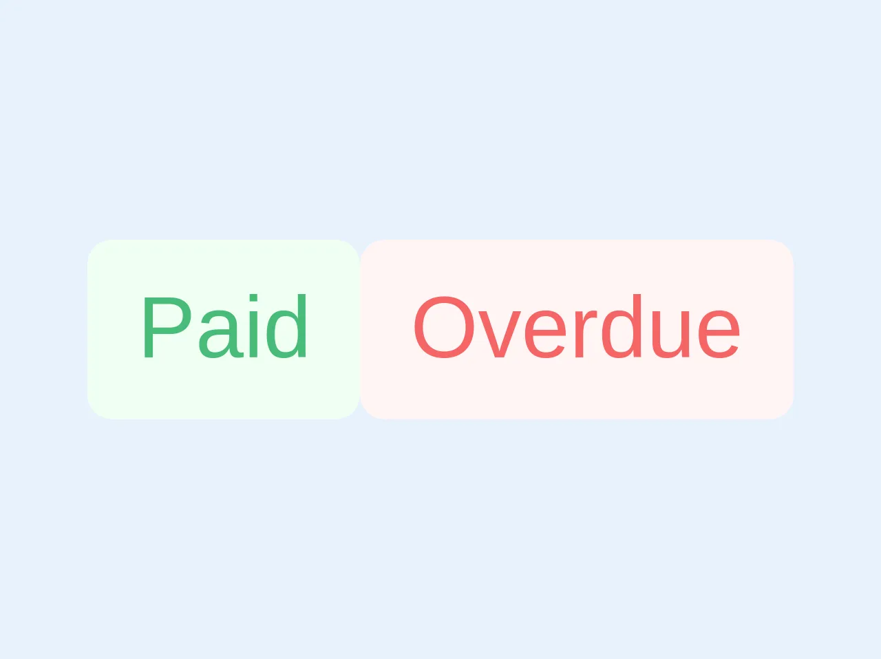
The preview of Label-Tag UI component
To create a Label-Tag UI component with Tailwind CSS, we will use the following classes:
bg-gray-200: sets the background color of the component to gray.text-gray-700: sets the text color of the component to gray.rounded-full: rounds the corners of the component.px-2: adds padding to the left and right of the component.py-1: adds padding to the top and bottom of the component.
Free download of the Label-Tag's source code
The source code of Label-Tag UI component
To create a Label-Tag UI component with Tailwind CSS, you can use the following HTML and CSS code:
<span class="text-sm font-medium bg-green-100 py-1 px-2 rounded text-green-500 align-middle">Paid</span>
<span class="text-sm font-medium bg-red-100 py-1 px-2 rounded text-red-500 align-middle">Overdue</span>
How to create a Label-Tag with Tailwind CSS?
To create a Label-Tag UI component with Tailwind CSS, follow these steps:
- Create a new HTML file and add the following code:
<div class="bg-gray-200 text-gray-700 rounded-full px-2 py-1">
  <span>Label</span>
  <span class="ml-1">Tag</span>
</div>
Save the file and open it in your browser. You should see a Label-Tag UI component with a gray background, gray text color, and rounded corners.
To customize the component's design, you can modify the classes used in the HTML code. For example, you can change the background color to blue by using the
bg-blue-200class.
<div class="bg-blue-200 text-gray-700 rounded-full px-2 py-1">
  <span>Label</span>
  <span class="ml-1">Tag</span>
</div>
Save the file and open it in your browser. You should see a Label-Tag UI component with a blue background, gray text color, and rounded corners.
You can also customize the component's design by modifying the Tailwind CSS configuration file. For example, you can change the default background color of the component by adding the following code to the configuration file:
module.exports = {
  theme: {
    extend: {
      backgroundColor: {
        'label-tag': '#F6E05E',
      },
    },
  },
  variants: {},
  plugins: [],
};
- Save the configuration file and restart your development server. The Label-Tag UI component should now have a yellow background color.
Conclusion
In this article, we have shown you how to create a Label-Tag UI component with Tailwind CSS. Tailwind CSS is an excellent choice for creating custom designs without writing any CSS code. With its pre-defined classes and customization options, you can create beautiful UI components quickly and easily. We hope this guide has been helpful to you, and we encourage you to explore Tailwind CSS further.