- Published on
Ultimate Guide: Build A Job Card With Tailwind CSS
- What is Tailwind CSS?
- The description of Job Card UI component
- Why use Tailwind CSS to create a Job Card UI component?
- The preview of Job Card UI component
- The source code of Job Card UI component
- How to create a Job Card with Tailwind CSS?
- Step 1: Set up the HTML structure
- Step 2: Style the Job Card UI component
- Step 3: Style the Job Card header
- Step 4: Style the Job Card body
- Step 5: Make the Job Card responsive
- Conclusion
As a FrontEnd technology blogger, it's essential to keep up with the latest trends in web development. Tailwind CSS is a popular utility-first CSS framework that has gained popularity among developers. In this article, we will explore how to build a Job Card UI component using Tailwind CSS.
What is Tailwind CSS?
Tailwind CSS is a utility-first CSS framework that provides a set of pre-defined CSS classes to help you build responsive and customizable user interfaces. Unlike other CSS frameworks, Tailwind CSS doesn't come with pre-built components. Instead, it provides a set of low-level utility classes that you can use to build your own custom components.
The description of Job Card UI component
A Job Card is a UI component that displays information about a job opening. It typically includes the job title, company name, location, and a brief description of the job. Job Cards are commonly used in job listing websites and job boards.
Why use Tailwind CSS to create a Job Card UI component?
Tailwind CSS provides a set of pre-defined utility classes that make it easy to create custom UI components. Using Tailwind CSS, you can quickly style your Job Card with minimal CSS code. It also provides responsive classes that allow you to create a responsive Job Card that adapts to different screen sizes.
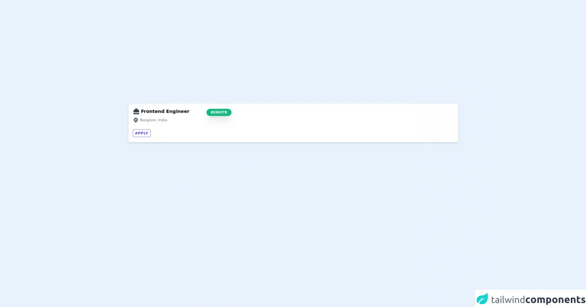
The preview of Job Card UI component
To give you an idea of what we will be building, here's a preview of the Job Card UI component we will create:
Free download of the Job Card's source code
The source code of Job Card UI component
Before we dive into the code, let's take a look at the HTML structure of the Job Card UI component:
<div class="rounded-md w-full bg-white px-4 py-4 shadow-md transition transform duration-500 cursor-pointer">
  <div class="flex flex-col justify-start">
    <div class="flex justify-between items-center w-96">
      <div class="text-lg font-semibold text-bookmark-blue flex space-x-1 items-center mb-2">
        <svg class="w-7 h-7 text-gray-700" fill="currentColor" viewBox="0 0 20 20" xmlns="http://www.w3.org/2000/svg">
          <path fillRule="evenodd" d="M6 6V5a3 3 0 013-3h2a3 3 0 013 3v1h2a2 2 0 012 2v3.57A22.952 22.952 0 0110 13a22.95 22.95 0 01-8-1.43V8a2 2 0 012-2h2zm2-1a1 1 0 011-1h2a1 1 0 011 1v1H8V5zm1 5a1 1 0 011-1h.01a1 1 0 110 2H10a1 1 0 01-1-1z" clipRule="evenodd" />
          <path d="M2 13.692V16a2 2 0 002 2h12a2 2 0 002-2v-2.308A24.974 24.974 0 0110 15c-2.796 0-5.487-.46-8-1.308z" />
        </svg>
        <span>Frontend Engineer</span>
      </div>
      <span class="bg-green-500 rounded-full uppercase text-white text-sm px-4 py-1 font-bold shadow-xl"> Remote </span>
    </div>
    <div class="text-sm text-gray-500 flex space-x-1 items-center">
      <svg class="w-6 h-6" fill="currentColor" viewBox="0 0 20 20" xmlns="http://www.w3.org/2000/svg">
        <path fillRule="evenodd" d="M5.05 4.05a7 7 0 119.9 9.9L10 18.9l-4.95-4.95a7 7 0 010-9.9zM10 11a2 2 0 100-4 2 2 0 000 4z" clipRule="evenodd" />
      </svg>
      <span>Banglore, India</span>
    </div>
    <div>
      <div class="mt-5">
        <button class="mr-2 my-1 uppercase tracking-wider px-2 text-indigo-600 border-indigo-600 hover:bg-indigo-600 hover:text-white border text-sm font-semibold rounded py-1 transition transform duration-500 cursor-pointer">Apply</button>
      </div>
    </div>
  </div>
</div>
How to create a Job Card with Tailwind CSS?
Now that we have an understanding of what a Job Card is and why we should use Tailwind CSS to create it, let's dive into the code and create our Job Card UI component.
Step 1: Set up the HTML structure
The first step is to set up the HTML structure for our Job Card. We will use a div element with a class of job-card to wrap our Job Card content. Inside the job-card div, we will create a div element with a class of job-card-header to display the job title and company name. We will also create a div element with a class of job-card-body to display the job location and job description.
<div class="job-card">
  <div class="job-card-header">
    <h2 class="text-lg font-semibold">Job Title</h2>
    <p class="text-gray-500">Company Name</p>
  </div>
  <div class="job-card-body">
    <p class="text-gray-500">Location</p>
    <p class="text-sm">Job Description</p>
  </div>
</div>
Step 2: Style the Job Card UI component
Now that we have our HTML structure in place, we can start styling our Job Card UI component using Tailwind CSS. We will use the bg-white, shadow-md, and rounded-md classes to give our Job Card a white background, a shadow, and rounded corners. We will also use the p-4 class to add padding to our Job Card.
<div class="job-card bg-white shadow-md rounded-md p-4">
  <div class="job-card-header">
    <h2 class="text-lg font-semibold">Job Title</h2>
    <p class="text-gray-500">Company Name</p>
  </div>
  <div class="job-card-body">
    <p class="text-gray-500">Location</p>
    <p class="text-sm">Job Description</p>
  </div>
</div>
Step 3: Style the Job Card header
Next, we will style the Job Card header. We will use the flex and justify-between classes to display the job title and company name on the same line and space them evenly. We will also use the text-lg and font-semibold classes to make the job title bold and larger.
<div class="job-card bg-white shadow-md rounded-md p-4">
  <div class="job-card-header flex justify-between">
    <h2 class="text-lg font-semibold">Job Title</h2>
    <p class="text-gray-500">Company Name</p>
  </div>
  <div class="job-card-body">
    <p class="text-gray-500">Location</p>
    <p class="text-sm">Job Description</p>
  </div>
</div>
Step 4: Style the Job Card body
Finally, we will style the Job Card body. We will use the text-gray-500 class to make the location text gray and the text-sm class to make the job description text smaller.
<div class="job-card bg-white shadow-md rounded-md p-4">
  <div class="job-card-header flex justify-between">
    <h2 class="text-lg font-semibold">Job Title</h2>
    <p class="text-gray-500">Company Name</p>
  </div>
  <div class="job-card-body">
    <p class="text-gray-500">Location</p>
    <p class="text-sm">Job Description</p>
  </div>
</div>
Step 5: Make the Job Card responsive
To make our Job Card responsive, we will use Tailwind CSS's responsive classes. We will use the flex-col class to stack the job title and company name on top of each other on small screens. We will also use the text-center class to center the job title and company name on small screens.
<div class="job-card bg-white shadow-md rounded-md p-4 sm:flex sm:flex-col">
  <div class="job-card-header flex justify-between sm:flex-col sm:text-center">
    <h2 class="text-lg font-semibold">Job Title</h2>
    <p class="text-gray-500">Company Name</p>
  </div>
  <div class="job-card-body">
    <p class="text-gray-500">Location</p>
    <p class="text-sm">Job Description</p>
  </div>
</div>
Conclusion
In this article, we explored how to build a Job Card UI component using Tailwind CSS. We learned what Tailwind CSS is, why we should use it to create a Job Card UI component, and how to create a Job Card UI component step by step. With Tailwind CSS's pre-defined utility classes, we can create custom UI components quickly and easily.