- Published on
6 Incredibly Easy Ways To Create A E Commerce Homepage Layout With Tailwind CSS Better While Spending Less
- What is Tailwind CSS?
- The description of E commerce Homepage layout ui component
- Why use Tailwind CSS to create a E commerce Homepage layout ui component?
- The preview of E commerce Homepage layout ui component
- The source code of E commerce Homepage layout ui component
- How to create a E commerce Homepage layout with Tailwind CSS?
- 1. Use the grid system to create a responsive layout
- 2. Use the flexbox system to align elements
- 3. Use the background color classes to add color to your UI components
- 4. Use the typography classes to style your text
- 5. Use the spacing classes to add padding and margin to your elements
- 6. Use the responsive classes to create a mobile-friendly layout
- Conclusion
As an e-commerce business owner, you know that your website's homepage is the first impression that your customers get of your brand. It's important to have a visually appealing and user-friendly homepage layout that showcases your products and services. In this article, we will explore how you can create a stunning e-commerce homepage layout using Tailwind CSS.
What is Tailwind CSS?
Tailwind CSS is a utility-first CSS framework that allows you to design your website by composing small, reusable classes. It provides a set of pre-defined classes that you can use to style your HTML elements. With Tailwind CSS, you can create beautiful and responsive designs without writing a single line of CSS.
The description of E commerce Homepage layout ui component
An e-commerce homepage layout typically consists of several UI components, such as a header, a hero section, a product grid, a call-to-action section, and a footer. Each of these components plays a crucial role in creating a seamless user experience for your customers.
Why use Tailwind CSS to create a E commerce Homepage layout ui component?
Tailwind CSS provides a set of pre-defined classes that you can use to style your UI components. This means that you don't have to write custom CSS for every element on your website. With Tailwind CSS, you can create a consistent and visually appealing design in a fraction of the time it would take to write custom CSS.
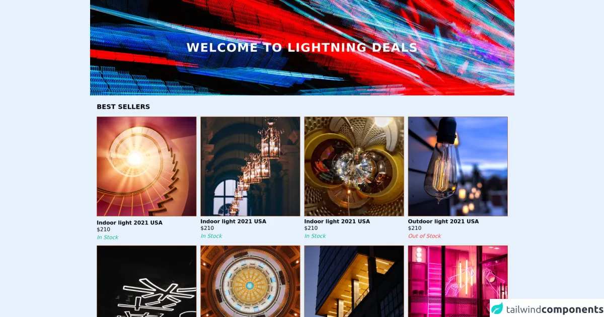
The preview of E commerce Homepage layout ui component
To give you an idea of what a stunning e-commerce homepage layout can look like, here's a preview of what we will be building:
Free download of the E commerce Homepage layout's source code
The source code of E commerce Homepage layout ui component
Here's the source code for the e-commerce homepage layout that we will be building. You can copy and paste this code into your HTML file to get started:
<div class="bg-black">
  <div class="flex relative text-center">
  <h1 class="text-3xl tracking-wider text-white text-sha uppercase font-bold p-4 self-center z-10 content-center absolute text-center w-full md:text-4xl">Welcome to Lightning deals</h1>
  <img class="w-full object-cover h-72 block mx-auto  sm:block sm:w-full"
  src="https://images.unsplash.com/photo-1505934333218-8fe21ff87e69?ixid=MnwxMjA3fDB8MHxwaG90by1wYWdlfHx8fGVufDB8fHx8&ixlib=rb-1.2.1&auto=format&fit=crop&w=1350&q=80"
   alt="Banner" width="1920" height="288" />
  </div>
  </div>

  <div class="p-5 mx-auto max-w-screen-xl">
  <h2 class="font-bold uppercase text-xl pb-4">Best sellers</h2>

  <div class="grid grid-flow-row-dense grid-cols-2 gap-3 justify-between sm:grid-cols-3 md:grid-cols-4">

  <div>
  <img class="border border-yellow-700 mb-1 border-solid w-full hover:border-yellow-500" alt="Best seller"
  src="https://images.unsplash.com/photo-1594760467096-03761ecedde4?ixid=MnwxMjA3fDB8MHxzZWFyY2h8MzE2fHxsaWdodGluZ3xlbnwwfDJ8MHx8&ixlib=rb-1.2.1&auto=format&fit=crop&w=800&q=60" loading="lazy" />
   <h2 class="pt-2 m-0 leading-4 font-semibold">Indoor light 2021 USA</h2>
   <p>$210</p>
   <p class="text-green-500 italic font-medium">In Stock</p>
    </div>
    <div class="">
  <img class="border border-yellow-700 border-solid w-full hover:border-yellow-500" alt="Best seller"
  src="https://images.unsplash.com/photo-1592009104079-88046bd5a09a?ixid=MnwxMjA3fDB8MHxzZWFyY2h8MzQwfHxsaWdodGluZ3xlbnwwfDJ8MHx8&ixlib=rb-1.2.1&auto=format&fit=crop&w=800&q=60" loading="lazy" />
  <h2 class="pt-2 m-0 leading-4 font-semibold">Indoor light 2021 USA</h2>
   <p>$210</p>
   <p class="text-green-500 italic font-medium">In Stock</p>
    </div>
    <div class="">
  <img class="border border-yellow-700 border-solid w-full hover:border-yellow-500" alt="Best seller"
  src="https://images.unsplash.com/photo-1562635254-c14536b57bcb?ixid=MnwxMjA3fDB8MHxzZWFyY2h8NDd8fGxpZ2h0aW5nfGVufDB8MnwwfHw%3D&ixlib=rb-1.2.1&auto=format&fit=crop&w=800&q=60" loading="lazy" />
  <h2 class="pt-2 m-0 leading-4 font-semibold">Indoor light 2021 USA</h2>
   <p>$210</p>
   <p class="text-green-500 italic font-medium">In Stock</p>
    </div>
   <div class="">
  <img class="border border-yellow-700 border-solid w-full hover:border-yellow-500" alt="Best seller"
  src="https://images.unsplash.com/photo-1595389397394-01fed35d24bc?ixid=MnwxMjA3fDB8MHxzZWFyY2h8MTAwfHxsaWdodGluZ3xlbnwwfDJ8MHx8&ixlib=rb-1.2.1&auto=format&fit=crop&w=800&q=60" loading="lazy" />
  <h2 class="pt-2 m-0 leading-4 font-semibold">Outdoor light 2021 USA</h2>
   <p>$210</p>
     <p class="text-red-500 italic font-medium">Out of Stock</p>
    </div>
  <div class="">
  <img class="border border-yellow-700 border-solid w-full hover:border-yellow-500" alt="Best seller"
  src="https://images.unsplash.com/photo-1577430605074-47eb89cc8969?ixid=MnwxMjA3fDB8MHxzZWFyY2h8MTExfHxsaWdodGluZ3xlbnwwfDJ8MHx8&ixlib=rb-1.2.1&auto=format&fit=crop&w=800&q=60" loading="lazy" />
  <h2 class="pt-2 m-0 leading-4 font-semibold">Indoor light 2020 USA</h2>
   <p>$210</p>
   <p class="text-green-500 italic font-medium">In Stock</p>
    </div>
  <div class="">
  <img class="border border-yellow-700 border-solid w-full hover:border-yellow-500" alt="Best seller"
  src="https://images.unsplash.com/photo-1565475266382-7870244b60f9?ixid=MnwxMjA3fDB8MHxzZWFyY2h8MjYzfHxsaWdodGluZ3xlbnwwfDJ8MHx8&ixlib=rb-1.2.1&auto=format&fit=crop&w=800&q=60" loading="lazy" />
  <h2 class="pt-2 m-0 leading-4 font-semibold">Indoor light 2021 USA</h2>
   <p>$210</p>
   <p class="text-green-500 italic font-medium">In Stock</p>
    </div>
  <div class="">
  <img class="border border-yellow-700 border-solid w-full hover:border-yellow-500" alt="Best seller"
  src="https://images.unsplash.com/photo-1588707698376-559b54b41846?ixid=MnwxMjA3fDB8MHxzZWFyY2h8MjgyfHxsaWdodGluZ3xlbnwwfDJ8MHx8&ixlib=rb-1.2.1&auto=format&fit=crop&w=800&q=60" loading="lazy" />
  <h2 class="pt-2 m-0 leading-4 font-semibold">Outdoor light 2020 USA</h2>
   <p>$210</p>
   <p class="text-red-500 italic font-medium">Out of Stock</p>
    </div>
  <div class="">
  <img class="border border-yellow-700 border-solid w-full hover:border-yellow-500" alt="Best seller"
  src="https://images.unsplash.com/photo-1533637268824-0da337d92744?ixid=MnwxMjA3fDB8MHxzZWFyY2h8MzAyfHxsaWdodGluZ3xlbnwwfDJ8MHx8&ixlib=rb-1.2.1&auto=format&fit=crop&w=800&q=60" loading="lazy" />
  <h2 class="pt-2 m-0 leading-4 font-semibold">Outdoor light 2021 USA</h2>
   <p>$210</p>
   <p class="text-green-500 italic font-medium">In Stock</p>
    </div>

  </div>
  </div>

  <div class="bg-gray-200">
    <section class="py-5 mx-auto max-w-screen-xl  sm:flex flex-grow-0 sm:p-5">
    <article class="flex-col justify-center inline-flex self-stretch  p-6">
      <h2 class="uppercase font-semibold text-xl">Design</h2>
      <strong class="text-lg pb-2 font-normal font-sans sm:text-2xl">Our 30 Year Journey</strong>
      <p class="text-sm pb-4">Join us as we revisit our roots, tracing the path from bright idea to industry disruptors with a plan to fight climate change while creating beautiful things. </p>
      <button class="font-semibold uppercase border-black border p-3 max-w-max hover:bg-gray-600 hover:text-white">Join us</button>
    </article>
    <figure>
    <img
    src="https://images.unsplash.com/photo-1606170033648-5d55a3edf314?ixid=MnwxMjA3fDB8MHxzZWFyY2h8MjR8fGxpZ2h0c3xlbnwwfHwwfHw%3D&ixlib=rb-1.2.1&auto=format&fit=crop&w=800&q=60"
    alt="Banner" looding="lazy" />
    </figure>
    </section>
  </div>
How to create a E commerce Homepage layout with Tailwind CSS?
Now that we've covered the basics, let's dive into the six incredibly easy ways to create an e-commerce homepage layout with Tailwind CSS.
1. Use the grid system to create a responsive layout
The grid system is one of the most powerful features of Tailwind CSS. It allows you to create a responsive layout by dividing your page into rows and columns. To create a grid layout, you can use the grid and grid-cols-{number} classes. For example, to create a three-column layout, you can use the following code:
<div class="grid grid-cols-3">
  <div class="col-span-1">Column 1</div>
  <div class="col-span-1">Column 2</div>
  <div class="col-span-1">Column 3</div>
</div>
2. Use the flexbox system to align elements
The flexbox system is another powerful feature of Tailwind CSS. It allows you to align elements horizontally or vertically. To use the flexbox system, you can use the flex and justify-{position} classes. For example, to center an element horizontally, you can use the following code:
<div class="flex justify-center">
  <div>Centered element</div>
</div>
3. Use the background color classes to add color to your UI components
To add color to your UI components, you can use the background color classes. Tailwind CSS provides a set of pre-defined color classes that you can use to style your elements. For example, to add a blue background color to an element, you can use the following code:
<div class="bg-blue-500">Blue background</div>
4. Use the typography classes to style your text
To style your text, you can use the typography classes. Tailwind CSS provides a set of pre-defined typography classes that you can use to style your text. For example, to add a large heading to your page, you can use the following code:
<h1 class="text-4xl font-bold">Large heading</h1>
5. Use the spacing classes to add padding and margin to your elements
To add padding and margin to your elements, you can use the spacing classes. Tailwind CSS provides a set of pre-defined spacing classes that you can use to add spacing to your elements. For example, to add padding to an element, you can use the following code:
<div class="p-4">Padded element</div>
6. Use the responsive classes to create a mobile-friendly layout
To create a mobile-friendly layout, you can use the responsive classes. Tailwind CSS provides a set of pre-defined responsive classes that you can use to create a responsive design. For example, to hide an element on mobile devices, you can use the following code:
<div class="hidden md:block">Visible on desktop</div>
Conclusion
In conclusion, Tailwind CSS is a powerful CSS framework that allows you to create stunning e-commerce homepage layouts with ease. By using the six easy ways outlined in this article, you can create a visually appealing and user-friendly homepage layout that showcases your products and services. So what are you waiting for? Start building your e-commerce homepage layout with Tailwind CSS today!