- Published on
How To Make A Item Review With Tailwind CSS In 5 Easy Steps
- What is Tailwind CSS?
- The description of Item Review UI component
- Why use Tailwind CSS to create an Item Review UI component?
- The preview of Item Review UI component
- The source code of Item Review UI component
- How to create an Item Review with Tailwind CSS?
- Step 1: Set up the HTML structure
- Step 2: Add Tailwind CSS to your project
- Step 3: Style the HTML elements with Tailwind CSS classes
- Step 4: Customize the design with Tailwind CSS
- Step 5: Preview and test your Item Review UI component
- Conclusion
As a FrontEnd technology blogger, I have come across many CSS frameworks, but Tailwind CSS is one of my favorites. Tailwind CSS is a utility-first CSS framework that allows you to create custom designs easily and quickly. In this article, we will learn how to create an Item Review UI component with Tailwind CSS in 5 easy steps.
What is Tailwind CSS?
Tailwind CSS is a utility-first CSS framework that provides a set of pre-defined classes that can be used to create custom designs. It is designed to be highly customizable and flexible, allowing developers to create unique designs without having to write custom CSS.
The description of Item Review UI component
An Item Review UI component is a common feature in many e-commerce websites. It is a section on the product page that allows customers to leave a review and rate the product. The Item Review UI component typically includes a star rating system, a comment section, and a submit button.
Why use Tailwind CSS to create an Item Review UI component?
Tailwind CSS provides a set of pre-defined classes that can be used to create custom designs easily and quickly. This makes it an ideal choice for creating UI components like the Item Review. Additionally, Tailwind CSS is highly customizable, which means that you can easily modify the design to match your website's branding.
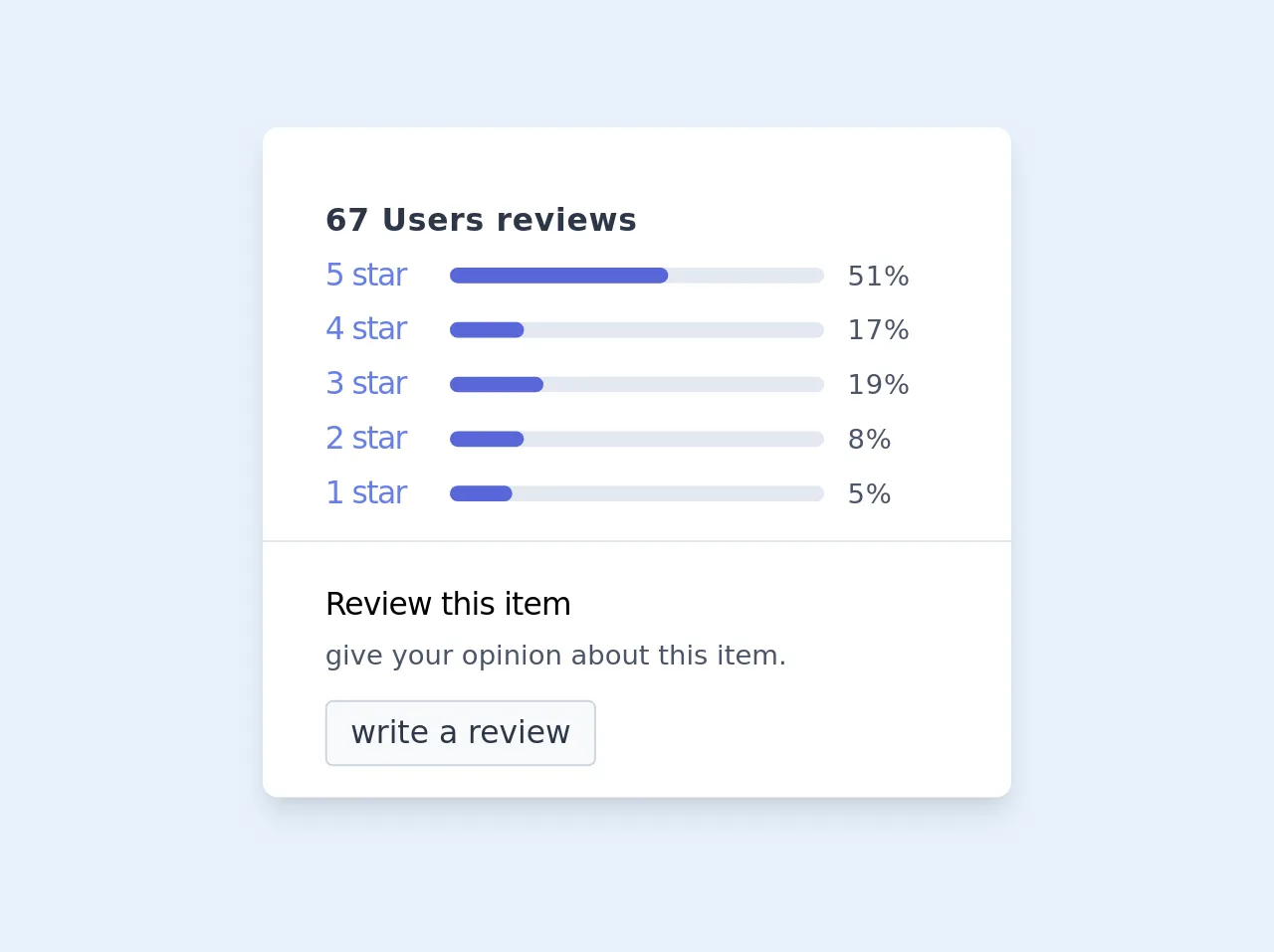
The preview of Item Review UI component
To give you an idea of what the Item Review UI component will look like, here is a preview:
Free download of the Item Review's source code
The source code of Item Review UI component
Here is the source code for the Item Review UI component:
<!-- review item -->
<div class="mx-auto bg-white shadow-lg rounded-lg my-32 px-4 py-4 max-w-sm ">
   <div class="mb-1 tracking-wide px-4 py-4" >
      <h2 class="text-gray-800 font-semibold mt-1">67 Users reviews</h2>
      <div class="border-b -mx-8 px-8 pb-3">
         <div class="flex items-center mt-1">
            <div class=" w-1/5 text-indigo-500 tracking-tighter">
               <span>5 star</span>
            </div>
            <div class="w-3/5">
               <div class="bg-gray-300 w-full rounded-lg h-2">
                  <div class=" w-7/12 bg-indigo-600 rounded-lg h-2"></div>
               </div>
            </div>
            <div class="w-1/5 text-gray-700 pl-3">
               <span class="text-sm">51%</span>
            </div>
         </div><!-- first -->
         <div class="flex items-center mt-1">
            <div class="w-1/5 text-indigo-500 tracking-tighter">
               <span>4 star</span>
            </div>
            <div class="w-3/5">
               <div class="bg-gray-300 w-full rounded-lg h-2">
                  <div class="w-1/5 bg-indigo-600 rounded-lg h-2"></div>
               </div>
            </div>
            <div class="w-1/5 text-gray-700 pl-3">
               <span class="text-sm">17%</span>
            </div>
         </div><!-- second -->
         <div class="flex items-center mt-1">
            <div class="w-1/5 text-indigo-500 tracking-tighter">
               <span>3 star</span>
            </div>
            <div class="w-3/5">
               <div class="bg-gray-300 w-full rounded-lg h-2">
                  <div class=" w-3/12 bg-indigo-600 rounded-lg h-2"></div>
               </div>
            </div>
            <div class="w-1/5 text-gray-700 pl-3">
               <span class="text-sm">19%</span>
            </div>
         </div><!-- thierd -->
         <div class="flex items-center mt-1">
            <div class=" w-1/5 text-indigo-500 tracking-tighter">
               <span>2 star</span>
            </div>
            <div class="w-3/5">
               <div class="bg-gray-300 w-full rounded-lg h-2">
                  <div class=" w-1/5 bg-indigo-600 rounded-lg h-2"></div>
               </div>
            </div>
            <div class="w-1/5 text-gray-700 pl-3">
               <span class="text-sm">8%</span>
            </div>
         </div><!-- 4th -->
         <div class="flex items-center mt-1">
            <div class="w-1/5 text-indigo-500 tracking-tighter">
               <span>1 star</span>
            </div>
            <div class="w-3/5">
               <div class="bg-gray-300 w-full rounded-lg h-2">
                  <div class=" w-2/12 bg-indigo-600 rounded-lg h-2"></div>
               </div>
            </div>
            <div class="w-1/5 text-gray-700 pl-3">
               <span class="text-sm">5%</span>
            </div>
         </div><!-- 5th -->
      </div>
   </div>
   <div class="w-full px-4">
      <h3 class="font-medium tracking-tight">Review this item</h3>
      <p class="text-gray-700 text-sm py-1">
         give your opinion about this item.
      </p>
      <button class="bg-gray-100 border border-gray-400 px-3 py-1 rounded  text-gray-800 mt-2">write a review</button>
   </div>
</div>
How to create an Item Review with Tailwind CSS?
Now that we have an idea of what the Item Review UI component looks like and what the source code is, let's dive into the steps to create it.
Step 1: Set up the HTML structure
The first step is to set up the HTML structure. We will create a simple form that includes a star rating system, a comment section, and a submit button. Here is the HTML code:
<div class="flex flex-col space-y-4">
  <h2 class="text-lg font-medium">Leave a review</h2>
  <div class="flex items-center space-x-2">
    <input type="radio" id="star5" name="rating" value="5" class="hidden" />
    <label for="star5" class="text-yellow-400 cursor-pointer">
      <svg class="w-6 h-6 fill-current" viewBox="0 0 24 24">
        <path
          d="M12 17.27l5.74 3.44c.84.5 1.86-.38 1.5-1.3l-1.8-5.62 4.8-3.48c.98-.71.46-2.14-.82-2.14H15.6l-2.48-5.1c-.45-.92-2.02-.92-2.47 0l-2.48 5.1H2.88c-1.28 0-1.8 1.43-.82 2.14l4.8 3.48-1.8 5.62c-.36.92.66 1.8 1.5 1.3L12 17.27z"
        />
      </svg>
    </label>
    <input type="radio" id="star4" name="rating" value="4" class="hidden" />
    <label for="star4" class="text-yellow-400 cursor-pointer">
      <svg class="w-6 h-6 fill-current" viewBox="0 0 24 24">
        <path
          d="M12 17.27l5.74 3.44c.84.5 1.86-.38 1.5-1.3l-1.8-5.62 4.8-3.48c.98-.71.46-2.14-.82-2.14H15.6l-2.48-5.1c-.45-.92-2.02-.92-2.47 0l-2.48 5.1H2.88c-1.28 0-1.8 1.43-.82 2.14l4.8 3.48-1.8 5.62c-.36.92.66 1.8 1.5 1.3L12 17.27z"
        />
      </svg>
    </label>
    <input type="radio" id="star3" name="rating" value="3" class="hidden" />
    <label for="star3" class="text-yellow-400 cursor-pointer">
      <svg class="w-6 h-6 fill-current" viewBox="0 0 24 24">
        <path
          d="M12 17.27l5.74 3.44c.84.5 1.86-.38 1.5-1.3l-1.8-5.62 4.8-3.48c.98-.71.46-2.14-.82-2.14H15.6l-2.48-5.1c-.45-.92-2.02-.92-2.47 0l-2.48 5.1H2.88c-1.28 0-1.8 1.43-.82 2.14l4.8 3.48-1.8 5.62c-.36.92.66 1.8 1.5 1.3L12 17.27z"
        />
      </svg>
    </label>
    <input type="radio" id="star2" name="rating" value="2" class="hidden" />
    <label for="star2" class="text-yellow-400 cursor-pointer">
      <svg class="w-6 h-6 fill-current" viewBox="0 0 24 24">
        <path
          d="M12 17.27l5.74 3.44c.84.5 1.86-.38 1.5-1.3l-1.8-5.62 4.8-3.48c.98-.71.46-2.14-.82-2.14H15.6l-2.48-5.1c-.45-.92-2.02-.92-2.47 0l-2.48 5.1H2.88c-1.28 0-1.8 1.43-.82 2.14l4.8 3.48-1.8 5.62c-.36.92.66 1.8 1.5 1.3L12 17.27z"
        />
      </svg>
    </label>
    <input type="radio" id="star1" name="rating" value="1" class="hidden" />
    <label for="star1" class="text-yellow-400 cursor-pointer">
      <svg class="w-6 h-6 fill-current" viewBox="0 0 24 24">
        <path
          d="M12 17.27l5.74 3.44c.84.5 1.86-.38 1.5-1.3l-1.8-5.62 4.8-3.48c.98-.71.46-2.14-.82-2.14H15.6l-2.48-5.1c-.45-.92-2.02-.92-2.47 0l-2.48 5.1H2.88c-1.28 0-1.8 1.43-.82 2.14l4.8 3.48-1.8 5.62c-.36.92.66 1.8 1.5 1.3L12 17.27z"
        />
      </svg>
    </label>
  </div>
  <textarea
    class="border border-gray-300 rounded-md p-2"
    placeholder="Write your review here..."
  ></textarea>
  <button
    class="bg-blue-500 hover:bg-blue-700 text-white font-bold py-2 px-4 rounded"
  >
    Submit
  </button>
</div>
Step 2: Add Tailwind CSS to your project
The next step is to add Tailwind CSS to your project. You can either download the CSS file and add it to your project, or you can use a package manager like npm to install it. Once you have added Tailwind CSS to your project, you can start using its pre-defined classes.
Step 3: Style the HTML elements with Tailwind CSS classes
Now that we have set up the HTML structure and added Tailwind CSS to our project, we can start styling the HTML elements using Tailwind CSS classes. Here is the CSS code:
/* Star rating system */
input[type="radio"]:checked + label svg {
  fill: #ffc107;
}

/* Submit button */
button:hover {
  background-color: #3b82f6;
}

/* Textarea */
textarea:focus {
  border-color: #3b82f6;
  outline: none;
}
Step 4: Customize the design with Tailwind CSS
Tailwind CSS provides a set of pre-defined classes that you can use to customize the design of your Item Review UI component. For example, you can change the color of the star rating system by using the text-yellow-400 class. You can also change the background color of the submit button by using the bg-blue-500 class.
Step 5: Preview and test your Item Review UI component
The final step is to preview and test your Item Review UI component. Make sure that it looks and works as expected. If there are any issues, go back and make the necessary changes.
Conclusion
In this article, we learned how to create an Item Review UI component with Tailwind CSS in 5 easy steps. Tailwind CSS is a powerful CSS framework that allows you to create custom designs easily and quickly. By following these steps, you can create a beautiful and functional Item Review UI component for your e-commerce website.