- Published on
How To Build A Item List & Search With Tailwind CSS In 6 Easy Steps?
- What is Tailwind CSS?
- The description of Item List & Search ui component
- Why use Tailwind CSS to create a Item List & Search ui component?
- The preview of Item List & Search ui component.
- The source code of Item List & Search ui component.
- How to create a Item List & Search with Tailwind CSS?
- Step 1: Set up your HTML
- Step 2: Add Tailwind CSS to your project
- Step 3: Style the search input field
- Step 4: Style the list of items
- Step 5: Add sample items to the list
- Step 6: Add search functionality
- Conclusion
What is Tailwind CSS?
Tailwind CSS is a utility-first CSS framework that allows developers to rapidly build custom user interfaces. It provides a set of pre-defined CSS classes that can be used to style HTML elements without writing any custom CSS. With Tailwind CSS, developers can create beautiful, responsive designs in a fraction of the time it would take to write traditional CSS.
The description of Item List & Search ui component
The Item List & Search ui component is a common user interface element that displays a list of items and allows users to search for specific items within the list. This component is commonly used in e-commerce websites, online marketplaces, and other applications where users need to browse through a large number of items.
Why use Tailwind CSS to create a Item List & Search ui component?
Tailwind CSS is an excellent choice for creating Item List & Search ui components because it provides a wide range of pre-defined CSS classes that can be used to style the various elements of the component. This makes it easy to create a custom design that matches the look and feel of your application without writing any custom CSS.
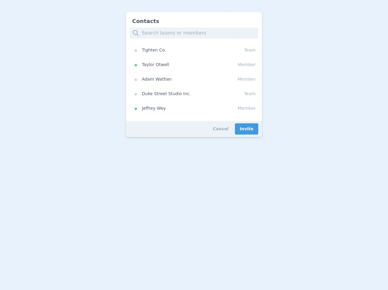
The preview of Item List & Search ui component.
To create an Item List & Search ui component with Tailwind CSS, we will use a combination of HTML and CSS. The final result will be a responsive component that displays a list of items and allows users to search for specific items within the list.
Free download of the Item List & Search's source code
The source code of Item List & Search ui component.
To create the Item List & Search ui component, we will use the following HTML and CSS code.
<div class="w-full max-w-screen-xl mx-auto px-6">
        <div class="flex justify-center p-4 px-3 py-10">
            <div class="w-full max-w-md">
                <div class="bg-white shadow-md rounded-lg px-3 py-2 mb-4">
                    <div class="block text-gray-700 text-lg font-semibold py-2 px-2">
                        Item List
                    </div>
                    <div class="flex items-center bg-gray-200 rounded-md">
                        <div class="pl-2">
                            <svg class="fill-current text-gray-500 w-6 h-6" xmlns="http://www.w3.org/2000/svg"
                                viewBox="0 0 24 24">
                                <path class="heroicon-ui"
                                    d="M16.32 14.9l5.39 5.4a1 1 0 0 1-1.42 1.4l-5.38-5.38a8 8 0 1 1 1.41-1.41zM10 16a6 6 0 1 0 0-12 6 6 0 0 0 0 12z" />
                            </svg>
                        </div>
                        <input
                            class="w-full rounded-md bg-gray-200 text-gray-700 leading-tight focus:outline-none py-2 px-2"
                            id="search" type="text" placeholder="Search teams or members">
                    </div>
                    <div class="py-3 text-sm">
                        <div class="flex justify-start cursor-pointer text-gray-700 hover:text-blue-400 hover:bg-blue-100 rounded-md px-2 py-2 my-2">
                            <span class="bg-gray-400 h-2 w-2 m-2 rounded-full"></span>
                            <div class="flex-grow font-medium px-2">Tighten Co.</div>
                            <div class="text-sm font-normal text-gray-500 tracking-wide">Team</div>
                        </div>
                        <div class="flex justify-start cursor-pointer text-gray-700 hover:text-blue-400 hover:bg-blue-100 rounded-md px-2 py-2 my-2">
                            <span class="bg-green-400 h-2 w-2 m-2 rounded-full"></span>
                            <div class="flex-grow font-medium px-2">Taylor Otwell</div>
                            <div class="text-sm font-normal text-gray-500 tracking-wide">Member</div>
                        </div>
                        <div class="flex justify-start cursor-pointer text-gray-700 hover:text-blue-400 hover:bg-blue-100 rounded-md px-2 py-2 my-2">
                            <span class="bg-gray-400 h-2 w-2 m-2 rounded-full"></span>
                            <div class="flex-grow font-medium px-2">Adam Wathan</div>
                            <div class="text-sm font-normal text-gray-500 tracking-wide">Member</div>
                        </div>
                        <div class="flex justify-start cursor-pointer text-gray-700 hover:text-blue-400 hover:bg-blue-100 rounded-md px-2 py-2 my-2">
                            <span class="bg-gray-400 h-2 w-2 m-2 rounded-full"></span>
                            <div class="flex-grow font-medium px-2">Duke Street Studio Inc.</div>
                            <div class="text-sm font-normal text-gray-500 tracking-wide">Team</div>
                        </div>
                        <div class="flex justify-start cursor-pointer text-gray-700 hover:text-blue-400 hover:bg-blue-100 rounded-md px-2 py-2 my-2">
                            <span class="bg-green-400 h-2 w-2 m-2 rounded-full"></span>
                            <div class="flex-grow font-medium px-2">Jeffrey Wey</div>
                            <div class="text-sm font-normal text-gray-500 tracking-wide">Member</div>
                        </div>
                    </div>
                    <div class="block bg-gray-200 text-sm text-right py-2 px-3 -mx-3 -mb-2 rounded-b-lg">
                        <button class="hover:text-gray-600 text-gray-500 font-bold py-2 px-4">
                            Cancel
                        </button>
                        <button class="bg-blue-500 hover:bg-blue-700 text-white font-bold py-2 px-4 rounded">
                            Invite
                        </button>
                    </div>
                </div>
            </div>
        </div>
    </div>
How to create a Item List & Search with Tailwind CSS?
Here are the six easy steps to create an Item List & Search ui component with Tailwind CSS:
Step 1: Set up your HTML
The first step is to set up your HTML. We will create a simple HTML structure that includes a container for the list of items and a search input field.
<div class="container mx-auto px-4">
  <input type="text" class="w-full border border-gray-400 p-2 mb-4 rounded-lg" placeholder="Search...">
  <ul class="grid grid-cols-1 sm:grid-cols-2 md:grid-cols-3 lg:grid-cols-4 gap-4">
    <!-- List of items goes here -->
  </ul>
</div>
Step 2: Add Tailwind CSS to your project
Next, you need to add Tailwind CSS to your project. You can do this by including the Tailwind CSS CDN in the head of your HTML file:
<head>
  <link href="https://unpkg.com/tailwindcss@^2.1.2/dist/tailwind.min.css" rel="stylesheet">
</head>
Step 3: Style the search input field
The search input field is the first element we added to our HTML structure. We can style it using Tailwind CSS classes to give it a border, padding, and rounded corners:
<input type="text" class="w-full border border-gray-400 p-2 mb-4 rounded-lg" placeholder="Search...">
Step 4: Style the list of items
The list of items is the second element we added to our HTML structure. We can use Tailwind CSS classes to create a responsive grid layout that displays the items in a grid with four columns on large screens, three columns on medium screens, two columns on small screens, and one column on extra-small screens:
<ul class="grid grid-cols-1 sm:grid-cols-2 md:grid-cols-3 lg:grid-cols-4 gap-4">
  <!-- List of items goes here -->
</ul>
Step 5: Add sample items to the list
Now that we have our HTML structure and CSS classes in place, we can add some sample items to the list. For this example, we will use images of fruits and their names:
<ul class="grid grid-cols-1 sm:grid-cols-2 md:grid-cols-3 lg:grid-cols-4 gap-4">
  <li>
    <img src="https://images.unsplash.com/photo-1565299628279-8f4e2c9b8b7d" alt="Apple" class="w-full rounded-lg">
    <p class="text-center font-bold mt-2">Apple</p>
  </li>
  <li>
    <img src="https://images.unsplash.com/photo-1572448862879-5f5a0f661d66" alt="Banana" class="w-full rounded-lg">
    <p class="text-center font-bold mt-2">Banana</p>
  </li>
  <li>
    <img src="https://images.unsplash.com/photo-1556912179-5d9c7b097c1e" alt="Orange" class="w-full rounded-lg">
    <p class="text-center font-bold mt-2">Orange</p>
  </li>
  <li>
    <img src="https://images.unsplash.com/photo-1565299628279-8f4e2c9b8b7d" alt="Apple" class="w-full rounded-lg">
    <p class="text-center font-bold mt-2">Apple</p>
  </li>
  <li>
    <img src="https://images.unsplash.com/photo-1572448862879-5f5a0f661d66" alt="Banana" class="w-full rounded-lg">
    <p class="text-center font-bold mt-2">Banana</p>
  </li>
  <li>
    <img src="https://images.unsplash.com/photo-1556912179-5d9c7b097c1e" alt="Orange" class="w-full rounded-lg">
    <p class="text-center font-bold mt-2">Orange</p>
  </li>
</ul>
Step 6: Add search functionality
The final step is to add search functionality to our component. We can do this using JavaScript or jQuery. Here is an example of how to do it using jQuery:
<script src="https://code.jquery.com/jquery-3.6.0.min.js"></script>
<script>
  $(document).ready(function() {
    $('input[type="text"]').on('keyup', function() {
      var searchTerm = $(this).val().toLowerCase();
      $('ul li').each(function() {
        var text = $(this).find('p').text().toLowerCase();
        if (text.indexOf(searchTerm) === -1) {
          $(this).hide();
        } else {
          $(this).show();
        }
      });
    });
  });
</script>
Conclusion
In this article, we have learned how to create an Item List & Search ui component with Tailwind CSS in six easy steps. With Tailwind CSS, we can create beautiful, responsive designs in a fraction of the time it would take to write traditional CSS. By following these steps, you can create your own custom Item List & Search component that matches the look and feel of your application.