- Published on
The 5 Really Obvious Ways To Build A Item Card With Tailwind CSS Better That You Ever Did
- What is Tailwind CSS?
- The description of Item card ui component
- Why use Tailwind CSS to create a Item card ui component?
- The preview of Item card ui component
- The source code of Item card ui component
- How to create a Item card with Tailwind CSS?
- Step 1: Set up your HTML
- Step 2: Add Tailwind CSS classes
- Step 3: Customize the styles
- Conclusion
What is Tailwind CSS?
Tailwind CSS is a utility-first CSS framework that helps developers to quickly build custom user interfaces. It provides a set of pre-defined classes that can be used to style HTML elements without writing any CSS code. With Tailwind CSS, you can create responsive and mobile-first designs that are easy to maintain and customize.
The description of Item card ui component
An item card is a UI component that displays information about a product, service, or any other item. It typically includes an image, a title, a description, and some additional details such as price, rating, and availability. Item cards are commonly used in e-commerce websites, online marketplaces, and social media platforms to showcase products and services.
Why use Tailwind CSS to create a Item card ui component?
Tailwind CSS is a great choice for creating item cards because it provides a set of pre-defined classes that can be used to style each element of the card. By using Tailwind CSS, you can easily customize the layout, typography, colors, and spacing of the item card without writing any custom CSS code. This makes it much faster and easier to create item cards that look great and are consistent with the rest of your UI.
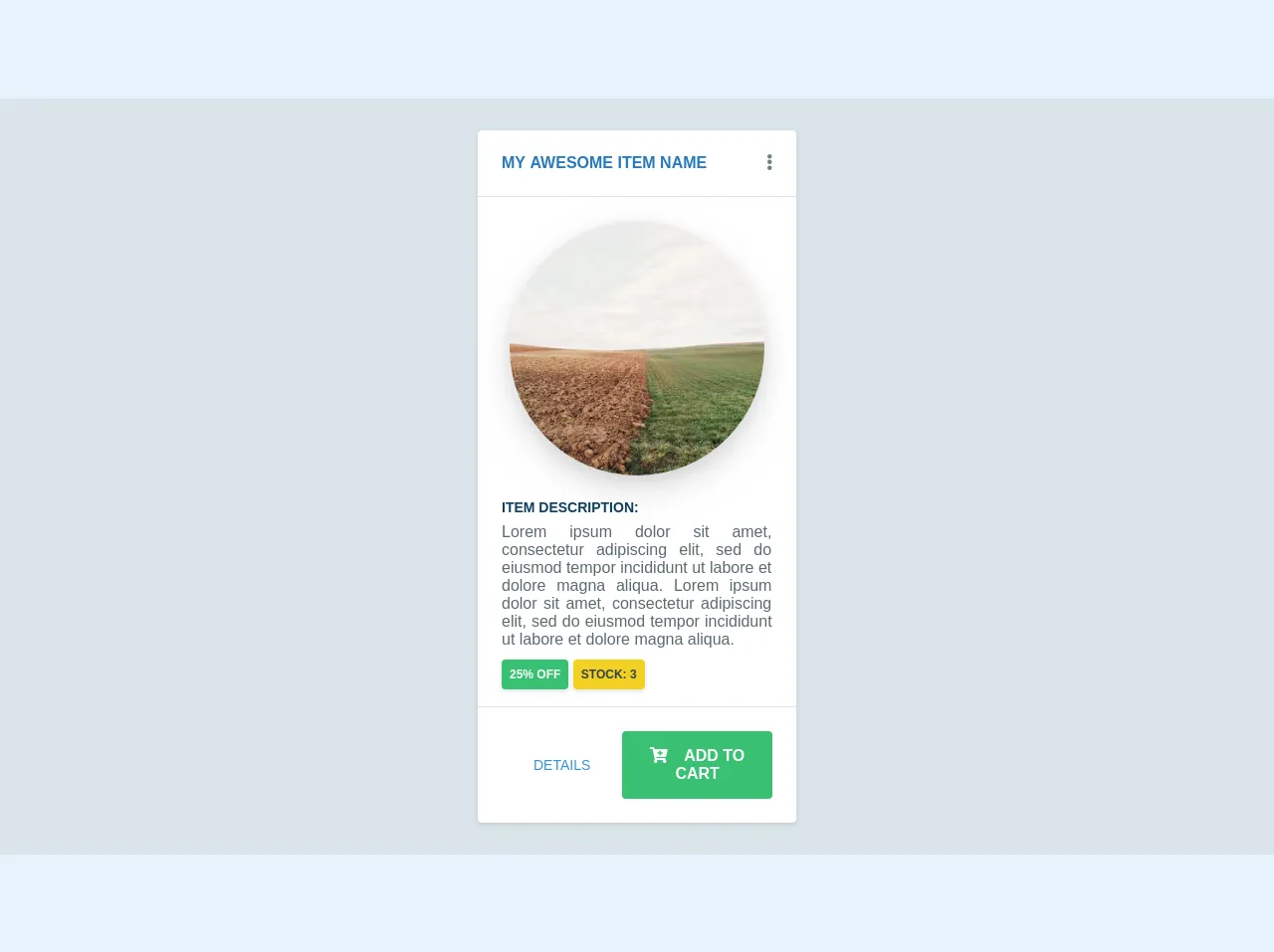
The preview of Item card ui component
To give you an idea of what an item card looks like, here's a preview:
Free download of the Item card's source code
The source code of Item card ui component
Here's the HTML and CSS code for a basic item card:
<html>
  <head>
    <style>
      .duration-4 {
       transition-duration: 0.4s;
      }
    </style>
    <link rel="stylesheet" href="https://use.fontawesome.com/releases/v5.8.1/css/all.css" integrity="sha384-50oBUHEmvpQ+1lW4y57PTFmhCaXp0ML5d60M1M7uH2+nqUivzIebhndOJK28anvf" crossorigin="anonymous">
  </head>
  <body>
  <div class="bg-grey-light py-8 w-full flex justify-center items-center">
    <div class="bg-white rounded w-1/4 shadow hover:shadow-md duration-4">
      <div class="flex flex-row justify-between uppercase font-bold text-blue-dark border-b p-6">
        <p>My awesome item name<p>
        <div class="cursor-pointer text-grey-dark hover:text-blue duration-4"><i class="fas fa-ellipsis-v"></i></div>
      </div>
      <div class="p-6 text-grey-darker text-justify flex flex-col">
        <img src="https://picsum.photos/300/300" alt="Some image" class="w-64 flex self-center rounded-full shadow-lg mb-6">
        <p class="font-bold text-sm uppercase mb-2 text-blue-darker">Item description:<p>
        <span class="text-grey-darker">
          Lorem ipsum dolor sit amet, consectetur adipiscing elit, sed do eiusmod tempor incididunt ut labore et dolore magna aliqua.
          Lorem ipsum dolor sit amet, consectetur adipiscing elit, sed do eiusmod tempor incididunt ut labore et dolore magna aliqua.
        </span>
        <div class="pt-4">
          <span class="uppercase bg-green text-white font-bold p-2 text-xs shadow rounded">25% off</span>
          <span class="uppercase bg-yellow-dark text-grey-darkest font-bold p-2 text-xs shadow rounded">stock: 3</span>
        </div>
      </div>
      <div class="p-6 text-grey-darker text-justify flex flex-row justify-end border-t">
        <button class="uppercase self-end text-blue mx-8 text-sm hover:text-blue-dark duration-4 self-center">details</button>
        <button class="uppercase self-end bg-green font-bold text-white px-6 py-4 rounded hover:bg-green-dark duration-4"><i class="fa fa-cart-plus mr-4"></i>Add to cart</button>
      </div>
     </div>
  </div>
  </body>
</html>
How to create a Item card with Tailwind CSS?
Now that you know why Tailwind CSS is a great choice for creating item cards, let's take a look at how to create one.
Step 1: Set up your HTML
The first step is to set up your HTML. Start by creating a container element that will hold your item card. Inside the container, create the elements for the image, title, description, and additional details. Here's an example:
<div class="max-w-xs rounded overflow-hidden shadow-lg">
  <img class="w-full" src="item.jpg" alt="Item">
  <div class="px-6 py-4">
    <div class="font-bold text-xl mb-2">Item Title</div>
    <p class="text-gray-700 text-base">Item description goes here.</p>
  </div>
  <div class="px-6 py-4">
    <span class="inline-block bg-gray-200 rounded-full px-3 py-1 text-sm font-semibold text-gray-700 mr-2">Price</span>
    <span class="inline-block bg-gray-200 rounded-full px-3 py-1 text-sm font-semibold text-gray-700 mr-2">Rating</span>
    <span class="inline-block bg-gray-200 rounded-full px-3 py-1 text-sm font-semibold text-gray-700">Availability</span>
  </div>
</div>
Step 2: Add Tailwind CSS classes
Once you have your HTML set up, you can start adding Tailwind CSS classes to style each element of the item card. Here's an example of how to add classes to the HTML:
<div class="max-w-xs rounded overflow-hidden shadow-lg">
  <img class="w-full" src="item.jpg" alt="Item">
  <div class="px-6 py-4">
    <div class="font-bold text-xl mb-2">Item Title</div>
    <p class="text-gray-700 text-base">Item description goes here.</p>
  </div>
  <div class="px-6 py-4">
    <span class="inline-block bg-gray-200 rounded-full px-3 py-1 text-sm font-semibold text-gray-700 mr-2">Price</span>
    <span class="inline-block bg-gray-200 rounded-full px-3 py-1 text-sm font-semibold text-gray-700 mr-2">Rating</span>
    <span class="inline-block bg-gray-200 rounded-full px-3 py-1 text-sm font-semibold text-gray-700">Availability</span>
  </div>
</div>
Step 3: Customize the styles
Finally, you can customize the styles of the item card by modifying the Tailwind CSS classes or adding your own custom classes. Here are some examples of how to customize the styles:
<div class="max-w-xs rounded overflow-hidden shadow-lg">
  <img class="w-full" src="item.jpg" alt="Item">
  <div class="px-6 py-4">
    <div class="font-bold text-xl mb-2 text-blue-500">Item Title</div>
    <p class="text-gray-700 text-base">Item description goes here.</p>
  </div>
  <div class="px-6 py-4">
    <span class="inline-block bg-blue-500 rounded-full px-3 py-1 text-sm font-semibold text-white mr-2">Price</span>
    <span class="inline-block bg-blue-500 rounded-full px-3 py-1 text-sm font-semibold text-white mr-2">Rating</span>
    <span class="inline-block bg-blue-500 rounded-full px-3 py-1 text-sm font-semibold text-white">Availability</span>
  </div>
</div>
In this example, we've changed the color of the title and the additional details to blue, and we've changed the text color and background color of the details to white and blue, respectively.
Conclusion
Item cards are a common UI component that can be used to display information about products, services, or any other items. With Tailwind CSS, you can easily create item cards that are responsive, customizable, and easy to maintain. By following the steps outlined in this article, you can create item cards that look great and are consistent with the rest of your UI.