- Published on
3 Things You Must Know To Make A IOS Switches With Tailwind CSS
- What is Tailwind CSS?
- The description of iOS switches UI component
- Why use Tailwind CSS to create an iOS switches UI component?
- The preview of iOS switches UI component
- The source code of iOS switches UI component
- How to create an iOS switches with Tailwind CSS?
- Step 1: Set up your HTML
- Step 2: Style the track and thumb
- Step 3: Style the labels
- Conclusion
If you're looking to create an iOS switches UI component, you'll need to have a good understanding of CSS and HTML. Fortunately, Tailwind CSS can make the process much easier. In this article, we'll discuss three things you must know to make an iOS switches UI component with Tailwind CSS.
What is Tailwind CSS?
Tailwind CSS is a utility-first CSS framework that makes it easy to create responsive and customizable UI components. It provides a set of pre-defined CSS classes that you can use to style your HTML elements. With Tailwind CSS, you can create complex UI components without writing any custom CSS.
The description of iOS switches UI component
An iOS switch is a UI component that allows users to toggle between two states. It's commonly used in mobile apps to turn features on or off. The switch consists of a track, a thumb, and two labels that indicate the on and off states.
Why use Tailwind CSS to create an iOS switches UI component?
Tailwind CSS provides a set of pre-defined CSS classes that you can use to create an iOS switches UI component quickly. You don't need to write any custom CSS, which can save you a lot of time and effort. Additionally, Tailwind CSS is highly customizable, so you can easily tweak the styles to match your design requirements.
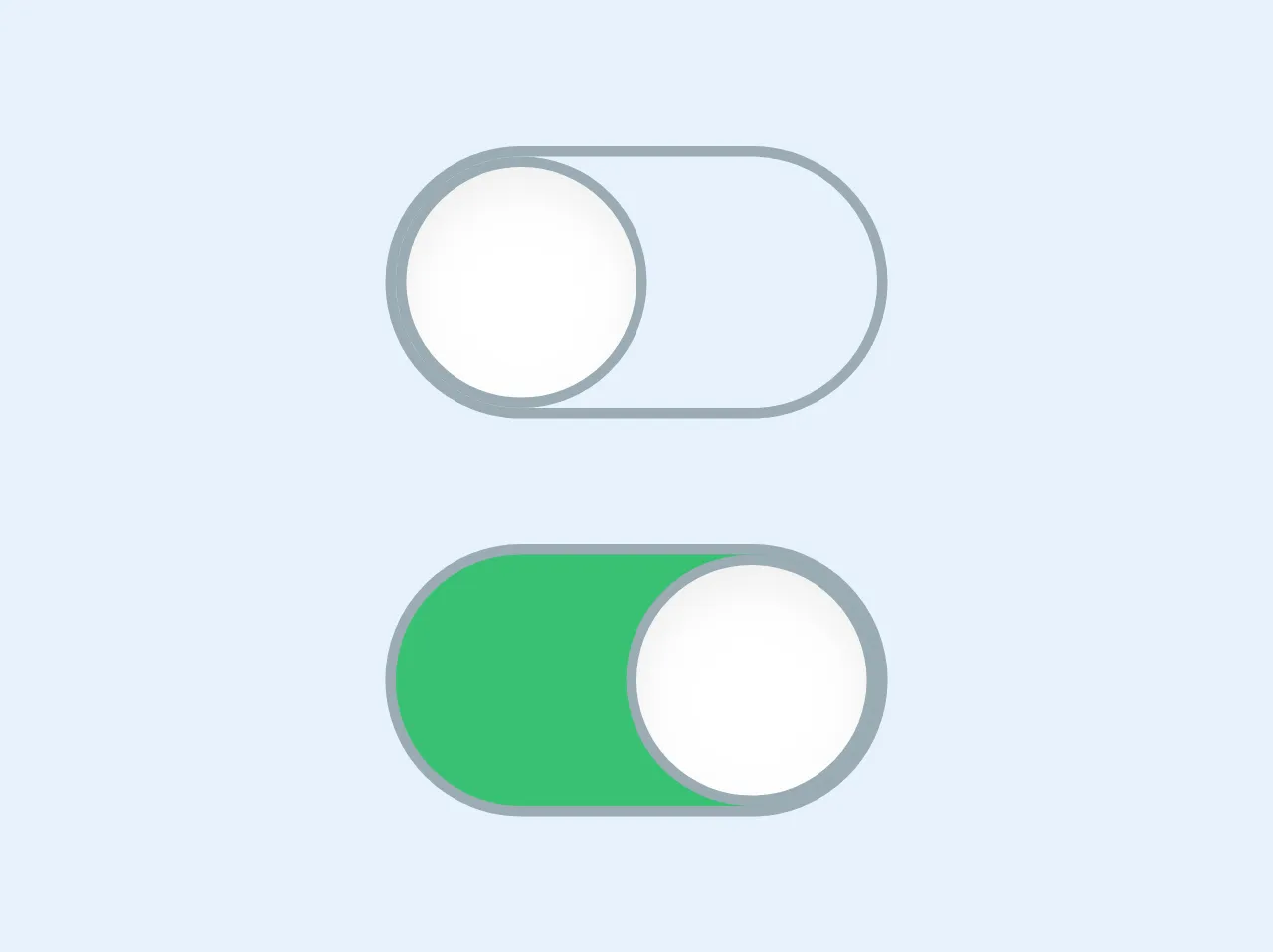
The preview of iOS switches UI component
To create an iOS switches UI component with Tailwind CSS, you'll need to use a combination of CSS classes to style your HTML elements. Here's a preview of what the final result will look like:
Free download of the iOS switches's source code
The source code of iOS switches UI component
To create the iOS switches UI component, you'll need to use a combination of HTML and CSS. Here's the source code for the component:
<div class="flex flex-col justify-between h-16">


  <!------- off ----->

  <span class="border rounded-full border-grey flex items-center cursor-pointer w-12 justify-start">
    <span class="rounded-full border w-6 h-6 border-grey shadow-inner bg-white shadow">
    </span>
  </span>


  <!------- on ----->

  <span class="border rounded-full border-grey flex items-center cursor-pointer w-12 bg-green justify-end">
    <span class="rounded-full border w-6 h-6 border-grey shadow-inner bg-white shadow">
    </span>
  </span>


</div>
How to create an iOS switches with Tailwind CSS?
Now that you have an idea of what an iOS switches UI component looks like and why you should use Tailwind CSS to create it, let's dive into the steps you need to follow to create the component.
Step 1: Set up your HTML
The first step is to set up your HTML. You'll need to create a container element for the switch and add two labels for the on and off states. Here's an example:
<div class="relative inline-block w-10 mr-2 align-middle select-none transition duration-200 ease-in">
  <input type="checkbox" name="toggle" id="toggle" class="toggle-checkbox absolute block w-6 h-6 rounded-full bg-white border-4 appearance-none cursor-pointer" />
  <label for="toggle" class="toggle-label block overflow-hidden h-6 rounded-full bg-gray-300 cursor-pointer"></label>
</div>
<label for="toggle" class="text-xs text-gray-700">Toggle me</label>
<label for="toggle" class="text-xs text-gray-700">Off</label>
<label for="toggle" class="text-xs text-gray-700">On</label>
Step 2: Style the track and thumb
The next step is to style the track and thumb of the switch. You'll need to use the .toggle-checkbox and .toggle-label classes to style the input element and the label element, respectively. Here's an example:
.toggle-checkbox:checked + .toggle-label {
  background-color: #4dc3ff;
}

.toggle-checkbox:focus + .toggle-label {
  box-shadow: 0 0 0 2px rgba(77, 194, 255, 0.4);
}

.toggle-checkbox:checked + .toggle-label:before {
  transform: translateX(5.5rem);
}

.toggle-label:before {
  content: "";
  display: block;
  width: 1.5rem;
  height: 1.5rem;
  margin-left: -0.75rem;
  margin-top: -0.25rem;
  background-color: #fff;
  border-radius: 50%;
  transition: transform 0.2s ease-in-out;
}
Step 3: Style the labels
The final step is to style the labels for the on and off states. You'll need to use the .text-gray-700 class to set the color of the labels. Here's an example:
label[for="toggle"] {
  margin-left: 0.5rem;
}

label[for="toggle"]:last-of-type {
  margin-left: 1.5rem;
}

label[for="toggle"]:first-of-type {
  margin-right: 1.5rem;
}

label[for="toggle"]:last-of-type,
label[for="toggle"]:first-of-type {
  color: #a0aec0;
}

label[for="toggle"]:hover {
  cursor: pointer;
  text-decoration: underline;
}
Conclusion
Creating an iOS switches UI component with Tailwind CSS is easy, thanks to the pre-defined CSS classes that the framework provides. By following the steps outlined in this article, you can create a stylish and functional switch for your mobile app in no time.