- Published on
The Ninja Guide To How To Build A IOS Keyboard Clone (Light Mode) With Tailwind CSS Better
- What is Tailwind CSS?
- The description of iOS Keyboard Clone (Light Mode) ui component
- Why use Tailwind CSS to create an iOS Keyboard Clone (Light Mode) ui component?
- The preview of iOS Keyboard Clone (Light Mode) ui component
- The source code of iOS Keyboard Clone (Light Mode) ui component
- How to create a iOS Keyboard Clone (Light Mode) with Tailwind CSS?
- Step 1: Set up your project
- Step 2: Create the HTML structure
- Step 3: Style the component using Tailwind CSS
- Conclusion
As a FrontEnd technology blogger, it's important to stay up-to-date with the latest trends and tools. One such tool that has gained a lot of popularity in recent times is Tailwind CSS. In this article, we will explore how to use Tailwind CSS to create an iOS Keyboard Clone (Light Mode) ui component.
What is Tailwind CSS?
Tailwind CSS is a utility-first CSS framework that helps you quickly build custom user interfaces. It provides a set of pre-defined classes that you can use to style your HTML elements. With Tailwind CSS, you don't need to write custom CSS code for every element in your UI. Instead, you can use pre-defined classes to style your elements.
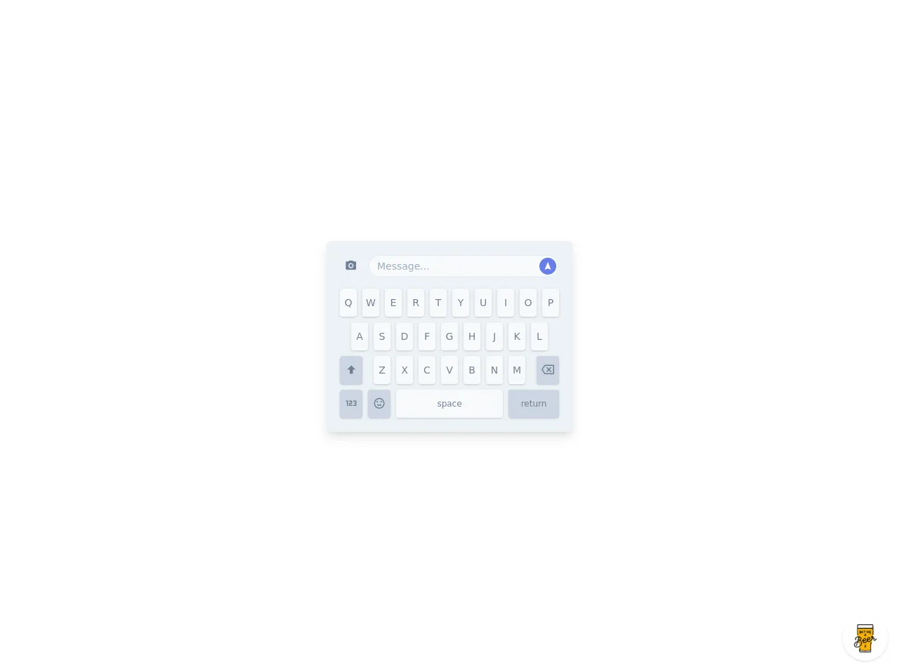
The description of iOS Keyboard Clone (Light Mode) ui component
The iOS Keyboard Clone (Light Mode) ui component is a replica of the iOS keyboard that you see on your iPhone. It has a sleek and modern design that looks great on any device. The component includes all the keys that you would find on an iOS keyboard, including letters, numbers, and symbols.
Why use Tailwind CSS to create an iOS Keyboard Clone (Light Mode) ui component?
Tailwind CSS provides a number of benefits when it comes to creating UI components. Here are some of the reasons why you should use Tailwind CSS to create an iOS Keyboard Clone (Light Mode) ui component:
- Efficiency: With Tailwind CSS, you can quickly style your UI components without having to write custom CSS code for every element.
- Consistency: Tailwind CSS provides a set of pre-defined classes that ensure consistency across your UI components.
- Flexibility: Tailwind CSS provides a wide range of classes that allow you to customize your UI components to meet your specific needs.
The preview of iOS Keyboard Clone (Light Mode) ui component
Free download of the iOS Keyboard Clone (Light Mode)'s source code
The source code of iOS Keyboard Clone (Light Mode) ui component
<style>
@import url(https://cdnjs.cloudflare.com/ajax/libs/MaterialDesign-Webfont/5.3.45/css/materialdesignicons.min.css);
</style>
<div class="min-w-screen min-h-screen bg-white flex items-center justify-center px-5 py-5">
    <div class="bg-gray-200 text-gray-600 text-sm rounded-lg shadow-lg overflow-hidden p-5">
        <div class="flex -mx-1">
            <div class="w-10 px-1 mb-4">
                <button class="block w-full h-8 hover:text-indigo-500 focus:outline-none text-center leading-none">
                    <i class="mdi mdi-camera text-lg"></i>
                </button>
            </div>
            <div class="flex-1 px-1 mb-4 relative">
                <input type="text" class="w-full h-8 px-3 bg-gray-100 border focus:outline-none rounded-full" placeholder="Message...">
                <button class="absolute z-10 top-0 right-0 mt-1 mr-2 block w-6 h-6 rounded-full bg-indigo-500 hover:bg-indigo-600 text-white focus:outline-none text-center leading-none">
                    <i class="mdi mdi-navigation"></i>
                </button>
            </div>
        </div>
        <div class="flex -mx-1 justify-center">
            <div class="w-8 px-1 mb-2">
                <button class="block w-full h-10 rounded bg-gray-100 hover:bg-indigo-600 hover:text-white shadow focus:outline-none text-center leading-none">Q</button>
            </div>
            <div class="w-8 px-1 mb-2">
                <button class="block w-full h-10 rounded bg-gray-100 hover:bg-indigo-600 hover:text-white shadow focus:outline-none text-center leading-none">W</button>
            </div>
            <div class="w-8 px-1 mb-2">
                <button class="block w-full h-10 rounded bg-gray-100 hover:bg-indigo-600 hover:text-white shadow focus:outline-none text-center leading-none">E</button>
            </div>
            <div class="w-8 px-1 mb-2">
                <button class="block w-full h-10 rounded bg-gray-100 hover:bg-indigo-600 hover:text-white shadow focus:outline-none text-center leading-none">R</button>
            </div>
            <div class="w-8 px-1 mb-2">
                <button class="block w-full h-10 rounded bg-gray-100 hover:bg-indigo-600 hover:text-white shadow focus:outline-none text-center leading-none">T</button>
            </div>
            <div class="w-8 px-1 mb-2">
                <button class="block w-full h-10 rounded bg-gray-100 hover:bg-indigo-600 hover:text-white shadow focus:outline-none text-center leading-none">Y</button>
            </div>
            <div class="w-8 px-1 mb-2">
                <button class="block w-full h-10 rounded bg-gray-100 hover:bg-indigo-600 hover:text-white shadow focus:outline-none text-center leading-none">U</button>
            </div>
            <div class="w-8 px-1 mb-2">
                <button class="block w-full h-10 rounded bg-gray-100 hover:bg-indigo-600 hover:text-white shadow focus:outline-none text-center leading-none">I</button>
            </div>
            <div class="w-8 px-1 mb-2">
                <button class="block w-full h-10 rounded bg-gray-100 hover:bg-indigo-600 hover:text-white shadow focus:outline-none text-center leading-none">O</button>
            </div>
            <div class="w-8 px-1 mb-2">
                <button class="block w-full h-10 rounded bg-gray-100 hover:bg-indigo-600 hover:text-white shadow focus:outline-none text-center leading-none">P</button>
            </div>
        </div>
        <div class="flex -mx-1 justify-center">
            <div class="w-8 px-1 mb-2">
                <button class="block w-full h-10 rounded bg-gray-100 hover:bg-indigo-600 hover:text-white shadow focus:outline-none text-center leading-none">A</button>
            </div>
            <div class="w-8 px-1 mb-2">
                <button class="block w-full h-10 rounded bg-gray-100 hover:bg-indigo-600 hover:text-white shadow focus:outline-none text-center leading-none">S</button>
            </div>
            <div class="w-8 px-1 mb-2">
                <button class="block w-full h-10 rounded bg-gray-100 hover:bg-indigo-600 hover:text-white shadow focus:outline-none text-center leading-none">D</button>
            </div>
            <div class="w-8 px-1 mb-2">
                <button class="block w-full h-10 rounded bg-gray-100 hover:bg-indigo-600 hover:text-white shadow focus:outline-none text-center leading-none">F</button>
            </div>
            <div class="w-8 px-1 mb-2">
                <button class="block w-full h-10 rounded bg-gray-100 hover:bg-indigo-600 hover:text-white shadow focus:outline-none text-center leading-none">G</button>
            </div>
            <div class="w-8 px-1 mb-2">
                <button class="block w-full h-10 rounded bg-gray-100 hover:bg-indigo-600 hover:text-white shadow focus:outline-none text-center leading-none">H</button>
            </div>
            <div class="w-8 px-1 mb-2">
                <button class="block w-full h-10 rounded bg-gray-100 hover:bg-indigo-600 hover:text-white shadow focus:outline-none text-center leading-none">J</button>
            </div>
            <div class="w-8 px-1 mb-2">
                <button class="block w-full h-10 rounded bg-gray-100 hover:bg-indigo-600 hover:text-white shadow focus:outline-none text-center leading-none">K</button>
            </div>
            <div class="w-8 px-1 mb-2">
                <button class="block w-full h-10 rounded bg-gray-100 hover:bg-indigo-600 hover:text-white shadow focus:outline-none text-center leading-none">L</button>
            </div>
        </div>
        <div class="flex -mx-1">
            <div class="w-10 px-1 mb-2">
                <button class="block w-full h-10 rounded bg-gray-400 hover:bg-indigo-600 hover:text-white shadow focus:outline-none text-center leading-none">
                    <i class="mdi mdi-arrow-up-bold text-lg"></i>
                </button>
            </div>
            <div class="flex flex-1 justify-center">
                <div class="w-8 px-1 mb-2">
                    <button class="block w-full h-10 rounded bg-gray-100 hover:bg-indigo-600 hover:text-white shadow focus:outline-none text-center leading-none">Z</button>
                </div>
                <div class="w-8 px-1 mb-2">
                    <button class="block w-full h-10 rounded bg-gray-100 hover:bg-indigo-600 hover:text-white shadow focus:outline-none text-center leading-none">X</button>
                </div>
                <div class="w-8 px-1 mb-2">
                    <button class="block w-full h-10 rounded bg-gray-100 hover:bg-indigo-600 hover:text-white shadow focus:outline-none text-center leading-none">C</button>
                </div>
                <div class="w-8 px-1 mb-2">
                    <button class="block w-full h-10 rounded bg-gray-100 hover:bg-indigo-600 hover:text-white shadow focus:outline-none text-center leading-none">V</button>
                </div>
                <div class="w-8 px-1 mb-2">
                    <button class="block w-full h-10 rounded bg-gray-100 hover:bg-indigo-600 hover:text-white shadow focus:outline-none text-center leading-none">B</button>
                </div>
                <div class="w-8 px-1 mb-2">
                    <button class="block w-full h-10 rounded bg-gray-100 hover:bg-indigo-600 hover:text-white shadow focus:outline-none text-center leading-none">N</button>
                </div>
                <div class="w-8 px-1 mb-2">
                    <button class="block w-full h-10 rounded bg-gray-100 hover:bg-indigo-600 hover:text-white shadow focus:outline-none text-center leading-none">M</button>
                </div>
            </div>
            <div class="w-10 px-1 mb-2">
                <button class="block w-full h-10 rounded bg-gray-400 hover:bg-indigo-600 hover:text-white shadow focus:outline-none text-center leading-none">
                    <i class="mdi mdi-backspace-outline text-lg"></i>
                </button>
            </div>
        </div>
        <div class="flex -mx-1">
            <div class="w-10 px-1">
                <button class="block w-full h-10 rounded bg-gray-400 hover:bg-indigo-600 hover:text-white shadow focus:outline-none text-center leading-none">
                    <i class="mdi mdi-numeric text-lg"></i>
                </button>
            </div>
            <div class="w-10 px-1">
                <button class="block w-full h-10 rounded bg-gray-400 hover:bg-indigo-600 hover:text-white shadow focus:outline-none text-center leading-none">
                    <i class="mdi mdi-emoticon-happy-outline text-lg"></i>
                </button>
            </div>
            <div class="flex-1 px-1">
                <button class="block w-full h-10 rounded bg-gray-100 hover:bg-indigo-600 hover:text-white shadow focus:outline-none text-center leading-none text-xs">space</button>
            </div>
            <div class="w-20 px-1">
                <button class="block w-full h-10 rounded bg-gray-400 hover:bg-indigo-600 hover:text-white shadow focus:outline-none text-center leading-none text-xs">return</button>
            </div>
        </div>
    </div>
</div>

<!-- BUY ME A BEER AND HELP SUPPORT OPEN-SOURCE RESOURCES -->
<div class="flex items-end justify-end fixed bottom-0 right-0 mb-4 mr-4 z-10">
    <div>
        <a title="Buy me a beer" href="https://www.buymeacoffee.com/scottwindon" target="_blank" class="block w-16 h-16 rounded-full transition-all shadow hover:shadow-lg transform hover:scale-110 hover:rotate-12">
            <img class="object-cover object-center w-full h-full rounded-full" src="https://i.pinimg.com/originals/60/fd/e8/60fde811b6be57094e0abc69d9c2622a.jpg"/>
        </a>
    </div>
</div>
How to create a iOS Keyboard Clone (Light Mode) with Tailwind CSS?
Now that we have a basic understanding of Tailwind CSS and the iOS Keyboard Clone (Light Mode) ui component, let's dive into the steps involved in creating the component.
Step 1: Set up your project
The first step is to set up your project. You can create a new project using your preferred text editor or IDE. Once you have created your project, you need to add Tailwind CSS to your project. You can do this by installing Tailwind CSS using npm or by including the Tailwind CSS CDN in your HTML file.
Step 2: Create the HTML structure
The next step is to create the HTML structure for the iOS Keyboard Clone (Light Mode) ui component. You can use the following HTML code as a starting point:
<div class="keyboard">
  <div class="row">
    <div class="key">1</div>
    <div class="key">2</div>
    <div class="key">3</div>
    <div class="key">4</div>
    <div class="key">5</div>
    <div class="key">6</div>
    <div class="key">7</div>
    <div class="key">8</div>
    <div class="key">9</div>
    <div class="key">0</div>
  </div>
  <div class="row">
    <div class="key">q</div>
    <div class="key">w</div>
    <div class="key">e</div>
    <div class="key">r</div>
    <div class="key">t</div>
    <div class="key">y</div>
    <div class="key">u</div>
    <div class="key">i</div>
    <div class="key">o</div>
    <div class="key">p</div>
  </div>
  <div class="row">
    <div class="key">a</div>
    <div class="key">s</div>
    <div class="key">d</div>
    <div class="key">f</div>
    <div class="key">g</div>
    <div class="key">h</div>
    <div class="key">j</div>
    <div class="key">k</div>
    <div class="key">l</div>
  </div>
  <div class="row">
    <div class="key">shift</div>
    <div class="key">z</div>
    <div class="key">x</div>
    <div class="key">c</div>
    <div class="key">v</div>
    <div class="key">b</div>
    <div class="key">n</div>
    <div class="key">m</div>
    <div class="key">delete</div>
  </div>
  <div class="row">
    <div class="key">123</div>
    <div class="key">space</div>
    <div class="key">return</div>
  </div>
</div>
Step 3: Style the component using Tailwind CSS
The final step is to style the component using Tailwind CSS. You can use the following CSS code to style the component:
.keyboard {
  display: flex;
  flex-direction: column;
  background-color: #f2f2f7;
  padding: 10px;
  border-radius: 10px;
}

.row {
  display: flex;
  flex-direction: row;
  justify-content: space-between;
  margin-bottom: 10px;
}

.key {
  display: flex;
  justify-content: center;
  align-items: center;
  width: 40px;
  height: 40px;
  background-color: #ffffff;
  border-radius: 5px;
  box-shadow: 0px 2px 2px rgba(0, 0, 0, 0.25);
}

.key:hover {
  background-color: #e5e5ea;
}
Conclusion
In this article, we have explored how to use Tailwind CSS to create an iOS Keyboard Clone (Light Mode) ui component. We have discussed the benefits of using Tailwind CSS and provided a step-by-step guide to creating the component. With Tailwind CSS, you can quickly and easily create custom UI components that look great on any device.