- Published on
Build A IOS Keyboard Clone (Dark Mode) With Tailwind CSS Like A Pro With The Help Of These 6 Tips
- What is Tailwind CSS?
- The description of iOS Keyboard Clone (Dark Mode) UI component
- Why use Tailwind CSS to create an iOS Keyboard Clone (Dark Mode) UI component?
- The preview of iOS Keyboard Clone (Dark Mode) UI component
- The source code of iOS Keyboard Clone (Dark Mode) UI component
- How to create an iOS Keyboard Clone (Dark Mode) with Tailwind CSS?
- Step 1: Set up your project
- Step 2: Create the grid
- Step 3: Add the keys
- Step 4: Style the keys
- Step 5: Add the dark mode
- Step 6: Add the other keys
- Conclusion
If you are a front-end developer, you must have heard of Tailwind CSS. It is a utility-first CSS framework that allows you to build custom designs quickly. In this article, we will show you how to use Tailwind CSS to build an iOS Keyboard Clone (Dark Mode) UI component. We will also provide you with six tips that will help you build it like a pro.
What is Tailwind CSS?
Tailwind CSS is a utility-first CSS framework that provides you with a set of pre-defined CSS classes that you can use to style your HTML elements. It is designed to make it easy for you to build custom designs quickly. With Tailwind CSS, you don't have to write custom CSS code for every element on your page. Instead, you can use pre-defined classes to style your elements.
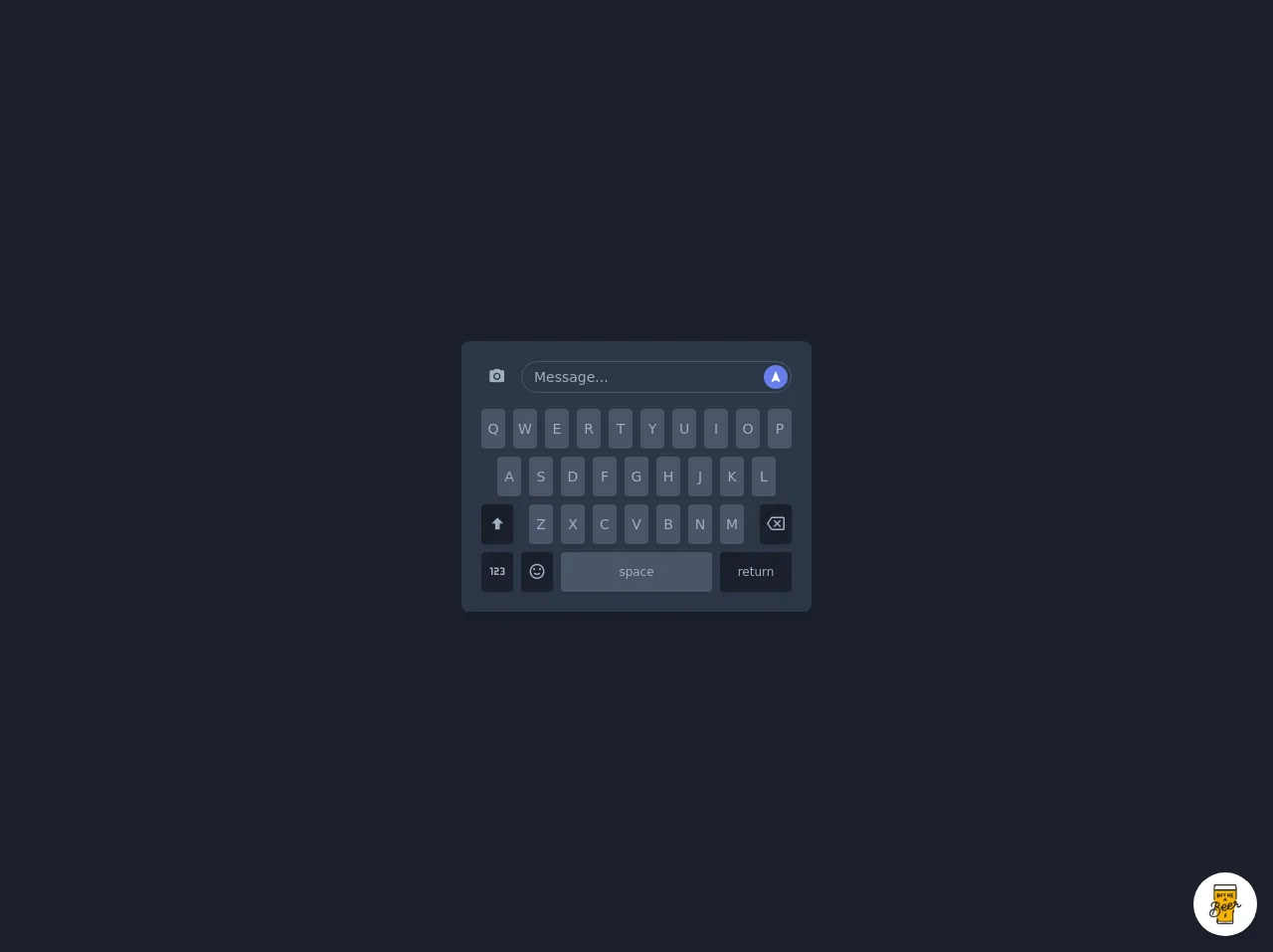
The description of iOS Keyboard Clone (Dark Mode) UI component
The iOS Keyboard Clone (Dark Mode) UI component is a replica of the iOS keyboard that is used on iPhones and iPads. It is a dark-themed keyboard that is designed to be used in low-light environments. The UI component consists of a set of keys that are arranged in a grid. Each key has a unique symbol or character on it.
Why use Tailwind CSS to create an iOS Keyboard Clone (Dark Mode) UI component?
Tailwind CSS is an excellent choice for building UI components like the iOS Keyboard Clone (Dark Mode). It provides you with a set of pre-defined classes that you can use to style your elements. This makes it easy for you to build custom designs quickly. With Tailwind CSS, you don't have to write custom CSS code for every element on your page. Instead, you can use pre-defined classes to style your elements.
The preview of iOS Keyboard Clone (Dark Mode) UI component
Free download of the iOS Keyboard Clone (Dark Mode)'s source code
The source code of iOS Keyboard Clone (Dark Mode) UI component
<style>
@import url(https://cdnjs.cloudflare.com/ajax/libs/MaterialDesign-Webfont/5.3.45/css/materialdesignicons.min.css);
</style>
<div class="min-w-screen min-h-screen bg-gray-900 flex items-center justify-center px-5 py-5">
    <div class="bg-gray-800 text-gray-500 text-sm rounded-lg shadow-lg overflow-hidden p-5">
        <div class="flex -mx-1">
            <div class="w-10 px-1 mb-4">
                <button class="block w-full h-8 hover:text-indigo-500 focus:outline-none text-center leading-none">
                    <i class="mdi mdi-camera text-lg"></i>
                </button>
            </div>
            <div class="flex-1 px-1 mb-4 relative">
                <input type="text" class="w-full h-8 px-3 bg-gray-800 border border-gray-700 focus:outline-none rounded-full" placeholder="Message...">
                <button class="absolute z-10 top-0 right-0 mt-1 mr-2 block w-6 h-6 rounded-full bg-indigo-500 hover:bg-indigo-600 text-white focus:outline-none text-center leading-none">
                    <i class="mdi mdi-navigation"></i>
                </button>
            </div>
        </div>
        <div class="flex -mx-1 justify-center">
            <div class="w-8 px-1 mb-2">
                <button class="block w-full h-10 rounded bg-gray-700 hover:bg-indigo-600 hover:text-white shadow focus:outline-none text-center leading-none">Q</button>
            </div>
            <div class="w-8 px-1 mb-2">
                <button class="block w-full h-10 rounded bg-gray-700 hover:bg-indigo-600 hover:text-white shadow focus:outline-none text-center leading-none">W</button>
            </div>
            <div class="w-8 px-1 mb-2">
                <button class="block w-full h-10 rounded bg-gray-700 hover:bg-indigo-600 hover:text-white shadow focus:outline-none text-center leading-none">E</button>
            </div>
            <div class="w-8 px-1 mb-2">
                <button class="block w-full h-10 rounded bg-gray-700 hover:bg-indigo-600 hover:text-white shadow focus:outline-none text-center leading-none">R</button>
            </div>
            <div class="w-8 px-1 mb-2">
                <button class="block w-full h-10 rounded bg-gray-700 hover:bg-indigo-600 hover:text-white shadow focus:outline-none text-center leading-none">T</button>
            </div>
            <div class="w-8 px-1 mb-2">
                <button class="block w-full h-10 rounded bg-gray-700 hover:bg-indigo-600 hover:text-white shadow focus:outline-none text-center leading-none">Y</button>
            </div>
            <div class="w-8 px-1 mb-2">
                <button class="block w-full h-10 rounded bg-gray-700 hover:bg-indigo-600 hover:text-white shadow focus:outline-none text-center leading-none">U</button>
            </div>
            <div class="w-8 px-1 mb-2">
                <button class="block w-full h-10 rounded bg-gray-700 hover:bg-indigo-600 hover:text-white shadow focus:outline-none text-center leading-none">I</button>
            </div>
            <div class="w-8 px-1 mb-2">
                <button class="block w-full h-10 rounded bg-gray-700 hover:bg-indigo-600 hover:text-white shadow focus:outline-none text-center leading-none">O</button>
            </div>
            <div class="w-8 px-1 mb-2">
                <button class="block w-full h-10 rounded bg-gray-700 hover:bg-indigo-600 hover:text-white shadow focus:outline-none text-center leading-none">P</button>
            </div>
        </div>
        <div class="flex -mx-1 justify-center">
            <div class="w-8 px-1 mb-2">
                <button class="block w-full h-10 rounded bg-gray-700 hover:bg-indigo-600 hover:text-white shadow focus:outline-none text-center leading-none">A</button>
            </div>
            <div class="w-8 px-1 mb-2">
                <button class="block w-full h-10 rounded bg-gray-700 hover:bg-indigo-600 hover:text-white shadow focus:outline-none text-center leading-none">S</button>
            </div>
            <div class="w-8 px-1 mb-2">
                <button class="block w-full h-10 rounded bg-gray-700 hover:bg-indigo-600 hover:text-white shadow focus:outline-none text-center leading-none">D</button>
            </div>
            <div class="w-8 px-1 mb-2">
                <button class="block w-full h-10 rounded bg-gray-700 hover:bg-indigo-600 hover:text-white shadow focus:outline-none text-center leading-none">F</button>
            </div>
            <div class="w-8 px-1 mb-2">
                <button class="block w-full h-10 rounded bg-gray-700 hover:bg-indigo-600 hover:text-white shadow focus:outline-none text-center leading-none">G</button>
            </div>
            <div class="w-8 px-1 mb-2">
                <button class="block w-full h-10 rounded bg-gray-700 hover:bg-indigo-600 hover:text-white shadow focus:outline-none text-center leading-none">H</button>
            </div>
            <div class="w-8 px-1 mb-2">
                <button class="block w-full h-10 rounded bg-gray-700 hover:bg-indigo-600 hover:text-white shadow focus:outline-none text-center leading-none">J</button>
            </div>
            <div class="w-8 px-1 mb-2">
                <button class="block w-full h-10 rounded bg-gray-700 hover:bg-indigo-600 hover:text-white shadow focus:outline-none text-center leading-none">K</button>
            </div>
            <div class="w-8 px-1 mb-2">
                <button class="block w-full h-10 rounded bg-gray-700 hover:bg-indigo-600 hover:text-white shadow focus:outline-none text-center leading-none">L</button>
            </div>
        </div>
        <div class="flex -mx-1">
            <div class="w-10 px-1 mb-2">
                <button class="block w-full h-10 rounded bg-gray-900 hover:bg-indigo-600 hover:text-white shadow focus:outline-none text-center leading-none">
                    <i class="mdi mdi-arrow-up-bold text-lg"></i>
                </button>
            </div>
            <div class="flex flex-1 justify-center">
                <div class="w-8 px-1 mb-2">
                    <button class="block w-full h-10 rounded bg-gray-700 hover:bg-indigo-600 hover:text-white shadow focus:outline-none text-center leading-none">Z</button>
                </div>
                <div class="w-8 px-1 mb-2">
                    <button class="block w-full h-10 rounded bg-gray-700 hover:bg-indigo-600 hover:text-white shadow focus:outline-none text-center leading-none">X</button>
                </div>
                <div class="w-8 px-1 mb-2">
                    <button class="block w-full h-10 rounded bg-gray-700 hover:bg-indigo-600 hover:text-white shadow focus:outline-none text-center leading-none">C</button>
                </div>
                <div class="w-8 px-1 mb-2">
                    <button class="block w-full h-10 rounded bg-gray-700 hover:bg-indigo-600 hover:text-white shadow focus:outline-none text-center leading-none">V</button>
                </div>
                <div class="w-8 px-1 mb-2">
                    <button class="block w-full h-10 rounded bg-gray-700 hover:bg-indigo-600 hover:text-white shadow focus:outline-none text-center leading-none">B</button>
                </div>
                <div class="w-8 px-1 mb-2">
                    <button class="block w-full h-10 rounded bg-gray-700 hover:bg-indigo-600 hover:text-white shadow focus:outline-none text-center leading-none">N</button>
                </div>
                <div class="w-8 px-1 mb-2">
                    <button class="block w-full h-10 rounded bg-gray-700 hover:bg-indigo-600 hover:text-white shadow focus:outline-none text-center leading-none">M</button>
                </div>
            </div>
            <div class="w-10 px-1 mb-2">
                <button class="block w-full h-10 rounded bg-gray-900 hover:bg-indigo-600 hover:text-white shadow focus:outline-none text-center leading-none">
                    <i class="mdi mdi-backspace-outline text-lg"></i>
                </button>
            </div>
        </div>
        <div class="flex -mx-1">
            <div class="w-10 px-1">
                <button class="block w-full h-10 rounded bg-gray-900 hover:bg-indigo-600 hover:text-white shadow focus:outline-none text-center leading-none">
                    <i class="mdi mdi-numeric text-lg"></i>
                </button>
            </div>
            <div class="w-10 px-1">
                <button class="block w-full h-10 rounded bg-gray-900 hover:bg-indigo-600 hover:text-white shadow focus:outline-none text-center leading-none">
                    <i class="mdi mdi-emoticon-happy-outline text-lg"></i>
                </button>
            </div>
            <div class="flex-1 px-1">
                <button class="block w-full h-10 rounded bg-gray-700 hover:bg-indigo-600 hover:text-white shadow focus:outline-none text-center leading-none text-xs">space</button>
            </div>
            <div class="w-20 px-1">
                <button class="block w-full h-10 rounded bg-gray-900 hover:bg-indigo-600 hover:text-white shadow focus:outline-none text-center leading-none text-xs">return</button>
            </div>
        </div>
    </div>
</div>

<!-- BUY ME A BEER AND HELP SUPPORT OPEN-SOURCE RESOURCES -->
<div class="flex items-end justify-end fixed bottom-0 right-0 mb-4 mr-4 z-10">
    <div>
        <a title="Buy me a beer" href="https://www.buymeacoffee.com/scottwindon" target="_blank" class="block w-16 h-16 rounded-full transition-all shadow hover:shadow-lg transform hover:scale-110 hover:rotate-12">
            <img class="object-cover object-center w-full h-full rounded-full" src="https://i.pinimg.com/originals/60/fd/e8/60fde811b6be57094e0abc69d9c2622a.jpg"/>
        </a>
    </div>
</div>
How to create an iOS Keyboard Clone (Dark Mode) with Tailwind CSS?
Now that you know what Tailwind CSS is and why it is a great choice for building UI components, let's dive into how to create an iOS Keyboard Clone (Dark Mode) with Tailwind CSS.
Step 1: Set up your project
The first step is to set up your project. You can use any code editor of your choice. We recommend using Visual Studio Code. Create a new HTML file and add the following code to it:
<!DOCTYPE html>
<html>
  <head>
    <title>iOS Keyboard Clone (Dark Mode)</title>
    <link rel="stylesheet" href="https://cdn.jsdelivr.net/npm/[email protected]/dist/tailwind.min.css">
  </head>
  <body>
    <!-- Add your HTML code here -->
  </body>
</html>
This code sets up a basic HTML file and includes the Tailwind CSS framework.
Step 2: Create the grid
The iOS Keyboard Clone (Dark Mode) UI component consists of a set of keys that are arranged in a grid. To create the grid, add the following code to your HTML file:
<div class="grid grid-cols-10 gap-2 p-4">
  <!-- Add your keys here -->
</div>
This code creates a grid with 10 columns and a gap of 2 between each column. The p-4 class adds padding to the grid.
Step 3: Add the keys
Now that you have created the grid, it's time to add the keys. To add a key, use the following code:
<button class="bg-gray-800 text-white font-bold rounded-lg p-2">A</button>
This code creates a button with a dark gray background, white text, and rounded corners. The p-2 class adds padding to the button. Replace the letter "A" with the symbol or character that you want to display on the key.
Step 4: Style the keys
To style the keys, you can use the pre-defined classes provided by Tailwind CSS. For example, to make the keys larger, you can use the w-12 h-12 classes. To add a shadow to the keys, you can use the shadow-md class. Here's an example:
<button class="bg-gray-800 text-white font-bold rounded-lg p-2 w-12 h-12 shadow-md">A</button>
This code makes the button larger, adds a shadow to it, and rounds the corners.
Step 5: Add the dark mode
To add the dark mode, you can use the dark class provided by Tailwind CSS. Here's an example:
<div class="grid grid-cols-10 gap-2 p-4 dark:bg-gray-900">
  <button class="bg-gray-800 text-white font-bold rounded-lg p-2 w-12 h-12 shadow-md dark:bg-gray-700">A</button>
</div>
This code adds the dark class to the grid and the button. It also changes the background color of the grid and the button to a darker shade.
Step 6: Add the other keys
To add the other keys, simply repeat steps 3-5 for each key. Here's an example:
<div class="grid grid-cols-10 gap-2 p-4 dark:bg-gray-900">
  <button class="bg-gray-800 text-white font-bold rounded-lg p-2 w-12 h-12 shadow-md dark:bg-gray-700">Q</button>
  <button class="bg-gray-800 text-white font-bold rounded-lg p-2 w-12 h-12 shadow-md dark:bg-gray-700">W</button>
  <button class="bg-gray-800 text-white font-bold rounded-lg p-2 w-12 h-12 shadow-md dark:bg-gray-700">E</button>
  <!-- Add the other keys here -->
</div>
This code adds the "Q", "W", and "E" keys to the grid.
Conclusion
In this article, we showed you how to use Tailwind CSS to build an iOS Keyboard Clone (Dark Mode) UI component. We also provided you with six tips that will help you build it like a pro. With Tailwind CSS, you can build custom designs quickly and easily. We hope this article has been helpful to you. Happy coding!