- Published on
How to Make A Instagram - Timeline Feed With Tailwind CSS?
- What is Tailwind CSS?
- The description of Instagram - Timeline Feed UI component
- Why use Tailwind CSS to create an Instagram - Timeline Feed UI component?
- The preview of Instagram - Timeline Feed UI component
- The source code of Instagram - Timeline Feed UI component
- How to create an Instagram - Timeline Feed with Tailwind CSS?
- Step 1: Set up the HTML structure
- Step 2: Style the HTML elements with Tailwind CSS
- Step 3: Add responsive design
- Conclusion
If you are a FrontEnd developer, you must have heard of Tailwind CSS. It is a utility-first CSS framework that helps you quickly build custom designs. In this article, we will show you how to create an Instagram - Timeline Feed UI component using Tailwind CSS.
What is Tailwind CSS?
Tailwind CSS is a utility-first CSS framework that provides a set of pre-defined classes to help you quickly build custom designs. It is different from other CSS frameworks like Bootstrap or Foundation because it does not provide any pre-designed components. Instead, it provides a set of low-level utility classes that you can use to build your own custom components.
The description of Instagram - Timeline Feed UI component
An Instagram - Timeline Feed UI component is a list of posts that displays the user's feed in chronological order. Each post contains an image, caption, and other details like likes and comments.
Why use Tailwind CSS to create an Instagram - Timeline Feed UI component?
Tailwind CSS provides a set of pre-defined utility classes that can help you quickly build custom designs. It also provides a responsive design system that allows you to create designs that work on different screen sizes.
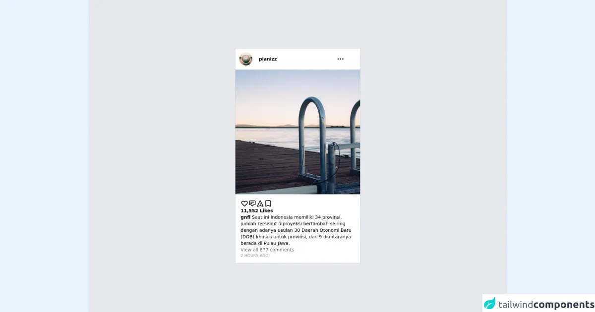
The preview of Instagram - Timeline Feed UI component
To create an Instagram - Timeline Feed UI component, we will use Tailwind CSS to style the HTML elements. Here is a preview of what the final component will look like:
Free download of the Instagram - Timeline Feed's source code
The source code of Instagram - Timeline Feed UI component
To create the Instagram - Timeline Feed UI component, we will use HTML and Tailwind CSS. Here is the source code for the component:
<div class="bg-gray-200 h-screen flex items-center justify-center">

  <card class="bg-white border-gray-300 w-96 border">

    <header class="grid grid-cols-6 items-center p-3 border-b border-b-gray-300">

      <div class="">
        <img src="https://picsum.photos/50/50" class="rounded-full w-10 h-10" />
      </div>

      <div class="col-span-4 text-sm font-semibold">
        pianizz
      </div>

      <div class="">
        <svg xmlns="http://www.w3.org/2000/svg" class="h-6 w-6" fill="none" viewBox="0 0 24 24" stroke="currentColor">
          <path stroke-linecap="round" stroke-linejoin="round" stroke-width="2" d="M5 12h.01M12 12h.01M19 12h.01M6 12a1 1 0 11-2 0 1 1 0 012 0zm7 0a1 1 0 11-2 0 1 1 0 012 0zm7 0a1 1 0 11-2 0 1 1 0 012 0z" />
        </svg>
      </div>

    </header>

    <photo>
       <img src="https://picsum.photos/500/500" />
    </photo>

    <content class="flex flex-col p-4 gap-3">

      <div class="flex flex-row gap-3">

          <svg xmlns="http://www.w3.org/2000/svg" class="h-6 w-6" fill="none" viewBox="0 0 24 24" stroke="currentColor">
            <path stroke-linecap="round" stroke-linejoin="round" stroke-width="2" d="M4.318 6.318a4.5 4.5 0 000 6.364L12 20.364l7.682-7.682a4.5 4.5 0 00-6.364-6.364L12 7.636l-1.318-1.318a4.5 4.5 0 00-6.364 0z" />
          </svg>

        <svg xmlns="http://www.w3.org/2000/svg" class="h-6 w-6" fill="none" viewBox="0 0 24 24" stroke="currentColor">
          <path stroke-linecap="round" stroke-linejoin="round" stroke-width="2" d="M7 8h10M7 12h4m1 8l-4-4H5a2 2 0 01-2-2V6a2 2 0 012-2h14a2 2 0 012 2v8a2 2 0 01-2 2h-3l-4 4z" />
        </svg>

        <svg xmlns="http://www.w3.org/2000/svg" class="h-6 w-6" fill="none" viewBox="0 0 24 24" stroke="currentColor">
          <path stroke-linecap="round" stroke-linejoin="round" stroke-width="2" d="M12 19l9 2-9-18-9 18 9-2zm0 0v-8" />
        </svg>

        <svg xmlns="http://www.w3.org/2000/svg" class="h-6 w-6" fill="none" viewBox="0 0 24 24" stroke="currentColor">
          <path stroke-linecap="round" stroke-linejoin="round" stroke-width="2" d="M5 5a2 2 0 012-2h10a2 2 0 012 2v16l-7-3.5L5 21V5z" />
        </svg>

      </div>

      <div class="text-sm font-semibold">
        11,552 Likes
      </div>

      <div class="text-sm">
        <span class="font-semibold">gnfi</span> Saat ini Indonesia memiliki 34 provinsi, jumlah tersebut diproyeksi bertambah seiring dengan adanya usulan 30 Daerah Otonomi Baru (DOB) khusus untuk provinsi, dan 9 diantaranya berada di Pulau Jawa.
      </div>

      <div class="text-gray-500 text-sm">
        View all 877 comments
      </div>

      <div class="text-gray-400 text-xs">
        2 HOURS AGO
      </div>

    </content>

    <footer>
    </footer>

  </card>

</div>
How to create an Instagram - Timeline Feed with Tailwind CSS?
To create an Instagram - Timeline Feed UI component with Tailwind CSS, follow these steps:
Step 1: Set up the HTML structure
The first step is to set up the HTML structure for the component. We will use an unordered list to display the posts. Each post will be a list item that contains an image, caption, and other details.
<ul class="timeline">
  <li>
    <div class="timeline-image">
      <img src="https://via.placeholder.com/150" alt="Post Image">
    </div>
    <div class="timeline-content">
      <h2 class="timeline-title">Post Title</h2>
      <p class="timeline-caption">Post Caption</p>
      <div class="timeline-details">
        <span class="timeline-likes">10 likes</span>
        <span class="timeline-comments">5 comments</span>
      </div>
    </div>
  </li>
  <!-- More list items for other posts -->
</ul>
Step 2: Style the HTML elements with Tailwind CSS
The next step is to style the HTML elements with Tailwind CSS. We will use the pre-defined utility classes to style the elements.
<ul class="timeline">
  <li class="flex">
    <div class="timeline-image flex-none">
      <img src="https://via.placeholder.com/150" alt="Post Image" class="rounded-lg">
    </div>
    <div class="timeline-content ml-4">
      <h2 class="timeline-title text-lg font-bold">Post Title</h2>
      <p class="timeline-caption text-gray-700">Post Caption</p>
      <div class="timeline-details flex items-center mt-2">
        <span class="timeline-likes text-gray-600 mr-4">10 likes</span>
        <span class="timeline-comments text-gray-600">5 comments</span>
      </div>
    </div>
  </li>
  <!-- More list items for other posts -->
</ul>
Step 3: Add responsive design
The final step is to add responsive design to the component. We will use Tailwind CSS's responsive design system to adjust the layout of the component on different screen sizes.
<ul class="timeline">
  <li class="flex flex-col md:flex-row">
    <div class="timeline-image flex-none">
      <img src="https://via.placeholder.com/150" alt="Post Image" class="rounded-lg">
    </div>
    <div class="timeline-content ml-4">
      <h2 class="timeline-title text-lg font-bold">Post Title</h2>
      <p class="timeline-caption text-gray-700">Post Caption</p>
      <div class="timeline-details flex items-center mt-2">
        <span class="timeline-likes text-gray-600 mr-4">10 likes</span>
        <span class="timeline-comments text-gray-600">5 comments</span>
      </div>
    </div>
  </li>
  <!-- More list items for other posts -->
</ul>
Conclusion
In this article, we showed you how to create an Instagram - Timeline Feed UI component using Tailwind CSS. We used Tailwind CSS's pre-defined utility classes to style the HTML elements and its responsive design system to make the component work on different screen sizes. With Tailwind CSS, you can quickly build custom designs without writing any CSS code from scratch.