- Published on
Beginners Guide: Make A Instagram Stories With Tailwind CSS
- What is Tailwind CSS?
- The description of Instagram Stories UI component
- Why use Tailwind CSS to create an Instagram Stories UI component?
- The preview of Instagram Stories UI component
- The source code of Instagram Stories UI component
- How to create an Instagram Stories UI component with Tailwind CSS?
- Conclusion
Are you a beginner in web development and want to learn how to create an Instagram Stories UI component? Look no further than Tailwind CSS! In this article, we'll go over what Tailwind CSS is, the description of Instagram Stories UI component, why use Tailwind CSS to create an Instagram Stories UI component, the preview and source code of the component, and finally, how to create an Instagram Stories UI component with Tailwind CSS.
What is Tailwind CSS?
Tailwind CSS is a utility-first CSS framework that allows developers to quickly and easily create custom designs without having to write custom CSS. It provides a set of pre-defined classes that can be used to style HTML elements. Tailwind CSS is highly customizable and can be used to create complex designs with ease.
The description of Instagram Stories UI component
Instagram Stories is a feature of the popular social media platform that allows users to post temporary photos and videos that disappear after 24 hours. The Stories UI component consists of a full-screen view with a header that displays the user's profile picture, username, and a menu button. The main content area displays the user's story, and the footer contains buttons for navigating between stories.
Why use Tailwind CSS to create an Instagram Stories UI component?
Tailwind CSS is an excellent choice for creating an Instagram Stories UI component because it allows developers to quickly and easily create custom designs without having to write custom CSS. The pre-defined classes provided by Tailwind CSS can be used to style the various elements of the Stories UI component, making it easy to create a design that matches the Instagram brand.
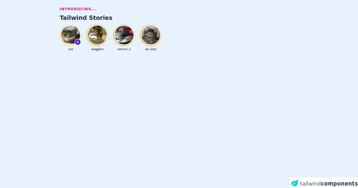
The preview of Instagram Stories UI component
To create an Instagram Stories UI component with Tailwind CSS, we'll need to use a combination of HTML and CSS. The HTML structure of the component will consist of a full-screen view with a header, main content area, and footer. The CSS will be used to style the various elements of the component.
Free download of the Instagram Stories's source code
The source code of Instagram Stories UI component
The source code of the Instagram Stories UI component will consist of HTML and CSS. The HTML will define the structure of the component, while the CSS will be used to style the various elements.
<div class="max-w-full mx-auto p-8">
  <h2 class="sm:text-lg sm:text-pink-700 leading-snug tracking-widest uppercase font-semibold">Introducing...</h2>
  <p class="text-3xl font-extrabold leading-none text-gray-800 py-4">Tailwind Stories</p>

<ul class="flex space-x-6 font-serif ">

  <li class="flex flex-col items-center space-y-1 relative">
    <div class="bg-gradient-to-tr from-yellow-300 to-fuchsia-800 p-1 rounded-full">
      <a class=" bg-white block rounded-full p-1 hover:-rotate-6 transform transition" href="#">
        <img class="h-24 w-24 rounded-full" src="http://placekitten.com/200/300" alt="cute kitty" />
      </a>
    </div>
    <button class="absolute bottom-8 right-1 bg-purple-800 rounded-full h-8 w-8 text-2xl
        text-white font-semibold border-2
         border-white flex justify-center items-center font-mono hover:bg-blue-700">+</button>
      <a href="#">
        you
      </a>
  </li>

  <li class="flex flex-col items-center space-y-1 ">
    <div class="bg-gradient-to-tr from-yellow-500 to-fuchsia-600 p-1 rounded-full">
      <a class=" bg-white block rounded-full p-1 hover:-rotate-6 transform transition" href="#">
        <img class="h-24 w-24 rounded-full" src="http://placekitten.com/208/136" alt="cute kitty" />
      </a>
    </div>
      <a href="#">
        snuggless
      </a>
  </li>

    <li class="flex flex-col items-center space-y-1 ">
    <div class="bg-gradient-to-tr from-yellow-500 to-fuchsia-600 p-1 rounded-full">
      <a class=" bg-white block rounded-full p-1 hover:-rotate-6 transform transition" href="#">
        <img class="h-24 w-24 rounded-full" src="http://placekitten.com/100/200" alt="cute kitty" />
      </a>
    </div>
      <a href="#">
        meoww_2
      </a>
  </li>
    <li class="flex flex-col items-center space-y-1 ">
    <div class="bg-gradient-to-tr from-yellow-500 to-fuchsia-600 p-1 rounded-full">
      <a class=" bg-white block rounded-full p-1 hover:-rotate-6 transform transition" href="#">
        <img class="h-24 w-24 rounded-full" src="http://placekitten.com/300/400" alt="cute kitty" />
      </a>
    </div>
      <a href="#">
        me_kitty
      </a>
  </li>
</ul>

</div>
How to create an Instagram Stories UI component with Tailwind CSS?
Now that we have an understanding of what Tailwind CSS is and why it's a good choice for creating an Instagram Stories UI component, let's go over the steps to create the component.
Create a new HTML file and add the basic structure of the component, including the header, main content area, and footer.
Add the necessary Tailwind CSS classes to style the various elements of the component.
Customize the design of the component to match the Instagram brand.
Test the component to ensure that it works as expected.
Conclusion
In conclusion, Tailwind CSS is an excellent choice for creating custom designs quickly and easily. By using Tailwind CSS, developers can create an Instagram Stories UI component that matches the Instagram brand in no time. With the steps outlined in this article, you'll be able to create your own Instagram Stories UI component with ease. Happy coding!