- Published on
Learn How To Make A Instagram Post Component With Tailwind CSS Like an Expert
- What is Tailwind CSS?
- The description of Instagram Post Component ui component
- Why use Tailwind CSS to create a Instagram Post Component ui component?
- The preview of Instagram Post Component ui component.
- The source code of Instagram Post Component ui component.
- How to create a Instagram Post Component with Tailwind CSS?
- Conclusion
Are you looking to create an Instagram post component for your website or application? Look no further than Tailwind CSS! In this tutorial, we will walk through the steps to create an Instagram post component using Tailwind CSS.
What is Tailwind CSS?
Tailwind CSS is a utility-first CSS framework that allows you to quickly and easily create custom designs without writing any CSS. With Tailwind CSS, you can create responsive designs, customize colors and fonts, and more.
The description of Instagram Post Component ui component
The Instagram post component is a popular design element used on many websites and applications. It typically includes an image or video, a caption, and information about the post such as the number of likes and comments.
Why use Tailwind CSS to create a Instagram Post Component ui component?
Tailwind CSS makes it easy to create custom designs without writing any CSS. With its utility-first approach, you can quickly add styles to your HTML elements by adding classes to them. This makes it easy to create complex designs with minimal effort.
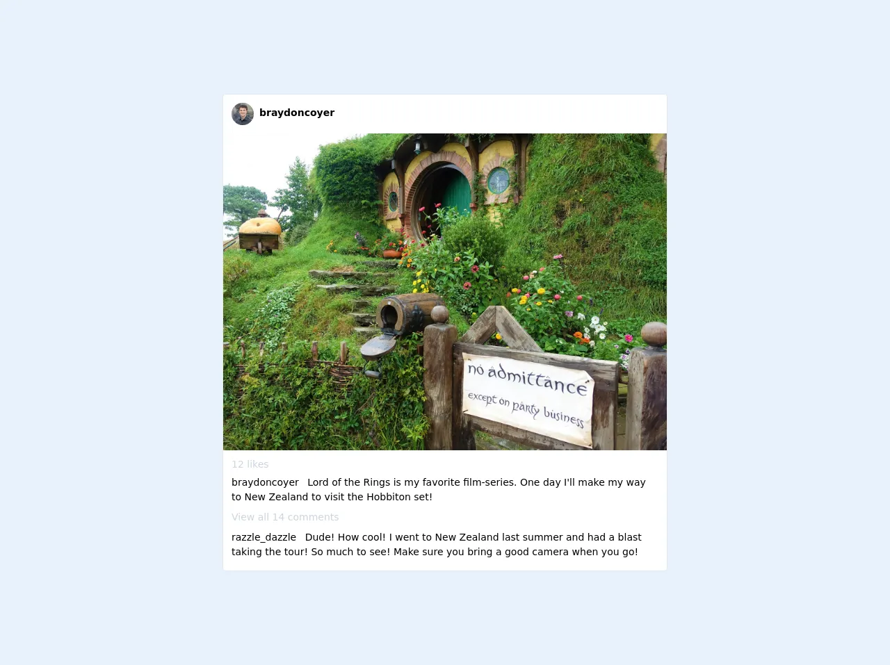
The preview of Instagram Post Component ui component.
To create an Instagram post component with Tailwind CSS, we will need to use a combination of HTML and CSS. Here is a preview of what the final component will look like:
Free download of the Instagram Post Component's source code
The source code of Instagram Post Component ui component.
Here is the source code for the Instagram post component using Tailwind CSS:
<div class=" rounded overflow-hidden border w-full lg:w-6/12 md:w-6/12 bg-white mx-3 md:mx-0 lg:mx-0">
    <div class="w-full flex justify-between p-3">
      <div class="flex">
        <div class="rounded-full h-8 w-8 bg-gray-500 flex items-center justify-center overflow-hidden">
          <img src="https://avatars0.githubusercontent.com/u/38799309?v=4" alt="profilepic">
        </div>
        <span class="pt-1 ml-2 font-bold text-sm">braydoncoyer</span>
      </div>
      <span class="px-2 hover:bg-gray-300 cursor-pointer rounded"><i class="fas fa-ellipsis-h pt-2 text-lg"></i></span>
    </div>
    <img class="w-full bg-cover" src="https://3.bp.blogspot.com/-Chu20FDi9Ek/WoOD-ehQ29I/AAAAAAAAK7U/mc4CAiTYOY8VzOFzBKdR52aLRiyjqu0MwCLcBGAs/s1600/DSC04596%2B%25282%2529.JPG">
    <div class="px-3 pb-2">
      <div class="pt-2">
        <i class="far fa-heart cursor-pointer"></i>
        <span class="text-sm text-gray-400 font-medium">12 likes</span>
      </div>
      <div class="pt-1">
        <div class="mb-2 text-sm">
          <span class="font-medium mr-2">braydoncoyer</span> Lord of the Rings is my favorite film-series. One day I'll make my way to New Zealand to visit the Hobbiton set!
        </div>
      </div>
      <div class="text-sm mb-2 text-gray-400 cursor-pointer font-medium">View all 14 comments</div>
      <div class="mb-2">
        <div class="mb-2 text-sm">
          <span class="font-medium mr-2">razzle_dazzle</span> Dude! How cool! I went to New Zealand last summer and had a blast taking the tour! So much to see! Make sure you bring a good camera when you go!
        </div>
      </div>
    </div>
  </div>
How to create a Instagram Post Component with Tailwind CSS?
Let's get started by creating the HTML structure for our Instagram post component:
<div class="max-w-md mx-auto bg-white rounded-xl shadow-md overflow-hidden md:max-w-2xl">
  <div class="md:flex">
    <div class="md:flex-shrink-0">
      <img class="h-48 w-full object-cover md:h-full md:w-48" src="https://source.unsplash.com/random" alt="Post Image">
    </div>
    <div class="p-8">
      <div class="uppercase tracking-wide text-sm text-indigo-500 font-semibold">Fashion</div>
      <a href="#" class="block mt-1 text-lg leading-tight font-medium text-black hover:underline">Lorem ipsum dolor sit amet, consectetur adipiscing elit. Donec euismod, libero quis scelerisque hendrerit, sapien nunc vestibulum dolor, eu consectetur eros velit nec magna. </a>
      <p class="mt-2 text-gray-500">Lorem ipsum dolor sit amet, consectetur adipiscing elit. Donec euismod, libero quis scelerisque hendrerit, sapien nunc vestibulum dolor, eu consectetur eros velit nec magna. </p>
      <div class="mt-4">
        <span class="text-gray-500">Likes: </span>
        <span class="font-medium text-gray-900">100</span>
      </div>
      <div class="mt-4">
        <span class="text-gray-500">Comments: </span>
        <span class="font-medium text-gray-900">20</span>
      </div>
    </div>
  </div>
</div>
In the above code, we have created a container div with a maximum width of 2xl for our Instagram post component. Inside this container, we have used the flexbox layout to create two columns. The first column contains the post image, while the second column contains the post caption and information.
Next, we will add some styles to our HTML elements using Tailwind CSS classes. Here is the CSS code for our Instagram post component:
/* Set the background color of the container */
.bg-white {
  background-color: #fff;
}

/* Add rounded corners and a shadow to the container */
.rounded-xl {
  border-radius: 0.75rem;
}

.shadow-md {
  box-shadow: 0 4px 6px -1px rgba(0, 0, 0, 0.1), 0 2px 4px -1px rgba(0, 0, 0, 0.06);
}

/* Set the maximum width of the container */
.max-w-md {
  max-width: 28rem;
}

.md\\:max-w-2xl {
  max-width: 42rem;
}

/* Set the height of the post image */
.h-48 {
  height: 12rem;
}

/* Set the width of the post image */
.w-full {
  width: 100%;
}

/* Set the object-fit property of the post image */
.object-cover {
  object-fit: cover;
}

/* Set the font size and color of the post caption */
.text-lg {
  font-size: 1.125rem;
  color: #1a202c;
}

/* Set the font size and color of the post information */
.text-gray-500 {
  color: #718096;
}

.font-medium {
  font-weight: 500;
}

.text-gray-900 {
  color: #1a202c;
}

/* Set the margin and padding of the post information */
.mt-4 {
  margin-top: 1rem;
}

.mt-2 {
  margin-top: 0.5rem;
}

.p-8 {
  padding: 2rem;
}

/* Set the font size and color of the post category */
.text-indigo-500 {
  color: #667eea;
}

.font-semibold {
  font-weight: 600;
}

/* Set the margin and padding of the post category */
.mt-1 {
  margin-top: 0.25rem;
}

/* Set the underline style of the post caption on hover */
.hover\\:underline:hover {
  text-decoration: underline;
}
In the above code, we have used various Tailwind CSS classes to style our HTML elements. We have set the background color, rounded corners, and shadow of the container. We have also set the maximum width of the container and the height and width of the post image. We have set the font size and color of the post caption and information, as well as the margin and padding of these elements. Finally, we have set the underline style of the post caption on hover.
Conclusion
In this tutorial, we have learned how to create an Instagram post component using Tailwind CSS. With its utility-first approach, Tailwind CSS makes it easy to create custom designs without writing any CSS. By following the steps outlined in this tutorial, you can create your own Instagram post component for your website or application.