- Published on
Most Effective Ways To Create A Instagram Feed Respnsive With Tailwind CSS
- What is Tailwind CSS?
- The description of Instagram feed Responsive UI component
- Why use Tailwind CSS to create an Instagram feed Responsive UI component?
- The preview of Instagram feed Responsive UI component
- The source code of Instagram feed Responsive UI component
- How to create an Instagram feed Responsive with Tailwind CSS?
- Conclusion
Social media has become an integral part of our lives. Instagram is one such platform that has gained immense popularity in recent years. It is a visual platform where users share their photos and videos with their followers. Instagram feeds are an essential part of any Instagram profile. In this article, we will discuss the most effective ways to create a responsive Instagram feed with Tailwind CSS.
What is Tailwind CSS?
Tailwind CSS is a utility-first CSS framework that helps you to create custom designs without writing any CSS. It provides a set of pre-defined classes that you can use to style your HTML elements. Tailwind CSS is highly customizable, and you can configure it to match your project's design requirements.
The description of Instagram feed Responsive UI component
An Instagram feed is a collection of photos and videos that are displayed in a grid format. The Instagram feed is an essential part of any Instagram profile, and it should be designed in a way that is visually appealing and easy to navigate. A responsive Instagram feed UI component should be designed in a way that it looks great on all devices, including desktop, tablet, and mobile.
Why use Tailwind CSS to create an Instagram feed Responsive UI component?
Tailwind CSS is an excellent choice for creating a responsive Instagram feed UI component. It provides a set of pre-defined classes that you can use to style your HTML elements. Tailwind CSS is highly customizable, and you can configure it to match your project's design requirements. It also provides a responsive design system that makes it easy to create a UI component that looks great on all devices.
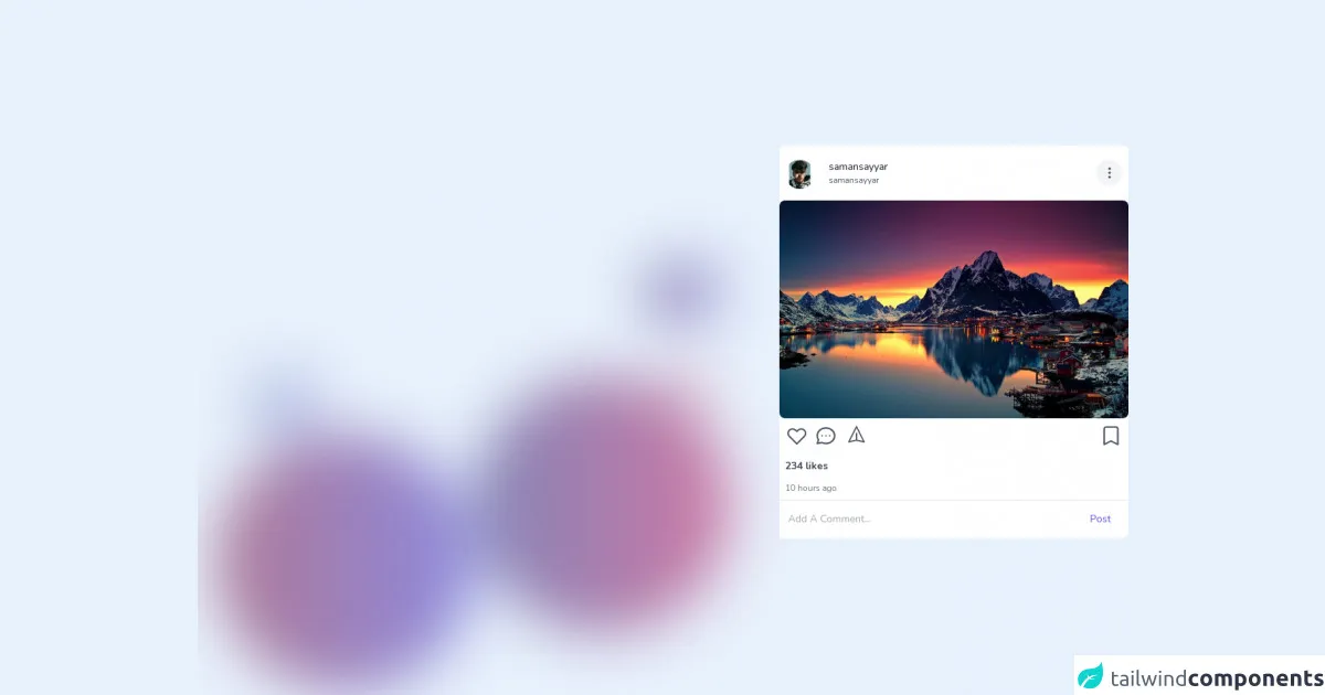
The preview of Instagram feed Responsive UI component
Creating a responsive Instagram feed UI component with Tailwind CSS is easy. You can use the grid system to create a grid of images that looks great on all devices. You can also use the responsive design system to adjust the size of the images based on the device's screen size. Here's a preview of what the Instagram feed UI component looks like:
Free download of the instagram feed Respnsive's source code
The source code of Instagram feed Responsive UI component
Here's the source code for the Instagram feed UI component. You can use this code as a starting point for your project. You can customize the code to match your project's design requirements.
<!-- This is an example component -->
<script defer src="https://unpkg.com/[email protected]/dist/cdn.min.js"></script>
<style>
	@import url('https://fonts.googleapis.com/css2?family=Nunito:wght@400;600;700&display=swap');
	@import url('https://fonts.googleapis.com/css2?family=Varela&display=swap');
	@import url('https://fonts.googleapis.com/css2?family=Karla:wght@200&display=swap');

	* {
		font-family: 'Nunito', -apple-system, BlinkMacSystemFont, 'Segoe UI', Roboto, Oxygen, Ubuntu, Cantarell, 'Open Sans', 'Helvetica Neue', sans-serif;
		direction: ltr;
		font-weight: 500;
	}
</style>
<div class="mx-auto flex justify-center items-center filter blur-2xl animate-pulse duration-500 transition w-full">
	<div class="mt-20 mr-10 flex relative">
		<div class="p-44 rounded-full bg-gradient-to-r to-indigo-700 from-pink-900 absolute top-20 right-0">

		</div>
		<div class="p-44 rounded-full bg-gradient-to-r to-pink-700 from-indigo-900 absolute md:flex hidden">

		</div>
	</div>
	<!-- Right Side -->
	<div class="flex flex-col absolute top-8 right-10 space-y-4">

		<div class="p-5 rounded-full bg-gradient-to-r to-pink-700 via-red-500 from-indigo-900 absolute right-16 top-10">

		</div>
	</div>
	<div class="flex flex-col absolute bottom-8 right-10 space-y-4">

		<div class="p-10 rounded-full bg-gradient-to-r to-pink-700 from-indigo-900 absolute right-16 bottom-10">

		</div>
	</div>
	<!--  Left side -->
	<div class="flex flex-col space-y-4 filter animate-pulse duration-500">
		<div class="p-10 bg-gradient-to-r to-indigo-700 from-blue-900 absolute top-20 left-20">

		</div>
		<div class="p-10 bg-gradient-to-r to-indigo-700 from-blue-900 absolute bottom-20 right-20">

		</div>
	</div>
</div>

<div class="mx-auto flex justify-center max-w-3xl md:mb-8 mt-4 bg-white rounded-lg items-center relative md:p-0 p-8"
	x-data="{
        comment : false,
    }">

	<div class="h-full relative">
		<div class="py-2 px-2">
			<div class="flex justify-between items-center py-2">
				<div class="relative mt-1 flex">
					<div class="mr-2">
						<img src="https://avatars.githubusercontent.com/u/68494287?v=4" alt="saman sayyar"
                                class="w-10 h-10 rounded-full object-cover">
                        </div>
						<div class="ml-3 flex justify-start flex-col items-start">
							<p class="text-gray-900 text-sm">
								samansayyar
							</p>
							<p class="text-gray-600 text-xs">
								samansayyar
							</p>
						</div>
						<!-- <span class="text-xs mx-2">•</span>
                       <button class="text-indigo-500 text-sm capitalize flex justify-start items-start">follow</button> -->
					</div>
					<button type="button"
                        class="relative p-2 focus:outline-none border-none bg-gray-100 rounded-full">
                        <svg class="w-5 h-5 text-gray-700" fill="none" stroke="currentColor" viewBox="0 0 24 24"
                            xmlns="http://www.w3.org/2000/svg">
                            <path stroke-linecap="round" stroke-linejoin="round" stroke-width="2"
                                d="M12 5v.01M12 12v.01M12 19v.01M12 6a1 1 0 110-2 1 1 0 010 2zm0 7a1 1 0 110-2 1 1 0 010 2zm0 7a1 1 0 110-2 1 1 0 010 2z">
                            </path>
                        </svg>
                    </button>
				</div>
			</div>
			<div class="relative w-full h-full">
				<img src="https://wallpaperaccess.com/full/345330.jpg" alt="saman" class="rounded-lg w-full h-full object-cover">
            </div>
				<div class="">

					<!-- Comment -->
					<div class="overflow-y-scroll w-full absolute inset-0 bg-white transform transition duration-200"
						x-show="comment" x-transition:enter="transition ease-out duration-200"
						x-transition:enter-start="opacity-0 transform scale-90"
						x-transition:enter-end="opacity-100 transform scale-100"
						x-transition:leave="transition ease-in duration-100"
						x-transition:leave-start="opacity-100 transform scale-100"
						x-transition:leave-end="opacity-0 transform scale-90">
						<div class="flex justify-start items-center py-2 px-4 border-b" @click="comment = !comment">
							<svg class="w-8 h-8 text-gray-700" fill="none" stroke="currentColor" viewBox="0 0 24 24"
								xmlns="http://www.w3.org/2000/svg">
								<path stroke-linecap="round" stroke-linejoin="round" stroke-width="1.5"
									d="M7 16l-4-4m0 0l4-4m-4 4h18"></path>
							</svg>
						</div>
						<div class="p-2 mb-10">
							<!-- System Comment -->
							<div
								class="flex justify-start flex-col space-y-3 items-start px-2 border-b border-gray-100">
								<div class="relative mt-1 mb-3 pt-2 flex">
									<div class="mr-2">
										<img src="https://avatars.githubusercontent.com/u/68494287?v=4" alt="saman sayyar"
                                        class="w-8 h-8 rounded-full object-cover">
                                </div>
										<div class="ml-2 w-full" x-data="{ replies : false }">
											<p class="text-gray-600 md:text-sm text-xs w-full">
												<!-- Username User -->
												<span class="font-normal text-gray-900">samansayyar</span>
												<!-- Username User -->
												You Can see?
											</p>
											<div class="flex space-x-4">
												<div class="time mt-1 text-gray-400 text-xs">
													<p>2d</p>
												</div>
												<button type="button" class="focus:outline-none time mt-1 text-gray-400 text-xs">
                                            <p>replay</p>
                                        </button>
											</div>
											<button type="button" @click="replies = !replies" class="focus:outline-none  mt-3 flex justify-center items-center">
                                        <p class="text-xs text-center text-indigo-500 flex space-x-2">
                                            <span>____ View replies (1)</span> <svg class="w-3 h-4" fill="none" stroke="currentColor" viewBox="0 0 24 24" xmlns="http://www.w3.org/2000/svg"><path stroke-linecap="round" stroke-linejoin="round" stroke-width="2" d="M19 9l-7 7-7-7"></path></svg>
                                        </p>
                                    </button>
											<div x-show="replies" x-transition
												class="flex justify-start flex-col space-y-3 items-start px-2 border-b border-gray-100">
												<div class="relative mt-1 mb-3 pt-2 flex">
													<div class="mr-2">
														<img src="https://avatars.githubusercontent.com/u/68494287?v=4" alt="saman sayyar"
                                                                    class="w-8 h-8 rounded-full object-cover">
                                                            </div>
														<div class="ml-2 w-full" x-data="{ replies : true }">
															<p class="text-gray-600 md:text-sm text-xs w-full">
																<!-- Username User -->
																<span class="font-normal text-gray-900">samansayyar</span>
																<!-- Username User -->
																You Can see?
															</p>
															<div class="flex space-x-4">
																<div class="time mt-1 text-gray-400 text-xs">
																	<p>2d</p>
																</div>
																<button type="button" class="focus:outline-none time mt-1 text-gray-400 text-xs">
                                                                        <p>replay</p>
                                                                    </button>
															</div>
														</div>
													</div>
												</div>
											</div>
										</div>
									</div>

									<div
										class="flex justify-start flex-col space-y-3 items-start px-2 border-b border-gray-100">
										<div class="relative mt-1 mb-3 pt-2 flex">
											<div class="mr-2">
												<img src="https://avatars.githubusercontent.com/u/68494287?v=4" alt="saman sayyar"
                                        class="w-8 h-8 rounded-full object-cover">
                                </div>
												<div class="ml-2 w-full">
													<p class="text-gray-600 md:text-sm text-xs w-full">
														<!-- Username User -->
														<span class="font-normal text-gray-900">samansayyar</span>
														<!-- Username User -->
														You Can see?
													</p>
													<div class="time mt-1 text-gray-400 text-xs">
														<p>2d</p>
													</div>
												</div>
											</div>
										</div>
									</div>
								</div>

								<!-- System Like and tools Feed -->
								<div class="flex justify-between items-start p-2 py-">
									<div class="flex space-x-2 items-center">
										<button type="button" class="focus:outline-none Like"><svg class="w-8 h-8 text-gray-600" fill="none" stroke="currentColor" viewBox="0 0 24 24" xmlns="http://www.w3.org/2000/svg"><path stroke-linecap="round" stroke-linejoin="round" stroke-width="1.6" d="M4.318 6.318a4.5 4.5 0 000 6.364L12 20.364l7.682-7.682a4.5 4.5 0 00-6.364-6.364L12 7.636l-1.318-1.318a4.5 4.5 0 00-6.364 0z"></path></svg></button>
										<button type="button" class="focus:outline-none Comment" @click="comment = !comment"><svg class="w-8 h-8 text-gray-600" fill="none" stroke="currentColor" viewBox="0 0 24 24" xmlns="http://www.w3.org/2000/svg"><path stroke-linecap="round" stroke-linejoin="round" stroke-width="1.6" d="M8 12h.01M12 12h.01M16 12h.01M21 12c0 4.418-4.03 8-9 8a9.863 9.863 0 01-4.255-.949L3 20l1.395-3.72C3.512 15.042 3 13.574 3 12c0-4.418 4.03-8 9-8s9 3.582 9 8z"></path></svg></button>
										<button type="button" class="focus:outline-none save"><svg class="w-7 h-7 mb-1 ml-1 text-gray-600  z-10" fill="none" stroke="currentColor" viewBox="0 0 24 24" xmlns="http://www.w3.org/2000/svg"><path stroke-linecap="round" stroke-linejoin="round" stroke-width="1.6" d="M12 19l9 2-9-18-9 18 9-2zm0 0v-8"></path></svg></button>
									</div>
									<div class="flex space-x-2 items-center">
										<button type="button" class="focus:outline-none Like"><svg class="w-8 h-8 text-gray-600" fill="none" stroke="currentColor" viewBox="0 0 24 24" xmlns="http://www.w3.org/2000/svg"><path stroke-linecap="round" stroke-linejoin="round" stroke-width="1.6" d="M5 5a2 2 0 012-2h10a2 2 0 012 2v16l-7-3.5L5 21V5z"></path></svg></button>
									</div>
								</div>
								<div class="p-2 flex flex-col space-y-3">
									<div class="w-full">
										<p class="font-bold text-sm text-gray-700">234 likes</p>
									</div>
									<div class="w-full">
										<p class="font-normal text-xs text-gray-500">10 hours ago</p>
									</div>
								</div>
								<!-- End System Like and tools Feed -->
								<div class="z-50">
									<form>
										<div class="flex justify-between border-t items-center w-full"
											:class="comment ? 'absolute bottom-0' : '' ">
											<div class="w-full ">
												<input type="text" name="comment" id="comment" placeholder="Add A Comment..."
                                    class="w-full text-sm py-4 px-3 rounded-none focus:outline-none">
                            </div>
												<div class="w-20">
													<button class="border-none text-sm px-4 bg-white py-4 text-indigo-600 focus:outline-none">Post</button>
												</div>
											</div>
									</form>
								</div>
							</div>
						</div>
					</div>
How to create an Instagram feed Responsive with Tailwind CSS?
Creating a responsive Instagram feed with Tailwind CSS is easy. Here are the steps to follow:
- Create a new HTML file and add the necessary HTML elements.
- Add the Tailwind CSS CDN link to the head section of your HTML file.
- Use the grid system to create a grid of images. You can use the
grid-colsclass to define the number of columns in the grid. - Use the
object-coverclass to ensure that the images cover the entire grid cell. - Use the responsive design system to adjust the size of the images based on the device's screen size. You can use the
sm,md,lg, andxlclasses to define different image sizes for different screen sizes.
Here's the sample code for creating a responsive Instagram feed with Tailwind CSS:
<!DOCTYPE html>
<html lang="en">
<head>
    <meta charset="UTF-8">
    <meta name="viewport" content="width=device-width, initial-scale=1.0">
    <title>Instagram Feed</title>
    <link rel="stylesheet" href="https://cdn.jsdelivr.net/npm/[email protected]/dist/tailwind.min.css">
</head>
<body>
    <div class="container mx-auto">
        <div class="grid grid-cols-1 sm:grid-cols-2 md:grid-cols-3 lg:grid-cols-4 xl:grid-cols-5 gap-4">
            <img class="w-full h-full object-cover" src="https://picsum.photos/300/300" alt="Image 1">
            <img class="w-full h-full object-cover" src="https://picsum.photos/300/300" alt="Image 2">
            <img class="w-full h-full object-cover" src="https://picsum.photos/300/300" alt="Image 3">
            <img class="w-full h-full object-cover" src="https://picsum.photos/300/300" alt="Image 4">
            <img class="w-full h-full object-cover" src="https://picsum.photos/300/300" alt="Image 5">
            <img class="w-full h-full object-cover" src="https://picsum.photos/300/300" alt="Image 6">
            <img class="w-full h-full object-cover" src="https://picsum.photos/300/300" alt="Image 7">
            <img class="w-full h-full object-cover" src="https://picsum.photos/300/300" alt="Image 8">
            <img class="w-full h-full object-cover" src="https://picsum.photos/300/300" alt="Image 9">
            <img class="w-full h-full object-cover" src="https://picsum.photos/300/300" alt="Image 10">
        </div>
    </div>
</body>
</html>
Conclusion
In conclusion, creating a responsive Instagram feed with Tailwind CSS is easy. It provides a set of pre-defined classes that you can use to style your HTML elements. It also provides a responsive design system that makes it easy to create a UI component that looks great on all devices. By following the steps outlined in this article, you can create a visually appealing and responsive Instagram feed for your profile.