- Published on
Imagine You Make A Inputs With Icons With Tailwind CSS Like An Expert. Follow These 6 Steps To Get There
- What is Tailwind CSS?
- The description of inputs with icons ui component
- Why use Tailwind CSS to create a inputs with icons ui component?
- The preview of inputs with icons ui component.
- The source code of inputs with icons ui component.
- How to create a inputs with icons with Tailwind CSS?
- Step 1: Create the HTML structure
- Step 2: Style the icon
- Step 3: Style the input field
- Step 4: Align the icon and input field
- Step 5: Add more icons
- Step 6: Customize the styles
- Conclusion
As a FrontEnd technology blogger, it's important to stay up-to-date with the latest trends and tools in the industry. One such tool that has gained popularity in recent years is Tailwind CSS. Tailwind CSS is a utility-first CSS framework that allows you to quickly and easily create responsive and customizable user interfaces. In this article, we'll explore how to create inputs with icons using Tailwind CSS.
What is Tailwind CSS?
Tailwind CSS is a utility-first CSS framework that provides a set of pre-defined CSS classes that you can use to style your HTML elements. It's different from other CSS frameworks like Bootstrap or Foundation in that it doesn't provide pre-designed components or styles. Instead, it focuses on providing low-level utility classes that you can use to build your own custom designs.
The description of inputs with icons ui component
Inputs with icons are a common UI component used in web applications. They consist of an input field with an icon placed either inside or outside of the input field. The icon is usually used to represent the type of input that is expected in the field, such as an envelope icon for an email input field or a lock icon for a password input field.
Why use Tailwind CSS to create a inputs with icons ui component?
Tailwind CSS provides a set of pre-defined utility classes that make it easy to create inputs with icons. Instead of having to write custom CSS for each input with an icon, you can simply use Tailwind's pre-defined classes to style your inputs.
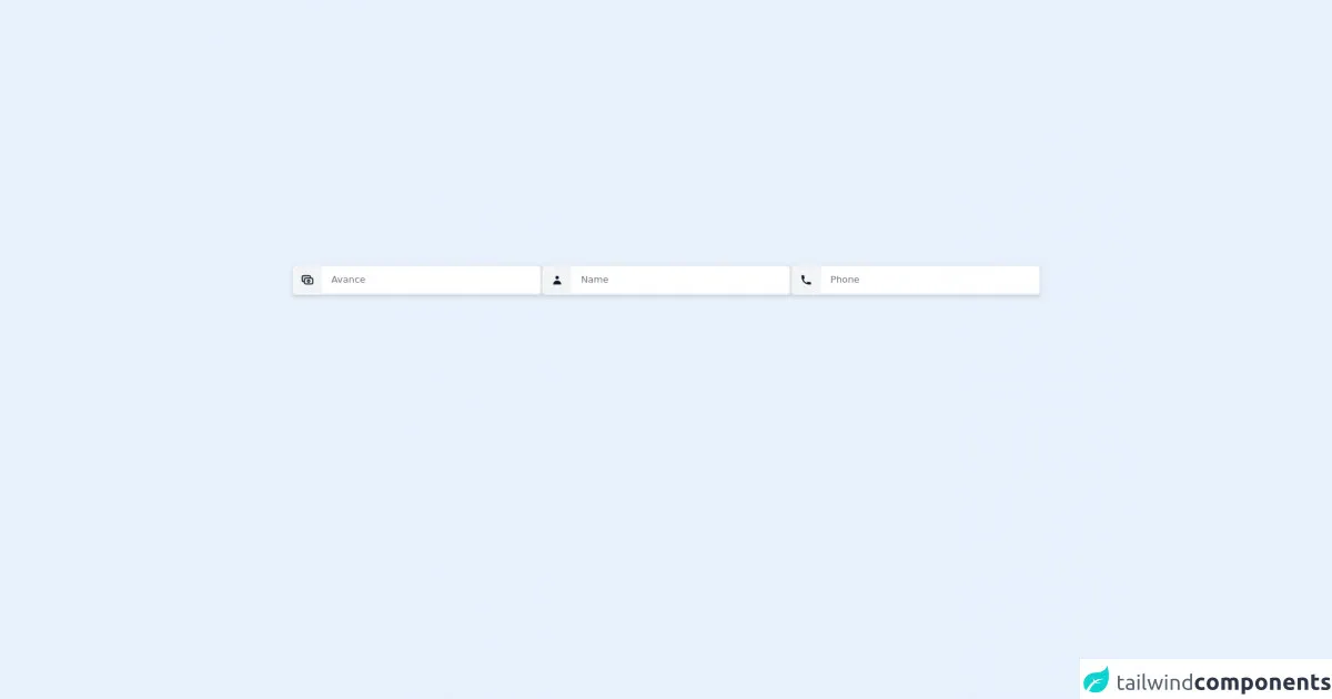
The preview of inputs with icons ui component.
To create inputs with icons using Tailwind CSS, you can use the flex and items-center classes to align the icon and input field. You can also use the px-3 class to add padding to the input field and the text-gray-700 class to set the text color to gray.
Free download of the inputs with icons's source code
The source code of inputs with icons ui component.
To create inputs with icons using Tailwind CSS, you can use the following HTML code:
<div
                    class="  my-2 border mx-auto    border-[2px]  w-10/12 justify-center flex items-center rounded-md shadow-md">
                    <div>
                        <button type=" submit"
                            class="flex items-center bg-gray-100 rounded-l-md border border-white justify-center w-12 h-12 text-white "
                            :class="(search.length > 0) ? 'bg-purple-500' : 'bg-gray-500 cursor-not-allowed'"
                            :disabled="search.length == 0">
                            <svg xmlns="http://www.w3.org/2000/svg" class="h-6 w-6 text-gray-900" fill="none"
                                viewBox="0 0 24 24" stroke="currentColor">
                                <path stroke-linecap="round" stroke-linejoin="round" stroke-width="2"
                                    d="M17 9V7a2 2 0 00-2-2H5a2 2 0 00-2 2v6a2 2 0 002 2h2m2 4h10a2 2 0 002-2v-6a2 2 0 00-2-2H9a2 2 0 00-2 2v6a2 2 0 002 2zm7-5a2 2 0 11-4 0 2 2 0 014 0z" />
                            </svg>
                        </button>
                    </div>

                    <div class="  w-full">
                        <input type="search" x-model="input3"
                            class="w-full h-12 px-4 py-1 rounded-r-md border border-gray-100 text-gray-800 focus:outline-none"
                            placeholder="Avance" >
                    </div>
                </div>
                 <div
                    class="  my-2 border mx-auto    border-[2px]  w-10/12 justify-center flex items-center rounded-md shadow-md">
                    <div>
                        <button type=" submit"
                            class="flex items-center bg-gray-100 rounded-l-md border border-white justify-center w-12 h-12 text-white ">
                            <svg xmlns="http://www.w3.org/2000/svg" class="h-5 w-5 text-gray-900" viewBox="0 0 20 20"
                                fill="currentColor">
                                <path fill-rule="evenodd" d="M10 9a3 3 0 100-6 3 3 0 000 6zm-7 9a7 7 0 1114 0H3z"
                                    clip-rule="evenodd" />
                            </svg>
                        </button>
                    </div>

                    <div class="  w-full">
                        <input type="search" x-model="input1"
                            class="w-full h-12 px-4 py-1 rounded-r-md border border-gray-100 text-gray-800 focus:outline-none"
                            placeholder="Name" >
                    </div>
                </div>
                <div
                    class="  my-2 border mx-auto    border-[2px]  w-10/12 justify-center flex items-center rounded-md shadow-md">
                    <div>
                        <button type=" submit"
                            class="flex items-center bg-gray-100 rounded-l-md border border-white justify-center w-12 h-12 text-white "
                            :class="(search.length > 0) ? 'bg-purple-500' : 'bg-gray-500 cursor-not-allowed'"
                            :disabled="search.length == 0">
                            <svg xmlns="http://www.w3.org/2000/svg" class="h-5 w-5 text-gray-900" viewBox="0 0 20 20"
                                fill="currentColor">
                                <path
                                    d="M2 3a1 1 0 011-1h2.153a1 1 0 01.986.836l.74 4.435a1 1 0 01-.54 1.06l-1.548.773a11.037 11.037 0 006.105 6.105l.774-1.548a1 1 0 011.059-.54l4.435.74a1 1 0 01.836.986V17a1 1 0 01-1 1h-2C7.82 18 2 12.18 2 5V3z" />
                            </svg>
                        </button>
                    </div>

                    <div class="  w-full">
                        <input type="search" x-model="input2"
                            class="w-full h-12 px-4 py-1 rounded-r-md border border-gray-100 text-gray-800 focus:outline-none"
                            placeholder="Phone" >
                    </div>
                </div>
How to create a inputs with icons with Tailwind CSS?
Now that we've covered the basics of inputs with icons and why Tailwind CSS is a great tool to use for creating them, let's dive into the steps to create inputs with icons using Tailwind CSS.
Step 1: Create the HTML structure
The first step is to create the HTML structure for the input with an icon. This can be done using the input and i HTML elements. The input element will be used for the input field, and the i element will be used for the icon.
<div class="flex items-center">
  <i class="material-icons">email</i>
  <input type="email" class="px-3 text-gray-700" placeholder="Email">
</div>
In this example, we're using the material-icons class to add an icon to the input field. You can replace email with any other icon name from the Material Icons library.
Step 2: Style the icon
Next, we need to style the icon using CSS. We can do this by adding a few utility classes to the i element.
<i class="material-icons text-gray-500 mr-2">email</i>
In this example, we're using the text-gray-500 class to set the color of the icon to gray and the mr-2 class to add some margin to the right of the icon.
Step 3: Style the input field
Now, we need to style the input field using CSS. We can do this by adding a few utility classes to the input element.
<input type="email" class="px-3 py-2 text-gray-700 bg-gray-200 rounded-lg focus:bg-white focus:outline-none" placeholder="Email">
In this example, we're using the px-3 and py-2 classes to add padding to the input field, the text-gray-700 class to set the text color to gray, the bg-gray-200 class to set the background color to light gray, the rounded-lg class to add rounded corners to the input field, and the focus:bg-white and focus:outline-none classes to change the background color and remove the outline when the input field is in focus.
Step 4: Align the icon and input field
To align the icon and input field, we can use the flex and items-center classes.
<div class="flex items-center">
  <i class="material-icons text-gray-500 mr-2">email</i>
  <input type="email" class="px-3 py-2 text-gray-700 bg-gray-200 rounded-lg focus:bg-white focus:outline-none" placeholder="Email">
</div>
In this example, we're wrapping the i and input elements in a div element with the flex and items-center classes. This will align the icon and input field horizontally and vertically.
Step 5: Add more icons
You can add more icons to your input fields by simply changing the icon name in the i element.
<div class="flex items-center">
  <i class="material-icons text-gray-500 mr-2">lock</i>
  <input type="password" class="px-3 py-2 text-gray-700 bg-gray-200 rounded-lg focus:bg-white focus:outline-none" placeholder="Password">
</div>
In this example, we're using the lock icon from the Material Icons library to represent a password input field.
Step 6: Customize the styles
Finally, you can customize the styles of your inputs with icons by modifying the utility classes or adding your own custom CSS.
<div class="flex items-center">
  <i class="material-icons text-red-500 mr-2">error</i>
  <input type="text" class="px-3 py-2 text-red-500 bg-white rounded-lg border border-red-500 focus:outline-none" placeholder="Error message">
</div>
In this example, we're using the text-red-500 class to set the text color to red, the bg-white class to set the background color to white, the rounded-lg class to add rounded corners to the input field, the border and border-red-500 classes to add a red border to the input field, and the focus:outline-none class to remove the outline when the input field is in focus.
Conclusion
In this article, we've explored how to create inputs with icons using Tailwind CSS. We've covered the basics of inputs with icons, why Tailwind CSS is a great tool to use for creating them, and the steps to create inputs with icons using Tailwind CSS. With these steps, you'll be able to create beautiful and functional inputs with icons in no time.