- Published on
Here Are 6 Ways To Build A Input With Static Text With Tailwind CSS
- What is Tailwind CSS?
- The description of Input with static text UI component
- Why use Tailwind CSS to create an Input with static text UI component?
- The preview of Input with static text UI component.
- The source code of Input with static text UI component.
- How to create an Input with static text with Tailwind CSS?
- 1. Basic Input with static text
- 2. Input with static text and icon
- 3. Input with static text and label
- 4. Input with static text and error message
- 5. Input with static text and button
- 6. Input with static text and dropdown
- Conclusion
Tailwind CSS is a utility-first CSS framework that helps you create responsive and customizable UI components with ease. In this article, we will explore how to build an Input with static text UI component using Tailwind CSS.
What is Tailwind CSS?
Tailwind CSS is a CSS framework that provides a set of pre-designed CSS classes that you can use to style your HTML elements. It is a utility-first framework, which means that it focuses on providing small, composable classes that you can combine to create complex designs.
The description of Input with static text UI component
An Input with static text UI component is a form input field that has some static text displayed next to it. It is commonly used in forms where you need to provide some context or instructions to the user about the input field.
Why use Tailwind CSS to create an Input with static text UI component?
Tailwind CSS provides a set of pre-designed CSS classes that you can use to create an Input with static text UI component quickly and easily. It also allows you to customize the component's appearance by modifying the classes or creating your own.
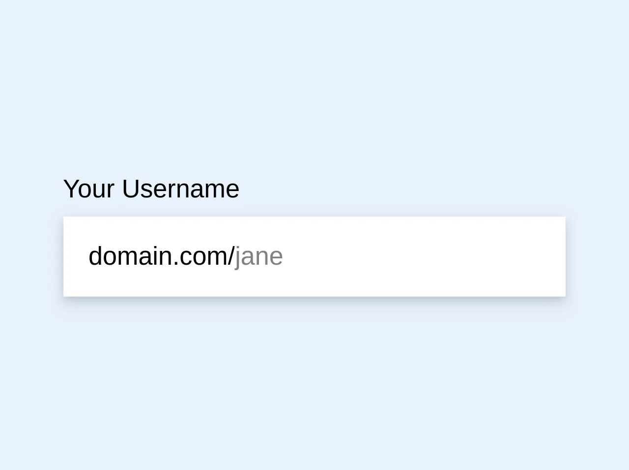
The preview of Input with static text UI component.
To create an Input with static text UI component, you can use the following HTML code:
<div class="flex items-center border-b border-gray-500 py-2">
  <span class="mr-3">{{__placeholder1__}}</span>
  <input type="text" class="bg-transparent focus:outline-none">
</div>
Free download of the Input with static text's source code
The source code of Input with static text UI component.
To create an Input with static text UI component, you can use the following HTML code:
<div class="flex items-center border-b border-gray-500 py-2">
  <span class="mr-3">Username:</span>
  <input type="text" class="bg-transparent focus:outline-none">
</div>
<div class="my-8">
<div class="pb-6 md:pb-0 flex flex-col"><label for="name" class="input-label text-base mb-2">Your Username</label><div><label class="input-field inline-flex items-baseline border-none shadow-md bg-white p-4"><span class="flex-none text-dusty-blue-darker select-none leading-none">domain.com/</span><div class="flex-1 leading-none"><input id="handle" type="text" class="placeholder-blue w-full p-0 no-outline text-dusty-blue-darker" name="handle" placeholder="jane"></div></label></div></div></div>
How to create an Input with static text with Tailwind CSS?
Here are six ways to create an Input with static text using Tailwind CSS:
1. Basic Input with static text
To create a basic Input with static text, you can use the following HTML code:
<div class="flex items-center border-b border-gray-500 py-2">
  <span class="mr-3">Username:</span>
  <input type="text" class="bg-transparent focus:outline-none">
</div>
In this code, we use the flex and items-center classes to align the text and input field horizontally. The border-b and border-gray-500 classes add a bottom border to the component, and the py-2 class adds some vertical padding.
2. Input with static text and icon
To add an icon to the Input with static text, you can use the following HTML code:
<div class="flex items-center border-b border-gray-500 py-2">
  <span class="mr-3">
    <i class="fas fa-user"></i>
  </span>
  <input type="text" class="bg-transparent focus:outline-none">
</div>
In this code, we use the fas fa-user class to add a user icon to the component.
3. Input with static text and label
To add a label to the Input with static text, you can use the following HTML code:
<div class="flex flex-col border-b border-gray-500 py-2">
  <label for="username" class="mb-1">Username:</label>
  <div class="flex items-center">
    <input type="text" id="username" class="bg-transparent focus:outline-none">
  </div>
</div>
In this code, we use the flex-col class to stack the label and input field vertically. The mb-1 class adds some margin below the label.
4. Input with static text and error message
To add an error message to the Input with static text, you can use the following HTML code:
<div class="flex flex-col border-b border-gray-500 py-2">
  <span class="mr-3">Username:</span>
  <div class="flex items-center">
    <input type="text" class="bg-transparent focus:outline-none border-red-500">
    <span class="text-red-500 ml-2">Invalid username</span>
  </div>
</div>
In this code, we use the border-red-500 class to add a red border to the input field and the text-red-500 class to add a red error message.
5. Input with static text and button
To add a button to the Input with static text, you can use the following HTML code:
<div class="flex items-center border-b border-gray-500 py-2">
  <span class="mr-3">Search:</span>
  <div class="flex items-center">
    <input type="text" class="bg-transparent focus:outline-none">
    <button class="bg-blue-500 hover:bg-blue-700 text-white font-bold py-2 px-4 rounded">
      Search
    </button>
  </div>
</div>
In this code, we use the bg-blue-500 and hover:bg-blue-700 classes to style the button.
6. Input with static text and dropdown
To add a dropdown to the Input with static text, you can use the following HTML code:
<div class="flex items-center border-b border-gray-500 py-2">
  <span class="mr-3">Country:</span>
  <div class="relative">
    <input type="text" class="bg-transparent focus:outline-none pr-8">
    <select class="absolute right-0 top-0 h-full w-8 opacity-0">
      <option>US</option>
      <option>UK</option>
      <option>CA</option>
    </select>
    <div class="pointer-events-none absolute inset-y-0 right-0 flex items-center px-2 text-gray-700">
      <svg class="fill-current h-4 w-4" xmlns="http://www.w3.org/2000/svg" viewBox="0 0 20 20"><path d="M14.707 7.293a1 1 0 0 0-1.414-1.414L10 9.586 6.707 6.293a1 1 0 1 0-1.414 1.414l4 4a1 1 0 0 0 1.414 0l4-4z"/></svg>
    </div>
  </div>
</div>
In this code, we use the relative class to position the dropdown relative to the input field. The absolute right-0 top-0 h-full w-8 opacity-0 class hides the dropdown and positions it to the right of the input field. The pointer-events-none absolute inset-y-0 right-0 flex items-center px-2 text-gray-700 class adds a dropdown icon to the input field.
Conclusion
In this article, we explored six ways to create an Input with static text UI component using Tailwind CSS. Tailwind CSS provides a set of pre-designed CSS classes that you can use to create responsive and customizable UI components quickly and easily. By combining these classes, you can create complex designs without writing any custom CSS.