- Published on
What You Need To Create A Input With Label As Placeholder With Tailwind CSS
- What is Tailwind CSS?
- The description of Input with label as placeholder ui component
- Why use Tailwind CSS to create a Input with label as placeholder ui component?
- The preview of Input with label as placeholder ui component.
- The source code of Input with label as placeholder ui component.
- How to create a Input with label as placeholder with Tailwind CSS?
- Conclusion
What is Tailwind CSS?
Tailwind CSS is a utility-first CSS framework that provides a set of pre-defined CSS classes that can be used to build web applications. It is designed to make it easy to create responsive and customizable user interfaces without having to write custom CSS code.
The description of Input with label as placeholder ui component
An input with label as placeholder is a user interface component that combines the functionality of an input field and a label. The label is displayed as a placeholder within the input field, providing context and guidance to the user.
Why use Tailwind CSS to create a Input with label as placeholder ui component?
Tailwind CSS provides a set of pre-defined CSS classes that can be used to create an input with label as placeholder ui component quickly and easily. By using Tailwind CSS, you can save time and effort by not having to write custom CSS code.
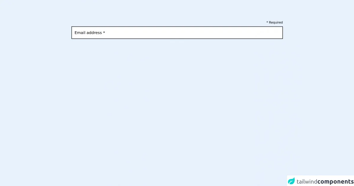
The preview of Input with label as placeholder ui component.
Free download of the Input with label as placeholder's source code
The source code of Input with label as placeholder ui component.
<!-- The whole element works on https://play.tailwindcss.com/ -->
<!-- But on tailwindcomponents.com, group-focus-within doesn't seems to work -->

<main class="p-24">
  <label class="flex flex-col-reverse relative focus group">

    <input
        type="email" name="email" required
        class="border-2 border-black px-4 py-3 leading-9">

    <span class="absolute text-xl transform -translate-y-3 left-4 transition leading-10 group-focus-within:-translate-y-16">
      Email address *
    </span>

    <span class="ml-auto leading-10">* Required</span>

  </label>
</main>
How to create a Input with label as placeholder with Tailwind CSS?
To create an input with label as placeholder using Tailwind CSS, follow these steps:
- Create an HTML input element with a label element.
<label for="username" class="text-gray-700">Username</label>
<input type="text" id="username" name="username" class="border-gray-400 border-2 rounded-md p-2 w-full">
- Add the
text-gray-700class to the label element to set the text color to gray. - Add the
border-gray-400andborder-2classes to the input element to set the border color to gray and the border width to 2 pixels. - Add the
rounded-mdclass to the input element to set the border radius to medium. - Add the
p-2class to the input element to set the padding to 2 pixels. - Add the
w-fullclass to the input element to set the width to 100% of the parent container.
Here is the complete HTML code for the input with label as placeholder using Tailwind CSS:
<div class="flex flex-col space-y-2">
  <label for="username" class="text-gray-700">Username</label>
  <input type="text" id="username" name="username" class="border-gray-400 border-2 rounded-md p-2 w-full">
</div>
Conclusion
In conclusion, creating an input with label as placeholder using Tailwind CSS is a quick and easy way to add a user interface component to your web application. By using the pre-defined CSS classes provided by Tailwind CSS, you can save time and effort by not having to write custom CSS code.