- Published on
Ways To Create A Input With Icon And Validation Error With Tailwind CSS In 60 Minutes
- What is Tailwind CSS?
- The description of Input with icon and validation error ui component
- Why use Tailwind CSS to create a Input with icon and validation error ui component?
- The preview of Input with icon and validation error ui component.
- The source code of Input with icon and validation error ui component.
- How to create a Input with icon and validation error with Tailwind CSS?
- Step 1: Set up the HTML structure
- Step 2: Style the input with icon and validation error
- Step 3: Add custom validation error message
- Conclusion
As a FrontEnd technology blogger, it's important to stay up-to-date with the latest trends and tools in the industry. One such tool that has gained popularity in recent years is Tailwind CSS. Tailwind CSS is a utility-first CSS framework that allows developers to quickly create custom designs without writing custom CSS.
In this article, we will explore ways to create an input with icon and validation error with Tailwind CSS in just 60 minutes.
What is Tailwind CSS?
Tailwind CSS is a utility-first CSS framework that provides a set of pre-defined classes to style HTML elements. It is designed to make it easy to create custom designs without writing custom CSS.
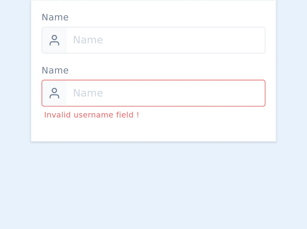
The description of Input with icon and validation error ui component
An input with icon and validation error is a user interface component that allows users to input data into a form field. It includes an icon to provide visual context and a validation error message to inform users of any errors in their input.
Why use Tailwind CSS to create a Input with icon and validation error ui component?
Tailwind CSS provides a set of pre-defined classes that can be used to quickly style HTML elements. This makes it easy to create custom designs without writing custom CSS. Additionally, Tailwind CSS is highly customizable, allowing developers to create unique designs that match their brand or project requirements.
The preview of Input with icon and validation error ui component.
To create an input with icon and validation error with Tailwind CSS, we will use a combination of HTML and CSS. The HTML will define the structure of the component, while the CSS will provide the styling.
Free download of the Input with icon and validation error's source code
The source code of Input with icon and validation error ui component.
To create an input with icon and validation error with Tailwind CSS, we will use a combination of HTML and CSS. The HTML will define the structure of the component, while the CSS will provide the styling.
<div class="flex flex-col w-full max-w-sm mx-auto p-4 border border-gray-200 bg-white shadow">
	<div class="flex flex-col mb-4">
		<label for="name"
			   class="mb-1 text-xs sm:text-sm tracking-wide text-gray-600">
			Name
		</label>

		<div class="relative">

			<div class="absolute flex border border-transparent left-0 top-0 h-full w-10">
				<div class="flex items-center justify-center rounded-tl rounded-bl z-10 bg-gray-100 text-gray-600 text-lg h-full w-full">
					<svg viewBox="0 0 24 24"
						 width="24"
						 height="24"
						 stroke="currentColor"
						 stroke-width="2"
						 fill="none"
						 stroke-linecap="round"
						 stroke-linejoin="round"
						 class="h-5 w-5">
						<path d="M20 21v-2a4 4 0 0 0-4-4H8a4 4 0 0 0-4 4v2"></path>
						<circle cx="12"
								cy="7"
								r="4"></circle>
					</svg>
				</div>
			</div>

			<input id="name"
				   name="name"
				   type="text"
				   placeholder="Name"
				   value=""
				   class="text-sm sm:text-base relative w-full border rounded placeholder-gray-400 focus:border-indigo-400 focus:outline-none py-2 pr-2 pl-12">

		</div>
	</div>
	<div class="flex flex-col mb-4">
		<label for="name"
			   class="mb-1 text-xs sm:text-sm tracking-wide text-gray-600">
			Name
		</label>

		<div class="relative">

			<div class="absolute flex border border-transparent left-0 top-0 h-full w-10">
				<div class="flex items-center justify-center rounded-tl rounded-bl z-10 bg-gray-100 text-gray-600 text-lg h-full w-full">
					<svg viewBox="0 0 24 24"
						 width="24"
						 height="24"
						 stroke="currentColor"
						 stroke-width="2"
						 fill="none"
						 stroke-linecap="round"
						 stroke-linejoin="round"
						 class="h-5 w-5">
						<path d="M20 21v-2a4 4 0 0 0-4-4H8a4 4 0 0 0-4 4v2"></path>
						<circle cx="12"
								cy="7"
								r="4"></circle>
					</svg>
				</div>
			</div>

			<input id="name"
				   name="name"
				   type="text"
				   placeholder="Name"
				   value=""
				   class="text-sm sm:text-base relative w-full border rounded placeholder-gray-400 focus:border-indigo-400 focus:outline-none py-2 pr-2 pl-12 border-red-500">

		</div>

		<span class="flex items-center font-medium tracking-wide text-red-500 text-xs mt-1 ml-1">
			Invalid username field !
		</span>
	</div>
</div>
How to create a Input with icon and validation error with Tailwind CSS?
Step 1: Set up the HTML structure
The first step is to set up the HTML structure for the input with icon and validation error. We will use a div element to wrap the input and label elements, and add a span element for the icon and validation error message.
<div class="relative">
  <input type="text" id="input" name="input" class="border rounded py-2 px-3 w-full">
  <label for="input" class="absolute top-0 left-0 py-2 px-3">Input Label</label>
  <span class="absolute top-0 right-0 mr-3 mt-2">
    <svg class="fill-current h-4 w-4" xmlns="http://www.w3.org/2000/svg" viewBox="0 0 20 20">
      <path d="M10 12a2 2 0 100-4 2 2 0 000 4z"/>
      <path fill-rule="evenodd" d="M10 18a8 8 0 100-16 8 8 0 000 16zm0-2a6 6 0 100-12 6 6 0 000 12z" clip-rule="evenodd"/>
    </svg>
  </span>
  <span class="text-red-500 text-sm mt-1">Validation error message</span>
</div>
In the above code, we have added a div element with the relative class to create a relative positioning context for the child elements. We have also added an input element with a border, rounded, py-2, px-3, and w-full classes to create a text input field.
We have added a label element with an absolute position to create a label for the input field. We have also added a span element with an absolute position to create an icon for the input field. We have used an SVG icon to create the icon.
Finally, we have added another span element to display the validation error message. We have used the text-red-500 and text-sm classes to style the validation error message.
Step 2: Style the input with icon and validation error
The next step is to style the input with icon and validation error using Tailwind CSS. We will use a combination of pre-defined classes and custom CSS to style the component.
input:focus ~ label,
input:not(:placeholder-shown) ~ label {
  transform: translate(-0.5rem, -1.5rem);
  font-size: 0.75rem;
  font-weight: bold;
  color: #333;
}

input:focus ~ .text-red-500,
input:not(:placeholder-shown) ~ .text-red-500 {
  display: none;
}

input:focus ~ .mt-1 {
  mt: 0;
}

input:focus ~ svg {
  fill: #333;
}
In the above code, we have used the :focus and :not(:placeholder-shown) pseudo-classes to style the label and validation error message when the input field is in focus or has a value.
We have used the transform property to move the label above the input field and change its font size and color. We have also used the display property to hide the validation error message when the input field is in focus or has a value.
Finally, we have used the fill property to change the color of the icon when the input field is in focus.
Step 3: Add custom validation error message
The final step is to add a custom validation error message to the input with icon and validation error. We will use JavaScript to validate the input field and display the error message.
const input = document.querySelector('#input');
const errorMessage = document.querySelector('.text-red-500');

input.addEventListener('invalid', () => {
  errorMessage.style.display = 'block';
});

input.addEventListener('input', () => {
  errorMessage.style.display = 'none';
});
In the above code, we have used the querySelector method to select the input field and validation error message. We have added an invalid event listener to the input field to display the validation error message when the input is invalid.
We have also added an input event listener to the input field to hide the validation error message when the input is valid.
Conclusion
In this article, we have explored ways to create an input with icon and validation error with Tailwind CSS in just 60 minutes. We have used a combination of HTML, CSS, and JavaScript to create a custom user interface component that is both functional and visually appealing.
Tailwind CSS provides a set of pre-defined classes that make it easy to create custom designs without writing custom CSS. Additionally, Tailwind CSS is highly customizable, allowing developers to create unique designs that match their brand or project requirements.
By following the steps outlined in this article, you can create an input with icon and validation error with Tailwind CSS in just 60 minutes.