- Published on
6 Steps To Build A Input Group Add Ons With Tailwind CSS Like A Pro In Under An Hour
- What is Tailwind CSS?
- The description of Input Group Add Ons ui component
- Why use Tailwind CSS to create an Input Group Add Ons ui component?
- The preview of Input Group Add Ons ui component.
- The source code of Input Group Add Ons ui component.
- How to create a Input Group Add Ons with Tailwind CSS?
- Step 1: Set up your HTML
- Step 2: Add Tailwind CSS to your project
- Step 3: Customize your Input Group Add Ons
- Step 4: Add additional elements to the Input Group Add Ons
- Step 5: Add responsiveness to your Input Group Add Ons
- Step 6: Test and deploy your Input Group Add Ons
- Conclusion
Are you looking to create an Input Group Add Ons UI component for your website or application? Look no further than Tailwind CSS. In this article, we will guide you through the process of building an Input Group Add Ons UI component with Tailwind CSS in just six easy steps.
What is Tailwind CSS?
Tailwind CSS is a utility-first CSS framework that allows developers to quickly and easily style their web applications. With Tailwind CSS, developers can create responsive and customizable designs without having to write custom CSS.
The description of Input Group Add Ons ui component
An Input Group Add Ons UI component is a form input field that includes additional text or icons on either side of the input field. This component is commonly used in search bars or forms where additional information is needed to be displayed alongside the input field.
Why use Tailwind CSS to create an Input Group Add Ons ui component?
Tailwind CSS provides a simple and efficient way to create an Input Group Add Ons UI component. With Tailwind CSS, you can easily customize the appearance of the component to match your website or application's design.
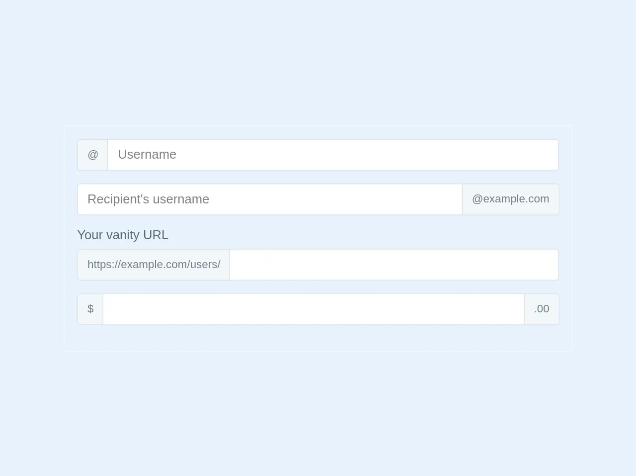
The preview of Input Group Add Ons ui component.
To give you an idea of what an Input Group Add Ons UI component looks like, here is a preview:
Free download of the Input Group Add Ons's source code
The source code of Input Group Add Ons ui component.
Here is the source code for the Input Group Add Ons UI component:
<div class="relative p-4 border border-grey-lighter w-1/2">

		<div class="flex flex-wrap items-stretch w-full mb-4 relative">
			<div class="flex -mr-px">
				<span class="flex items-center leading-normal bg-grey-lighter rounded rounded-r-none border border-r-0 border-grey-light px-3 whitespace-no-wrap text-grey-dark text-sm">@</span>
			</div>
			<input type="text" class="flex-shrink flex-grow flex-auto leading-normal w-px flex-1 border h-10 border-grey-light rounded rounded-l-none px-3 relative focus:border-blue focus:shadow" placeholder="Username">
		</div>

		<div class="flex flex-wrap items-stretch w-full mb-4 relative">
			<input type="text" class="flex-shrink flex-grow flex-auto leading-normal w-px flex-1 border h-10 border-grey-light rounded rounded-r-none px-3 relative" placeholder="Recipient's username">
			<div class="flex -mr-px">
				<span class="flex items-center leading-normal bg-grey-lighter rounded rounded-l-none border border-l-0 border-grey-light px-3 whitespace-no-wrap text-grey-dark text-sm">@example.com</span>
			</div>
		</div>

		<label for="basic-url" class="text-grey-darker inline-block mb-2">Your vanity URL</label>
		<div class="flex flex-wrap items-stretch w-full mb-4 relative">
			<div class="flex -mr-px">
				<span class="flex items-center leading-normal bg-grey-lighter rounded rounded-r-none border border-r-0 border-grey-light px-3 whitespace-no-wrap text-grey-dark text-sm">https://example.com/users/</span>
			</div>
			<input type="text" class="flex-shrink flex-grow flex-auto leading-normal w-px flex-1 border h-10 border-grey-light rounded rounded-l-none px-3 relative" >
		</div>

		<div class="flex flex-wrap items-stretch w-full mb-4 relative">
			<div class="flex -mr-px">
				<span class="flex items-center leading-normal bg-grey-lighter rounded rounded-r-none border border-r-0 border-grey-light px-3 whitespace-no-wrap text-grey-dark text-sm">$</span>
			</div>
			<input type="text" class="flex-shrink flex-grow flex-auto leading-normal w-px flex-1 border h-10 border-grey-light px-3 relative" >
			<div class="flex -mr-px">
				<span class="flex items-center leading-normal bg-grey-lighter rounded rounded-l-none border border-l-0 border-grey-light px-3 whitespace-no-wrap text-grey-dark text-sm">.00</span>
			</div>
		</div>

	</div>
How to create a Input Group Add Ons with Tailwind CSS?
Now that you have an understanding of what an Input Group Add Ons UI component is and why you should use Tailwind CSS, let's dive into the six easy steps to create one.
Step 1: Set up your HTML
To begin, create a new HTML file and add the following code:
<div class="flex flex-col">
  <label for="input" class="text-gray-700 font-bold mb-2">Input</label>
  <div class="relative">
    <input type="text" id="input" name="input" class="border rounded-lg py-2 px-3 text-gray-700 leading-tight focus:outline-none focus:shadow-outline" placeholder="Input">
    <div class="absolute inset-y-0 right-0 flex items-center px-2 bg-gray-100 rounded-r-lg">
      <button class="bg-blue-500 hover:bg-blue-700 text-white font-bold py-2 px-4 rounded">
        Button
      </button>
    </div>
  </div>
</div>
This code creates a basic input field with a button on the right side.
Step 2: Add Tailwind CSS to your project
Next, add Tailwind CSS to your project by including the following code in the head of your HTML file:
<link href="https://cdn.jsdelivr.net/npm/tailwindcss@latest/dist/tailwind.min.css" rel="stylesheet">
This code links to the latest version of Tailwind CSS hosted on a CDN.
Step 3: Customize your Input Group Add Ons
Now that you have the basic HTML and Tailwind CSS set up, you can customize your Input Group Add Ons. Here are some examples of customizations you can make:
- Change the color of the button:
bg-red-500 - Change the size of the button:
py-3 px-6 - Add an icon to the button:
<i class="fas fa-search"></i>
Step 4: Add additional elements to the Input Group Add Ons
You can also add additional elements to the Input Group Add Ons, such as text or icons. Here is an example of how to add a search icon to the left side of the input field:
<div class="relative">
  <div class="absolute inset-y-0 left-0 flex items-center pl-2">
    <i class="fas fa-search text-gray-400"></i>
  </div>
  <input type="text" id="input" name="input" class="border rounded-lg py-2 px-3 pl-10 text-gray-700 leading-tight focus:outline-none focus:shadow-outline" placeholder="Input">
  <div class="absolute inset-y-0 right-0 flex items-center px-2 bg-gray-100 rounded-r-lg">
    <button class="bg-blue-500 hover:bg-blue-700 text-white font-bold py-2 px-4 rounded">
      Button
    </button>
  </div>
</div>
Step 5: Add responsiveness to your Input Group Add Ons
Tailwind CSS provides a simple way to make your Input Group Add Ons responsive. Here is an example of how to make the Input Group Add Ons stack on smaller screens:
<div class="relative">
  <div class="absolute inset-y-0 left-0 flex items-center pl-2">
    <i class="fas fa-search text-gray-400"></i>
  </div>
  <input type="text" id="input" name="input" class="border rounded-lg py-2 px-3 pl-10 text-gray-700 leading-tight focus:outline-none focus:shadow-outline" placeholder="Input">
  <div class="absolute inset-y-0 right-0 flex items-center px-2 bg-gray-100 rounded-r-lg">
    <button class="bg-blue-500 hover:bg-blue-700 text-white font-bold py-2 px-4 rounded">
      Button
    </button>
  </div>
</div>

<div class="relative mt-2 sm:mt-0">
  <select class="block appearance-none w-full bg-gray-200 border border-gray-200 text-gray-700 py-3 px-4 pr-8 rounded leading-tight focus:outline-none focus:bg-white focus:border-gray-500">
    <option>Option 1</option>
    <option>Option 2</option>
    <option>Option 3</option>
  </select>
  <div class="pointer-events-none absolute inset-y-0 right-0 flex items-center px-2 text-gray-700">
    <svg class="fill-current h-4 w-4" xmlns="http://www.w3.org/2000/svg" viewBox="0 0 20 20"><path d="M14.95 6.95l-4.242 4.243-4.243-4.243-1.414 1.414 4.243 4.243-4.243 4.242 1.414 1.414 4.243-4.242 4.242 4.242 1.414-1.414-4.242-4.242 4.242-4.243-1.414-1.414z"/></svg>
  </div>
</div>
Step 6: Test and deploy your Input Group Add Ons
Finally, test your Input Group Add Ons to ensure it is working as expected. Once you are satisfied with the component, deploy it to your website or application.
Conclusion
In this article, we have shown you how to create an Input Group Add Ons UI component with Tailwind CSS in just six easy steps. With Tailwind CSS, you can easily customize the appearance of the component to match your website or application's design. We hope this article has been helpful in guiding you through the process of building an Input Group Add Ons UI component.