- Published on
The Ultimate Guide To Help You Build A Input Field With Label With Tailwind CSS
- What is Tailwind CSS?
- The description of Input field with label UI component
- Why use Tailwind CSS to create an Input field with label UI component?
- The preview of Input field with label UI component
- The source code of Input field with label UI component
- How to create an Input field with label with Tailwind CSS?
- Conclusion
As a FrontEnd technology blogger, it is important to stay up-to-date with the latest trends and tools in the industry. One such tool that has gained a lot of popularity in recent years is Tailwind CSS. In this article, we will explore how to use Tailwind CSS to build an input field with label UI component.
What is Tailwind CSS?
Tailwind CSS is a utility-first CSS framework that provides a set of pre-defined classes to help you build responsive and customizable user interfaces. It is designed to be highly modular and easy to use, allowing you to create complex layouts and designs with minimal effort.
The description of Input field with label UI component
An input field with label is a common UI component used in forms to collect user input. It consists of a label that describes the input field and an input field where the user can enter their information. This UI component is essential for any form-based application and can be customized to fit the design of your application.
Why use Tailwind CSS to create an Input field with label UI component?
Tailwind CSS provides a set of pre-defined classes that can be used to create an input field with label UI component quickly. These classes can be customized to fit the design of your application, and you don't have to write any custom CSS code. Additionally, Tailwind CSS is highly modular, making it easy to maintain and update your codebase.
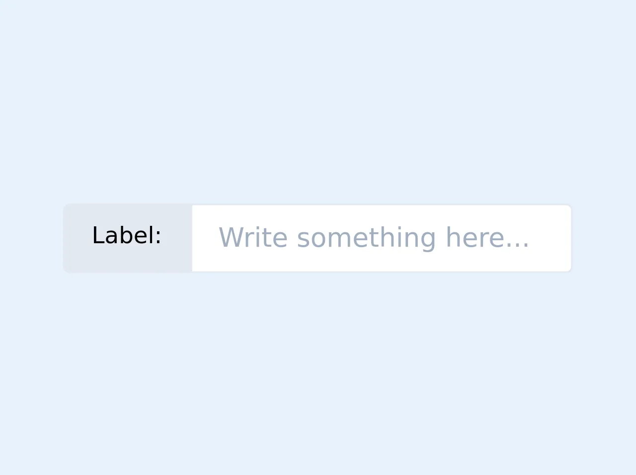
The preview of Input field with label UI component
To create an input field with label UI component using Tailwind CSS, we will use the following classes:
block: This class sets the display property of the element to block, making it take up the full width of its parent container.mb-4: This class adds a margin-bottom of 1rem to the element, creating space between the input field and the next element.text-gray-700: This class sets the color of the text to gray-700, making it easy to read.border-2: This class adds a 2px border to the input field.border-gray-300: This class sets the color of the border to gray-300, making it easy to see.rounded-md: This class adds rounded corners to the input field, making it look more polished.py-2: This class adds padding to the top and bottom of the input field, making it easier to interact with.px-3: This class adds padding to the left and right of the input field, making it easier to read.
Free download of the Input field with label's source code
The source code of Input field with label UI component
To create an input field with label UI component using Tailwind CSS, you can use the following HTML code:
<div class="block mb-4">
  <label class="text-gray-700" for="input-field">Input Field Label</label>
  <input class="border-2 border-gray-300 rounded-md py-2 px-3" type="text" id="input-field" name="input-field">
</div>
<div class="flex">
    <span class="text-sm border border-2 rounded-l px-4 py-2 bg-gray-300 whitespace-no-wrap">Label:</span>
    <input name="field_name" class="border border-2 rounded-r px-4 py-2 w-full" type="text" placeholder="Write something here..." />
</div>
How to create an Input field with label with Tailwind CSS?
To create an input field with label UI component using Tailwind CSS, follow these steps:
- Create a new HTML file and add the following code:
<!DOCTYPE html>
<html lang="en">
<head>
  <meta charset="UTF-8">
  <title>Input Field with Label</title>
  <link rel="stylesheet" href="https://cdn.jsdelivr.net/npm/[email protected]/dist/tailwind.min.css">
</head>
<body>
  <div class="container mx-auto mt-4">
    <div class="block mb-4">
      <label class="text-gray-700" for="input-field">Input Field Label</label>
      <input class="border-2 border-gray-300 rounded-md py-2 px-3" type="text" id="input-field" name="input-field">
    </div>
  </div>
</body>
</html>
- Save the file as
index.html. - Open the file in your web browser to see the input field with label UI component.
Conclusion
In this article, we explored how to use Tailwind CSS to create an input field with label UI component. We discussed the benefits of using Tailwind CSS, provided a preview of the UI component, and shared the source code and steps to create it. With Tailwind CSS, you can create complex UI components quickly and easily, making it a valuable tool for any FrontEnd developer.