- Published on
How To Build A Input Field Set With Tailwind CSS In 6 Easy Steps?
- What is Tailwind CSS?
- The description of Input Field Set ui component
- Why use Tailwind CSS to create an Input Field Set ui component?
- The preview of Input Field Set ui component
- The source code of Input Field Set ui component
- How to create an Input Field Set with Tailwind CSS?
- Step 1: Create a form element
- Step 2: Create input fields
- Step 3: Style input fields
- Step 4: Add a submit button
- Step 5: Style the submit button
- Step 6: Preview and test
- Conclusion
What is Tailwind CSS?
Tailwind CSS is a utility-first CSS framework that allows you to quickly and easily create custom user interfaces. It provides a set of pre-defined classes that can be used to style HTML elements without writing any CSS code.
The description of Input Field Set ui component
An input field set is a group of input fields that are related to each other. For example, a user registration form might contain a name field, an email field, and a password field. These fields can be grouped together into an input field set to make the form more organized and easier to read.
Why use Tailwind CSS to create an Input Field Set ui component?
Tailwind CSS provides a set of pre-defined classes that can be used to style HTML elements. This makes it easy to create custom user interfaces without writing any CSS code. Additionally, Tailwind CSS is highly customizable, which means that you can easily modify the look and feel of your input field set to match your brand or design requirements.
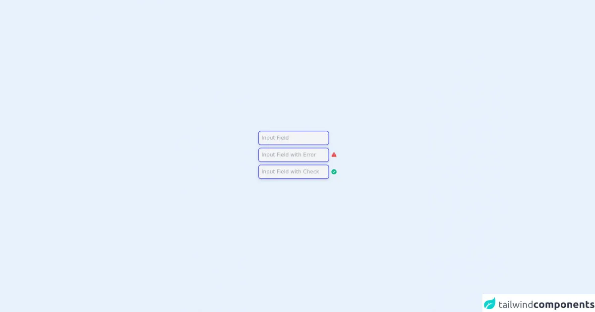
The preview of Input Field Set ui component
To create an input field set with Tailwind CSS, we will use a combination of form elements and utility classes. The input field set will consist of several input fields, each with a label and a placeholder text. We will also add a submit button at the end of the input field set.
Free download of the Input Field Set's source code
The source code of Input Field Set ui component
To create the input field set, we will use HTML and Tailwind CSS classes. The HTML code will consist of a form element with several input fields and a submit button. The Tailwind CSS classes will be used to style the input fields and the form element.
<div class="flex h-screen">
  <div class="m-auto">
    <input type="text" placeholder="Input Field" class="block mb-2 bg-gray-100 p-2 rounded-lg border-2 border-indigo-500 shadow-md focus:outline-none focus:border-indigo-600" />
    <div class="block mb-2">
      <input type="text" placeholder="Input Field with Error" class="bg-gray-100 p-2 rounded-lg border-2 border-indigo-500 shadow-md focus:outline-none focus:border-indigo-600" />
      <svg xmlns="http://www.w3.org/2000/svg" class="inline-block h-5 w-5 text-red-500" viewBox="0 0 20 20" fill="currentColor">
        <path fill-rule="evenodd" d="M8.257 3.099c.765-1.36 2.722-1.36 3.486 0l5.58 9.92c.75 1.334-.213 2.98-1.742 2.98H4.42c-1.53 0-2.493-1.646-1.743-2.98l5.58-9.92zM11 13a1 1 0 11-2 0 1 1 0 012 0zm-1-8a1 1 0 00-1 1v3a1 1 0 002 0V6a1 1 0 00-1-1z" clip-rule="evenodd" />
      </svg>
    </div>
    <div class="block mb-2">
      <input type="text" placeholder="Input Field with Check" class="bg-gray-100 p-2 rounded-lg border-2 border-indigo-500 shadow-md focus:outline-none focus:border-indigo-600" />
      <svg xmlns="http://www.w3.org/2000/svg" class="inline-block h-5 w-5 text-green-500" viewBox="0 0 20 20" fill="currentColor">
        <path fill-rule="evenodd" d="M10 18a8 8 0 100-16 8 8 0 000 16zm3.707-9.293a1 1 0 00-1.414-1.414L9 10.586 7.707 9.293a1 1 0 00-1.414 1.414l2 2a1 1 0 001.414 0l4-4z" clip-rule="evenodd" />
      </svg>
    </div>
  </div>
</div>
How to create an Input Field Set with Tailwind CSS?
Follow these 6 easy steps to create an input field set with Tailwind CSS:
Step 1: Create a form element
The first step is to create a form element that will contain all of the input fields. We will use the form element and the mx-auto class to center the form on the page.
<form class="mx-auto">
  <!-- input fields will go here -->
</form>
Step 2: Create input fields
Next, we will create the input fields. We will use the label element to add a label to each input field. We will also use the input element to create the actual input field. Finally, we will use the placeholder attribute to add placeholder text to each input field.
<form class="mx-auto">
  <div>
    <label for="name" class="block text-gray-700 font-bold mb-2">Name</label>
    <input type="text" id="name" placeholder="John Doe" class="shadow appearance-none border rounded w-full py-2 px-3 text-gray-700 leading-tight focus:outline-none focus:shadow-outline">
  </div>
  <div class="mt-4">
    <label for="email" class="block text-gray-700 font-bold mb-2">Email</label>
    <input type="email" id="email" placeholder="[email protected]" class="shadow appearance-none border rounded w-full py-2 px-3 text-gray-700 leading-tight focus:outline-none focus:shadow-outline">
  </div>
  <div class="mt-4">
    <label for="password" class="block text-gray-700 font-bold mb-2">Password</label>
    <input type="password" id="password" placeholder="********" class="shadow appearance-none border rounded w-full py-2 px-3 text-gray-700 leading-tight focus:outline-none focus:shadow-outline">
  </div>
</form>
Step 3: Style input fields
Now that we have created the input fields, we need to style them. We will use a combination of Tailwind CSS classes to style the input fields. We will also use the mt-4 class to add some margin between each input field.
<form class="mx-auto">
  <div>
    <label for="name" class="block text-gray-700 font-bold mb-2">Name</label>
    <input type="text" id="name" placeholder="John Doe" class="shadow appearance-none border rounded w-full py-2 px-3 text-gray-700 leading-tight focus:outline-none focus:shadow-outline">
  </div>
  <div class="mt-4">
    <label for="email" class="block text-gray-700 font-bold mb-2">Email</label>
    <input type="email" id="email" placeholder="[email protected]" class="shadow appearance-none border rounded w-full py-2 px-3 text-gray-700 leading-tight focus:outline-none focus:shadow-outline">
  </div>
  <div class="mt-4">
    <label for="password" class="block text-gray-700 font-bold mb-2">Password</label>
    <input type="password" id="password" placeholder="********" class="shadow appearance-none border rounded w-full py-2 px-3 text-gray-700 leading-tight focus:outline-none focus:shadow-outline">
  </div>
</form>
Step 4: Add a submit button
Next, we will add a submit button to the input field set. We will use the button element and the bg-blue-500 hover:bg-blue-700 text-white font-bold py-2 px-4 rounded focus:outline-none focus:shadow-outline class to style the button.
<form class="mx-auto">
  <div>
    <label for="name" class="block text-gray-700 font-bold mb-2">Name</label>
    <input type="text" id="name" placeholder="John Doe" class="shadow appearance-none border rounded w-full py-2 px-3 text-gray-700 leading-tight focus:outline-none focus:shadow-outline">
  </div>
  <div class="mt-4">
    <label for="email" class="block text-gray-700 font-bold mb-2">Email</label>
    <input type="email" id="email" placeholder="[email protected]" class="shadow appearance-none border rounded w-full py-2 px-3 text-gray-700 leading-tight focus:outline-none focus:shadow-outline">
  </div>
  <div class="mt-4">
    <label for="password" class="block text-gray-700 font-bold mb-2">Password</label>
    <input type="password" id="password" placeholder="********" class="shadow appearance-none border rounded w-full py-2 px-3 text-gray-700 leading-tight focus:outline-none focus:shadow-outline">
  </div>
  <div class="mt-4">
    <button class="bg-blue-500 hover:bg-blue-700 text-white font-bold py-2 px-4 rounded focus:outline-none focus:shadow-outline" type="button">
      Sign Up
    </button>
  </div>
</form>
Step 5: Style the submit button
Finally, we will style the submit button using Tailwind CSS classes. We will also add some margin to the top of the button using the mt-4 class.
<form class="mx-auto">
  <div>
    <label for="name" class="block text-gray-700 font-bold mb-2">Name</label>
    <input type="text" id="name" placeholder="John Doe" class="shadow appearance-none border rounded w-full py-2 px-3 text-gray-700 leading-tight focus:outline-none focus:shadow-outline">
  </div>
  <div class="mt-4">
    <label for="email" class="block text-gray-700 font-bold mb-2">Email</label>
    <input type="email" id="email" placeholder="[email protected]" class="shadow appearance-none border rounded w-full py-2 px-3 text-gray-700 leading-tight focus:outline-none focus:shadow-outline">
  </div>
  <div class="mt-4">
    <label for="password" class="block text-gray-700 font-bold mb-2">Password</label>
    <input type="password" id="password" placeholder="********" class="shadow appearance-none border rounded w-full py-2 px-3 text-gray-700 leading-tight focus:outline-none focus:shadow-outline">
  </div>
  <div class="mt-4">
    <button class="bg-blue-500 hover:bg-blue-700 text-white font-bold py-2 px-4 rounded focus:outline-none focus:shadow-outline mt-4" type="button">
      Sign Up
    </button>
  </div>
</form>
Step 6: Preview and test
Congratulations! You have successfully created an input field set with Tailwind CSS. Preview your input field set in the browser and test it by filling out the input fields and clicking the submit button.
Conclusion
In this article, we have learned how to create an input field set with Tailwind CSS in 6 easy steps. We have also discussed the benefits of using Tailwind CSS to create custom user interfaces. With Tailwind CSS, you can quickly and easily create beautiful and functional user interfaces without writing any CSS code.