- Published on
Learn How To Create A Input Field With Tailwind CSS from the Pros
- What is Tailwind CSS?
- The description of Input field ui component
- Why use Tailwind CSS to create a Input field ui component?
- The preview of Input field ui component.
- The source code of Input field ui component.
- How to create a Input field with Tailwind CSS?
- Conclusion
Tailwind CSS is a popular utility-first CSS framework that makes it easy to create responsive and customizable user interfaces. In this article, we will teach you how to create an input field UI component using Tailwind CSS.
What is Tailwind CSS?
Tailwind CSS is a CSS framework that provides a set of pre-defined classes that can be used to style HTML elements. It is known for its utility-first approach, which means that instead of writing custom CSS code, you can use pre-defined classes to style your elements.
The description of Input field ui component
An input field is a UI component that allows users to input data into a form. It is a common UI element that is used in almost every web application. An input field can be used to collect various types of data, such as text, numbers, dates, and more.
Why use Tailwind CSS to create a Input field ui component?
Tailwind CSS is a great choice for creating UI components like input fields because it provides a set of pre-defined classes that can be used to style the component. This makes it easy to create a consistent and responsive UI, without having to write custom CSS code.
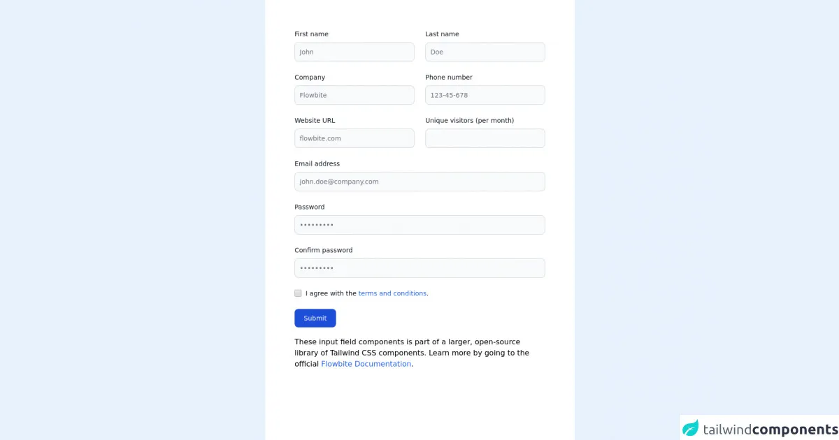
The preview of Input field ui component.
To create an input field using Tailwind CSS, we will use the input element and apply some classes to it. The final result will be a simple input field with a placeholder text.
Free download of the Input field's source code
The source code of Input field ui component.
To create the input field, we will use the following HTML code and apply some Tailwind CSS classes to it.
<!-- This is an example component -->
<div class="max-w-2xl mx-auto bg-white p-16">

	<form>
    <div class="grid gap-6 mb-6 lg:grid-cols-2">
        <div>
            <label for="first_name" class="block mb-2 text-sm font-medium text-gray-900 dark:text-gray-300">First name</label>
            <input type="text" id="first_name" class="bg-gray-50 border border-gray-300 text-gray-900 text-sm rounded-lg focus:ring-blue-500 focus:border-blue-500 block w-full p-2.5 dark:bg-gray-700 dark:border-gray-600 dark:placeholder-gray-400 dark:text-white dark:focus:ring-blue-500 dark:focus:border-blue-500" placeholder="John" required>
        </div>
        <div>
            <label for="last_name" class="block mb-2 text-sm font-medium text-gray-900 dark:text-gray-300">Last name</label>
            <input type="text" id="last_name" class="bg-gray-50 border border-gray-300 text-gray-900 text-sm rounded-lg focus:ring-blue-500 focus:border-blue-500 block w-full p-2.5 dark:bg-gray-700 dark:border-gray-600 dark:placeholder-gray-400 dark:text-white dark:focus:ring-blue-500 dark:focus:border-blue-500" placeholder="Doe" required>
        </div>
        <div>
            <label for="company" class="block mb-2 text-sm font-medium text-gray-900 dark:text-gray-300">Company</label>
            <input type="text" id="company" class="bg-gray-50 border border-gray-300 text-gray-900 text-sm rounded-lg focus:ring-blue-500 focus:border-blue-500 block w-full p-2.5 dark:bg-gray-700 dark:border-gray-600 dark:placeholder-gray-400 dark:text-white dark:focus:ring-blue-500 dark:focus:border-blue-500" placeholder="Flowbite" required>
        </div>
        <div>
            <label for="phone" class="block mb-2 text-sm font-medium text-gray-900 dark:text-gray-300">Phone number</label>
            <input type="tel" id="phone" class="bg-gray-50 border border-gray-300 text-gray-900 text-sm rounded-lg focus:ring-blue-500 focus:border-blue-500 block w-full p-2.5 dark:bg-gray-700 dark:border-gray-600 dark:placeholder-gray-400 dark:text-white dark:focus:ring-blue-500 dark:focus:border-blue-500" placeholder="123-45-678" pattern="[0-9]{3}-[0-9]{2}-[0-9]{3}" required>
        </div>
        <div>
            <label for="website" class="block mb-2 text-sm font-medium text-gray-900 dark:text-gray-300">Website URL</label>
            <input type="url" id="website" class="bg-gray-50 border border-gray-300 text-gray-900 text-sm rounded-lg focus:ring-blue-500 focus:border-blue-500 block w-full p-2.5 dark:bg-gray-700 dark:border-gray-600 dark:placeholder-gray-400 dark:text-white dark:focus:ring-blue-500 dark:focus:border-blue-500" placeholder="flowbite.com" required>
        </div>
        <div>
            <label for="visitors" class="block mb-2 text-sm font-medium text-gray-900 dark:text-gray-300">Unique visitors (per month)</label>
            <input type="number" id="visitors" class="bg-gray-50 border border-gray-300 text-gray-900 text-sm rounded-lg focus:ring-blue-500 focus:border-blue-500 block w-full p-2.5 dark:bg-gray-700 dark:border-gray-600 dark:placeholder-gray-400 dark:text-white dark:focus:ring-blue-500 dark:focus:border-blue-500" placeholder="" required>
        </div>
    </div>
    <div class="mb-6">
        <label for="email" class="block mb-2 text-sm font-medium text-gray-900 dark:text-gray-300">Email address</label>
        <input type="email" id="email" class="bg-gray-50 border border-gray-300 text-gray-900 text-sm rounded-lg focus:ring-blue-500 focus:border-blue-500 block w-full p-2.5 dark:bg-gray-700 dark:border-gray-600 dark:placeholder-gray-400 dark:text-white dark:focus:ring-blue-500 dark:focus:border-blue-500" placeholder="[email protected]" required>
    </div>
    <div class="mb-6">
        <label for="password" class="block mb-2 text-sm font-medium text-gray-900 dark:text-gray-300">Password</label>
        <input type="password" id="password" class="bg-gray-50 border border-gray-300 text-gray-900 text-sm rounded-lg focus:ring-blue-500 focus:border-blue-500 block w-full p-2.5 dark:bg-gray-700 dark:border-gray-600 dark:placeholder-gray-400 dark:text-white dark:focus:ring-blue-500 dark:focus:border-blue-500" placeholder="•••••••••" required>
    </div>
    <div class="mb-6">
        <label for="confirm_password" class="block mb-2 text-sm font-medium text-gray-900 dark:text-gray-300">Confirm password</label>
        <input type="password" id="confirm_password" class="bg-gray-50 border border-gray-300 text-gray-900 text-sm rounded-lg focus:ring-blue-500 focus:border-blue-500 block w-full p-2.5 dark:bg-gray-700 dark:border-gray-600 dark:placeholder-gray-400 dark:text-white dark:focus:ring-blue-500 dark:focus:border-blue-500" placeholder="•••••••••" required>
    </div>
    <div class="flex items-start mb-6">
        <div class="flex items-center h-5">
        <input id="remember" type="checkbox" value="" class="w-4 h-4 border border-gray-300 rounded bg-gray-50 focus:ring-3 focus:ring-blue-300 dark:bg-gray-700 dark:border-gray-600 dark:focus:ring-blue-600 dark:ring-offset-gray-800" required>
        </div>
        <label for="remember" class="ml-2 text-sm font-medium text-gray-900 dark:text-gray-400">I agree with the <a href="#" class="text-blue-600 hover:underline dark:text-blue-500">terms and conditions</a>.</label>
    </div>
    <button type="submit" class="text-white bg-blue-700 hover:bg-blue-800 focus:ring-4 focus:outline-none focus:ring-blue-300 font-medium rounded-lg text-sm w-full sm:w-auto px-5 py-2.5 text-center dark:bg-blue-600 dark:hover:bg-blue-700 dark:focus:ring-blue-800">Submit</button>
</form>

	<p class="mt-5">These input field components is part of a larger, open-source library of Tailwind CSS components. Learn
		more by going to the official <a class="text-blue-600 hover:underline"
			href="https://flowbite.com/docs/getting-started/introduction/" target="_blank">Flowbite
			Documentation</a>.
	</p>
</div>
How to create a Input field with Tailwind CSS?
To create an input field with Tailwind CSS, follow these steps:
- Create an HTML
inputelement.
<input type="text" placeholder="Enter your name">
- Apply the
borderandroundedclasses to the input element to give it a border and rounded corners.
<input type="text" placeholder="Enter your name" class="border border-gray-300 rounded-md">
- Apply the
pyandpxclasses to the input element to add padding to the top and bottom and left and right sides of the input field.
<input type="text" placeholder="Enter your name" class="border border-gray-300 rounded-md py-2 px-3">
- Apply the
focus:outline-noneclass to the input element to remove the default outline when the input field is in focus.
<input type="text" placeholder="Enter your name" class="border border-gray-300 rounded-md py-2 px-3 focus:outline-none">
- Apply the
focus:border-blue-500class to the input element to add a blue border when the input field is in focus.
<input type="text" placeholder="Enter your name" class="border border-gray-300 rounded-md py-2 px-3 focus:outline-none focus:border-blue-500">
- Apply the
w-fullclass to the input element to make it take up the full width of its container.
<input type="text" placeholder="Enter your name" class="border border-gray-300 rounded-md py-2 px-3 focus:outline-none focus:border-blue-500 w-full">
- Finally, you can customize the input field further by applying additional Tailwind CSS classes.
Conclusion
In this article, we have learned how to create an input field UI component using Tailwind CSS. Tailwind CSS provides a set of pre-defined classes that can be used to style UI components like input fields, making it easy to create a consistent and responsive UI. By following the steps outlined in this article, you can create a simple and functional input field that can be customized further to fit your specific needs.