- Published on
Most Effective Ways To Make A Input With Tailwind CSS
- What is Tailwind CSS?
- The description of Input UI component
- Why use Tailwind CSS to create an Input UI component?
- The preview of Input UI component
- The source code of Input UI component
- How to create an Input with Tailwind CSS?
- Conclusion
Tailwind CSS is a utility-first CSS framework that helps you build modern and responsive websites quickly. It provides a set of pre-defined CSS classes that you can use to style your HTML elements. In this article, we will discuss the most effective ways to create an input UI component using Tailwind CSS.
What is Tailwind CSS?
Tailwind CSS is a CSS framework that provides a set of pre-defined CSS classes that you can use to style your HTML elements. It is a utility-first CSS framework, which means that it focuses on providing utility classes that you can use to style your HTML elements instead of providing pre-defined components.
The description of Input UI component
The input UI component is used to get input from the user. It is a common UI component that is used in almost every web application. It can be used to get user information like name, email, password, etc.
Why use Tailwind CSS to create an Input UI component?
Tailwind CSS provides a set of pre-defined CSS classes that you can use to style your HTML elements. It is a utility-first CSS framework, which means that it focuses on providing utility classes that you can use to style your HTML elements instead of providing pre-defined components. This makes it easy to create custom UI components like input fields.
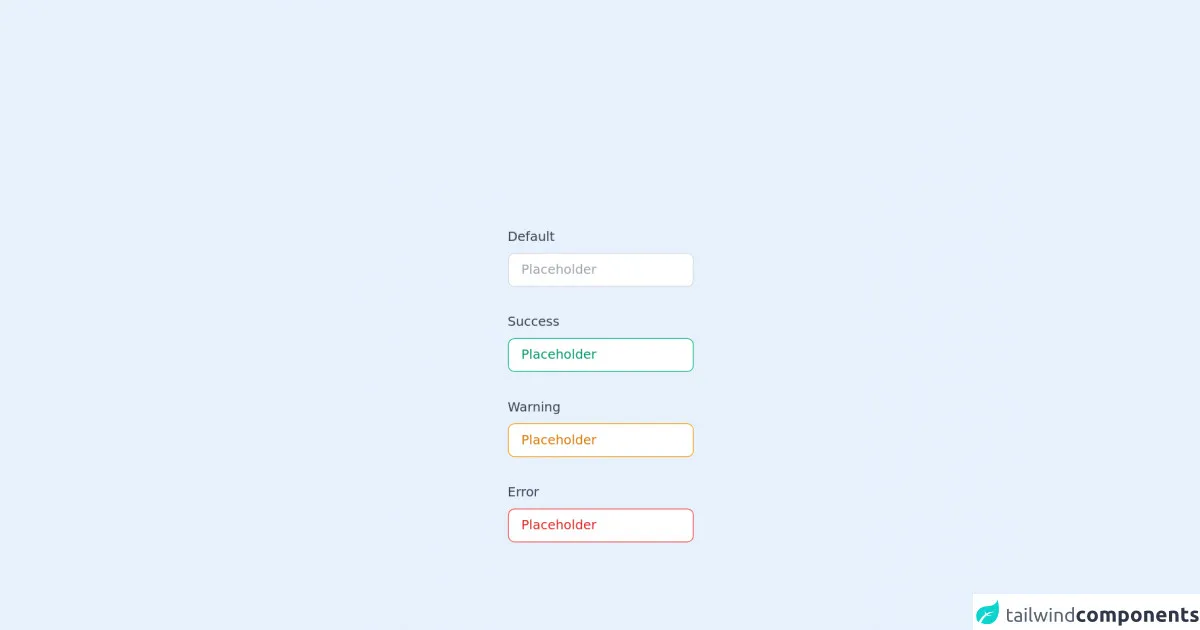
The preview of Input UI component
To create an input UI component using Tailwind CSS, we can use the input class. This class provides a basic styling for the input element. We can also use other utility classes like border, rounded, shadow, text, placeholder, etc. to customize the input element.
Free download of the Input's source code
The source code of Input UI component
To create an input UI component using Tailwind CSS, we can use the following HTML code:
<div class="py-20 space-y-8">
  <div class="flex flex-col space-y-2">
    <label for="default" class="text-gray-700 select-none font-medium">Default</label>
    <input
      id="default"
      type="text"
      name="default"
      placeholder="Placeholder"
      class="px-4 py-2 rounded-lg border border-gray-300 focus:outline-none focus:ring-2 focus:ring-gray-200"
    />
  </div>

  <div class="flex flex-col space-y-2">
    <label for="success" class="text-gray-700 select-none font-medium">Success</label>
    <input
      id="success"
      type="text"
      name="success"
      placeholder="Placeholder"
      class="px-4 py-2 rounded-lg border border-green-500 text-green-600 placeholder-green-600 focus:outline-none focus:ring-2 focus:ring-green-200"
    />
  </div>

  <div class="flex flex-col space-y-2">
    <label for="warning" class="text-gray-700 select-none font-medium">Warning</label>
    <input
      id="warning"
      type="text"
      name="warning"
      placeholder="Placeholder"
      class="px-4 py-2 rounded-lg border border-yellow-500 text-yellow-600 placeholder-yellow-600 focus:outline-none focus:ring-2 focus:ring-yellow-200"
    />
  </div>

  <div class="flex flex-col space-y-2">
    <label for="error" class="text-gray-700 select-none font-medium">Error</label>
    <input
      id="error"
      type="text"
      name="error"
      placeholder="Placeholder"
      class="px-4 py-2 rounded-lg border border-red-500 text-red-600 placeholder-red-600 focus:outline-none focus:ring-2 focus:ring-red-200"
    />
  </div>
</div>
This code creates an input element with the input class and other utility classes like border, rounded, shadow, text, placeholder, etc. We can customize the input element by adding or removing utility classes.
How to create an Input with Tailwind CSS?
To create an input UI component using Tailwind CSS, follow these steps:
- Create an HTML file and add the following code:
<div class="w-full max-w-xs">
  <input class="input border rounded shadow text-grey-dark mb-2" type="text" placeholder="Enter your name">
</div>
- Add the Tailwind CSS stylesheet to your HTML file:
<link href="https://cdn.jsdelivr.net/npm/[email protected]/dist/tailwind.min.css" rel="stylesheet">
- Customize the input element by adding or removing utility classes.
For example, to change the color of the input element, you can add the bg-blue-100 class:
<div class="w-full max-w-xs">
  <input class="input border rounded shadow text-grey-dark mb-2 bg-blue-100" type="text" placeholder="Enter your name">
</div>
This will change the background color of the input element to light blue.
Conclusion
In this article, we discussed the most effective ways to create an input UI component using Tailwind CSS. Tailwind CSS provides a set of pre-defined CSS classes that you can use to style your HTML elements. It is a utility-first CSS framework, which makes it easy to create custom UI components like input fields. By using the input class and other utility classes like border, rounded, shadow, text, placeholder, etc., you can create a customized input UI component in no time.