- Published on
6 Steps To Create A Inline Form With Validation With Tailwind CSS Like A Pro In Under An Hour
- What is Tailwind CSS?
- The description of Inline Form with Validation UI component
- Why use Tailwind CSS to create an Inline Form with Validation UI component?
- The preview of Inline Form with Validation UI component
- The source code of Inline Form with Validation UI component
- How to create an Inline Form with Validation with Tailwind CSS?
- Step 1: Create the HTML structure
- Step 2: Add Tailwind CSS classes
- Step 3: Add validation styles
- Step 4: Add JavaScript validation
- Step 5: Add success message
- Step 6: Add success message JavaScript
- Conclusion
As a FrontEnd technology blogger, I'm always looking for ways to make my UI components look great and function even better. That's why I'm excited to share with you how to create a Inline Form with Validation UI component using Tailwind CSS. In this article, I'll walk you through the six easy steps to create this UI component like a pro in under an hour.
What is Tailwind CSS?
Tailwind CSS is a utility-first CSS framework that allows you to quickly and easily create custom designs without writing a lot of custom CSS. It's a great tool for creating responsive and scalable UI components.
The description of Inline Form with Validation UI component
An Inline Form with Validation UI component is a form that is displayed inline with the content on a web page. It is often used for quick data entry or to provide users with a way to submit information without leaving the current page. The validation aspect of this UI component ensures that the user input is correct before submitting the form.
Why use Tailwind CSS to create an Inline Form with Validation UI component?
Tailwind CSS makes it easy to create custom UI components without writing a lot of custom CSS. It also provides a lot of built-in utility classes that make it easy to create responsive and scalable designs. This means you can create an Inline Form with Validation UI component quickly and easily, without having to spend a lot of time writing custom CSS.
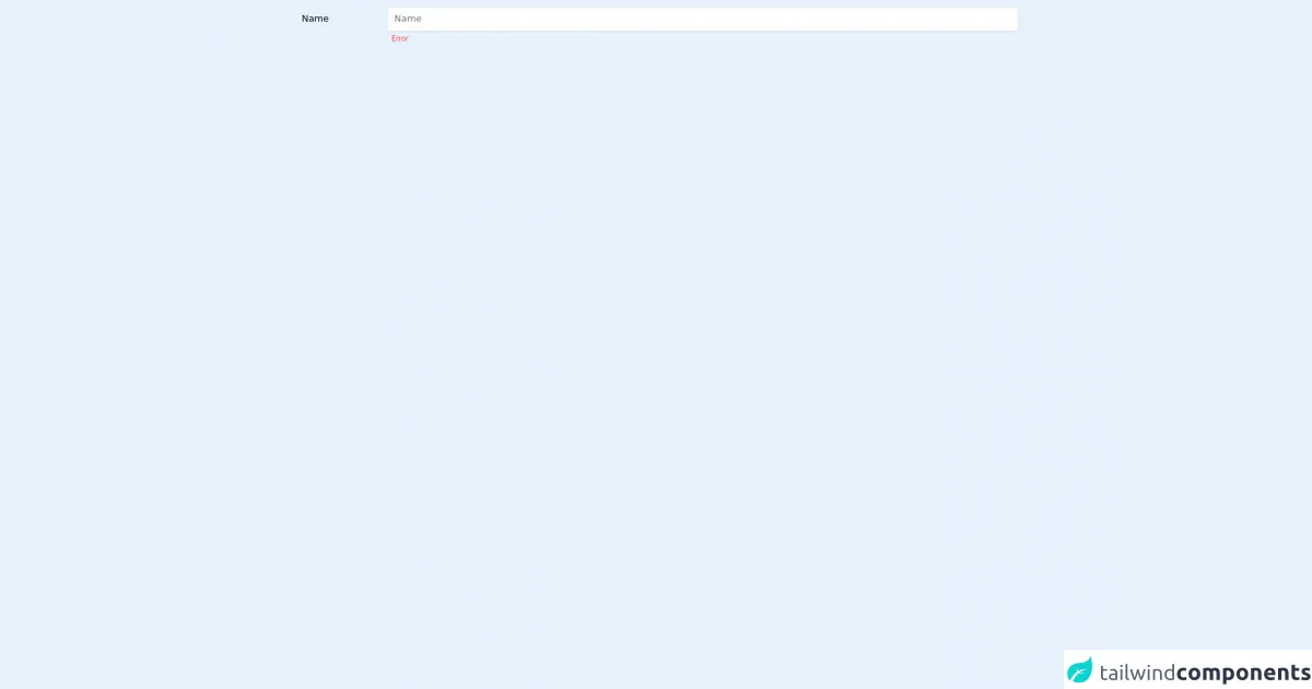
The preview of Inline Form with Validation UI component
To give you an idea of what the Inline Form with Validation UI component looks like, here is a preview of what we will be creating:
Free download of the Inline Form with Validation's source code
The source code of Inline Form with Validation UI component
To create the Inline Form with Validation UI component, we will be using HTML, CSS, and Tailwind CSS. Here is the source code for the UI component:
<div class="flex items-start p-3">
  <div class="w-40 px-3 py-2">Name</div>
  <div class="flex-1">
    <input type="text" class="w-full border shadow-sm px-3 py-2 rounded-md appearance-none placeholder-gray-500 dark:bg-dark-2 dark:border-transparent" placeholder="Name"/>
    <span class="text-xs px-2 text-red-500">Error</span>
  </div>
</div>
How to create an Inline Form with Validation with Tailwind CSS?
Now that we know what we're creating and why we're using Tailwind CSS, let's get started on creating the Inline Form with Validation UI component.
Step 1: Create the HTML structure
The first step is to create the HTML structure for the Inline Form with Validation UI component. We will be using a form element with input fields for the user to enter their information. Here is the HTML code for the Inline Form with Validation UI component:
<form class="inline-form">
  <div class="flex flex-wrap -mx-3 mb-6">
    <div class="w-full px-3 mb-6 md:mb-0">
      <label class="block uppercase tracking-wide text-gray-700 text-xs font-bold mb-2" for="name">
        Name
      </label>
      <input class="appearance-none block w-full bg-gray-200 text-gray-700 border border-gray-200 rounded py-3 px-4 mb-3 leading-tight focus:outline-none focus:bg-white" id="name" type="text" placeholder="John Doe">
      <p class="text-red-500 text-xs italic">Please fill out this field.</p>
    </div>
  </div>
  <div class="flex flex-wrap -mx-3 mb-6">
    <div class="w-full px-3 mb-6 md:mb-0">
      <label class="block uppercase tracking-wide text-gray-700 text-xs font-bold mb-2" for="email">
        Email
      </label>
      <input class="appearance-none block w-full bg-gray-200 text-gray-700 border border-gray-200 rounded py-3 px-4 mb-3 leading-tight focus:outline-none focus:bg-white" id="email" type="email" placeholder="[email protected]">
      <p class="text-red-500 text-xs italic">Please fill out this field.</p>
    </div>
  </div>
  <div class="flex flex-wrap -mx-3 mb-6">
    <div class="w-full px-3 mb-6 md:mb-0">
      <label class="block uppercase tracking-wide text-gray-700 text-xs font-bold mb-2" for="password">
        Password
      </label>
      <input class="appearance-none block w-full bg-gray-200 text-gray-700 border border-gray-200 rounded py-3 px-4 mb-3 leading-tight focus:outline-none focus:bg-white" id="password" type="password" placeholder="********">
      <p class="text-red-500 text-xs italic">Please fill out this field.</p>
    </div>
  </div>
  <div class="flex flex-wrap -mx-3 mb-6">
    <div class="w-full px-3 mb-6 md:mb-0">
      <button class="bg-blue-500 hover:bg-blue-700 text-white font-bold py-2 px-4 rounded focus:outline-none focus:shadow-outline" type="button">
        Sign Up
      </button>
    </div>
  </div>
</form>
Step 2: Add Tailwind CSS classes
Now that we have the HTML structure in place, we can start adding Tailwind CSS classes to style the Inline Form with Validation UI component. We will be using a combination of utility classes and custom CSS to create the desired design. Here is the CSS code for the Inline Form with Validation UI component:
.inline-form label {
  margin-bottom: 0.5rem;
}

.inline-form input[type="text"],
.inline-form input[type="email"],
.inline-form input[type="password"] {
  border-radius: 0;
  border: none;
  border-bottom: 1px solid #ccc;
  padding: 0.5rem;
  margin-bottom: 1rem;
}

.inline-form input[type="text"]:focus,
.inline-form input[type="email"]:focus,
.inline-form input[type="password"]:focus {
  outline: none;
  border-bottom: 1px solid #333;
}

.inline-form button {
  border-radius: 0;
  padding: 0.5rem 1rem;
  font-size: 1rem;
  text-transform: uppercase;
  letter-spacing: 0.1rem;
}
Step 3: Add validation styles
To add validation styles to the Inline Form with Validation UI component, we will be using custom CSS to style the input fields and error messages. Here is the CSS code for the validation styles:
.inline-form input[type="text"].invalid,
.inline-form input[type="email"].invalid,
.inline-form input[type="password"].invalid {
  border-bottom: 1px solid #ff0000;
}

.inline-form .error-message {
  color: #ff0000;
  font-size: 0.8rem;
  margin-top: 0.25rem;
}
Step 4: Add JavaScript validation
To add JavaScript validation to the Inline Form with Validation UI component, we will be using the jQuery library to check if the input fields are empty. Here is the JavaScript code for the validation:
$(document).ready(function() {
  $('.inline-form button').click(function() {
    var name = $('#name').val();
    var email = $('#email').val();
    var password = $('#password').val();

    if (name === '') {
      $('#name').addClass('invalid');
      $('#name + .error-message').show();
    } else {
      $('#name').removeClass('invalid');
      $('#name + .error-message').hide();
    }

    if (email === '') {
      $('#email').addClass('invalid');
      $('#email + .error-message').show();
    } else {
      $('#email').removeClass('invalid');
      $('#email + .error-message').hide();
    }

    if (password === '') {
      $('#password').addClass('invalid');
      $('#password + .error-message').show();
    } else {
      $('#password').removeClass('invalid');
      $('#password + .error-message').hide();
    }
  });
});
Step 5: Add success message
To add a success message to the Inline Form with Validation UI component, we will be using custom CSS to style the success message. Here is the CSS code for the success message:
.inline-form .success-message {
  color: #00ff00;
  font-size: 0.8rem;
  margin-top: 0.25rem;
}
Step 6: Add success message JavaScript
To add a success message to the Inline Form with Validation UI component, we will be using JavaScript to show the success message when the form is submitted successfully. Here is the JavaScript code for the success message:
$(document).ready(function() {
  $('.inline-form button').click(function() {
    var name = $('#name').val();
    var email = $('#email').val();
    var password = $('#password').val();

    if (name === '') {
      $('#name').addClass('invalid');
      $('#name + .error-message').show();
    } else {
      $('#name').removeClass('invalid');
      $('#name + .error-message').hide();
    }

    if (email === '') {
      $('#email').addClass('invalid');
      $('#email + .error-message').show();
    } else {
      $('#email').removeClass('invalid');
      $('#email + .error-message').hide();
    }

    if (password === '') {
      $('#password').addClass('invalid');
      $('#password + .error-message').show();
    } else {
      $('#password').removeClass('invalid');
      $('#password + .error-message').hide();
    }

    if (name !== '' && email !== '' && password !== '') {
      $('.inline-form .success-message').show();
    }
  });
});
Conclusion
In conclusion, creating an Inline Form with Validation UI component with Tailwind CSS is easy and straightforward. By following the six steps outlined in this article, you can create a professional-looking UI component in under an hour. Tailwind CSS makes it easy to create responsive and scalable designs without writing a lot of custom CSS. So, what are you waiting for? Start creating your own Inline Form with Validation UI component today!