- Published on
Advanced Guide: Create A Info Card - Forest With Tailwind CSS
- What is Tailwind CSS?
- The description of Info Card - Forest ui component
- Why use Tailwind CSS to create a Info Card - Forest ui component?
- The preview of Info Card - Forest ui component
- The source code of Info Card - Forest ui component
- How to create a Info Card - Forest with Tailwind CSS?
- Step 1: Set up your HTML
- Step 2: Style the Info Card with Tailwind CSS
- Step 3: Customize the Info Card to match your design
- Conclusion
What is Tailwind CSS?
Tailwind CSS is a utility-first CSS framework that provides a set of pre-defined classes to help you quickly build custom user interfaces. It allows you to create complex layouts and designs with minimal effort, and it's perfect for building responsive and mobile-first websites.
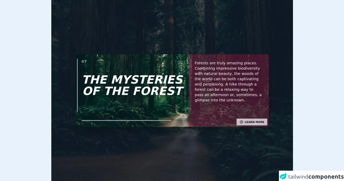
The description of Info Card - Forest ui component
The Info Card - Forest is a UI component that displays information about a particular topic in a visually appealing way. It typically includes an image, a title, and a short description of the topic. The Forest version of the Info Card has a green color scheme and a nature-inspired design that is perfect for environmental or outdoor-related topics.
Why use Tailwind CSS to create a Info Card - Forest ui component?
Tailwind CSS is an excellent choice for creating the Info Card - Forest UI component because it provides a wide range of utility classes that can be used to quickly style and layout the component. With Tailwind, you can easily customize the colors, fonts, and spacing of the component to match your design requirements. Additionally, Tailwind's responsive design features make it easy to create a component that looks great on all devices.
The preview of Info Card - Forest ui component
The Info Card - Forest UI component is a visually appealing way to display information about a particular topic. It typically includes an image, a title, and a short description of the topic. The Forest version of the Info Card has a green color scheme and a nature-inspired design that is perfect for environmental or outdoor-related topics.
Free download of the Info Card - Forest's source code
The source code of Info Card - Forest ui component
To create the Info Card - Forest UI component, we will use HTML and Tailwind CSS. The HTML will define the structure of the component, while the Tailwind CSS classes will be used to style and layout the component.
<div class="z-30 relative items-center justify-center w-full h-full overflow-auto">
    <div class="inset-0 h-screen bg-cover bg-center"
        style="
        background-image:
        url('https://wallpapercave.com/wp/wp6689710.jpg');"
    >
    </div>
    <div class="absolute inset-0 z-20 flex items-center justify-center h-screen w-full bg-gray-900 bg-opacity-75"></div>
    <div class="absolute inset-0  z-30  flex flex-col items-center justify-center">
        <div class="shadow-2xl rounded-lg w-4/5 h-96 bg-cover bg-center"
            style="
            background-image:
            url('https://wallpapercave.com/wp/wp6689710.jpg');">

            <div class="grid grid-cols-12 gap-1">
                <div class="relative my-6 px-8 col-span-12 sm:col-span-12 md:col-span-7 lg:col-span-7 xxl:col-span-7">
                    <div class="border-l-4 border-gray-400 py-20 px-5 mx-2 absolute left-0">
                        <p class="italic text-white text-xl md:text-4xl lg:text-6xl uppercase text-center  font-semibold ">
                            The Mysteries Of The Forest
                        </p>
                    </div>
                    <div class="text-gray-400 font-semibold text-xl mb-4">07</div>
                    <div class="absolute border-gray-400 border-t-4 bottom-0 py-1 px-4 w-4/5"></div>
                </div>
                <div class="col-span-12 sm:col-span-12 md:col-span-5 lg:col-span-5 xxl:col-span-5">
                    <div class="relative bg-pink-900 h-full md:h-96 w-full bg-opacity-50 rounded-tr-lg rounded-br-lg">
                        <div class="p-8">
                            <p class="text-white text-xs md:text-sm lg:text-xl mb-4">
                                Forests are truly amazing places.
                                Combining impressive biodiversity with natural beauty,
                                the woods of the world can be both captivating and perplexing.
                                A hike through a forest can be a relaxing way to pass an afternoon or,
                                sometimes, a glimpse into the unknown.
                            </p>
                            <div class="bottom-0 absolute p-2 right-0">
                                <button class="opacity-75 bg-gray-100 hover:bg-pink-900 hover:text-white text-sm font-bold py-2 px-4 rounded inline-flex items-center">
                                    <svg xmlns="http://www.w3.org/2000/svg" class="h-5 w-5 mr-2" fill="none" viewBox="0 0 24 24" stroke="currentColor">
                                        <path stroke-linecap="round" stroke-linejoin="round" stroke-width="2" d="M13 9l3 3m0 0l-3 3m3-3H8m13 0a9 9 0 11-18 0 9 9 0 0118 0z" />
                                    </svg>
                                    <span>LEARN MORE</span>
                                </button>
                            </div>
                        </div>
                    </div>
                </div>
            </div>
        </div>
    </div>
</div>
How to create a Info Card - Forest with Tailwind CSS?
To create the Info Card - Forest UI component, follow these steps:
Step 1: Set up your HTML
The first step is to set up your HTML. Here's an example of what your HTML might look like:
<div class="max-w-md mx-auto rounded-md overflow-hidden">
  <img class="w-full h-48 object-cover" src="https://source.unsplash.com/featured/?forest" alt="Forest">
  <div class="p-4">
    <h2 class="text-2xl font-bold mb-2">Explore the Forest</h2>
    <p class="text-gray-700">Discover the beauty of the forest with our guided tours and nature walks.</p>
  </div>
</div>
In this example, we have a div element that contains an img element and a div element. The img element displays an image of a forest, while the div element contains the title and description of the Info Card.
Step 2: Style the Info Card with Tailwind CSS
Next, we'll use Tailwind CSS classes to style the Info Card. Here's an example of what your CSS might look like:
.rounded-md {
  border-radius: 0.375rem;
}

.overflow-hidden {
  overflow: hidden;
}

.object-cover {
  object-fit: cover;
}

.max-w-md {
  max-width: 28rem;
}

.mx-auto {
  margin-left: auto;
  margin-right: auto;
}

.w-full {
  width: 100%;
}

.h-48 {
  height: 12rem;
}

.p-4 {
  padding: 1rem;
}

.text-2xl {
  font-size: 1.5rem;
  line-height: 2rem;
}

.font-bold {
  font-weight: 700;
}

.mb-2 {
  margin-bottom: 0.5rem;
}

.text-gray-700 {
  color: #4a5568;
}
In this example, we have defined several utility classes that are used to style the Info Card. We have used classes like rounded-md to add rounded corners to the component, overflow-hidden to hide any overflow content, and object-cover to ensure that the image fills the entire container. We have also used classes like text-2xl to set the font size of the title and text-gray-700 to set the color of the description.
Step 3: Customize the Info Card to match your design
Finally, you can customize the Info Card to match your design requirements. For example, you can change the color scheme by using different background and text colors, or you can change the font family by using a different font stack.
Conclusion
Creating the Info Card - Forest UI component with Tailwind CSS is a great way to quickly and easily display information about a particular topic in a visually appealing way. With Tailwind CSS, you can customize the component to match your design requirements and ensure that it looks great on all devices. So why not give it a try and see how easy it is to create beautiful UI components with Tailwind CSS?