- Published on
Best Ways To Build A Info Card With Tailwind CSS
- What is Tailwind CSS?
- The description of Info Card ui component
- Why use Tailwind CSS to create a Info Card ui component?
- The preview of Info Card ui component
- The source code of Info Card ui component
- How to create a Info Card with Tailwind CSS?
- Step 1: Set up the HTML structure
- Step 2: Style the card with Tailwind CSS
- Step 3: Add custom styles
- Conclusion
What is Tailwind CSS?
Tailwind CSS is a utility-first CSS framework that provides a set of pre-defined CSS classes to create a user interface. It allows developers to build responsive and customizable web applications quickly and efficiently. With Tailwind CSS, developers can create complex layouts and designs without writing a single line of custom CSS.
The description of Info Card ui component
An info card is a user interface component that displays information about a product, service, or person. It typically includes an image, a title, a description, and some additional information. Info cards are commonly used in e-commerce websites, social media platforms, and online directories.
Why use Tailwind CSS to create a Info Card ui component?
Tailwind CSS provides a set of pre-defined CSS classes that make it easy to create an info card. It also offers responsive design utilities that enable developers to create a card that looks great on any device. Additionally, Tailwind CSS is highly customizable, allowing developers to modify the design of the card to fit their specific needs.
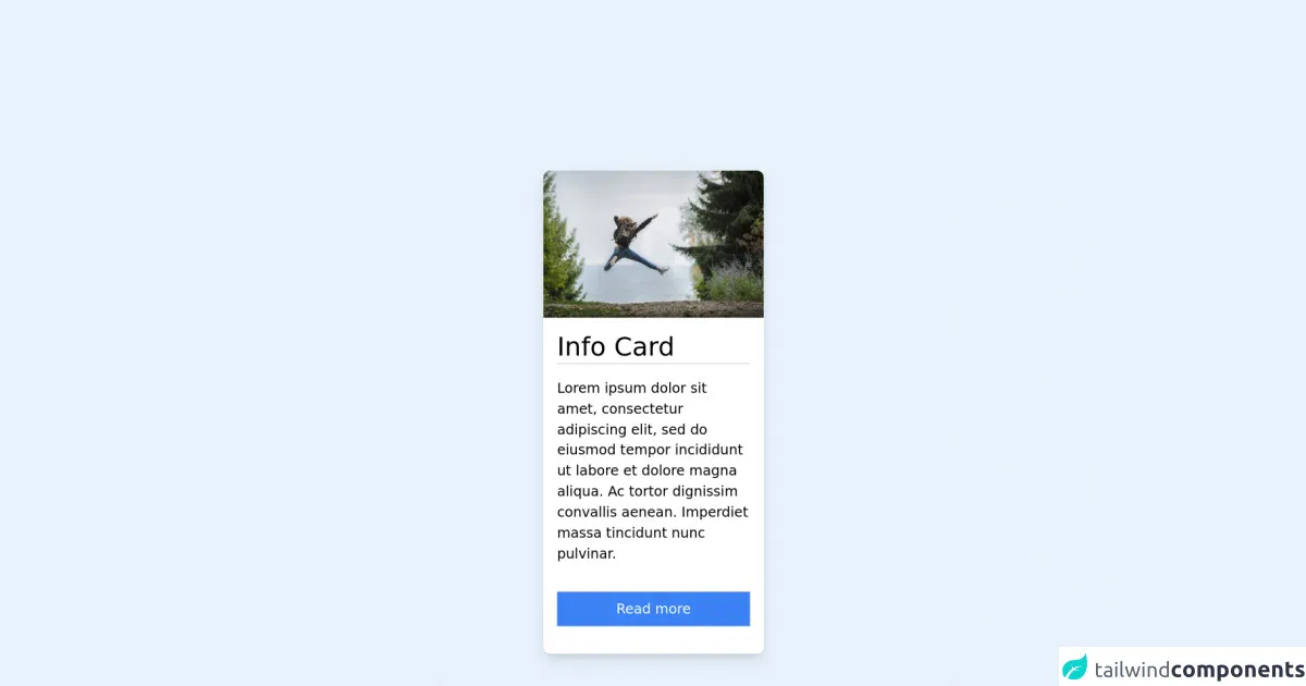
The preview of Info Card ui component
To create an info card with Tailwind CSS, we'll use a combination of pre-defined classes and custom styles. The result will be a card that displays an image, a title, a description, and some additional information.
Free download of the Info Card's source code
The source code of Info Card ui component
To create the info card, we'll use HTML and Tailwind CSS classes. The HTML structure will consist of a div element with nested elements for the image, title, description, and additional information. We'll use Tailwind CSS classes to style each element.
<!-- This is an example component -->
<div id="whoobe-3fery" class="w-full md:w-64 justify-center items-center bg-white shadow-lg rounded-lg flex flex-col">
    <img src="https://res.cloudinary.com/moodgiver/image/upload/v1633344243/adventure_woman_rujic1.webp" alt="img" title="img" class="w-full h-auto object-cover rounded-t-lg" id="whoobe-ixxe5">
        <div id="whoobe-1okdg" class="w-full p-4 justify-start flex flex-col">
            <h4 class="border-b-2 text-3xl" id="whoobe-3mr7n">Info Card</h4>
            <p class="my-4" id="whoobe-950fw">Lorem ipsum dolor sit amet, consectetur adipiscing elit, sed do eiusmod tempor incididunt ut labore et dolore magna aliqua. Ac tortor dignissim convallis aenean. Imperdiet massa tincidunt nunc pulvinar.</p>
            <button value="button" class="my-4 px-4 py-2 text-white hover:bg-blue-700 bg-blue-500" id="whoobe-jkkr2">Read more</button>
        </div>
</div>
How to create a Info Card with Tailwind CSS?
Step 1: Set up the HTML structure
The first step is to set up the HTML structure for the info card. We'll use a div element with nested elements for the image, title, description, and additional information. Here's the HTML code:
<div class="max-w-xs rounded overflow-hidden shadow-lg">
  <img class="w-full" src="https://source.unsplash.com/random/400x200" alt="Sunset in the mountains">
  <div class="px-6 py-4">
    <div class="font-bold text-xl mb-2">The Coldest Sunset</div>
    <p class="text-gray-700 text-base">
      Lorem ipsum dolor sit amet, consectetur adipisicing elit. Voluptatibus quia, nulla! Maiores et perferendis eaque, exercitationem praesentium nihil.
    </p>
  </div>
  <div class="px-6 pt-4 pb-2">
    <span class="inline-block bg-gray-200 rounded-full px-3 py-1 text-sm font-semibold text-gray-700 mr-2">#photography</span>
    <span class="inline-block bg-gray-200 rounded-full px-3 py-1 text-sm font-semibold text-gray-700 mr-2">#travel</span>
    <span class="inline-block bg-gray-200 rounded-full px-3 py-1 text-sm font-semibold text-gray-700">#winter</span>
  </div>
</div>
Step 2: Style the card with Tailwind CSS
Next, we'll use Tailwind CSS classes to style the info card. We'll add classes to each element to set the font size, font weight, padding, margin, and other properties. Here's the CSS code:
.max-w-xs {
  max-width: 20rem;
}

.rounded {
  border-radius: 0.25rem;
}

.overflow-hidden {
  overflow: hidden;
}

.shadow-lg {
  box-shadow: 0 10px 20px rgba(0, 0, 0, 0.19), 0 6px 6px rgba(0, 0, 0, 0.23);
}

.w-full {
  width: 100%;
}

.px-6 {
  padding-left: 1.5rem;
  padding-right: 1.5rem;
}

.py-4 {
  padding-top: 1rem;
  padding-bottom: 1rem;
}

.font-bold {
  font-weight: 700;
}

.text-xl {
  font-size: 1.25rem;
}

.mb-2 {
  margin-bottom: 0.5rem;
}

.text-gray-700 {
  color: #4a5568;
}

.text-base {
  font-size: 1rem;
}

.px-6 {
  padding-left: 1.5rem;
  padding-right: 1.5rem;
}

.pt-4 {
  padding-top: 1rem;
}

.pb-2 {
  padding-bottom: 0.5rem;
}

.inline-block {
  display: inline-block;
}

.bg-gray-200 {
  background-color: #edf2f7;
}

.rounded-full {
  border-radius: 9999px;
}

.px-3 {
  padding-left: 0.75rem;
  padding-right: 0.75rem;
}

.py-1 {
  padding-top: 0.25rem;
  padding-bottom: 0.25rem;
}

.text-sm {
  font-size: 0.875rem;
}

.font-semibold {
  font-weight: 600;
}

.text-gray-700 {
  color: #4a5568;
}

.mr-2 {
  margin-right: 0.5rem;
}
Step 3: Add custom styles
Finally, we'll add some custom styles to the info card to make it look more visually appealing. We'll add a border to the image, change the font family, and adjust the spacing between elements. Here's the updated CSS code:
img {
  border-top-left-radius: 0.25rem;
  border-top-right-radius: 0.25rem;
}

body {
  font-family: 'Open Sans', sans-serif;
}

.py-4 {
  padding-top: 1.5rem;
  padding-bottom: 1.5rem;
}

.pt-4 {
  padding-top: 1.5rem;
}

.pb-2 {
  padding-bottom: 0.75rem;
}
Conclusion
In conclusion, Tailwind CSS is a powerful tool for creating user interface components like info cards. With its pre-defined CSS classes and responsive design utilities, developers can quickly and efficiently create a card that looks great on any device. By using custom styles, developers can also modify the design of the card to fit their specific needs.