- Published on
Build A Inbox Ui With Tailwind CSS Like A Pro With The Help Of These 6 Tips
- What is Tailwind CSS?
- The description of Inbox Ui ui component
- Why use Tailwind CSS to create a Inbox Ui ui component?
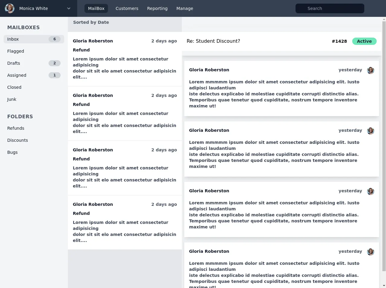
- The preview of Inbox Ui ui component.
- The source code of Inbox Ui ui component.
- How to create a Inbox Ui with Tailwind CSS?
- Conclusion
As a FrontEnd technology blogger, you must have heard about the Tailwind CSS framework. Tailwind CSS is a utility-first CSS framework that provides you with a set of pre-defined classes that you can use to create a responsive and beautiful UI. In this article, we will discuss how to build an Inbox UI with Tailwind CSS like a pro with the help of these 6 tips.
What is Tailwind CSS?
Tailwind CSS is a utility-first CSS framework that provides you with a set of pre-defined classes that you can use to create a responsive and beautiful UI. It is a highly customizable framework that allows you to create your own custom classes and styles.
The description of Inbox Ui ui component
The Inbox UI is a user interface component that displays a list of messages or emails in a user's inbox. It typically includes a list of messages, a search bar, and filters to help the user find specific messages.
Why use Tailwind CSS to create a Inbox Ui ui component?
Tailwind CSS is a great choice for creating an Inbox UI because it provides you with a set of pre-defined classes that you can use to create the UI quickly and easily. It also allows you to customize the UI to fit your specific needs.
The preview of Inbox Ui ui component.
To create an Inbox UI with Tailwind CSS, you can use the following tips:
- Use flexbox to create the layout of the UI.
- Use Tailwind CSS classes to style the search bar and filters.
- Use the hover and focus classes to add interactivity to the UI.
- Use the truncate class to truncate long text in the message list.
- Use the border and rounded classes to add borders and rounded corners to the UI.
- Use the text and background color classes to style the UI.
Free download of the Inbox Ui's source code
The source code of Inbox Ui ui component.
To create the Inbox UI with Tailwind CSS, you can use the following HTML and CSS code:
<div class="h-screen flex flex-col">
<header class="flex flex-shrink-0">
<div class="flex-shrink-0 px-4 py-3 bg-gray-800 w-64">
<button class="flex items-center block w-full">
<img class="h-8 w-8 rounded-full object-cover"
src="https://images.unsplash.com/photo-1438761681033-6461ffad8d80?ixlib=rb-1.2.1&ixid=eyJhcHBfaWQiOjEyMDd9&auto=format&fit=facearea&facepad=4&w=144&q=80"
alt="">
<span class="ml-4 text-sm font-medium text-white">Monica White</span>
<svg class=" ml-auto h-6 w-6 ml-10 stroke-current text-gray-400" viewBox="0 0 24 24" fill="none">
<path d="M16 10l-4 4-4-4" stroke="4A5568" stroke-width="2" stroke-linecap="round"
stroke-linejoin="round" />
</svg>
</button>
</div>
<div class="flex-1 flex bg-gray-700 px-6 items-center justify-between">
<nav>
<a href="#"
class="hover:bg-gray-600 rounded-lg bg-gray-800 inline-block text-sm font-medium text-white px-3 py-2 leading-none">MailBox</a>
<a href="#"
class="ml-2 hover:bg-gray-600 rounded-lg inline-block text-sm font-medium text-white px-3 py-2 leading-none">Customers</a>
<a href="#"
class="hover:bg-gray-600 rounded-lg inline-block text-sm font-medium text-white px-3 py-2 leading-none">Reporting</a>
<a href="#"
class="hover:bg-gray-600 rounded-lg inline-block text-sm font-medium text-white px-3 py-2 leading-none">Manage</a>
</nav>
<div class="flex items-center">
<span class="relative">
<span class="absolute inset-y-0 left-0 flex items-center">
<i class="fa fa-search h-5 w-5 px-2" style="color: gray;" aria-hidden="true"></i>
</span>
<input
class="focus:bg-white focus:text-gray-900 focus:placeholder-gray-700 pl-10 pr-4 py-2 leading-none block w-full bg-gray-900 rounded-lg text-sm placeholder-gray-400 text-white"
placeholder="Search">
</span>
<button class="ml-6 text-gray-400 hover:text-gray-200">
<i class="fa fa-bell-o h-5 w-5 fill-current" aria-hidden="true" style="color: #fff;"></i>
</button>
<button class="ml-6 text-gray-400 hover:text-gray-200">
<i class="fa fa-question-circle-o h-5 w-5 fill-current" aria-hidden="true"
style="color: #fff;"></i>
</button>
</div>
</div>
</header>
<div class="flex-1 flex overflow-x-hidden">
<div class="w-64 p-6 bg-gray-100 overflow-y-auto">
<nav>
<h2 class="font-semibold text-gray-600 uppercase tracking-wide">MailBoxes</h2>
<div class="mt-3">
<a href=""
class="-mx-3 py-1 px-3 text-sm font-medium flex items-center justify-between bg-gray-200 rounded-lg">
<span>
<i class="h-6 w-6 fa fa-envelope-o fill-current text-gray-700" aria-hidden="true"></i>
<span class=" text-gray-900">Inbox</span>
</span>
<span
class="inline-block px-4 py-1 text-center py-1 leading-none text-xs font-semibold text-gray-700 bg-gray-300 rounded-full">6</span>
</a>
</div>
<div class="mt-3">
<a href=""
class="-mx-3 py-1 px-3 text-sm font-medium flex items-center justify-between hover:bg-gray-200 rounded-lg">
<span>
<i class="h-6 w-6 fa fa-flag-o fill-current text-gray-700" aria-hidden="true"></i>
<span class=" text-gray-900">Flagged</span>
</span>
</a>
</div>
<div class="mt-3">
<a href=""
class="-mx-3 py-1 px-3 text-sm font-medium flex items-center justify-between hover:bg-gray-200 rounded-lg">
<span>
<i class="h-6 w-6 fa fa-pencil-square-o fill-current text-gray-700"
aria-hidden="true"></i>
<span class=" text-gray-900">Drafts</span>
</span>
<span
class="inline-block px-4 py-1 text-center py-1 leading-none text-xs font-semibold text-gray-700 bg-gray-300 rounded-full">2</span>
</a>
</div>
<div class="mt-3">
<a href=""
class="-mx-3 py-1 px-3 text-sm font-medium flex items-center justify-between hover:bg-gray-200 rounded-lg">
<span>
<i class="h-6 w-6 fa fa-user-o fill-current text-gray-700" aria-hidden="true"></i>
<span class=" text-gray-900">Assigned</span>
</span>
<span
class="inline-block px-4 py-1 text-center py-1 leading-none text-xs font-semibold text-gray-700 bg-gray-300 rounded-full">1</span>
</a>
</div>
<div class="mt-3">
<a href=""
class="-mx-3 py-1 px-3 text-sm font-medium flex items-center justify-between hover:bg-gray-200 rounded-lg">
<span>
<i class="h-6 w-6 fa fa-check-circle-o fill-current text-gray-700"
aria-hidden="true"></i>
<span class=" text-gray-900">Closed</span>
</span>
</a>
</div>
<div class="mt-3">
<a href=""
class="-mx-3 py-1 px-3 text-sm font-medium flex items-center justify-between hover:bg-gray-200 rounded-lg">
<span>
<i class="h-6 w-6 fa fa-trash-o fill-current text-gray-700" aria-hidden="true"></i>
<span class=" text-gray-900">Junk</span>
</span>
</a>
</div>
<div class="mt-8">
<h2 class="font-semibold text-gray-600 uppercase tracking-wide">Folders</h2>
<div class="mt-3">
<a href=""
class="-mx-3 py-1 px-3 text-sm font-medium flex items-center justify-between hover:bg-gray-200 rounded-lg">
<span class=" text-gray-900">Refunds</span>
</a>
</div>
<div class="mt-3">
<a href=""
class="-mx-3 py-1 px-3 text-sm font-medium flex items-center justify-between hover:bg-gray-200 rounded-lg">
<span class=" text-gray-900">Discounts</span>
</a>
</div>
<div class="mt-3">
<a href=""
class="-mx-3 py-1 px-3 text-sm font-medium flex items-center justify-between hover:bg-gray-200 rounded-lg">
<span class=" text-gray-900">Bugs</span>
</a>
</div>
</div>
</nav>
</div>
<main class=" flex bg-gray-200">
<div class="overflow-y-auto overflow-hidden">
<div class="px-4 py-2 flex items-center justify-between border-l border-r border-b">
<button class="text-sm flex items-center font-semibold text-gray-600">
<span>Sorted by Date</span>
<i class="ml-2 fa fa-angle-down justify-between" aria-hidden="true"></i>
</button>
<button class="text-sm flex items-center font-semibold text-gray-600">
<i class="fa fa-bars" aria-hidden="true"></i>
</button>
</div>
<div class="pt-3 pb-4 ">
<a href="#" class="block bg-white py-3 border-t">
<div class="px-4 py-2 flex justify-between">
<span class="text-sm font-semibold text-gray-900">Gloria Roberston</span>
<span class="text-sm font-semibold text-gray-600">2 days ago</span>
</div>
<span class="text-sm font-semibold text-gray-900 px-4 py-2">Refund</span>
<p class="px-4 py-2 text-sm font-semibold text-gray-700"">Lorem ipsum dolor sit amet consectetur adipisicing <br> dolor sit sit elo amet consectetur adipisicin elit....</p>
</a>
</div>
</div>
<div class="flex flex-col py-3 w-auto inline-block overflow-y-auto overflow-hidden bg-gray-100">
<div class="flex justify-between ">
<button>
<i class="px-3 fa fa-reply text-sm font-semibold text-gray-600" aria-hidden="true"></i>
<i class="px-3 fa fa-tag text-sm font-semibold text-gray-600" aria-hidden="true"></i>
<i class="px-3 fa fa-user-circle text-sm font-semibold text-gray-600" aria-hidden="true"></i>
<i class="px-3 fa fa-inbox text-sm font-semibold text-gray-600" aria-hidden="true"></i>
<i class="fa fa-ellipsis-h text-sm font-semibold text-gray-600" aria-hidden="true"></i>
</button>
<button>
<i class="fa fa-angle-down text-sm font-semibold text-gray-600" aria-hidden="true"></i>
<i class="px-4 fa fa-angle-up text-sm font-semibold text-gray-600" aria-hidden="true"></i>
</button>
</div>
<div class="shadow-lg">
<div class="pt-3 pb-4 ">
<a href="#" class="block bg-white py-3 border-t">
<div class="px-4 py-2 flex justify-between">
<span>Re: Student Discount?</span>
<div>
<span class="px-3 text-sm font-semibold">#1428</span>
<span class="text-sm font-semibold px-4 py-1 text-gray-800 rounded-full bg-green-300">Active</span>
</div>
</div>
</a>
</div>
</div>
<div>
<div class="shadow-lg pt-4 ml-2 mr-2 rounded-lg">
<a href="#" class="block bg-white py-3 border-t pb-4">
<div class="px-4 py-2 flex justify-between">
<span class="text-sm font-semibold text-gray-900">Gloria Roberston</span>
<div class="flex">
<span class="px-4 text-sm font-semibold text-gray-600"> yesterday</span>
<img class="h-6 w-6 rounded-full object-cover"
src="https://images.unsplash.com/photo-1438761681033-6461ffad8d80?ixlib=rb-1.2.1&ixid=eyJhcHBfaWQiOjEyMDd9&auto=format&fit=facearea&facepad=4&w=144&q=80"
alt="">
</div>
</div>
<p class="px-4 py-2 text-sm font-semibold text-gray-700"">Lorem mmmmm ipsum dolor sit amet consectetur adipisicing elit. Iusto adipisci laudantium <br> iste delectus explicabo id molestiae cupiditate corrupti distinctio alias. <br> Temporibus quae tenetur quod cupiditate, nostrum tempore inventore maxime ut! </p>
</a>
</div>
</div>
</div>
</main>
</div>
</div>
How to create a Inbox Ui with Tailwind CSS?
To create an Inbox UI with Tailwind CSS, you can follow these steps:
- Create the HTML structure of the UI using flexbox.
- Add the Tailwind CSS classes to style the search bar and filters.
- Add the hover and focus classes to add interactivity to the UI.
- Use the truncate class to truncate long text in the message list.
- Use the border and rounded classes to add borders and rounded corners to the UI.
- Use the text and background color classes to style the UI.
Conclusion
In this article, we discussed how to build an Inbox UI with Tailwind CSS like a pro with the help of these 6 tips. We hope that this article has provided you with some useful insights into how to use Tailwind CSS to create beautiful and responsive UIs. Remember, Tailwind CSS is a highly customizable framework, so feel free to experiment and create your own custom styles and classes.