- Published on
Practical Guide: Make A Image With Overlay Card With Tailwind CSS
- What is Tailwind CSS?
- The description of Image with Overlay Card ui component
- Why use Tailwind CSS to create a Image with Overlay Card ui component?
- The preview of Image with Overlay Card ui component
- The source code of Image with Overlay Card ui component
- How to create a Image with Overlay Card with Tailwind CSS?
- Conclusion
What is Tailwind CSS?
Tailwind CSS is a utility-first CSS framework that allows you to rapidly build custom user interfaces. It provides a set of pre-defined CSS classes that you can use to style your HTML elements. With Tailwind CSS, you can create complex layouts and designs with minimal effort.
The description of Image with Overlay Card ui component
An Image with Overlay Card is a UI component that displays an image with an overlay card containing additional information. This component is commonly used in websites and applications to showcase products, services, or events.
Why use Tailwind CSS to create a Image with Overlay Card ui component?
Tailwind CSS provides a set of pre-defined CSS classes that you can use to style your HTML elements. This makes it easy to create complex UI components like the Image with Overlay Card without having to write custom CSS code. Additionally, Tailwind CSS is highly customizable, so you can easily modify the styles to match your brand or design requirements.
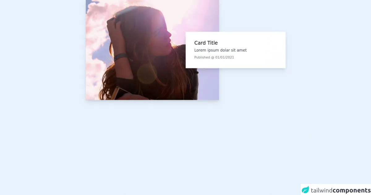
The preview of Image with Overlay Card ui component
To create an Image with Overlay Card, we will use Tailwind CSS classes to style the HTML elements. The result will be a visually appealing UI component that can be used in a variety of contexts.
Free download of the Image with Overlay Card's source code
The source code of Image with Overlay Card ui component
To create the Image with Overlay Card, we will use HTML and Tailwind CSS classes. The HTML will define the structure of the component, while the Tailwind CSS classes will style the elements.
<div class="grid grid-cols-12 md:items-center w-full max-w-screen-sm md:max-w-screen-md mx-auto px-4">
    <div class="col-span-12 md:col-span-auto md:col-start-1 md:col-end-9 md:row-start-1 md:row-end-1 bg-red-500">
        <a class="" href="#" title="Image Link">
            <picture class="relative block w-full h-0 pb bg-gray-300 overflow-hidden shadow-lg" style="padding-top: 75%;">
                <img class="absolute inset-0 w-full h-full object-cover" src="https://picsum.photos/800/600" alt="A random image from Unsplash">
            </picture>
        </a>
    </div>
    <div class="col-span-12 md:col-span-auto md:col-start-7 md:col-end-13 md:row-start-1 md:row-end-1 -mt-8 md:mt-0 relative z-10 px-4 md:px-0">
        <div class="p-4 md:p-8 bg-white shadow-lg">
            <p class="mb-2 text-lg leading-none font-medium">
                <a class="" href="#" title="Heading Link">
                    Card Title
                </a>
            </p>
            <p class="mb-2 text-sm text-gray-700">
                Lorem ipsum dolar sit amet
            </p>
            <p class="text-xs text-gray-500">
                Published @
                <time datetime="">
                    01/01/2021
                </time>
            </p>
        </div>
    </div>
</div>
How to create a Image with Overlay Card with Tailwind CSS?
To create an Image with Overlay Card with Tailwind CSS, follow these steps:
- Create an HTML structure for the component.
<div class="relative rounded-lg overflow-hidden">
  <img class="w-full h-auto" src="https://via.placeholder.com/800x400" alt="Placeholder Image">
  <div class="absolute inset-0 bg-black opacity-50"></div>
  <div class="absolute inset-0 flex items-center justify-center">
    <div class="p-4 bg-white rounded-lg">
      <h2 class="text-2xl font-bold mb-2">Title Here</h2>
      <p class="text-gray-700">Lorem ipsum dolor sit amet, consectetur adipiscing elit. Sed ac libero non ex bibendum lacinia. Donec euismod mauris vel velit ultricies, vitae bibendum quam cursus. </p>
      <a href="#" class="mt-4 bg-blue-500 hover:bg-blue-700 text-white font-bold py-2 px-4 rounded-full">Learn More</a>
    </div>
  </div>
</div>
- Add Tailwind CSS classes to style the HTML elements.
<div class="relative rounded-lg overflow-hidden">
  <img class="w-full h-auto" src="https://via.placeholder.com/800x400" alt="Placeholder Image">
  <div class="absolute inset-0 bg-black opacity-50"></div>
  <div class="absolute inset-0 flex items-center justify-center">
    <div class="p-4 bg-white rounded-lg">
      <h2 class="text-2xl font-bold mb-2">Title Here</h2>
      <p class="text-gray-700">Lorem ipsum dolor sit amet, consectetur adipiscing elit. Sed ac libero non ex bibendum lacinia. Donec euismod mauris vel velit ultricies, vitae bibendum quam cursus. </p>
      <a href="#" class="mt-4 bg-blue-500 hover:bg-blue-700 text-white font-bold py-2 px-4 rounded-full">Learn More</a>
    </div>
  </div>
</div>
- Customize the styles to match your design requirements.
<div class="relative rounded-lg overflow-hidden">
  <img class="w-full h-auto" src="https://via.placeholder.com/800x400" alt="Placeholder Image">
  <div class="absolute inset-0 bg-black opacity-50"></div>
  <div class="absolute inset-0 flex items-center justify-center">
    <div class="p-4 bg-white rounded-lg">
      <h2 class="text-3xl font-bold mb-2 text-gray-800">Title Here</h2>
      <p class="text-gray-700">Lorem ipsum dolor sit amet, consectetur adipiscing elit. Sed ac libero non ex bibendum lacinia. Donec euismod mauris vel velit ultricies, vitae bibendum quam cursus. </p>
      <a href="#" class="mt-4 bg-blue-500 hover:bg-blue-700 text-white font-bold py-2 px-4 rounded-full">Learn More</a>
    </div>
  </div>
</div>
- Use the component in your website or application.
<div class="container mx-auto">
  <div class="grid grid-cols-3 gap-4">
    <div>
      <div class="relative rounded-lg overflow-hidden">
        <img class="w-full h-auto" src="https://via.placeholder.com/800x400" alt="Placeholder Image">
        <div class="absolute inset-0 bg-black opacity-50"></div>
        <div class="absolute inset-0 flex items-center justify-center">
          <div class="p-4 bg-white rounded-lg">
            <h2 class="text-3xl font-bold mb-2 text-gray-800">Title Here</h2>
            <p class="text-gray-700">Lorem ipsum dolor sit amet, consectetur adipiscing elit. Sed ac libero non ex bibendum lacinia. Donec euismod mauris vel velit ultricies, vitae bibendum quam cursus. </p>
            <a href="#" class="mt-4 bg-blue-500 hover:bg-blue-700 text-white font-bold py-2 px-4 rounded-full">Learn More</a>
          </div>
        </div>
      </div>
    </div>
  </div>
</div>
Conclusion
In this article, we have learned how to create an Image with Overlay Card UI component using Tailwind CSS. With Tailwind CSS, we can easily create complex UI components without having to write custom CSS code. Additionally, Tailwind CSS is highly customizable, so we can easily modify the styles to match our brand or design requirements.