- Published on
Surprisingly Effective Ways To Build A Image Slider With Tailwind CSS
- What is Tailwind CSS?
- The description of Image Slider ui component
- Why use Tailwind CSS to create a Image Slider ui component?
- The preview of Image Slider ui component
- The source code of Image Slider ui component
- How to create a Image Slider with Tailwind CSS?
- Conclusion
As a FrontEnd technology blogger, you must have heard of Tailwind CSS, a utility-first CSS framework that helps you create responsive and customizable UI components quickly. In this article, we will discuss how to build an image slider with Tailwind CSS, which is a common UI component that can be found on many websites. We will go through the steps of creating an image slider using Tailwind CSS and provide you with the source code and a preview of the final product.
What is Tailwind CSS?
Tailwind CSS is a utility-first CSS framework that provides you with a set of pre-defined classes that you can use to style your HTML elements. It allows you to create responsive and customizable UI components quickly without having to write any CSS code. You can use Tailwind CSS with any JavaScript framework or library, including React, Vue, and Angular.
The description of Image Slider ui component
An image slider is a UI component that displays a set of images in a slideshow format. It is commonly used on websites to showcase products, services, or other visual content. An image slider usually consists of a container that holds the images and a set of controls that allow the user to navigate through the images.
Why use Tailwind CSS to create a Image Slider ui component?
Tailwind CSS provides you with a set of pre-defined classes that you can use to create an image slider quickly and easily. You can use the flexbox and grid utilities to layout the images and controls, and the transition and animation utilities to add visual effects to the slider. Tailwind CSS also provides you with a set of responsive classes that allow you to create a slider that works well on different screen sizes.
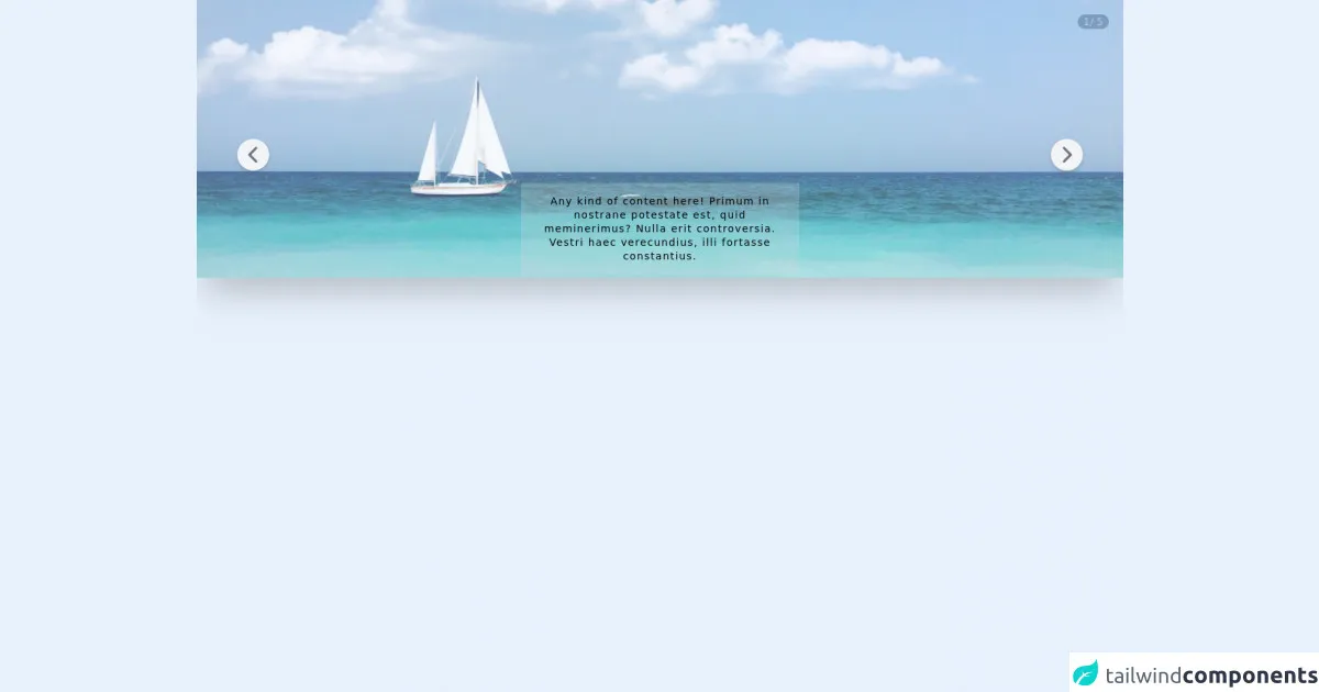
The preview of Image Slider ui component
To create an image slider with Tailwind CSS, we will use a container to hold the images and a set of controls to navigate through the images. We will also use the transition and animation utilities to add visual effects to the slider.
Free download of the Image Slider's source code
The source code of Image Slider ui component
To create an image slider with Tailwind CSS, you can use the following HTML and CSS code:
<script defer src="https://unpkg.com/[email protected]/dist/cdn.min.js"></script>

<article x-data="slider" class="relative w-full flex flex-shrink-0 overflow-hidden shadow-2xl">
    <div class="rounded-full bg-gray-600 text-white absolute top-5 right-5 text-sm px-2 text-center z-10">
        <span x-text="currentIndex"></span>/
        <span x-text="images.length"></span>
    </div>

    <template x-for="(image, index) in images">
        <figure class="h-96" x-show="currentIndex == index + 1" x-transition:enter="transition transform duration-300"
        x-transition:enter-start="opacity-0" x-transition:enter-end="opacity-100"
        x-transition:leave="transition transform duration-300" x-transition:leave-start="opacity-100"
        x-transition:leave-end="opacity-0">
        <img :src="image" alt="Image" class="absolute inset-0 z-10 h-full w-full object-cover opacity-70" />
        <figcaption class="absolute inset-x-0 bottom-1 z-20 w-96 mx-auto p-4 font-light text-sm text-center tracking-widest leading-snug bg-gray-300 bg-opacity-25">
            Any kind of content here!
            Primum in nostrane potestate est, quid meminerimus? Nulla erit controversia. Vestri haec verecundius, illi fortasse constantius.
        </figcaption>
        </figure>
    </template>

    <button @click="back()"
        class="absolute left-14 top-1/2 -translate-y-1/2 w-11 h-11 flex justify-center items-center rounded-full shadow-md z-10 bg-gray-100 hover:bg-gray-200">
        <svg class=" w-8 h-8 font-bold transition duration-500 ease-in-out transform motion-reduce:transform-none text-gray-500 hover:text-gray-600 hover:-translate-x-0.5" fill="none" stroke="currentColor" viewBox="0 0 24 24"
            xmlns="http://www.w3.org/2000/svg">
            <path stroke-linecap="round" stroke-linejoin="round" stroke-width="2.5" d="M15 19l-7-7 7-7">
            </path>
        </svg>
    </button>

    <button @click="next()"
    class="absolute right-14 top-1/2 translate-y-1/2 w-11 h-11 flex justify-center items-center rounded-full shadow-md z-10 bg-gray-100 hover:bg-gray-200">
        <svg class=" w-8 h-8 font-bold transition duration-500 ease-in-out transform motion-reduce:transform-none text-gray-500 hover:text-gray-600 hover:translate-x-0.5" fill="none" stroke="currentColor" viewBox="0 0 24 24"
        xmlns="http://www.w3.org/2000/svg">
        <path stroke-linecap="round" stroke-linejoin="round" stroke-width="2.5" d="M9 5l7 7-7 7"></path>
        </svg>
    </button>
</article>

<script>
    document.addEventListener('alpine:init', () => {
        Alpine.data('slider', () => ({
            currentIndex: 1,
            images: [
                'https://source.unsplash.com/1600x900/?beach',
                'https://source.unsplash.com/1600x900/?cat',
                'https://source.unsplash.com/1600x900/?dog',
                'https://source.unsplash.com/1600x900/?lego',
                'https://source.unsplash.com/1600x900/?textures&patterns'
            ],
            back() {
                if (this.currentIndex > 1) {
                    this.currentIndex = this.currentIndex - 1;
                }
            },
            next() {
                if (this.currentIndex < this.images.length) {
                    this.currentIndex = this.currentIndex + 1;
                } else if (this.currentIndex <= this.images.length){
                    this.currentIndex = this.images.length - this.currentIndex + 1
                }
            },
        }))
    })
</script>
How to create a Image Slider with Tailwind CSS?
To create an image slider with Tailwind CSS, you can follow these steps:
Create a container to hold the images. You can use the grid or flexbox utilities to layout the images.
Add the images to the container. You can use the object-fit utility to control the size and position of the images.
Create a set of controls to navigate through the images. You can use the flexbox utilities to layout the controls.
Add event listeners to the controls to change the active image. You can use JavaScript or a JavaScript framework to add the event listeners.
Use the transition and animation utilities to add visual effects to the slider. You can use the opacity, transform, and scale utilities to create different effects.
Use the responsive classes to create a slider that works well on different screen sizes. You can use the grid or flexbox utilities to adjust the layout of the slider.
Conclusion
In this article, we have discussed how to build an image slider with Tailwind CSS, a utility-first CSS framework that helps you create responsive and customizable UI components quickly. We have provided you with the source code and a preview of the final product. We hope that this article has been helpful to you and that you can use the knowledge you have gained to create your own image sliders with Tailwind CSS.