- Published on
The Ninja Guide To How To Make A Notification With Tailwind CSS Better
- What is Tailwind CSS?
- The description of Notification UI component
- Why use Tailwind CSS to create a Notification UI component?
- The preview of Notification UI component
- The source code of Notification UI component
- How to create a Notification with Tailwind CSS?
- Step 1: Define the HTML structure
- Step 2: Customize the styles
- Step 3: Add animation
- Step 4: Add JavaScript functionality
- Conclusion
As a FrontEnd developer, creating a notification UI component that is visually appealing and functional is a crucial part of the development process. In this article, we will explore how to create a notification UI component using Tailwind CSS, a popular utility-first CSS framework.
What is Tailwind CSS?
Tailwind CSS is a utility-first CSS framework that allows developers to create custom designs quickly. It provides a set of pre-defined CSS classes that can be used to style HTML elements. Tailwind CSS is highly customizable, which makes it a popular choice among developers.
The description of Notification UI component
A notification UI component is a visual element that is used to display alerts, messages, or updates to the user. It is an essential part of any application or website, as it helps to keep the user informed about important events.
Why use Tailwind CSS to create a Notification UI component?
Tailwind CSS provides a set of pre-defined CSS classes that can be used to create a notification UI component quickly. It also allows developers to customize the styles according to their needs. Using Tailwind CSS can save a lot of time and effort in creating a notification UI component from scratch.
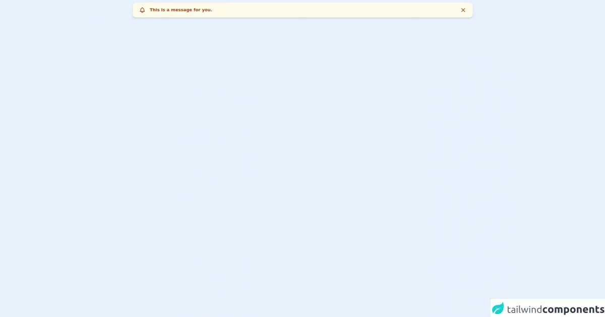
The preview of Notification UI component
Creating a notification UI component with Tailwind CSS is easy and straightforward. Here is a preview of what the final component will look like:
Free download of the Notification's source code
The source code of Notification UI component
To create a notification UI component with Tailwind CSS, we need to define the HTML structure and apply the CSS classes. Here is the source code for the notification UI component:
<div class="flex w-full px-6 py-4 my-2 rounded-xl shadow-md font-semibold text-md bg-yellow-50 text-yellow-800"><span class="h-6 w-6 mr-4"><svg xmlns="http://www.w3.org/2000/svg" fill="none" viewBox="0 0 24 24" stroke="currentColor"><path stroke-linecap="round" stroke-linejoin="round" stroke-width="2" d="M15 17h5l-1.405-1.405A2.032 2.032 0 0118 14.158V11a6.002 6.002 0 00-4-5.659V5a2 2 0 10-4 0v.341C7.67 6.165 6 8.388 6 11v3.159c0 .538-.214 1.055-.595 1.436L4 17h5m6 0v1a3 3 0 11-6 0v-1m6 0H9"></path></svg></span>This is a message for you.<button class="h-6 w-6 ml-auto"><svg xmlns="http://www.w3.org/2000/svg" fill="none" viewBox="0 0 24 24" stroke="currentColor"><path stroke-linecap="round" stroke-linejoin="round" stroke-width="2" d="M6 18L18 6M6 6l12 12"></path></svg></button></div>
How to create a Notification with Tailwind CSS?
To create a notification UI component with Tailwind CSS, we need to follow these steps:
Step 1: Define the HTML structure
The first step is to define the HTML structure for the notification UI component. We can use the following code as a starting point:
<div class="bg-white p-4 rounded-md shadow-md">
  <div class="flex items-center">
    <div class="rounded-full bg-green-500 p-2">
      <svg class="h-6 w-6 text-white" fill="none" viewBox="0 0 24 24" stroke="currentColor">
        <path stroke-linecap="round" stroke-linejoin="round" stroke-width="2" d="M5 13l4 4L19 7"></path>
      </svg>
    </div>
    <div class="ml-2">
      <div class="text-sm font-medium text-gray-900">Success</div>
      <div class="text-sm text-gray-500">Your action was successful</div>
    </div>
  </div>
</div>
In this code, we have defined a div element with the bg-white, p-4, rounded-md, and shadow-md classes. Inside this div element, we have defined another div element with the flex and items-center classes. Inside this div element, we have defined two more div elements with the rounded-full, bg-green-500, p-2, ml-2, text-sm, font-medium, text-gray-900, and text-gray-500 classes. We have also added an SVG icon to the notification.
Step 2: Customize the styles
The next step is to customize the styles according to our needs. We can use the pre-defined Tailwind CSS classes to change the background color, text color, font size, padding, margin, and other styles. For example, we can use the following classes to change the background color to red:
<div class="bg-red-500 p-4 rounded-md shadow-md">
We can also use the following classes to change the text color to white:
<div class="bg-red-500 p-4 rounded-md shadow-md text-white">
Step 3: Add animation
To make the notification UI component more visually appealing, we can add animation using Tailwind CSS. We can use the animate class to add animation to the notification. For example, we can use the following code to add a fade-in animation:
<div class="bg-red-500 p-4 rounded-md shadow-md text-white animate-fade-in">
Step 4: Add JavaScript functionality
Finally, we can add JavaScript functionality to the notification UI component to make it more interactive. We can use JavaScript to show and hide the notification, add a close button, or add a timer to automatically close the notification after a certain time.
Conclusion
Creating a notification UI component with Tailwind CSS is easy and straightforward. By following the steps outlined in this article, you can create a visually appealing and functional notification UI component for your application or website. Tailwind CSS provides a set of pre-defined CSS classes that can be used to create custom designs quickly, which makes it a popular choice among developers.