- Published on
A Complete Guide To Make A HUD Food With Tailwind CSS
- What is Tailwind CSS?
- The description of HUD Food UI component
- Why use Tailwind CSS to create a HUD Food UI component?
- The preview of HUD Food UI component
- The source code of HUD Food UI component
- How to create a HUD Food with Tailwind CSS?
- Conclusion
In this article, we will be discussing how to create a HUD Food UI component using Tailwind CSS. We will start with an introduction to Tailwind CSS, followed by a description of the HUD Food UI component. We will then discuss why Tailwind CSS is the best choice for creating this UI component. After that, we will provide a preview and source code of the HUD Food UI component. Finally, we will discuss how to create the HUD Food UI component using Tailwind CSS.
What is Tailwind CSS?
Tailwind CSS is a utility-first CSS framework that allows you to create custom designs quickly and easily. It provides a set of pre-defined CSS classes that you can use to style your HTML elements. Tailwind CSS is highly customizable and allows you to create unique designs without writing any custom CSS.
The description of HUD Food UI component
HUD Food is a UI component that is commonly used in video games and other digital applications. It is a heads-up display that displays the player's health, stamina, and other important information. The HUD Food UI component typically consists of a bar that represents the player's health, stamina, or other attribute, and a label that displays the current value of that attribute.
Why use Tailwind CSS to create a HUD Food UI component?
Tailwind CSS is the perfect choice for creating a HUD Food UI component because it allows you to create custom designs quickly and easily. With Tailwind CSS, you can create the bar and label elements of the HUD Food UI component using pre-defined CSS classes. This saves you time and allows you to focus on creating the functionality of the component.
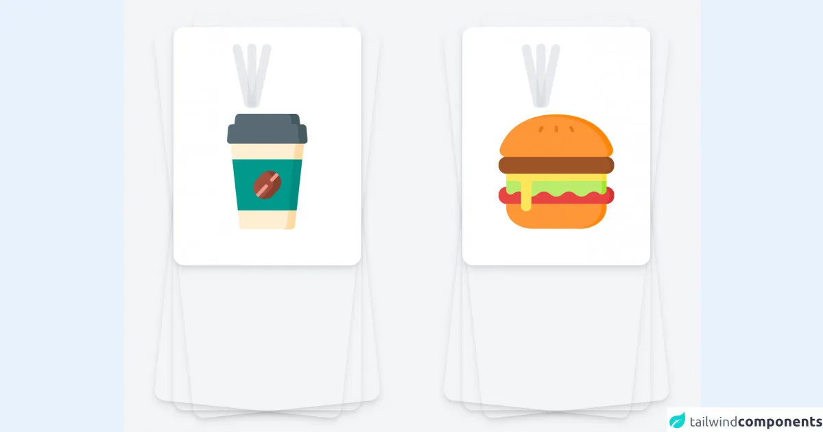
The preview of HUD Food UI component
Free download of the HUD Food's source code
The source code of HUD Food UI component
<div class="min-h-screen bg-gray-100 py-6 flex sm:py-12">
    <div class="relative py-3 sm:max-w-xl sm:mx-auto">
        <div class="absolute inset-0 bg-gradient-to-r from-cyan-400 to-light-blue-500 shadow-lg transform -skew-y-6 sm:skew-y-0 sm:-rotate-6 sm:rounded-3xl"></div>
        <div class="absolute inset-0 bg-gradient-to-l from-cyan-400 to-blue-light-500 shadow-lg transform -skew-y-6 sm:skew-y-0 sm:-rotate-0 sm:rounded-3xl"></div>
        <div class="absolute inset-0 bg-gradient-to-l from-cyan-400 to-blue-light-500 shadow-lg transform -skew-y-6 sm:skew-y-0 sm:rotate-6 sm:rounded-3xl"></div>
        <div class="relative px-4 py-10 bg-white shadow-lg sm:rounded-3xl sm:p-20">
            <div id="water_animation" class="flex absolute top-1 mt-8 gap-10 justify-center left-36">
                <div class="h-36 w-5 bg-gray-300 opacity-10 animate-pulse transform -rotate-12 rounded-full"></div>
                <div class="h-36 w-5 bg-gray-300 opacity-10 animate-pulse transform rounded-full"></div>
                <div class="h-36 w-5 bg-gray-300 opacity-10 animate-pulse transform rotate-12 rounded-full"></div>
            </div>

            <img src="https://image.flaticon.com/icons/png/512/3127/3127430.png" class="w-64 h-64 mt-28">
        </div>
    </div>

    <div class="relative py-3 sm:max-w-xl sm:mx-auto">
        <div class="absolute inset-0 bg-gradient-to-r from-cyan-400 to-light-blue-500 shadow-lg transform -skew-y-6 sm:skew-y-0 sm:-rotate-6 sm:rounded-3xl"></div>
        <div class="absolute inset-0 bg-gradient-to-l from-cyan-400 to-blue-light-500 shadow-lg transform -skew-y-6 sm:skew-y-0 sm:-rotate-0 sm:rounded-3xl"></div>
        <div class="absolute inset-0 bg-gradient-to-l from-cyan-400 to-blue-light-500 shadow-lg transform -skew-y-6 sm:skew-y-0 sm:rotate-6 sm:rounded-3xl"></div>
        <div class="relative px-4 py-10 bg-white shadow-lg sm:rounded-3xl sm:p-20">
            <div id="hunger_animation" class="flex absolute top-1 mt-8 gap-10 justify-center left-36">
                <div class="h-36 w-5 bg-gray-300 opacity-10 animate-pulse transform -rotate-12 rounded-full"></div>
                <div class="h-36 w-5 bg-gray-300 opacity-10 animate-pulse transform rounded-full"></div>
                <div class="h-36 w-5 bg-gray-300 opacity-10 animate-pulse transform rotate-12 rounded-full"></div>
            </div>

            <img src="https://image.flaticon.com/icons/png/512/3075/3075929.png" class="w-64 h-64 mt-28">
        </div>
    </div>
</div>

<script>
    const hunger_animation = document.getElementById('hunger_animation')
    const water_animation = document.getElementById('water_animation')

    setInterval(() => {
        hunger_animation.classList.toggle('flex')
        water_animation.classList.toggle('flex')

        hunger_animation.classList.toggle('hidden')
        water_animation.classList.toggle('hidden')
    }, 2500)
</script>
How to create a HUD Food with Tailwind CSS?
To create a HUD Food UI component using Tailwind CSS, we will follow these steps:
- Create a container element for the HUD Food UI component.
- Create a bar element that represents the player's health, stamina, or other attribute.
- Create a label element that displays the current value of the attribute.
- Style the container, bar, and label elements using Tailwind CSS classes.
Let's start by creating the container element for the HUD Food UI component.
<div class="hud-food-container"></div>
Next, we will create the bar element that represents the player's health, stamina, or other attribute.
<div class="hud-food-bar"></div>
We will then create the label element that displays the current value of the attribute.
<div class="hud-food-label">100/100</div>
Now that we have created the container, bar, and label elements, we can style them using Tailwind CSS classes. We will use the following classes to style the elements:
bg-gray-300: Sets the background color of the bar element to gray.h-4: Sets the height of the bar element to 4 pixels.w-48: Sets the width of the bar element to 48 pixels.rounded-full: Rounds the corners of the bar element.text-white: Sets the text color of the label element to white.text-sm: Sets the font size of the label element to small.ml-2: Adds a margin of 2 pixels to the left of the label element.
<div class="hud-food-container">
  <div class="hud-food-bar bg-gray-300 h-4 w-48 rounded-full"></div>
  <div class="hud-food-label text-white text-sm ml-2">100/100</div>
</div>
And that's it! We have successfully created a HUD Food UI component using Tailwind CSS.
Conclusion
In this article, we discussed how to create a HUD Food UI component using Tailwind CSS. We started with an introduction to Tailwind CSS, followed by a description of the HUD Food UI component. We then discussed why Tailwind CSS is the best choice for creating this UI component. After that, we provided a preview and source code of the HUD Food UI component. Finally, we discussed how to create the HUD Food UI component using Tailwind CSS. We hope that this guide has been helpful in creating your own HUD Food UI component using Tailwind CSS.